The income and wealth inequality that continues to grow in most advanced nations has led…
US labour market data – an uncertain and pessimistic future
On November 6, 2020, the US Bureau of Labor Statistics (BLS) released their latest labour market data – Employment Situation Summary – October 2020 – which shows that employment continues to grow, but will take a long time at this rate to make up the job losses incurred in March and April. Further, the unemployment rate fell by 1 point to 6.9 per cent and the participation rate rose by 0.3 points. So, on the face of it, this is a positive outcome – jobs growth, participation increasing and unemployment falling. There is some doubt about the strength of the labour force employment estimates but the payroll data also shows steady employment increases. Worrying trends were in the loss of government employment, particularly at the state and local government level. Those losses will worsen if there is no extra fiscal support applied at that level by the federal government. The impasse at Congress on the the size and design of the next tranche of fiscal support is not helping. And then the data shows the lax health policy is allowing the virus to run out of control and how that plays out is anyone’s guess. I suspect a nation has to get the health problem sorted before they can really sort out the economic problem. The US appears to be going in the opposite direction to that. I doubt it will turn out well.
Overview for October 2020:
- Payroll employment rose by 638,000 (slowing).
- Total labour force survey employment rose by 2,243 thousand net (1.52 per cent).
- The seasonally adjusted labour force rose by 724 thousand (0.45 per cent).
- Official unemployment fell by 1,519 thousand to 11,061 thousand
- The official unemployment rate fell by 1 point to 6.9 per cent.
- The participation rate rose by 0.3 points to 61.7 per cent.
- The broad labour underutilisation measure (U6) fell by 0.7 points to 12.1 per cent, even though the number in the part-time for economic reasons cohort (the US indicator of underemployment) rose by 383 thousand (6.1 per cent).
For those who are confused about the difference between the payroll (establishment) data and the household survey data you should read this blog post – US labour market is in a deplorable state – where I explain the differences in detail.
Election comments
I don’t have much to write at present. But progressives who are out there celebrating that a monster has gone should reflect on the new president’s past record, which is anything but encouraging.
The early rumours about the team he is assembling doesn’t augur well from an economics perspective.
And the lack of empathy with the blue-collar workers who have lost out in this globalised world, which goes back to the Clinton days and has become entrenched in the Democratic machine doesn’t suggest a great progressive future.
The 70 million voters who went for the monster are real people who have seen the Democrats cosy up to Wall Street and endorse deregulation and a refuse to endorse major increases in the wages.
They see a party that refuses to endorse scrapping the massive student loans that give their children any hope of upward mobility.
They saw Clinton’ welfare reforms that were racist and an attack on poverty. A criminalisation of poverty. Meanwhile they have seen the banksters mostly walk free with their government-bailout salaries and bonuses in place.
They have seen Obama care refuse to provide universal health care.
They have seen their children go to illegal wars and die.
And so it goes.
Unless the new president disavows all that including his own past record then nothing much will change.
I don’t think Biden won, rather Trump lost because his preposterous manner was just a little too muchor an already preposterous nation.
BLS explanation
The BLS provided a special note to help us understand the results this month.
We learn:
1. “The collection rate for the establishment survey was 79 percent in October, higher than the average for the 12 months ending in February 2020.”
2. “The household survey response rate was 80 percent in October, considerably higher than the low of 65 percent in June but below the average of 83 percent for the 12 months ending in February 2020.”
3. Both results reduce the accuracy of the surveys.
4. In the payroll survey:
… workers who are paid by their employer for all or any part of the pay period including the 12th of the month are counted as employed, even if they were not actually at their jobs. Workers who are temporarily or permanently absent from their jobs and are not being paid are not counted as employed, even if they are continuing to receive benefits.
5. In the Labour Force survey:
… In the household survey, individuals are classified as employed, unemployed, or not in the labor force based on their answers to a series of questions about their activities during the survey reference week (September 6th through September 12th). Workers who indicate they were no working during the entire survey reference week and expect to be recalled to their jobs should be classified as unemployed on temporary layoff. As in recent months, a large number of persons were classified as unemployed on temporary layoff in September.
The BLS wanted the latter group classified as unemployed for consistency but the survey staff didn’t always comply, which means that the employment estimates are probably overstated.
What impact might this have had?
The BLS say:
… the share of responses that may have been misclassified was highest in the early months of the pandemic and has been considerably lower in recent months.
For March through September, BLS published an estimate of what the unemployment rate would have been had misclassified workers been included among the unemployed. Repeating this same approach, the overall October unemployment rate would have been 0.3 percentage point higher than reported. However, this represents the upper bound of our estimate of misclassification and probably overstates the size of the misclassification error.
So we are still operating in an environment of uncertainty but the data accuracy has increased.
Once these classification issues are resolved, the participation response becomes more normal (workers coming back into the labour force), and the number of jobs lost forever becomes apparent, the true residual impact of the pandemic on the US labour market will become clearer.
Payroll employment trends
The BLS noted that:
Total nonfarm payroll employment rose by 638,000 in October and has increased for 6 consecutive months. In October, nonfarm employment was below its February level by 10.1 million, or 6.6 percent. Notable job gains occurred over the month in leisure and hospitality, professional and business services, retail trade, and construction. Employment in government declined.
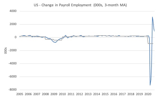
The first graph shows the monthly change in payroll employment (in thousands, expressed as a 3-month moving average to take out the monthly noise). The gray lines are the annual averages.
The data swings are still large and dwarf the past history.
Clearly, the 20.7 million job loss in April has not yet been reversed. Given the loss of payroll jobs in March and April, the US labour market is still 10.1 million jobs short from where it was at the end of February.
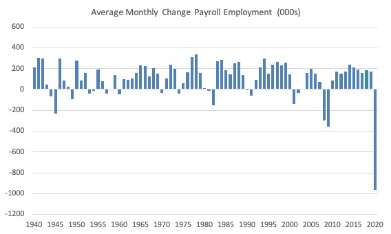
The next graph shows the same data in a different way – in this case the graph shows the average net monthly change in payroll employment (actual) for the calendar years from 1940 to 2020 (the 2020 average is for the months to date).
I usually only show this graph from 2005 but because history is being created at present I included the full sample available from 1940.
The final average for 2019 was 178 thousand.
The average so far for 2020 is -963 thousand.
In a way, graphs like this lose definition and only present a binary world.
Labour Force Survey – employment growth continues
The data for September continues the improvement for the time being
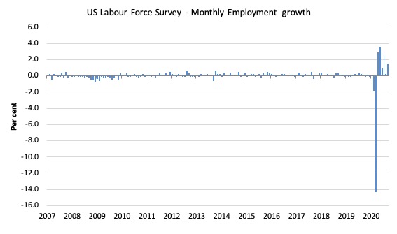
1. Employment as measured by the household survey rose by 2,243 thousand net 1.52 per cent). This is a massive increase and I suspect it is a sampling issue. At the same time the working age population estimate fell, which is a sure sign some sampling issues are going on
2. The labour force rose by 724 thousand (0.45 per cent).
3. The participation rate rose by 0.3 points.
4. As a result (in accounting terms), total measured unemployment fell by 1,519 thousand and the unemployment rate fell by 1 point to 6.9 per cent.
So, on the face of it, this is a virtuous situation – a rise in jobs, a rise in those seeking jobs and a fall in official unemployment (and hidden unemployment).
But standby for revisions.
The following graph shows the monthly employment growth since January 2008, which shows the massive disruption this sickness has caused.
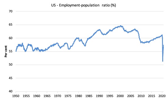
The Employment-Population ratio is a good measure of the strength of the labour market because the movements are relatively unambiguous because the denominator population is not particularly sensitive to the cycle (unlike the labour force).
The following graph shows the US Employment-Population from January 1950 to October 2020.
While the ratio fluctuates a little, the April 2020 ratio fell by 8.7 points to 51.3 per cent, which is the largest monthly fall since the sample began in January 1948.
In October 2020, it rose by 0.8 points to 57.4 per cent.
It is still well down on the level in January 2020 (61.2 per cent).
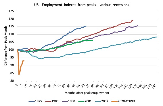
As a matter of history, the following graph shows employment indexes for the US (from US Bureau of Labor Statistics data) for the five NBER recessions since the mid-1970s and the current 2020-COVID crisis.
They are indexed at the employment peak in each case and we trace the data out for each episode until one month before the next peak.
So you get an idea of:
1. The amplitude (depth) of each cycle in employment terms.
2. The length of the cycle in months from peak-trough-peak.
The early 1980s recession was in two parts – a short downturn in 1981, which was followed by a second major downturn 12 months later in July 1982 which then endured.
Other facts:
1. Return to peak for the GFC was after 78 months.
2. The previous recessions have returned to the 100 index value after around 30 to 34 months.
3. Even at the end of the GFC cycle (146 months), total employment in the US had still only risen by 8.3 per cent (since December 2007), which is a very moderate growth path as is shown in the graph.
The current collapse is something else.
Unemployment and underutilisation trends
The BLS report that:
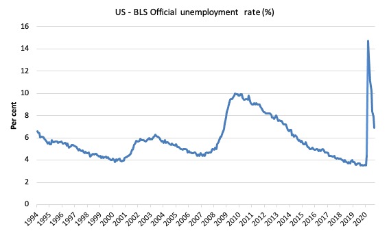
In October, the unemployment rate declined by 1.0 percentage point to 6.9 percent, and the number of unemployed persons fell by 1.5 million to 11.1 million. Both measures have declined for 6 consecutive months but are nearly twice their February levels (3.5 percent and 5.8 million, respectively).
The official unemployment rate declined in October 2020 largely because employment growth outstripped the labour force growth (driven by rising participation). This is usually seen as a good sign but be warned the employment estimates were suspect.
The first graph shows the official unemployment rate since January 1994.
The official unemployment rate is a narrow measure of labour wastage, which means that a strict comparison with the 1960s, for example, in terms of how tight the labour market, has to take into account broader measures of labour underutilisation.
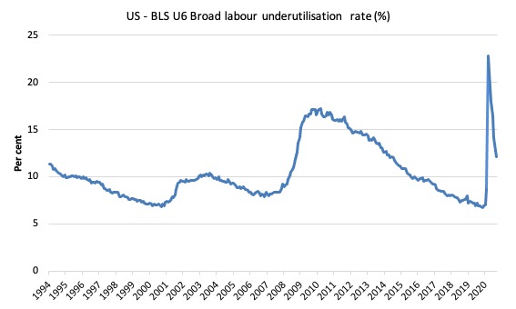
The next graph shows the BLS measure U6, which is defined as:
Total unemployed, plus all marginally attached workers plus total employed part time for economic reasons, as a percent of all civilian labor force plus all marginally attached workers.
It is thus the broadest quantitative measure of labour underutilisation that the BLS publish.
In December 2006, before the effects of the slowdown started to impact upon the labour market, the measure was estimated to be 7.9 per cent.
In October 2020 the U6 measure decreased by 0.7 points to 12.1 per cent.
What drove this improvement?
This was driven mostly by the decline in unemployment. Offsetting that was the rise in underemployment – up by 383 thousand.
The BLS say that:
The number of persons employed part time for economic reasons increased by 383,000 to 6.7 million in October, after declines totaling 4.6 million over the prior 5 months. These individuals, who would have preferred full-time employment, were working part time because their hours had been reduced or they were unable to find full-time jobs. This group includes persons who usually work full time and persons who usually work part time …
The number of persons not in the labor force who currently want a job decreased by 539,000 to 6.7 million in October; this measure is 1.7 million higher than in February. These individuals were not counted as unemployed because they were not actively looking for work during the last 4 weeks or were unavailable to take a job …
Among those not in the labor force who currently want a job, the number of persons marginally attached to the labor force, at 2.0 million, was about unchanged in October. These individuals were not in the labor force, wanted and were available for work, and had looked for a job sometime in the prior 12 months but had not looked for work in the 4 weeks preceding the survey. The number of discouraged workers, a subset of the marginally attached who believed that no jobs were available for them, was 588,000 in October, essentially unchanged from the previous month …
Ethnicity and Education
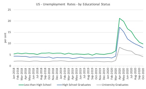
The next graph shows the evolution of unemployment rates for three cohorts based on educational attainment: (a) those with less than high school completion; (b) high school graduates; and (c) university graduates.
As usual, when there is a crisis, the least educated suffer disproportionately.
In the collapse in employment, the unemployment rates rose by:
- 14.4 points for those with less than high-school diploma.
- 12.9 points for high school, no college graduates.
- 5.9 points for those with university degrees.
The bounce back since April 2020 has seen the unemployment rate fall by:
- 11.4 points for those with less than high-school diploma meaning the unemployment rate is now 3.8 points above the March level.
- 9.2 points for high school, no college graduates meaning the unemployment rate is now 4.6 points above the March level.
- 4.2 points for those with university degrees meaning the unemployment rate is now 2.3 points above the March level.
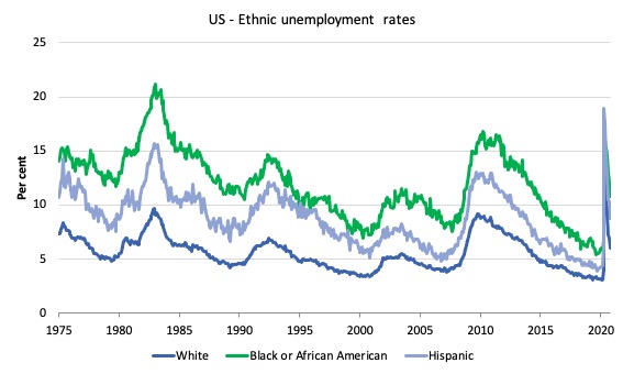
In the US context, especially in the current time, the trends in trends in unemployment by ethnicity are interesting.
Two questions arise:
1. How have the Black and African American and White unemployment rate fared in the post-GFC period?
2. How has the relationship between the Black and African American unemployment rate and the White unemployment rate changed since the GFC?
Summary:
1. All the series move together as economic activity cycles. The data also moves around a lot on a monthly basis.
2. The Black and African American unemployment rate was 6.7 per cent in March 2020, rose to 16.8 per cent in May and is now down to 10.8 per cent in October 2020.
3. The Hispanic or Latino unemployment rate was 6 per cent in March 2020, rose to 18.9 per cent in April and fell to 8.8 per cent in October 2020.
4. The White unemployment rate was 4 per cent in March 2020, rose to 14.2 per cent in April and fell to 6 per cent in October 2020.
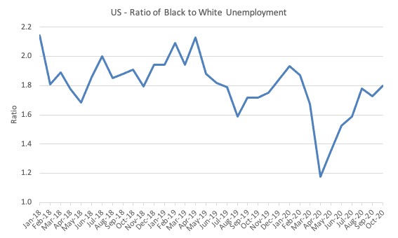
The next graph shows the Black and African American unemployment rate to White unemployment rate (ratio) from January 2018, when the White unemployment rate was at 3.5 per cent and the Black or African American rate was at 7.5 per cent.
This graph allows us to see whether the relative position of the two cohorts has changed since the crisis. If it is rising, then the unemployment rate of the Black and African American cohort is either rising faster than the white unemployment rate or falling more slowly (or a combination of that relativity).
While there is month-to-month variability, the data shows that, in fact, through to mid-2019, the position of Black and African Americans had improved in relative terms (to Whites), although that just reflected the fact that the White unemployment was so low that employers were forced to take on other ‘less preferred’ workers if they wanted to maintain growth.
In April 2019, the ratio was 2.1 (meaning the Black and African American unemployment rate was more than 2 times the White rate).
By April 2020, the ratio had fallen to its lowest level of 1.2, reflecting the improved relative Black and African American position.
As the pandemic hit, the ratio rose and peaked at 1.8 in August 2020, but fell to 1.7 in September, reflecting an improvement in the relative position of the Black and African American workers.
In October, the ratio rose to 1.8 reflecting a small deterioration in the relative Black and African American situation against Whites.
The Occupational Impacts to date – low wage workers bearing the brunt
As regular readers will know I have been tracking the sectoral and occupational employment changes in the US in relation to earnings for some time now.
I am exploring now is how is the US labour market collapse impacting on workers across the wage distribution.
The burning question is whether low-paid workers bear the brunt of downturns and how well the respective earnings groups fare in the recovery?
In the past, I have demonstrated that the proportion of jobs in the total employment in sectors that pay below-average pay has increased.
But at that level of aggregation, we are unable to say whether these jobs in question were high-pay or low-pay.
The next calculations help to expand on that understanding.
They show the net job losses (in the downturn) and net job gains (in the recovery to date) for the major occupations in the BLS classification.
I have sorted the occupations relative to median weekly earnings as at the September-quarter 2020 (most recent data).
Low-pay is 75 per cent of the median and in terms of the most recent earnings data includes the Service occupations, Farming, Fishing and Forestry occupations, and the Transportation and material moving occupations.
GFC downturn
1. In the downturn, 90.6 per cent of the jobs lost were in occupations that paid below median weekly earnings (12.3 per cent of those were in low-paid occupations). Very few jobs (relatively) were lost in the higher paying occupations.
2. Given 86.1 per cent of the total jobs lost in the downturn were in sectors paying above average pay. The inference is that the jobs lost were predominantly the lower paying jobs in those sectors (although we cannot strictly compare mean and median in a wage distribution given the skewness).
GFC recovery to February 2020
1. In the upturn to February 2020, the net jobs added had not yet replaced those lost in the occupations with below median weekly earnings. 67 per cent of the net jobs added were in occupations with above median weekly earnings. That proportion rose in the last three months to February 2020.
2. In the recovery, a much larger number of low-paid jobs were added. Of the 33 per cent share of below median earning jobs added in the recovery, almost all of them were in low-pay occupations (31.3 per cent of the total jobs added).
3. This tells us that there is a polarisation going on in the occupational employment structure with a bias towards low-pay jobs in the below median weekly earnings occupations and towards jobs in the above median weekly earnings with a hollowing out in the middle of the distribution.
4. That is, over the recovery period a hollowing out around the overall median pay levels was going on.
The Covid downturn – February 2020 to April 2020
The current crisis is very different to the GFC recession, given that a host of activities were forced to stop altogether ad authorities (slowly) enforced shutdowns and isolation.
The areas that are most affected include hospitality, sports, entertainment, restaurants and cafes, travel, and similar, which are major employers of low-paid, precarious workers.
So I expect the patterns of job loss to be somewhat different as a result.
The summary results are that:
1. Low-paid work slumped by 29.9 per cent between February and April 2020.
2. In just two months, the low-paid service sector occupations shed 160 per cent of the total jobs that were added in the period between January 2010 and February 2020. Think about that!
2. Below-median pay jobs slumped by 21.9 per cent.
3. Above-median pay jobs fell by 7.9 per cent.
4. In terms of total numbers of jobs lost:
(a) 22.9 per cent (5,646 thousand) were in above-median pay occupations.
(b) 77.1 per cent (19,045 thousand) in below-median pay occupations.
(c) 43.2 per cent of the total (10,671 thousand) have been in low-pay occupations.
The Covid recovery – from April 2020
The summary results are that:
1. Low-paid work has grown by 29.7 per cent and gained 70.9 per cent of the jobs lost between February and April 2020.
2. Below-median pay jobs have grown by 21.6 per cent and gained 76.9 per cent of the jobs lost between February and April 2020.
3. Above-median pay jobs have grown by 3.8 per cent and gained 43.5 per cent of the jobs lost between February and April 2020.
4. In terms of total numbers of jobs gained:
(a) 14.4 per cent (2,457 thousand) were in above-median pay occupations.
(b) 85.6 per cent (14,650 thousand) in below-median pay occupations.
(c) 44.3 per cent of the total (7,574 thousand) have been in low-pay occupations.
| Occupational Group | Jobs change – Feb-Apr 2020 (000s) | Proportion change (%) | Jobs change – Apr-Oct 2020 (000s) | Proportion change (%) |
| Above-median pay | -5,646 | 22.9 | 2,457 | 14.4 |
| Management, business, and financial operations occupations | 1,471 | 6.0 | 549 | 3.2 |
| Professional and related | -3,452 | 14.0 | 1,508 | 8.8 |
| Installation, maintenance, and repair | -723 | 2.9 | 400 | 2.3 |
| Below-median pay but not low pay | -19,045 | 77.1 | 14,650 | 85.6 |
| Sales and related | -2,846 | 11.5 | 2,308 | 13.5 |
| Office and administrative support | -1,937 | 7.8 | 1,682 | 9.8 |
| Construction and extraction | -1,605 | 6.5 | 1,691 | 9.9 |
| Production | -1,986 | 8.0 | 1,395 | 8.2 |
| Low pay | -10,671 | 43.2 | 7,574 | 44.3 |
| Service | -8,189 | 33.2 | 6,103 | 35.7 |
| Farming, fishing, and forestry | -64 | 0.3 | 37 | 0.2 |
| Transportation and material moving | -2,418 | 9.8 | 1,434 | 8.4 |
| Total | 24,691 | 100.0 | 17,107 | 100.0 |
Conclusion
The October 2020 US BLS labour market data release reveals an on-going rebound from the catastrophic labour market collapse in March and April but the pace of recovery is still not sufficient to wipe out the losses accumulated in March and April.
The payroll data suggests the pace of recovery is slowing, whereas the labour force data gives the opposite view. Next month will resolve those conflicts one suspects as revisions will come.
The question that I have is how far can the US go with its open policy with the virus spiralling out of control, hospitals becoming overcrowded and the death rate rising to unimaginable levels.
Will the states lockdown again or not?
How many firms have failed in the past few months.
One of the questions that we do not know the answer to yet is how many firms have disappeared altogether as a result of the lockdowns in March and April.
One of the issues that will impact on future results is the loss of jobs in the government sector.
Total (net) jobs lost in the government sector was 268 thousand in October.
Of those, 130 thousand (net) jobs fell in the state and local government sector and if the Congress does not approve further support for the states then this figure will escalate.
It doesn’t make sense in a massive crisis for government employment to be falling.
The bankruptcy data also indicates a slight fall in filings in the June-quarter 2020 relative to the March-quarter. So it is unclear at present how many firms have disappeared.
The delays in extra US government assistance are not helpful and perhaps with the political situation less uncertain (for most) the Congress will resolve the impasse.
That is enough for today!
(c) Copyright 2020 William Mitchell. All Rights Reserved
” I suspect a nation has to get the health problem sorted before they can really sort out the economic problem.”
I suspect you are right about that. And that is very unfortunate because the US does not appear to be capable of dealing with this virus any better than we have been anytime soon. Maybe one of the vaccines will work and become available in six months or so. I can’t see the US managing to do anything as far as a national public health policy that would really limit the spread of this further.
So the United States is a “preposterous” nation? Well we have been called worse. The current President is no doubt truly preposterous. I don’t know that makes the rest of us fall into that category. But I don’t care to argue about it much- I don’t understand my country either. As far as the election- the most striking divide to me is the difference between more rural areas and more urban areas and who they voted for. And considering that Donald Trump is the epitome of a caricature of all the worst characteristics of the most urban city in this country- I just don’t understand how he has support in the vast more ‘rural-ish’ areas of this country that he apparently still has.
@ Jerry Brown
As one who passed the penultimate year of his ‘teens at school in the USA I long ago since ceased to understand it any more (which I naively thought I did then – and loved it all, or nearly all).
I shall remember to my dying day that electric moment in the McCarthy-Army hearings (which along with 20 million or so others I was watching on TV) when Counsel for the Army Welch interrupted a McCarthy tirade with the words “Senator. You’ve done enough. Have you no sense of decency, Sir, at long last? Have you left no sense of decency?” – at which the members of the public who were present broke into spontaneous applause and the session was closed.
McCarthy’s career ended in that instant.
Could anything like it have happened in today’s USA? I don’t think so. Had anyone put the same question to Trump any time during the last four years he simply wouldn’t have comprehended what they were talking about, let alone have been in even the minutest degree abashed by it. Worse, a large part (perhaps the largest part) of the public, not including you Jerry or other Americans I know, wouldn’t have understood the question either.
I’ve long felt that America lost its way somewhere between then and now, and ceased terminally to be the great country I once thought it was.
Jerry,
Trump gained support among casualties of the rust belt, which neither mainstream Dems or Repubs dealt with, over decades. But there is also the sheer visceral attractiveness of a charismatic, if narcissistic, “I’m extremely wealthy” leader, who can appeal to self-interested survival instincts in less educated folk….the “deplorables”, maybe?
Let me second Jerry Brown’s observations. I had copied the same short quote to use as an intro to mine. I would only add that getting the health problem “sorted out” may prove to be far more difficult, take a much longer time, than most of us would like to think–not only in the U.S. but in many if not most other countries. We may well be dealing with a tenacious, unpredictable virus that comes and goes, that again rears its ugly head just when we thought we had “whack-a-moled” it, and if so, then intermittent social and economic paralysis will become our new way of life for the foreseeable future. How will neoliberalism, a shark that must constantly swim to breathe, deal with being repeatedly frozen in its tracks? My intuition and my hope is that the shark will croak and take with it a lot of predation upon people and planet.
Now the Neoliberal globalists are back in charge.
“Foreign policy and security”
Is all that matters so there is a 0% chance any of it will include MMT.
The Guardian newspaper will be beating the war drums soon enough. The chimes of liberalism.
Neoliberal globalist hit list 5 year plan
Bernie ✔
Corbyn ✔
Trump ✔
Boris
Farage
Sturgeon
Duda
Erdogan
20 year plan
Ayatollah Ali Khamenei
Putin
Xi Jinping
Kim Jong-un
How far down the list will they get before things really start to get out of control ?
If the right keep fighting the left
The left keep fighting the right
Might as well put a fork in us all.
What generally happens when things become so divided as we have seen over many years. Is that the whole pie when it retreats into different parts and divided itself they form echo chambers.
Echo chambers don’t really put fear into those who have money.In fact those that do have money tend to fund the different parts after they have divided and then pay someone to control it. Call them an editor.
The editor then Corrales and controls them in that echo chamber making sure they will never really make a difference.
The echo chambers think they are making a difference but they aren’t really. They are being controlled.
Many echo chambers might spring up as the whole pie divides itself. But overtime dominant ones from that people gravitate to over time. Making them even easier to control.
Echo chambers are the release valves of anger. They serve a purpose for those who have money.They control the sheer volume of anger and prevent that anger from blowing the system up. Work the same way as sheep pens.
The Guardian is a sheep pen
The Telegraph is a sheep pen
The Times and financial Times are sheep pens for those
Who have money
Guido Fawkes and Spiked were sheep pens created due to Brexit.
The Scottish National and Bella Caledonia and Wings over Scotland were sheep pens created by Scottish indy.
This time feels different however…
If these echo chambers can’t be controlled as they have been in the passed this thing is gonna blow. How it blows will decide what America will look like in the very near future. As we speak millions in America are deciding which echo chamber to choose. Some are ditching FOX, Breitbart is staying solid and the mainstream are being abandoned. Newsmax and news start seems to be the echo chambers of choice.
The question is…
Will the sheep pens work this time as millions more give up on the mainstream. Will they be manipulated and corralled and controlled.
Or is this thing gonna blow ?
Are the anger overflow valves going to control the steam?
More importantly are the left and right going to unite and identify who The real enemy is ?
Or sit and stew in their sheep pens and throw mud at each other waiting to be defeated ?
Me personally I would like to see Corbyn and Farage join forces and start a party.The sovereignty party. Corbyn introduce MMT policies Farage can handle the tax cuts. Ain’t going to happen but it would shake things up a bit and they would probably win by a landslide. Get the popcorn out for another few years.
Wall St , City of London and Frankfurt wins the tools they use instead of standing armies. Everyone loses including MMT.
“Me personally I would like to see Corbyn and Farage join forces and start a party”. (Derek Henry)
It could be named “the Far-Corbynage Party”.
Should do well.
The sheep pens don’t even report news anymore.
1% is news 99% are opinion pieces.
The opinion pieces are the shepard whistle to keep everyone divided. The editorials are the Shepard crook to show who’s boss.
Robert H @19:30,
Thank you. But in many ways the US is a better, more decent, nation than it was in 1954. Far from perfect- but far better than we were in many areas. A better recognition of civil rights for people of all races is perhaps the largest most important improvement in my opinion, but it doesn’t stop there by any means. I could call myself a communist if I wanted to nowadays (I don’t, only because I am not) and not fear being dragged before a Senate committee.
I don’t understand my country but I don’t doubt that we can have moments of greatness going forward. This is a really big place with all kinds of people- many, many millions of us that mostly really just want to be good people even if there are huge disagreements about how to do that. But Bill Mitchell’s comment about the entire nation being ‘preposterous’ really stings because it is in some ways true. But the US is not a terminal case- at least I hope not. Plenty of very decent human beings here, even if it is hard to tell sometimes.
Jerry,
If you take a look at the US electoral map at the county level it is immediately obvious that there is a great divide in the US. Virtually all the population centres are Blue even in Red states. The rural areas are Red even in the Blue states. This rural/city divide is striking.
I am interested in amateur radio. Over the weekend, after Biden won the call, I thought it might be interesting to listen to the online HF receivers in the US and see what the locals were saying (even though talking politics on the air is frowned upon). There are receivers in Alabama and Pennsylvania that I listened to. There is a particular band (the 80 metre band) which is suited to local communication and more often than not conversations between groups of men (white, generally in their 60s, 70s, 80s) located in rural areas can be heard. It is clear this class is deeply enamoured of Trump. Their views are entrenched. They totally believe his nonsense about the Democrats pulling 100,000s of ballots from thin air in critical states. They believe his presidency has benefited them economically. There was even one old codger that said the “socialists” would set up re-education camps. Some of the things said were “preposterous” and disturbing. It was all very instructive. And there was Biden, in his powerful post call speech, talking about unification of the nation.
Henry,
Yes- those are the maps I have been looking at. And it certainly seems to be a large divide. And I don’t understand why it is that it is so.
Jerry and Henry,
IMO, it is because—
1] The Repud Party is totally for the 1%. Trump spent like a drunken sailor and the Repud Senate let him. So, some of Trumps deficit spending trickled down to some voters. However, the Repud are already back to their austerity mantra now that a Dem will be President.
2] Since about 1988 the Dem Party has decided that it want to be the Party of the top 20%. It has stabbed the workers (urban and rural) in the back ever since. Because it doesn’t care about the workers, the workers are free to find a reason to vote Repud. Slowly this has happened.
Trump talked a great game and made many promises to bring back good lobs for workers, but he didn’t deliver. Rural folks are still hoping that Trump can deliver, so they vote Repud.
Urban voters are the 20%, people of color, and some others. The Dems do do things for them, so they vote Dem.
IMHO, if AOC and all the Squad moved to the Green Party and the Green Party could get its candidates on the ballot almost everywhere, then AOC could promise to work for the workers and rural people. If they crated their message right they would win easily, because the voters desperately want someone to care about them. The new Green Party would be given some time 4-6 years to deliver ‘something’. Again IMHO, the new Green/workers Party would win a majority in the House in 2 to 4 years.