The recent extreme weather in the northern hemisphere, the twin monster tropical storms in Japan,…
US labour market improves but GFC residue remains
On October 5, 2018, the US Bureau of Labor Statistics (BLS) released their latest labour market data – Employment Situation Summary – September 2018 – which showed that total non-farm employment from the payroll survey rose by only 134,000. The labour force survey measures show that employment growth outstripped the growth in the labour force, which resulted in the unemployment rate declining by 0.2 points to 3.69 per cent. The US labour market is reaching unemployment rates not seen since the late 1960s, although the participation rate is well below the pre-GFC levels and a substantial jobs deficit remains. The employment-population ratio rose by 0.1 points in September. Taken together, the US labour market continued to improve in September but remains some distance from full employment.
Overview for September 2018
- Payroll employment rose by 134,000.
- Total labour force survey employment rose by 420 thousand in net terms.
- The seasonally adjusted labour force rose by 150 thousand.
- Official unemployment fell by 270 thousand to 5,964 thousand.
- The official unemployment rate fell by 0.2 points to 3.68 per cent. It has fallen from 4.20 per cent to its current level over the last 12 months.
- The participation rate was steady at 62.7 per cent but remains well below the peak in December 2006 (66.4 per cent). Adjustng for age effects, the rise in those who have given up looking for work for one reason or another since December 2006 is around 3,726 thousand workers. The corresponding unemployment rate would be 5.7 per cent, far higher than the current official rate.
- The broad labour underutilisation measure (U6) rose from 7.4 per cent to 7.5 per cent.
For those who are confused about the difference between the payroll (establishment) data and the household survey data you should read this blog – US labour market is in a deplorable state – where I explain the differences in detail.
See also the – Employment Situation FAQ – provided by the BLS, itself.
The BLS say that:
The establishment survey employment series has a smaller margin of error on the measurement of month-to-month change than the household survey because of its much larger sample size. … However, the household survey has a more expansive scope than the establishment survey because it includes self-employed workers whose businesses are unincorporated, unpaid family workers, agricultural workers, and private household workers …
Payroll employment trends
The BLS noted this month that:
The change in total nonfarm payroll employment for July was revised up from +147,000 to +165,000, and the change for August was revised up from +201,000 to +270,000. With these revisions, employment gains in July and August combined were 87,000 more than previously reported.
This arises when the statistician gets extra information.
What it means is that labour market did not slow down as much as the original data for July and August had suggested.
Which is a good outcome.
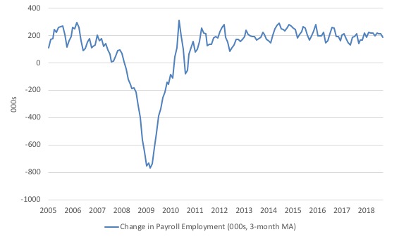
The first graph shows the monthly change in payroll employment (in thousands, expressed as a 3-month moving average to take out the monthly noise).
The monthly changes were stronger in 2014 and 2015, and then dipped in the first-half of 2016. By the end of 2016, job creation was stronger but then it tailed off again, somewhat.
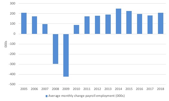
The next graph shows the same data in a different way – in this case the graph shows the average net monthly change in payroll employment (actual) for the calendar years from 2005 to 2018 (the current year is up to September).
The slowdown that began in 2015 is continued through 2017 and 2018 so far appears to have reversed that trend, with the current average for 2018 (208 thousand) higher than the 2017 average.
The average change in 2017 was 182 thousand, down from the 195 thousand average throughout 2016.
The average net change in 2014 was 250 thousand, in 2015 it was 226 thousand.
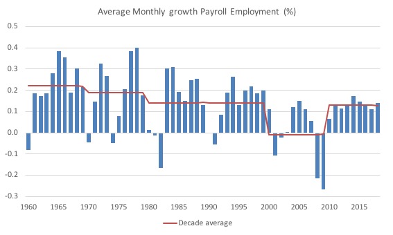
To put the current recovery into historical perspective the following graph shows the average annual growth in payroll employment since 1960 (blue columns) with the decade averages shown by the red line.
It reinforces the view that while payroll employment growth has been steady since the crisis ended, it is still well down on previous decades of growth.
Labour Force Survey – employment growth reverses last month’s fall
In September 2018, employment as measured by the household survey rose by 420 thousand net (0.27 per cent) while the labour force rose by 150 thousand (0.09 per cent) and the participation rate was steady at 62.7 per cent (having been 62.9 per cent in July).
As a result, total unemployment fell by 270 thousand.
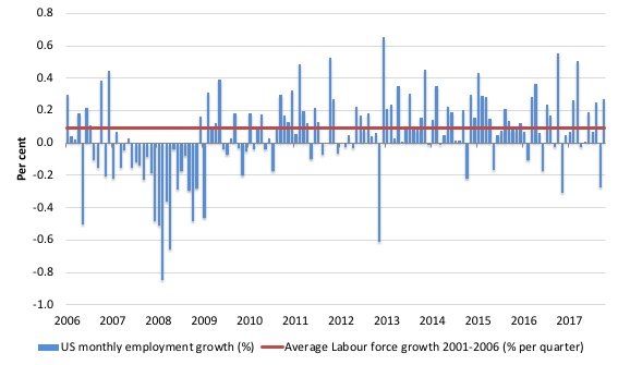
The next graph shows the monthly employment growth since the low-point unemployment rate month (December 2006). The red line is the average labour force growth over the period December 2001 to December 2006 (0.09 per cent per month).
Summary conclusions:
1. The swings around the zero line are obvious.
2. There is still no coherent positive and reinforcing trend in employment growth since the recovery began back in 2009. There are still many months where employment growth, while positive, remains relatively weak when compared to the average labour force growth prior to the crisis or is negative.
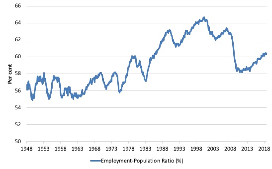
A good measure of the strength of the labour market is the Employment-Population ratio given that the movements are relatively unambiguous because the denominator population is not particularly sensitive to the cycle (unlike the labour force).
The following graph shows the US Employment-Population from January 1970 to September 2018. While the ratio fluctuates a little, the September 2018 ratio was up by 0.1 points to 60.4 per cent and has been at that level since February 2018.
Over the longer period though, we see that the ratio remains well down on pre-GFC levels (peak 63.4 per cent in December 2006), which is a further indication of how weak the recovery has been so far and the distance that the US labour market is from being at full capacity (assuming that the December 2006 level was closer to that state).
It has not risen at all in the last 12 months.
Unemployment and underutilisation trends
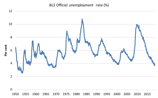
The first graph shows the official unemployment rate since January 1950.
It is clear that the US labour market is reaching unemployment rates not seen since the late 1960s, although the comments made earlier about the decline in the participation rate have to be taken into account.
The official unemployment rate is a narrow measure of labour wastage.
The next graph shows the BLS measure U6, which is defined as:
Total unemployed, plus all marginally attached workers plus total employed part time for economic reasons, as a percent of all civilian labor force plus all marginally attached workers.
It is thus the broadest measure of labour underutilisation that the BLS publish.
In December 2006, before the affects of the slowdown started to impact upon the labour market, the measure was estimated to be 7.9 per cent.
It is now at 7.5 per cent and after declining in the early part of 2018 rose by 0.1 points in September 2018.
The U-6 measure is marginally below the pre-GFC level but remains above the trough of the early 2000s.
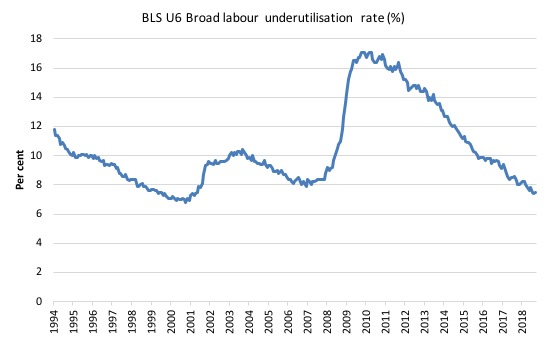
That provides a quite different perspective in the way we assess the US recovery and challenges the view that the US economy is close to full employment.
The ethnic trends in trends in unemployment by ethnicity are interesting in the US.
Two questions arise:
1. How have the Black and African American and White unemployment rate fared in the post-GFC period?
2. How has the relationship between the Black and African American unemployment rate and the White unemployment rate changed since the GFC?
The first graph shows the history of BLS unemployment rates for Black and African Americans, Hispanics and Whites.
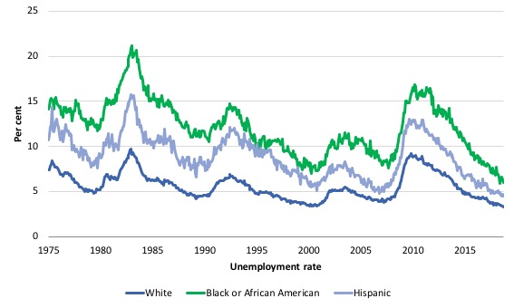
Summary:
- All the series move together as economic activity cycles. The data also moves around a lot on a monthly basis.
- The Black and African American unemployment rate is currently at 6 per cent, which is well below the pre-GFC minimum achieved of 7.6 per cent (August 2007).
- The Black and African American unemployment rate has fallen by 1 percentage point over the last 12 months.
- The White unemployment rate is 3.3 per cent in September 2018 and 0.8 points lower than the pre-GFC low-point (October 2007).
- The White unemployment rate has fallen by 0.4 percentage point over the last 12 months.
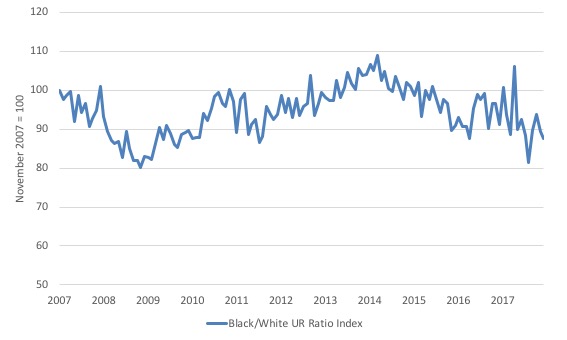
The second graph shows the Black and African American unemployment rate to White unemployment rate (ratio) from October 2007 (index = 100), when the White unemployment rate was at its previous lowest level.
This graph allows us to see whether the relative position of the two cohorts has changed since the crisis.
The data shows that, in fact, Black and African Americans are better off in relative terms (to Whites) now (September 2018) than they were in October 2007.
The ratio index stands at 87.7 points, meaning that that the Black and African American to White unemployment rate ratio has fallen by 12.3 percentage points since October 2007 – a relative improvement for Black and African Americans.
It has fallen sharply in the last few months.
Overall, since the end of the GFC, the US labour force growth is absorbing proportionately more disadvantaged workers.
The US jobs deficit
As noted in the Overview, the current participation rate of 62.7 per cent is a long way below the most recent peak in December 2006 of 66.4 per cent.
When times are bad, many workers opt to stop searching for work while there are not enough jobs to go around. As a result, national statistics offices classify these workers as not being in the labour force (they fail the activity test), which has the effect of attenuating the rise in official estimates of unemployment and unemployment rates.
These discouraged workers are considered to be in hidden unemployment and like the officially unemployed workers are available to work immediately and would take a job if one was offered.
In most advanced nations, the population is shifting towards older workers who have lower participation rates – so the US is not special in this regard.
Thus some of the decline in the total participation rate could simply being an averaging issue – more workers who have a lower participation rate as a proportion of the total workforce.
In this blog post (November 7, 2017) – Updating the impact of ageing labour force on US participation rates – I estimated that about 61 per cent of the decline in the participation rate since January 2008 has been due to non-cyclical shifts in the demographic weights (shifting age composition).
That still leaves a significant cyclical response.
Adjusting for the demographic effect would give an estimate of the participation rate in April 2018 of 64.2 per cent if there had been no cyclical effects (up from the current 62.7 per cent).
To compute these job gaps we have to set a ‘full employment’ benchmark. I have set this at 3.6 per cent, which is where the US labour market is now sitting.
I explain in this blog post – US labour market – strengthened in February but still not at full employment (April 13, 2018) – is the best case scenario given that I actually think the cyclical losses are much worse than I provide here.
Using the estimated potential labour force (controlling for declining participation), we can compute a ‘necessary’ employment series which is defined as the level of employment that would ensure on 3.6 per cent of the simulated labour force remained unemployed.
This time series tells us by how much employment has to grow each month (in thousands) to match the underlying growth in the working age population with participation rates constant at their January 2008 peak – that is, to maintain the 3.6 per cent unemployment rate benchmark.
In the blog post cited above (US labour market – strengthened in February but still not at full employment), I provide more information and analysis on the method.
There are two separate effects:
- The actual loss of jobs between the employment peak in November 2007 and the trough (January 2010) was 8,582 thousand jobs. However, total employment is now above the January 2008 peak by 9,367 thousand jobs.
- The shortfall of jobs (the overall jobs gap) is the actual employment relative to the jobs that would have been generated had the demand-side of the labour market kept pace with the underlying population growth – that is, with the participation rate at its January 2008 value and the unemployment rate was constant at 3.6 per cent. This shortfall loss amounts to 6,014 thousand jobs.
The following graph shows the US Jobs Gap, which is the departure of current employment from the level of employment that would have generated a 3.6 per cent unemployment rate, given current population trends.
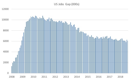
This reinforces the conclusion we reached above that the US labour market, while continuing to experience a declining official unemployment rate has not fully recovered from the GFC.
The ridiculous NAIRU
I have written conceptual articles on the NAIRU several times in the past.
Among others:
1. The dreaded NAIRU is still about! (April 16, 2009).
2. NAIRU mantra prevents good macroeconomic policy (November 19, 2010).
3. Why we have to learn about the NAIRU (and reject it) (November 19, 2013).
Further, my 2008 book with Joan Muysken – Full Employment abandoned – presented a detailed critique of the concept combining logical, mathematical and empirical arguments – so fairly comprehensive.
The essential prediction of the New Keynesian approach that places the Non-Accelerating Inflation Rate of Unemployment (NAIRU) at a central theoretical concept is that inflation should fall during periods when the unemployment rate is above the estimated NAIRU and vice versa.
We can allow some dynamic lags in the prediction but even then it doesn’t stack up.
On January 18, 2017, the then Chair of the Federal Reserve Bank, Janet Yellen gave a speech in San Francisco – The Goals of Monetary Policy and How We Pursue Them.
She asked in the context of a discussion about what might constitute “maximum employment”:
… what unemployment rate is roughly equivalent to the maximum level of employment that can be sustained in the longer run? The rate can change over time as the economy evolves, but, for now, many economists, including my colleagues at the Fed and me, judge that it is around 4-3/4 percent. It’s important to try to estimate the unemployment rate that is equivalent to maximum employment because persistently operating below it pushes inflation higher, which brings me to our price stability mandate.
So there is no doubt that policy makers, particularly central bankers still hang on to the NAIRU construct and actively try to come up with estimates of it.
The US unemployment rate was 3.68 per cent in September. It hasn’t been that low since around December 1969.
Yet inflation is stable.
Moreover, the current estimate of the NAIRU from the Congressional Budget Office – which is the unemployment rate, below which inflation starts to accelerate – is 4.62 per cent.
The long-term projections from CBO have the NAIRU in the US at 4.55 per cent out around December 2028.
Those comparisons, alone should tell you have ridiculous the whole exercise is.
In an earlier blog post – US labour market tepid – there is plenty of scope fiscal expansion (May 7, 2018) – I published a range of graphs that showed how useless the NAIRU is as a guiding concept for policy.
Here, I will just post one graph, which shows the relationship between what we call the UGAP (the difference between the actual unemployment and the estimated NAIRU from CBO) on the horizontal axis and the change in the annual inflation rate on the vertical axis.
The sample is from March-quarter 1949 to September-quarter 2018. The overall conclusion is also invariant to the sample chosen.
While the comparison is in terms of contemporaneous values – if I lagged the UGAP any number of times we would not get a significantly different picture.
And I have done very detailed econometric modelling of this relationship over my career (beginning with my PhD studies) and the same story emerges.
For those not familiar with scatter plots, the pattern demonstrated shows no relationship. Not even the hint of one. The formal statistical properties underlying the graph that we can derive confirm that conclusion in a formal way.
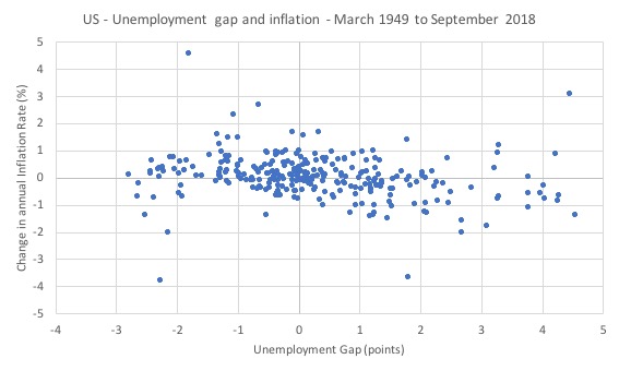
It is clear that since the December-quarter 2016, the actual unemployment rate has been below the estimated NAIRU for the US (UGAP strongly positive), which should invoke strong inflationary pressures.
But there has been no sign of that happening.
The problem is that the policy makers use the correspondence between the estimated NAIRU and the actual unemployment rate to formulate both fiscal and monetary policy.
It means that they err on the side of excessive fiscal austerity and/or higher than necessary interest rates when the actual rate is below the NAIRU, which leads to an upward bias in actual labour underutilisation.
Conclusion
The September BLS labour market data release for the US tells me that the US labour market is improving but still suffers from a residual of wastage from the GFC.
Caution should always be exercised given the volatility of the monthly data.
The official unemployment rate is at levels not seen since the late 1960s but the U6 broad underutilisation rate is still at elevated levels.
Further, the participation rate is still well below where it was even after we adjust for the ageing effects (retirements) which means the labour market is some 6 million jobs short of where it would have been had not the cyclical decline in participation occurred.
That is enough for today!
(c) Copyright 2018 William Mitchell. All Rights Reserved.
It’s funny, isn’t it, the way all the bad economic effects come from the average working person. When he’s in a good bargaining position, that’s bad, that causes inflation. All lies. The bottom 60 or 70 % of the working force hasn’t seen an increase in their standard of living in 40 years. But we’re had inflation. How can that be? It couldn’t be that the wealthy and the powerful, the owners and managers of business have taken a greater and greater share. Grasping hand over fist. Oh No. That’s impossible. They’re simply not like that. But they are. An example of how self serving lies are institutionalized.
Yok,
Good comment. However an important factor in inflationary pressure is the oil/energy price which is rising. If this continues then inflation will rise. It was energy price rises due to the OPEC oil rationing in the 1970s that caused the marked inflation then.
Economist Mark Blyth says that the inflation of the 60s & 70s was caused by *full* employment making *wages rise too fast*, but I have seen a graph showing productivity and wages over time and wages tracked productivity very well until the mid to late 70s when wages went flat. So, wages were tracking productivity and it seems like this should not be inflationary. I have blamed the massive inflation on OPEC raising oil prices, but I see that it really started in the late 60s. This might have been a problem of buying guns [Vietnam War] and butter [Great Society] at the same time. And ½ M workers/soldiers being sent to Vietnam.
. . . Further the graph above of the US unemployment rate from 1950 until now shows that unemployment was not noticeably lower in the late 60s and early 70s (before OPEC and the oil embargo). So, I just don’t buy Mark Blyth’s explanation.
. . . Does MMT have a better explanation of the massive inflation of the late 60s and very early 70s?
Dear Steve_American (at 2018/10/09 at 1:38 pm)
Go to the Debriefing category and search for inflation.
I have written stacks about it.
best wishes
bill
If I am not missing anything, then the numbers in the article don’t say much about the “quality” of the jobs created only the quantity. One big problem in today’s economy seems to be people who are employed and still have to either rely on government aid or accrueing new debt to make ends meet. I belive it is Prof. Michael Hudson who points at the fact that most of the recovery has gone to the FIRE sector (finance, insurance and real estate) and not the bulk of the working population, thus setting the stage for the next financial meltdown, when they finally start defaulting on ther credits (student and car loans seem to be the current ticking bombs).
Is it correct to assume that MMT would adress such a problem through the job guarante, i.e. government jobs at a (better) fixed wage to either weed the “McJobs” out or force the employers to raise wages?
P.S.: I’m sorry if the question is too basic for the blog. I just discovered MMT and am absolutely fascinated by it. But I’d like to get it as right as possible before I start missioning my friends (and probably losing some of them).
Steve. You’r right. Massive overseas spending by the government in Vietnam. It broke the gold standard. Inflation is caused by something becoming harder to do and shifts in the distribution of wealth. The living standards of working americans didn’t improve, so, wealth wasn’t redistributed to them. They weren’t asking for too much. Tell your friend Mark to try the shoes on: tell Mark that inflation in the 70’s was caused by corporations and businesses trying to maintain profit margins in the face of rising input costs, the soaring cost of petroleum. You know. The wealthy and the powerful – they ask for too much too.
Yok,
Prof. Mark Blyth has gone viral on youtube in the last few years. He is an economics prof., but a maverick.
He in not an MMTer. His big claim to fame was that he knows that austerity is a dumb idea.
Thanks for the confirmation of my thoughts and adding the part about overseas spending.
I had not thought of that.
I’m still trying to find where our Bill explained the inflation of the 60s & very early 70s.
I really like your and my theory that OPEC caused the inflation after 1972.
I add that the Fed. made it much worse by fighting it (OPEC’s infl.) by raising interest rates. Dumb.
Steve. My Buddy. Thanks. I looked briefly for Bill’s stuff on inflation and couldn’t find it either. Sure, after the Vietnam War, the cost of oil was the cause of inflation. Inflation was inevitable. The real terms of trade had become disastrous. It would have taken us back to horse and wagons. The arabs could have owned the country in a few years. Instead of shrinking we played their game. As they tried to increase the real value of what they sold, we decreased the value of what we used to purchase. In the end the real terms of trade stayed about the same. We had negated the aggression of OPEC. I suspect some people of power knew what was really taking place – an economic parry.