In the 1990s, a new industry was created in Australia. It produced nothing. But it…
Australian labour market – some growth but unlikely to be a trend
Today’s release of the – Labour Force data – for May 2015 by the Australian Bureau of Statistics shows that the Australian labour market was stronger than last month, when it contracted. The data continues the repeating pattern over the last 24 months or so where employment growth zig-zags around the zero line and is weak at best. Overall employment growth was relatively strong, although most of the gains were in part-time work. There was minimal shift in working hours. The unemployment rate fell to 6 per cent, which was where we were a year ago. Underemployment was unchanged over the last three months. Teenagers did not participate in the growth and that segment of the labour market remains in a parlous state and requires an urgent policy intervention. In general, there remains a need for more job creation stimulated by an increased federal government deficit.
The summary ABS Labour Force (seasonally adjusted) estimates for May 2015 are:
- Employment increased 42,000 (0.4 per cent) with full-time employment increasing by 14,700 and part-time employment rising by 27,300.
- Unemployment decreased 22,000 to 745,200.
- The official unemployment rate increased by 0.2 point to 6.0 per cent.
- The participation rate remained steady at 64.7 per cent. It is still well below its November 2010 peak (recent) of 65.9 per cent.
- Aggregate monthly hours worked increased by 2.2 million hours (0.1 cent).
- The quarterly ABS broad labour underutilisation estimates (the sum of unemployment and underemployment) were updated this month. Underemployment remained constant at 8.6 per cent and total labour underutilisation rate was 14.5 per cent (down 0.4 points). There were 1,060.9 thousand persons underemployed and a total of 1.838.2 thousand workers either unemployed or underemployed. The next quarterly release is in the AUgust 2015 publication.
Employment growth positive
In the last month, total employment increased by 42,000 (0.4 per cent) with full-time employment increasing by 14,700 and part-time employment rising by 27,300.
While that is at the stronger end of recent monthly increases hours worked barely moved. Further, the gain in full-time employment this month failed to offset the loss last month.
Over the last 12 months employment has grown by 2 per cent which slightly below the underlying population growth rate. The labour force has grown just over 2 per cent over that period with the participation rate stable.
Over the last 24 months or so we have seen the labour market data switching back and forth regularly between negative employment growth and positive growth spikes.
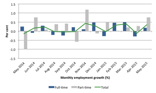
The following graph shows the month by month growth in full-time (blue columns), part-time (grey columns) and total employment (green line) for the 24 months to May 2015 using seasonally adjusted data. It gives you a good impression of just how flat employment growth has been notwithstanding the huge spike in part-time employment in the November 2014 survey.
While full-time and part-time employment growth are fluctuating around the zero line, total employment growth is still well below the growth that was boosted by the fiscal-stimulus in the middle of 2010.
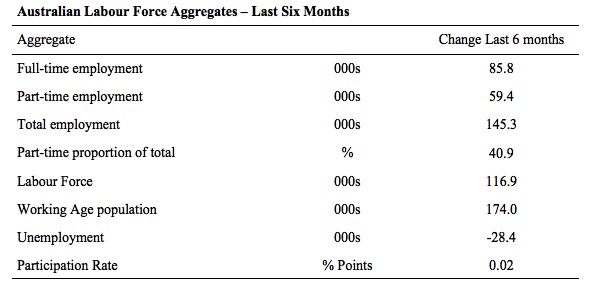
The following table provides an accounting summary of the labour market performance over the last six months. The monthly data is highly variable so this Table provides a longer view which allows for a better assessment of the trends. WAP is working age population (above 15 year olds).
The conclusion – overall there have been only 145.3 thousand jobs (net) added in Australia over the last six months. This is a modest employment growth outcome overall.
Full-time employment has risen by 85.8 thousand jobs (net) while part-time work has risen by 59.4 thousand jobs. Thus, 40.9 per cent of the total employment created (net) over the last 6 months has been part-time.
The Working Age Population has risen by 174 thousand in the same period while the labour force has risen by 116.9 thousand. The participation rate has risen by 0.02 points.
The result is that employment growth has been above growth in the labour force and unemployment has fallen by 28.4 thousand. However, underemployment remain unchanged.
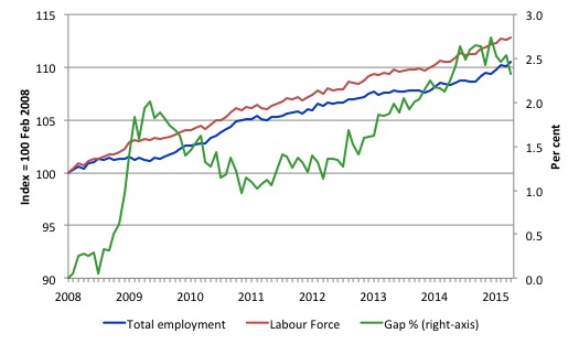
To put the recent data in perspective, the following graph shows the movement in the labour force and total employment since the low-point unemployment rate month in the last cycle (February 2008) to May 2015. The two series are indexed to 100 at that month. The green line (right-axis) is the gap (plotted against the right-axis) between the two aggregates and measures the change in the unemployment rate since the low-point of the last cycle (when it stood at 4 per cent).
You can see that the labour force and employment indexes are following a similar growth path and so the rise in unemployment has levelled off for the time being.
The Gap series gives you a good impression of the asymmetry in unemployment rate responses even when the economy experiences a mild downturn (such as the case in Australia). The unemployment rate jumps quickly but declines slowly.
It also highlights the fact that the recovery has not strong enough to bring the unemployment rate back down to its pre-crisis low. You can see clearly that the unemployment rate fell in late 2009 and then has hovered at the same level for some months before rising again over the last several months.
Since the current government was elected in September 2013, the situation has deteriorated significantly.
The Gap shows that the labour market is now in much worse shape than it was at the peak of the financial crisis in 2009. After the government prematurely terminated the fiscal stimulus the situation has progressively deteriorated.
In May 2015, the Gap of 2.3 percentage points and remains well above the levels that appeared in May and June 2009 when the Australian economy was enduring the impact of the crisis. All the gains made since then have thus disappeared due to poorly crafted fiscal policy not responding appropriately to non-government spending changes.
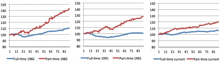
Full-time and Part-time employment trends
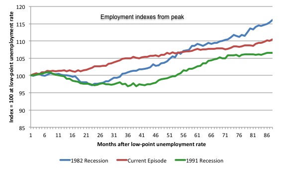
The following graph shows employment indexes for the last 3 recessions and allows us to see how the trajectory of total employment after each peak prior to the three major recessions in recent history: 1982, 1991 and 2009 (the latter to capture the current episode).
The peak is defined as the month of the low-point unemployment rate in the relevant cycle and total employment was indexed at 100 in each case and then indexed to that base for each of the months as the recession unfolded.
I have plotted the 3 episodes for 87 months after the low-point unemployment rate was reached in each cycle – the length of the current episode.
The initial employment decline was similar for the 1982 and 1991 recessions but the 1991 recovery was delayed by many months and the return to growth much slower than the 1982 recession.
The current episode is distinguished by the lack of a major slump in total employment, which reflects the success of the large fiscal stimulus in 2008 and 2009.
However, the recovery spawned by the stimulus clearly dissipated once the fiscal position was reversed and the economy is now producing very subdued employment outcomes.
Moreover, since February 2008, employment has grown by a miserly 10.5 per cent, which is a glacial pace.
The next 3-panel graph decomposes the previous graph into full-time and part-time employment. The vertical scales are common to allow a comparison between the three episodes.
First, after the peak is reached, part-time employment continues to increase as firms convert full-time jobs into fractional jobs.
Second, recoveries are dominated by growth in part-time employment as firms are reluctant to commit to more permanent arrangements with workers while there is uncertainty of the future course in aggregate demand.
Third, the current recovery is clearly mediocre by comparison, with both very subdued growth in full-time and part-time work.
Teenage labour market – continues to deteriorate
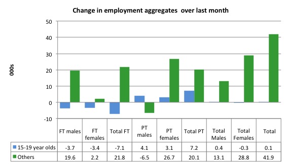
Despite the overall economy adding 42 thousands jobs in May 2015, teenagers gained only 100 (net) jobs overall. More disturbing is that they lost 7.1 thousand full-time jobs and gained 7.2 thousand part-time jobs net.
This is a very dismal result and outlook.
The following graph shows the distribution of net employment creation in the last month by full-time/part-time status and age/gender category (15-19 year olds and the rest)
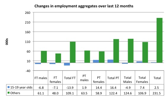
If you take a longer view you see how poor the situation remains.
Over the last 12 months, teenagers have gained only 2.5 thousand jobs overall while the rest of the labour force have gained 231.5 thousand net jobs. Remember that the overall result represents a fairly poor annual growth in employment.
The teenage segment of the labour market is being particularly dragged down by the sluggish employment growth, which is hardly surprising given that the least experienced and/or most disadvantaged (those with disabilities etc) are rationed to the back of the queue by the employers.
The following graph shows the change in aggregates over the last 12 months.
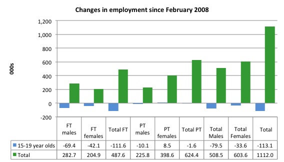
To further emphasise the plight of our teenagers, I compiled the following graph that extends the time period from the February 2008, which was the month when the unemployment rate was at its low point in the last cycle, to the present month (May 2015). So it includes the period of downturn and then the so-called “recovery” period. Note the change in vertical scale compared to the previous two graphs.
Since February 2008, there have been only 1,112 thousand (net) jobs added to the Australian economy but teenagers have lost a staggering 113.1 thousand over the same period. It is even more stark when you consider that 111.6 thousand full-time teenager jobs have been lost in net terms.
Even in the traditionally, concentrated teenage segment – part-time employment, teenagers have lost 1.6 thousand jobs (net) even though 624.4 thousand part-time jobs have been added overall.
Overall, the total employment increase is modest. Further, around 56 per cent of the total (net) jobs added since February 2008 have been part-time, which raises questions about the quality of work that is being generated overall.
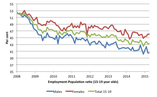
To put the teenage employment situation in a scale context the following graph shows the Employment-Population ratios for males, females and total 15-19 year olds since February 2008 (the month which coincided with the low-point unemployment rate of the last cycle).
You can interpret this graph as depicting the loss of employment relative to the underlying population of each cohort. We would expect (at least) that this ratio should be constant if not rising somewhat (depending on school participation rates).
The facts are that the absolute loss of jobs reported above is depicting a disastrous situation for our teenagers. Males, in particular, have lost out severely as a result of the economy being deliberately stifled by austerity policy positions.
The male ratio has fallen by 11.9 percentage points since February 2008, the female by 6.1 percentage points and the overall teenage employment-population ratio has fallen by 9.1 percentage points. That is a staggering decline in the employment market for Australian teenagers.
Overall, the performance of the teenage labour market continues to be deeply disturbing. It doesn’t rate much priority in the policy debate, which is surprising given that this is our future workforce in an ageing population. Future productivity growth will determine whether the ageing population enjoys a higher standard of living than now or goes backwards.
The best the Government appears to be capable of is to dream up plans which deny income support to this group and impose impossible activity tests on them.
The longer-run consequences of this teenage “lock out” will be very damaging.
I continue to recommend that the Australian government immediately announce a major public sector job creation program aimed at employing all the unemployed 15-19 year olds, who are not in full-time education or a credible apprenticeship program.
The Government should abandon their ideological obsession with supply-side punishment regimes and realise that the unemployed cannot search for jobs that are not there.
It is clear that the Australian labour market continues to fail our 15-19 year olds. At a time when we keep emphasising the future challenges facing the nation in terms of an ageing population and rising dependency ratios the economy still fails to provide enough work (and on-the-job experience) for our teenagers who are our future workforce.
Unemployment – decreased 22 thousand
The unemployment rate decreased by 0.2 points to 6.0 per cent in May 2015 taking it back to its value this time last year.
Overall, the labour market still has significant excess capacity available in most areas and what growth there is is not making any major inroads into the idle pools of labour.
The following graph updates my 3-recessions graph which depicts how quickly the unemployment rose in Australia during each of the three major recessions in recent history: 1982, 1991 and 2009 (the latter to capture the 2008-2010 episode). The unemployment rate was indexed at 100 at its lowest rate before the recession in each case (February 1981; February 1989; May 2008, respectively) and then indexed to that base for each of the months as the recession unfolded.
I have plotted the 3 episodes for 87 months after the low-point unemployment rate was reached in each cycle. This is the duration of the current episode. For 1991, the peak unemployment which was achieved some 38 months after the downturn began and the resulting recovery was painfully slow. While the 1982 recession was severe the economy and the labour market was recovering by the 26th month. The pace of recovery for the 1982 once it began was faster than the recovery in the current period.
It is significant that the current situation while significantly less severe than the previous recessions is dragging on which is a reflection of the lack of private spending growth and declining public spending growth.
Moreover, the current episode is also different to the last two major recessions in the sense that the recovery is over and the economy is deteriorating again.
In relative terms, the current episode is now worse than the other two recessions (in terms of deviation from low-point unemployment rate).
The graph provides a graphical depiction of the speed at which the recession unfolded (which tells you something about each episode) and the length of time that the labour market deteriorated (expressed in terms of the unemployment rate).
Clearly this type of graph will lose relevance because the 1982 episode will start feeding into the 1992 period. It just goes to show how long these episodes of high unemployment are – in all three cases the unemployment rate was still well above where it started some 7 years earlier.
From the start of the current downturn to May 2015, the official unemployment rate has risen from a base index value of 100 to a value 149.6.
After falling steadily as the fiscal stimulus pushed growth along (it reached 122.5 after 35 months – in February 2010), it has been slowly trending up for some months now. Unlike the other episodes, the current trend, at this stage of the cycle, is mildly upwards.
It is now above the peak that was reached just before the introduction of the fiscal stimulus. In other words, the gains that emerged in the recovery as a result of the fiscal stimulus in 2009-10 have now been lost.
It is clear that at an equivalent point in the “recovery cycle” the current period is more sluggish than our recent two major downturns and trending upwards while the trend in the earlier episodes was moderately downwards.
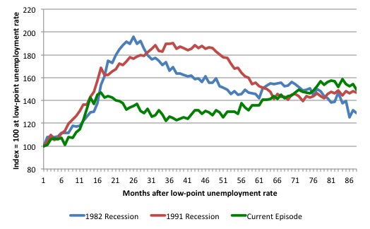
Note that these are index numbers and only tell us about the speed of decay rather than levels of unemployment. Clearly the 6.0 per cent at this stage of the downturn is lower that the unemployment rate was in the previous recessions at a comparable point in the cycle although we have to consider the broader measures of labour underutilisation (which include underemployment) before we draw any clear conclusions.
The notable aspect of the current situation is that the recovery is very slow.
Broad labour underutilisation – 14.5 per cent
The ABS published its quarterly broad labour underutilisation measures for the May-quarter in this months’ data release.
In the May-quarter, total underemployment remained at 8.5 per cent in the May-quarter and the ABS broad labour underutilisation rate (the sum of unemployment and underemployment) fell from 14.9 per cent to 14.5 per cent (as a result of the fall in the unemployment rate this month).
| There are now 1,058.1 thousand persons underemployed. Overall, there are 1,803.2 thousand workers either unemployed or underemployed. |
The following graph plots the history of underemployment in Australia since February 1978.
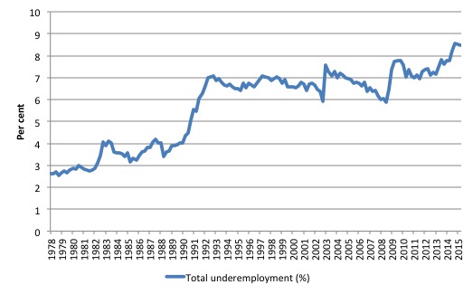
If hidden unemployment is added to the broad ABS figure the best-case (conservative) scenario would see a underutilisation rate well above 16.5 per cent at present. Please read my blog – Australian labour underutilisation rate is at least 13.4 per cent – for more discussion on this point.
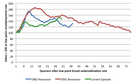
The following graph shows the same type of indexes as the previous graph except it uses the ABS broad labour underutilisation rate (unemployment plus underemployment). It also is in terms of quarters rather than months.
We also show the full evolution of the the 1982 and 1991 episodes from the low-point (= 100) through the peak and back to the next low-point. In the case of the 1982 recession the index had risen to a peak of 172.8 in May 1983 (a broad underutilisation rate of 14.4 per cent) and then fell back to 9.8 per cent by November 1989 (index value 117.4).
At that point, the cycle turned down again signalling the beginning of the 1991 recession. That cycle reached a peak of 185 (or 18.1 per cent in November 1992) and it took until February 2008 for it to reach the low-point of 9.9 percent (an index value of 100.9). That point marked the beginning of the next cycle.
That should tell you how severe the 1991 recession was and how asymmetric the labour market response is on either side of the cycle. From its start in November 1989 it took 74 quarters (18.5 years) to return to more or less that level.
In terms of the three recession comparison, at the same period in the ‘recovery’ (using quarterly data), the broad labour underutilisation rate (unemployment plus underemployment) had an index value of 128.9 in the 1982 recession (absolute value of 10.7 per cent); an index value of 160.2 in the 1991 recession (absolute value of 15.7 per cent); and an index value of 146.5 in the current period (absolute value of 14.5 per cent).
So while the level of unemployment is much lower now than in the 1982 recession (at a comparable stage), underemployment is now much higher and so the total labour underutilisation rates is higher. Further, the 1982 recovery in broad underutilisation terms was more robust than the current stagnating situation.
The current situation is akin to the devastating 1991 recession, although underemployment is higher and unemployment lower.
Commentators who think of the 1982 recession as severe, rarely see it in these terms. Joblessness is probably worse than underemployment but both mean that labour is wasted and income earning opportunities are being foregone. For a worker with extensive nominal commitments, the loss of income when hours are rationed may be no less severe than the loss of hours involved in unemployment, if the threshold of solvency is breached.
The next update will be for the August-quarter 2015 Labour Force data release published in early September 2015.
Hours worked – barely rose in May 2015
Aggregate monthly hours worked increased by 2.2 million hours (0.14 per cent) in May 2015 in seasonally adjusted terms.
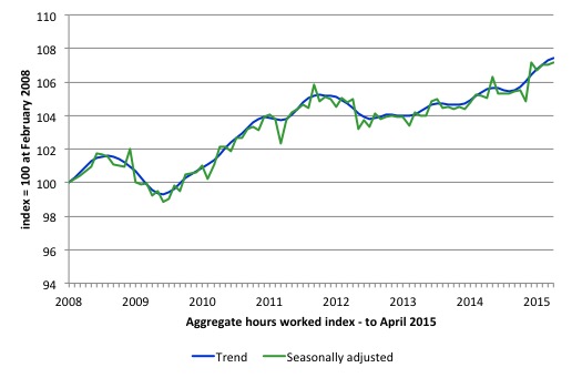
The following graph shows the trend and seasonally adjusted aggregate hours worked indexed to 100 at the peak in February 2008 (which was the low-point unemployment rate in the previous cycle).
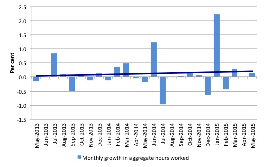
The next graph shows the monthly growth (in per cent) over the last 24 months. The dark linear line is a simple regression trend of the monthly change – which depicts the slightest upward trend. You can see the pattern of the change in working hours is also portrayed in the employment graph – zig-zagging across the zero growth line.
The reality is that working hours in the Australian labour market over the last two years have exhibited hardly any net growth and over the last twelve months total working hours are up by just 2 per cent.
Conclusion
In general, we always have to be careful interpreting month to month movements given the way the Labour Force Survey is constructed and implemented.
While the press is claiming the latest data is a “strong set of numbers” (Source), the devil is in the detail.
Clearly, unemployment fell and that is always a good thing unless it is derived from a falling participation rate. The participation rate was stable in the last month, so the fall in unemployment is all down to the employment growth being stronger than the growth in the working age population.
That is a positive.
However, the participation rate remains well below its November 2010 peak, which means that employment growth has not been strong enough to induce people back into the labour force.
But the growth in full-time employment was weak and not sufficient to offset the losses made in April. Further, monthly working hours have barely changed in the last three months.
That might signal that more workers are enjoying shorter hours. But it is likely to signal the rising part-time jobs growth and the static unederemployment.
The other curious thing is that recent job advertisements data revealed that employment growth has deteriorated in recent months. So I do not agree with commentators who consider this month’s data to be a sign of a strengthening trend in the labour market overall.
The glaring failure is that the teenage labour market remains in a parlous state. This segment of the labour force is not enjoying any of the growth in the labour market.
This is an emergency which is being ignored by the Federal Government. The neglect of our teenagers will have a very long memory indeed and the negative consequences will be stronger given the ageing population.
The data continues to tell us that the policy settings are all wrong. A fiscal stimulus is needed. Unfortunately, the Federal government is still talking cuts in public spending.
Cutting net public spending when the economy is slowing and incapable of producing enough jobs is the exemplar of fiscal incompetence.
That is enough for today!
From this side of the pond-this letter, forwarded to the White House, seems appropriate to Bill’s concern regarding the jobs report in Australia [neo-liberalism is pervasive].
To Whom It May Concern:
A DISCLAIMER: This is a letter about candor-
We have 60% minority unemployment [hereafter UE] in all of our inner cities, which have become war zones…with drug economies, and an epidemic of homicides-for only ONE reason-and excuse the candor–so that many in the 1%, who still have one foot on the plantation, can relegate American employees to A POOL OF SLAVES: To Be Used and Discarded “at will” [Amazon].
Specifically, this group has spent tens of millions since WW II to buy governors and legislators to cement “at will” employment in every state in America [only Montana limits “at will” employment to probationary employees]–
And, to decimate the union movement-i.e., specifically “collective bargaining” so American employees can join to bargain for employee rights.
Indeed, on March 9, 2015, Walker [a consummate bought governor]–signed this union busting legislation into law in Wisconsin—marking this as the half-way point-i.e., the 25th state to go to war against the union movement in America-and the Republicans in Congress [more bought and paid for legislators] assert that their goal is to extend the law in Wisconsin to all 50 states!
The war against this mind-set is not new….Indeed, the March On Washington in 1963, and the famous “I had a dream” speech by Dr. King, was a march for JOBS.
Our two choices going forward are to adapt and change-in a rapidly changing world-or create a Police State to keep the above mind-set in place-and, sadly, America has opted for the latter-with the pernicious result played out almost daily in our media….
And yet to be considered is that UE is “social” problem-we, as the larger society, have the absolute responsibility to address, via HR 1000 et al [rather than left to the whims of the market]-and UE is a No One Wins-the jobless lose, civility loses, and the market loses, to wit:
THE LAW OF DIMINISHED INCOME TO THE MARKET FROM UNEMPLOYMENT [hereafter the D/UE LAW]
Short Definition:
3% is the zero-sum threshold above which UE starts substantially undermining the Market–and the loss in income to the Market is compounded exponentially with each percentage point of increase in UE, above 3%.
Turning the page is a “win-win”–the American people win, and the market wins.
FULL EMPLOYMENT IS A PRO-MARKET CONCEPT, Amazon
Jim Green, Democrat opponent to Lamar Smith, Congress, 2000
http://neweconomicperspectives.org/2015/06/roger-cohen-laments-his-inadequate-schadenfreude-because-the-greeks-dont-suffer-enough.html
WTF?
Bill, I think you will get weak growth like in the UK, but the election is too early for liberal victory?
Not all so called full time jobs are equal.
Building construction jobs, residential and commercial, are counted as full time. However it takes less than two years to build a high rise tower and only 8 weeks to build a house. The property boom results in a tempory increase in full time jobs. These jobs evaporate when the property boom ends. This is distorting the figures.
Cheers Punchy