I read a new Report this morning - Waste Not - that was published by…
British government has failed to “rebalance” the economy
In April 2013, I wrote a blog – The March of the Makers – out! – in reference to the failed mission (at that time) of the UK government to base growth on an export boom. The Chancellor’s 2011 Budget Speech had claimed his fiscal strategy was “for making things, not for making things up”. He imperiously announced that the Government’s strategy was for a “Britain carried aloft by the march of the makers”. I wrote that the march of the makers hasn’t been a long one. In fact, it hasn’t been much of a march at all. If anything, given the title of that blog – the march has been out. I have been holding off commenting on the third-quarter British national accounts data because I wanted to see what the revisions on the earlier estimates were. I also wanted to get a better feel for what was happening to the external sector data. In the last week, the British Office of National Statistics released several key data publications (National Accounts, Public Finance and Balance of Payments) which allow us to get a better understanding of what is happening. The short message is that austerity has failed to rebalance the British economy. The more complicated message is that government net spending supported growth in the third-quarter 2013, which means those who see the real GDP growth as a victory for austerity better think again. Further, the economy is starting to exhibit dynamics consistent with the unsustainable pre-crisis period. That means the celebration of the growth should be muted at best.
In this blog – I don’t wanna know one thing about evil – which I wrote on April 29, 2011, I considered the – 2011 British Budget – specifically in terms of how the Government thought that growth would unfold over the next years.
Under the heading “A strong and stable economy” (Page 7) we read:
… Over the pre-crisis decade, developments in the UK economy were driven by unsustainable levels of private sector debt and rising public sector debt. Indeed, it has been estimated that the UK became the most indebted country in the world … Households took on rising levels of mortgage debt to buy increasingly expensive housing, while by 2008 the debt of nonfinancial companies reached 110 per cent of GDP. Within the financial sector, the accumulation of debt was even greater. By 2007, the UK financial system had become the most highly leveraged of any major economy … This model of growth proved to be unsustainable …
This discussion is in the context of a vulnerable and unbalanced economy relying too much on private sector indebtedness for growth and being very sensitive to housing price movements.
That was the only reference to household debt in the document, which at the time was odd given the role played by the unsustainable credit growth in the UK in the crisis.
A growth strategy that relies on the private sector increasingly funding its consumption spending via credit (or more recently running down its saving balances) is unsustainable.
Eventually the precariousness of the private balance sheets (or the finite capacity of accumulated saving) becomes the problem and households (and firms) then seek to reduce debt levels and that impacts negatively on aggregate demand (spending) which, in turn, stifles economic growth.
When those adjustments are stark – as they were in the recent financial crisis – especially when housing prices collapsed – the consequences are wide-ranging and very damaging.
A recession induced by a private debt crisis is usually deeper and harder to resolve than a downturn arising in the real sector from, for example, a loss of consumer confidence.
When there are unsustainable stocks of private debt to deal with the adjustment becomes more complex. That is one of the lessons that the global financial crisis should have taught all the mainstream economists – although the evidence is that there has not been much learning going on.
After that reference to household debt, the rest of the document provided an obsessive coverage of the evils of public debt and the need to reduce it. The justification for the harsh austerity program was all tied up in spurious public debt arguments.
Soon after the only reference to private sector debt in the Budget 2011 Document you read that the “The Government’s economic policy objective is to achieve strong, sustainable and balanced growth that is more evenly shared across the country and between industries”.
What is required for a growth strategy that aims to reduce private sector debt (given the 2011 Budget recognised it as a major problem) and public sector debt (to satisfy the ideologues) while maintaining the sort of growth estimates that have appeared in successive fiscal statements in the UK?
Clearly, the external sector has to come up trumps and provide the demand stimulus to the economy capable of (more than) offsetting the net saving desires of the private domestic sector and the fiscal drag coming from the public austerity program. If that doesn’t occur then the economy will shrink.
Alternatively, the economy might grow a bit if the austerity is not effective and/or the private sector does not run down its debt.
In the 2011 Budget paper (Page 89, Annexe C) the British Office for Budget Responsibility (OBR) presented the forward estimates or “the OBR’s key projections for the economy and public finances”. The Budget Annex says that “(f)urther detail and explanation can be found in their report”. At the time, I thought this was a joke given how long it took me to actually find the detail. It was well hidden and for good reason.
From Table C.1 we saw very optimistic forecasts for Household consumption and net exports over the period 2011 to 2015. However, even if the net exports had come in at forecast (they haven’t – far from it), the real GDP growth forecast would also requred the very strong recovery in household consumption that is forecast.
At the time, I thought the projections were interesting given that growth in Real household disposable income was forecast to be negative that year and then sluggish in the following years of the forecast horizon.
Since then real household disposable income has grown by just 3.67 per cent overall (from March-quarter 2011 to Septemnber-quarter 2013) while real consumption has grown by 4.14 per cent overall. The difference is more debt and/or run down of savings (more the latter in recent quarters).
This shouldn’t surprise though.
The OBR published this document (published April 21, 2011) – Household debt in the Economic and fiscal outlook.
In it, the OBR provided the March 2011 household debt forecast which is the OBR input for the “household debt projection in the Economic and fiscal outlook” (that is, the Budget):
Our March forecast shows household debt rising from £1.6 trillion in 2011 to £2.1 trillion in 2015, or from 160 per cent of disposable income to 175 per cent. Essentially, this reflects our expectation that household consumption and investment will rise more quickly than household disposable income over this period. We forecast that income growth will be constrained by a relatively weak wage response to higher-than-expected inflation. But we expect households to seek to protect their standard of living, relative to their earlier expectations, so that growth in household spending is not as weak as growth in household income. This requires households to borrow throughout the forecast period.
The OBR said at the time that “net worth is forecast to decline as a percentage of income as the household debt ratio is expected to rise and the household assets ratio is expected to fall”.
It was small-print analysis that the major UK newspapers missed altogether. But it told us that while the British government was making a fuss about the debt levels – both public and private – its own growth strategy was contingent on the private sector taking on a rising debt burden over the forecast period and becoming relatively poorer?
What the British government’s strategy amounted to is reducing public debt at the expense of more private debt. Prudent fiscal management requires that exactly the opposite is the case when the economy is floundering – given current conventions about matching budget deficits with public debt issuance.
The situation now, however, is even worse, given the latest – Balance of Payments data – from the British Office of National Statistics.
There we learned that:
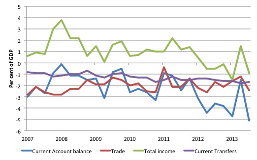
- The United Kingdom’s (UK) current account deficit … in Quarter 3 2013 equated to 5.1% of GDP at current market prices, up from 1.5% in Quarter 2 2013.
- The trade deficit widened to £10.0 billion in Quarter 3 2013, from £5.0 billion in Quarter 2 2013.
- The income balance switched to a deficit of £3.7 billion in Quarter 3 2013, from a surplus of £6.0 billion in Quarter 2 2013.
The following graphs use the – Complete UK BOPs dataset.
At the outset, the British ONS is the worst of all statistical agencies in terms of data presentation. It is poorly laid-out, is badly documented, and takes ages to work through.
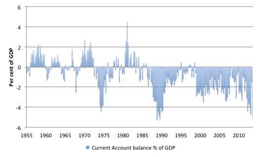
Anyway, the first graph shows the Current Account balance as a per cent of GDP since the March-quarter 1955 to the September-quarter 2013. It is going in the wrong direction if the nation was betting on a net exports boom.
The next graph zooms in on the period from the March-quarter 2007 to the September-quarter 2013 and decomposes the total into its components. Again the data is presented in percent of GDP terms.
The fiscal austerity abroad also bit UK corporations when the net income transfers (called the “total income balance” by the ONS) switched from “a surplus of £6.0 billion in Quarter 2 2013 to a deficit of £3.7 billion in Quarter 3 2013”.
The ONS reported that:
The switching of the income balance to a deficit was mainly due to the surplus on foreign direct investment narrowing in Quarter 3 2013 (mainly due to decreased profits by private non-financial corporation investment abroad).
Total income balance for the UK with respect to the EU28 nations is typically negative and is offset by positive income inflow from elsewhere.
An increasing Current Account balance should not cause alarm if domestic policy settings are sound – why? – because it means that Britain is enjoying a quantum of real imports without having to ship an equivalent real value of its resources (embodied as exports).
But from the the perspective of the logic used by the British government to explain its policy approach, the latest data represents a monumental failure of its policy strategy.
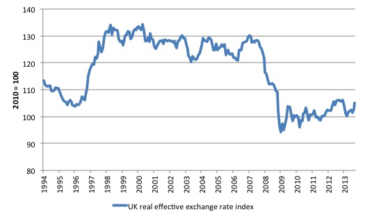
It is also worth noting that the UK has experienced a massive shift in its international competitiveness since the crisis began as a result of the nominal exchange rate depreciation.
The real effective exchange rate shown in the next graph (taken from BIS data) shows a 19.9 per cent real depreciation since June 2007 (the last peak).
Real effective exchange rates provide a measure on international competitiveness and are based on information pertaining movements in relative prices and costs, expressed in a common currency. Economists started computing effective exchange rates after the Bretton Woods system collapsed in the early 1970s because that ended the “simple bilateral dollar rate” (Source).
If the REER rises, then we conclude that the nation is less internationally competitive and vice-versa.
At the end of November 2007, the nominal US-sterling parity was 2.0701. By the end of March 2009, it had bottomed to 1.4174, a depreciation of 31.5 per cent. Six years later (Novmber 2013), it still stands at 1.6104, an overall depreciation of 22 per cent.
The difference between the shifts in the nominal spot exchange rate and the BIS measure of real effective exchange rate relates to differential inflation rates between the UK and elsewhere.
Please read my blog – It’s all been for nothing – that is, if we ignore the millions of jobs lost etc – for more discussion on interpreting real effective exchange rate measures.
The point is that thinking that net exports would be the saviour at a time when austerity was being imposed almost everywhere was like searching for fool’s gold.
Please read my blog – Fiscal austerity – the newest fallacy of composition – for more discussion on this point.
The latest British ONS – Quarterly National Accounts, Q3 2013 – shows that:
- Real GDP grew by “0.8% between Q2 2013 and Q3 2013
- real GDP grew by “1.9% when comparing Q3 2013 with Q3 2012, revised up 0.4 percentage points from the previously estimated 1.5% increase”.
- “Later data for expenditure, in particular household final consumption expenditure, has led to upward revisions for GDP since Q1 2012”.
Is this a good result? In one sense, it is because it will probably reduce unemployment somewhat. But in a deeper sense, from a longer-term perspective, the result is not very attractive.
What is driving growth?
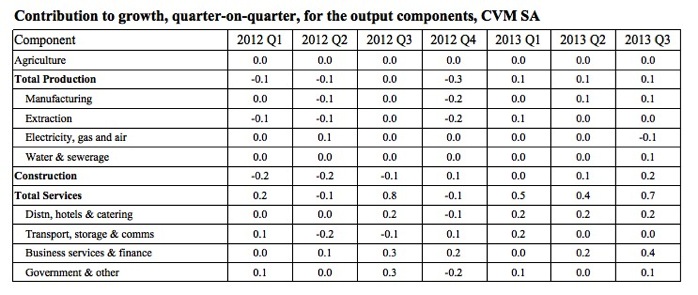
The following table shows the contribution to real GDP growth in percentage points by sector by quarter (on quarter). The growth is largely being driven by services (dominated by Business services and finance) and Construction.
Note also that despite the austerity rhetoric, the Government sector supported growth in the third-quarter 2013.
Total real GDP growth in the September-quarter 2013 was 0.8 per cent.
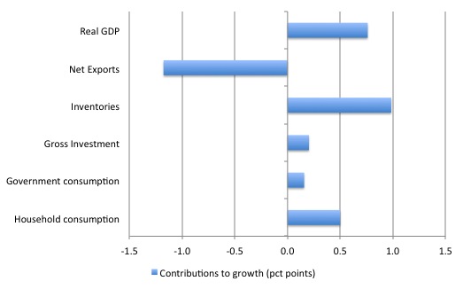
In terms of the expenditure components, the following graph shows that Net exports drained growth by 1.2 percentage points.
Household consumption contributed 0.5 points to the overall growth, while inventories dominated at 1 point.
Note also the contribution of Government consumption.
The contribution of gross capital formation (0.2 points) came entirely from Business investment with the contribution of Government investment being zero (but not negative).
That means that the General Government sector is still (just) supporting growth despite all the austerity talk. That is also why this result doesn’t validate the neo-liberal rhetoric.
The latest ONS – Public Sector Finances, November 2013 – also confirms that the government deficit rose in the third-quarter 2013, which means it was supporting growth not undermining it.
The growth is not a victory for austerity.
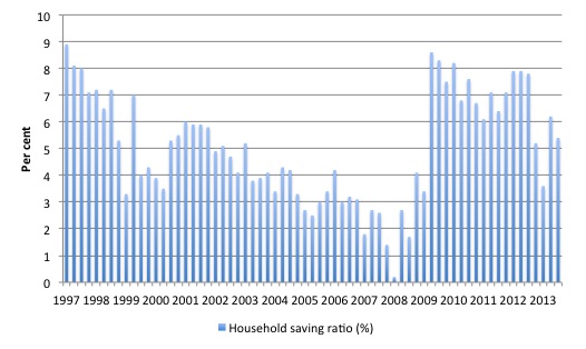
Further, consider what has been underpinning the household consumption growth. The household saving ratio is the difference between consumption and disposable income expressed as a percentage disposable income.
The following graph shows the evolution of the saving ratio from March-quarter 1997 to the September-quarter 2013. The ratio averaged 7.2 per cent in 2012 compared with 6.7 per cent in 2011.
You can also see that the ratio is cyclical.
The household saving ratio dropped to 5.4 per cent in the September-quarter 2013 down from 6.2 per cent in the June-quarter.
This drop largely explains the rise in household final consumption.
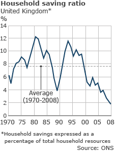
To put the recent data into perspective, the following graph is taken from ONS data and shows that the household saving ratio is now substantially lower than the average of 7.6 per cent recorded between 1970 and 2008.
The current behaviour in the context of real disposable incomes being squeezed, is reminiscent of the pre-crisis period.
The major different this time is that households are reluctant to pile on debt and are instead meeting their shortfalls by reducing saving.
This is also not a sustainable growth strategy.
Conclusion
First, the makers are not driving growth.
Second, net exports is draining growth.
Third, general government is modestly supporting growth. The austerity narrative is not consistent with the data.
Fourth, inventory build-up and household consumption drove UK real GDP growth in the third-quarter 2013. Neither is sustainable.
Fifth, for all the talk about re-balancing the British economy, the latest data confirms what we have been seeing for some quarter now.
That is, a return to the sort of growth drivers that were present before the crisis. Which means one thing: the current growth will not be sustainable unless there are significant changes in the composition of final expenditure in the UK.
That is enough for today!
(c) Copyright 2013 Bill Mitchell. All Rights Reserved.
I would encourage Mr. Osborne to watch Poor Kids, to understand the same problems exist in his own country (assuming he cares) and to rethink his desire for a March of Makers rodeo clown parade rather than an end to poverty.
Thanks for this analysis Bill. My thinking needed re balancing after listening to an interview with the chancellor of the exchequer on a Canadian news service last week. All about how austerity is driving growth allowing Britain to buck the European trend.
This mornings news had the representative for a “non profit” think tank telling us how important balancing the Canadian federal budget and reduced government will be to continued growth in 2014. This we are told will allow the private sector (now in debt to the tune of 164% of annual income on average) to work it’s magic.
It seems the louder the criticism of neo liberal economic policy becomes the more vociferous it’s pundits become yet they always get the media attention no matter how often they prove incorrect.
Thanks Bill.
Very useful. Pretty sure the Tories will not be able to sustain the ‘we are on the path to prosperity’ line until the next election. The tragedy is that the shadow chancellor wants to run a surplus. And he’s not even Australian.
I have said for some time that the UK has decided to consume real goods over income from the EU.
This can be achieved by simply stopping Ulster bank type free banking operations in the euro area – as these effective colonies cannot produce money to sustain rational domestic demand their primary goods inputs must flow back into the UK.
Having said that I have noticed Irish road traffic volumes have increased these past few months and now the IEA states (if you care to believe them)
Ireland (always the canary in the coal mine or maybe oil well)
“The Irish demand series for 2013 has been adjusted upwards following revisions to official statistics. For
2Q13, Irish demand estimates have been hiked by roughly 15 kb/d, or more than 13%!!!!. These figures,
coupled with stronger demand readings for recent months, lift the Irish demand estimate for 2013 as a
whole to around 140 kb/d, 10 kb/d more than estimated in last month’s Report and 5 kb/d (or 4.6%)
above the year earlier.”
As a Dork which has found himself on the Cork – Waterford road over these past few months I have noticed & can confirm a large rise in traffic on that road. (although the waterford toll road remains empty)
The local CB is still reporting a decline in domestic credit production so this must be outside credit / oil looking for a yield.
Ireland is on the brink of another major capital dumping event as the UK is reaching its limit to absorb primary (surplus oil from euro economies tanking) and added value goods (cars mainly) from the Euro area. (although there is a major shortage of Nat gas)
From the Energy trends Q3 2013 report (published dec 2013)
“Total deliveries of the key transport fuels were stable when compared to the same period last
year. Diesel deliveries increased by 1.3 per cent and while this is a slower rate of increase than
the recent trend, diesel share of road fuels have reached 63.5 per cent, up 16 percentage
points on 10 years ago. Deliveries of aviation turbine fuel were up by 1.6 per cent”
Once you begin to understand that domestic labour means very little if anything in the claims on capital hungry UK – you can begin to understand UK monetary and fiscal operations.
Ireland is a extreme but very convenient area of UK / Euro scarcity production / capital overproduction boom bust cycles.
With the seizure of the Irish gas company recently even more rent flows will be injected directly into London (as wages are reduced in these companies) without the need for more complex and wasteful free banking extraction games – just take the loot out of natural utilities – much easier me thinks.
As so it goes on and on and on…….
The growth of the UK is a simple result of further centralization of the EU.
Much the same thing happened during the 80s Big bang – the loot from Euro wage deflation was simply spent in Londons loads of money cultural tar pit.