The Australian Bureau of Statistics (ABS) released the latest labour force data today (APRIL 16,…
Manufacturing employment trends in Australia
I have been looking at industry employment data today for Australia, in particular, the behaviour of the manufacturing industry, which has attracted considerable press attention in the recent period as a result of announcements of substantial job losses being linked to exchange rate movements and high interest rate spreads between Australia and the rest of the world. What follows is a discussion of various features of the change in manufacturing employment over the last few decades which is a precursor to some very detailed work I am doing on shifts in industry employment (reasons, implications etc). These shifts are not unrelated to the major macroeconomic policy settings (fiscal and monetary) which are currently stifling economic activity at present. These aggregate effects manifest in disaggregated ways through such things as the composition of employment by industry. That is what I am looking at today.
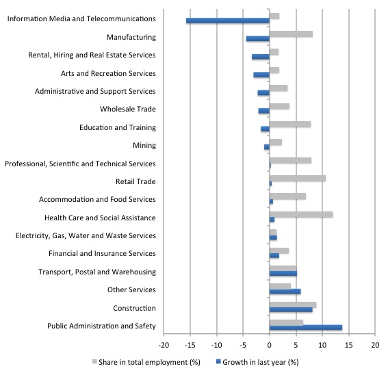
To provide an overview of movements in industry employment I used the latest ABS data – Labour Force, Australia, Detailed, Quarterly, Aug 2013 – to construct the following graphs.
The first graph shows the growth in industry employment over the last 12 months (blue bars) and the proportion of each industry’s employment in total employment as at August-quarter 2013 (to give you an idea of the relativities).
The data is arranged in inverse order of growth performance. The two worst performing industries are Information Media and Technology and Manufacturing. The former is a relatively small industry while Manufacturing is the fifth largest employer (see below).
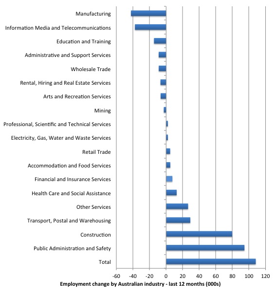
The next graph shows the absolute change in employment for each industry over the last 12 months (in thousands).
Two years ago these same graphs were very different with mining dominating the employment growth (despite its small size overall). Mining employment is now contracting as the record commodity prices ease. Overall investment in mining projects has fallen substantially as well. This doesn’t mean the “mining boom” is over. It just means that the capacity-building phase is probably at an end (or near to it) and we will have to see what export growth comes from the capacity (that is, the actual shipping of mining output).
But the “mining boom” has caused damage to other exchange-rate sensitive industries such as manufacturing because the record commodity prices (reflecting a strong demand for our minerals-based exports has been one factor driving our exchange rate up and reducing our competitiveness (see below). It is not the only factor. Monetary policy has been too tight (interest rates too high) relative to the rest of the world and this has also attracted foreign capital inflow which pushed the Australian dollar up.
There was an article in the Melbourne Age yesterday (November 14, 2013) – Reserve Bank should intervene to push down the Australian dollar – by the economics editor Tim Colebatch.
The tenor of the article is that the high value of the Australian dollar is killing industry – a transient happening (the exchange rate) having permanent effects.
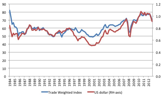
The following graph shows the movements in the US dollar (per AUD) and the Trade-Weighted Index (TWI) since 1984. Upwards movements indicate an appreciating Australian dollar.
The ABS article – Trade-Weighted Index – says that:
The trade-weighted index (TWI) for the Australian dollar is an indicator of movements in the average value of the Australian dollar against the currencies of our trading partners.
The RBA article (November 30, 2012) – Weights for the TWI – tells us that the Chinese renminbi (weight 23.5501), Japanese yen (13.9465), US dollar (9.8560), Euro (9.5477) and the South Korean won (6.1243) are the top five currencies in the index. Overall there are 21 currencies with 13 being Asia-Pacific nations.
If you want to learn about Trade Weighted Index (TWI) the RBA document – TWI – Method of Calculation – is worth reading.
Since the May-quarter 2001, when the exchange rate was 50.88 US cents to the Australia dollar, they has been a steady appreciation with the peak being in the May-quarter 2011 (107.88 US cents). as the graph shows a similar movement is recorded in the TWI.
The Age article’s sub-title is that “Manufacturing is being decimated by a policy of inaction”.
The article contains some plain nonsense such as:
Conventional wisdom can build fiscal self-discipline. It is important that budgets are in balance over the cycle …
Balancing the government budget over the cycle is equivalent to ensuring that Australian households and firms spend more than they are earning over the same cycle, given that our external sector is typically in deficit.
We surely have learned by now that the private domestic sector cannot continuously add to its debt load – cycle after cycle. Eventually there is a restitution sought and that takes the form of cuts in private spending and recession if the government deficit doesn’t rise.
Tim Colebatch then considers the impact that the exchange rate has had on local industry, which is safer territory for this journalist given the weaknesses in his macroeconomics analysis.
He writes:
… as the markets have pushed up the value of our dollar to post-float highs, making overseas trips incredibly cheap, but Australian-made goods and services incredibly expensive in global markets.
In many countries, central banks intervene or governments change laws to hold their currencies down, and ensure that producers remain competitive. But in Australia, it is conventional wisdom that the Reserve Bank and the governments must let the dollar float freely (apart from occasional raids to stop it falling too low). The only action Reserve governor Glenn Stevens has taken in this crisis has been to argue that the dollar is overvalued. And governments, Labor or Liberal, have done nothing.
He concludes that this lack of policy action “has made Australian producers uncompetitive. It is forcing jobs overseas” and lists several major job loss announcements in recent months in manufacturing as the “casualties of the high dollar – casualties we can’t afford”.
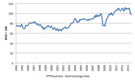
The following graph confirms the loss of international competitiveness for the Australian export sector. Its shows the movements in the Bank of International Settlements monthly Effective exchange rate indices – from January 1994 to September 2013.
You can learn about this data from their publication – The new BIS effective exchange rate indices – which appeared in the BIS Quarterly Review, March 2006.
There was an earlier publication – Measuring international price and cost competitiveness – which appeared in the BIS Economic Papers, No 39, November 1993.
Real effective exchange rates provide a measure on international competitiveness and are based on information pertaining movements in relative prices and costs, expressed in a common currency. Economists started computing effective exchange rates after the Bretton Woods system collapsed in the early 1970s because that ended the “simple bilateral dollar rate” (Source).
The BIS say that:
An effective exchange rate (EER) provides a better indicator of the macroeconomic effects of exchange rates than any single bilateral rate. A nominal effective exchange rate (NEER) is an index of some weighted average of bilateral exchange rates. A real effective exchange rate (REER) is the NEER adjusted by some measure of relative prices or costs; changes in the REER thus take into account both nominal exchange rate developments and the inflation differential vis-à-vis trading partners. In both policy and market analysis, EERs serve various purposes: as a measure of international competitiveness, as components of monetary/financial conditions indices, as a gauge of the transmission of external shocks, as an intermediate target for monetary policy or as an operational target.2 Therefore, accurate measures of EERs are essential for both policymakers and market participants.
If the REER rises, then we conclude that the nation is less internationally competitive and vice-versa.
Putting the two graphs (exchange rates and REER) leaves one in no doubt that the movements in competitiveness are driven by the shifts in the nominal exchange rate rather than disparate inflation trends between Australia and the rest of the world.
The point that Tim Colebatch makes, which is sound, is that:
The high dollar cannot last forever. But there is a limit to how long companies can go on losing money while waiting for the dollar to fall. We are allowing a temporary over-valuation to shut down economic capacity permanently. This is not how the successful Asian economies operate.
He proposes that:
1. The RBA should engage in official intervention – “either by pushing back against the currency traders as they push the dollar up, or by setting a ceiling for the exchange rate, as the Swiss do, and selling dollars to keep it down”.
He notes that to bring a currency down is easy for a currency-issuer such as Australia – “it just requires lots of Australian dollars, which the Reserve can create at will”.
In fact, the Australian government (consolidated central bank and treasury) has infinite quantities of the essential input to the exercise – $As.
Which then should inform all his readers that this means all the hoopla about bond issues, debt ceilings, etc is a meaningless distraction given that the government can create $s “at will”.
2. The Treasury “should remove the $2 billion a year tax break … to foreign buyers of Australian bonds in 2009 when he thought we needed incentives to attract them”.
This tax break was the doing of the last Treasurer in the Labor government and reflected how poorly he understood the relationship between the currency-issuing government he was in and the private bond markets. The latter are the supplicants. They will lap up the corporate welfare presented by the on-going bond issuance without any sugar on top. It just showed the poverty of understanding of basic macroeconomics among our government officials.
Over the last two years, employment growth in Australia has been very flat. In this environment it is interesting to examine the shifts in Manufacturing employment in more detail.
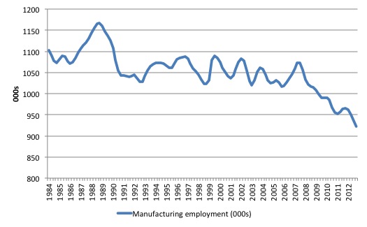
The first graph shows the evolution of manufacturing employment in Australia (in 000s) since the November-quarter 1994 to the August-quarter 2013. The data is seasonally adjusted and quarterly.
The points to note are:
1. Manufacturing is still a large employer in Australia. In November 1984, it accounted for 16.7 per cent of total employment with the next largest industry being retail (10.5 per cent).
By the August-quarter 2013 the share was 7.9 per cent and it had dropped to 4th most important employer. The leading industry shares were Health Care and Social Assistance (11.9 per cent); Retail (10.5 per cent); Construction ( 9.2 per cent); Professional, Scientific and Technical Services (7.9 per cent); and Education and Training (7.6 per cent).
2. There is a clear downward trend in Manufacturing industry employment over the time period shown.
3. Around that trend are some very defined cycles.
The question is how much of the recent downturn in manufacturing employment is cyclical (as a result of declining economic activity) and how much is trend.
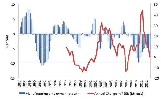
The next graph shows the annual growth in manufacturing employment from 1997 to the third-quarter2013 and the annual change (per cent) in the real effective exchange rate. The availability of the BIS REER time series restricts the sample that I can compute the growth in competitiveness for (from February 1997).
The points to note are:
1. There is a very defined cycle in the growth of manufacturing employment which broadly coincide with the major economic recessions (or slowdowns) in the broader Australian economy over the period shown.
The 1991 recession was severe and manufacturing employment took a large hit in job losses. The downturn in the recent period is also economy-wide.
2. There appears to be some evidence in the graph that when competitiveness falls, the growth in manufacturing employment declines and vice versa.
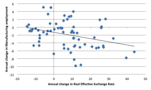
The next graph is just another view of the previous graph with the annual change in the REER on the horizontal axis and the annual change in Manufacturing employment on the vertical axis.
The black line is a simple linear regression. More sophisticated analysis would find significant negative correlation between the two series such that when the REER rose (decline in competitiveness) manufacturing employment falls. The causality is added by our understanding of the relationship between external competitiveness and employment in traded-goods sectors.
In the case of manufacturing, and unlike the mining sector, which has been floating on record world commodity prices, the external demand conditions have not been favourable. So when the nominal exchange rate appreciates (partly because of the high interest rate spreads between local and foreign assets) and competitiveness falls, it is likely that manufacturing employment gets squeezed. Not rocket science!
I explored the changes in manufacturing employment a little further. We can use time-series decomposition techniques to separate out the various components.
This is a highly technical area and I won’t go into the chapter and verse here. It is far to complex for a blog.
Basically, a time series – that is, a series of observations on something over time, such as manufacturing employment, may be the product of various components that statisticians can isolate (separate out).
The components comprise:
1. Seasonality – we buy more ice creams in Summer, for example.
2. Irregular behaviour – once-off spikes perhaps due to floods, bush-fires etc.
3. Trends – relatively slow movements up or down indicating the long-run tendency of the data series. In economics, population movements, technology, changes in tastes which shift expenditure patterns over time, social attitudes (for example, more women in the workforce) – are often invoked to explain trend behaviour.
4. Cycles – regular swings around the trend due in economics to fluctuations in aggregate demand. I am using the term here generally rather than referring to some specific periodic phenomenon such as a sine curve.
These components are separated out in a plethora of ways (techniques) each carrying advantages and disadvantages and no one method being superior on all fronts. It is an absolute mine-field for applied researchers as to which technique to use and students glaze over when you are teaching this stuff – it lacks a bit of colour, which is an understatement.
But this area of knowledge is crucial to many big debates – the most significant at the moment being the issue of climate change. There are all sorts of shonks (typically climate change deniers) out there who misuse these techniques to infer whatever they want.
Decomposition methods are typically some sort of filtering technique that exploit the so-called frequency spectrum of the time series to isolate components (defined by specific frequencies).
More simple methods employ linear regression to separate the deterministic trend from the stationary cyclical component or in the case of so-called difference stationary (or integrated) time series, various orders of differencing (subtraction) are used to achieve the same purpose.
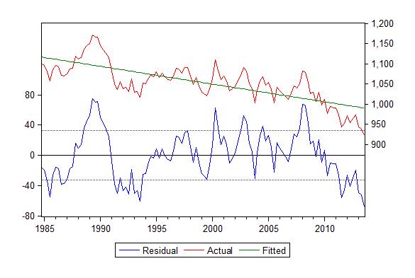
In the following example, I used a simple linear regression (regressing manufacturing employment on a constant and a linear trend) to de-trend the manufacturing time series so we can look the non-trending (cyclical?) component.
The following graph might be a bit technical for some but it is a graphical portrayal of the linear regression where I have de-trended the data (assuming the trend was deterministic or trend-stationary).
The assumption of trend-stationarity means that once I extract the trend the remaining part of the time series is stationary (has no trend). The literature here is very complex and I am making the assumption for blog-purposes only. In a full-blown academic paper I would conduct exhaustive tests.
In fact some of the simple “unit root” tests would suggest my assumption is okay for the time being.
Anyway, the upper panel of the graph shows in the actual time series (manufacturing employment) – the red line and the “fitted” trend from the regression (the green line). The fitted trend just means the forecast part of the time series that relates to a trend type variable (taking the value 1 at the start of the sample and increasing by 1 each subsequent observation).
You can see the linear trend is downward sloping.
The variation around the trend is captured by the blue line in the lower panel and in technical terms is the “residual” from the regression (hence its annotation). By construction of the regression technique this series has a mean of zero, which means it is stationary (keeping it simple that is! Please don’t write in and tell me about the other requirements for stationarity).
In conceptual terms, the blue line is the cyclical component of the time series.
The results and underlying actual data tell us that:
1. From the peak of the last cycle (February 2008) manufacturing has lost 160.3 thousand jobs. The declining trend component identified accounts for 24.2 thousand of those losses, the rest being “unexplained” but in the way we have constructed the discussion must be related to the cycle.
2. The difficulty then is working out what impact the shift in the external competitiveness on the time-series. Some additional analysis (which I haven’t time today to detail) suggests that the competitiveness effect is less important than the downturn in the overall business cycle in Australia as a result of poor private sector spending and, more recently, declining mining investment and fiscal austerity in the last financial year.
An alternative method of decomposing the components uses what are known as Band-pass filters, which the E-Views User Guide tells us are frequency filters used:
… to isolate the cyclical component of a time series by specifying a range for its duration. Roughly speaking, the band-pass filter is a linear filter that takes a two-sided weighted moving average of the data where cycles in a “band”, given by a specified lower and upper bound, are “passed” through, or extracted, and the remaining cycles are “filtered” out.
Enough!
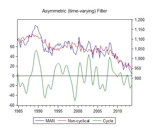
The point is that the technique generates a trend component and a cyclical component.
The specific filter I use below is the full sample asymmetric filter “where the weights on the leads and lags are allowed to differ”. In particular (for those interested) the algorithm was the Christiano-Fitzgerald filter.
This is time-varying (so isn’t a simple linear trend like the regression above) and allows variations in the filter (using the lags and leads of the data) to be asymmetric.
The graph below shows the results.
1. The blue line is the actual manufacturing employment series while the red line is the filtered trend.
2. The green wavy line is the decomposed cycle of the series.
3. In this case, the declining trend component identified accounts for 102.2 thousand of those losses, the rest being attributed to the cyclical component. It is no surprise that the cyclical component is smaller given the difference between filtering and linear de-trending.
In the linear regression technique you can see the trend line is well above the actual series in the recent period which means the cyclical component is larger than the BP filter estimate. It just goes to show that the results that are out there in the literature that are then massaged into English to support all sorts of wild propositions are very sensitive to technical specification.
Conclusion
I spent a little time trying to isolate the competitiveness effect from the broader domestic cycle and my best estimates are that the latter is the more dominant influence in explaining the large decline in manufacturing employment since February 2008. But this is not to say that a lower exchange rate would not be beneficial.
Long flight coming up so …
That is enough for today!
(c) Copyright 2013 Bill Mitchell. All Rights Reserved.
Dear Bill
What is the reason why a rich country like Australia has a tendency to run trade deficits? Continuous trade deficits, of course, mean even larger current-account deficits because if a country keeps importing capital, it will also run deficits in investment income.
As a rule, sectors that undergo the fastest productivity growth will have the slowest employment growth. That’s why in all developed countries there has been a trend for manufacturing’s share of total employment to decline, although not as fast as in agriculture. The difference of course is that people have a limited capacity to consume food but can increase their consumption of manufactured goods quite easily. Employment in services has gone up, not so much because people consume so many more services, but because productivity growth in services has been much slower than in manufacturing.
Let’s illustrate this. People can consume haircuts (services) and widgets (manufactured goods). Widget production undergoes rapid productivity growth but the productivity growth for haircuts is zero. We can then have the following illustration for Peter, who has an income of 100:
…………haircuts……………widgets
t1……5 x $10 = 50……..5 x $10 = 50
t2……7 x $10 = 70……..15 x $2 = 30
Between t1 and t2, productivity of widget manufacturing has quintupled, so its price has fallen by 80%. The price of haircuts has remained the same. As a result, Peter’s consumption of widgets has tripled between t1 and t2 while his consumption of haircuts has increased by only 40%. Yet in t1, Peter was spending 50% of his income on haircuts but in t2 this is 70%. As I see it, something like this has happened in the last 50 years. Consumption of manufactured goods has increased much faster than the consumption of services, but the share of income spent on services went up while the share for manufactured goods went down. Employment in services went up but in manufacturing it went down.
I was away for a week, so I didn’t reply to some of the criticisms about my ideas about debt. Suppose that in 2002 I had no debts at all and nothing owing to me either. In 2007, I had a net debt of 50,000. In 2012, I was back to where I was in 2002. Let’s assume that in that 10-year period I didn’t make or receive any gifts. We can then conclude that in the 5 years between 2002 and 2007 I lived above my means while between 2007 and 2012 I lived below my means. If somehow I managed to avoid living below my means between 2007 and 2012, then that could only mean that I defaulted on my debt or had my debts forgiven.
It should be the same for a country. If a country persistently runs current-account deficits, it must eventually live below its means, that is, consume less than it produces, even if all its debts are in its own currency. In fact, if its international investment position is very negative, it is possible for a country to run a current-account deficit and at the same have a trade surplus. It is living below its means despite its current-account deficit. For example, if Ruritania has an international investment position of minus 800 billion ruris, if the return on those 800 billion is 4% and if all the investment income on that amount is repatriated, then Ruritania must have a trade surplus of 12 billion if it has a current-account deficit of 20. billion. Its exports could be, say, 52 billion, its imports 40 billion, repatriation of investment income 32 billion and capital imports 20 billion. 52 – 40 – 32 = -20.
Regards. James
“It should be the same for a country”
James, the short answer: it is not the same. And Bill spends much of his time on his blog explaining why. The government balance sheet whether in surplus or deficit is neither living above, or below it’s means — which in the context of currency issuing nation is a meaningless statement.
@Keith
MMT believes in a Central bank…….it (The MMT state) does not just issue currency ……that currency is all double entry stuff……its debt baby.
The very basis of modern Keynesian thought is when the treasury and Central bank became one unit as in back in 1914……
Who really benefits from this mass mobilization of the workforce be it in war or job programmes during peacetime.
MMT effectively argues we must do pointless jobs of killing some German automan or sweeping the road before the autumn leaves fall – all in order to gain access to capital……how absurd….capital is meant to replace labour in the first place.
http://en.wikipedia.org/wiki/Social_credit
Dear Keith Wresch
I wasn’t talking about the government but about the country as a whole. If a country starts to live above its means by going into debt to foreigners and subsequently gets out of debt without living below its means, then it has performed a miracle, defaulted or received a gift.
Regards. James