The Australian Bureau of Statistics (ABS) released the latest labour force data today (APRIL 16,…
Australian labour market – weak and deteriorating
Today’s release by the Australian Bureau of Statistics (ABS) of the – Labour Force data – for June 2013 signals a deteriorating situation. Employment growth was about zero and full-time employment continued to contract. 84 per cent of jobs created in the last 6 months have been part-time. Unemployment rose by 23,700 and the unemployment rate rose 0.2 points to 5.7 per cent. This data signals an urgent need for fiscal stimulus to reverse the negative trend. Unfortunately, with both sides of politics locked into an austerity mindset the situation is likely to deteriorate further.
The summary ABS Labour Force (seasonally adjusted) estimates for June 2013 are:
- Employment increased 10,300 (0.1 per cent) with full-time employment falling by 4,400 and part-time employment rising by 14,800.
- Unemployment increased by 23,700 (3.5 per cent) to 709,300.
- The official unemployment rate rose by 0.2 points to 5.7 per cent.
- The participation rate rose by 0.1 points to 65.3 per cent still well below its November 2010 peak (recent) of 65.9 per cent.
- Aggregate monthly hours worked increased by 8.8 million hours (0.54 per cent).
- The quarterly ABS broad labour underutilisation estimate (the sum of unemployment and underemployment) in the May-quarter was 12.9 per cent. This will now be well over 13 per cent as a result of today’s data. In the May-quarter, underemployment was estimated to be 7.4 per cent or 908.6 thousand persons.
The unemployment rate has now reached the peaks we saw in September 2009 as the economy was trying to come to terms with the global financial crisis and the fiscal stimulus had not yet started to drive growth strongly.
The recovery that the economy experienced since that time has now evaporated and a very weak situation is now deteriorating.
Employment growth – virtually zero
The June 2013 data shows that employment growth was virtually zero. Total employment rose by 10,300 (0.1 per cent) to 11,668,500. Full-time employment fell by 4,400 while part-time employment rose by 14,800.
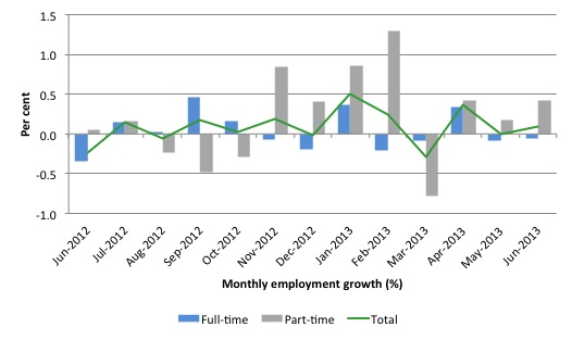
Today’s data reasserts the message that the labour market data is switching back and forth regularly between negative employment growth and positive growth spikes. This monthly behaviour is producing a weak positive trend, although not too much should be read into one month’s results.
There have been considerable fluctuations in the full-time/part-time growth over the last year with regular crossings of the zero growth line.
The following graph shows the month by month growth in full-time (blue columns), part-time (grey columns) and total employment (green line) for the 12 months to June 2013 using seasonally adjusted data.
Today’s results just repeat the topsy-turvy nature of the data over the period shown.
While full-time and part-time employment growth are fluctuating around the zero line, total employment growth is still well below the growth that was boosted by the fiscal-stimulus in the middle of 2010.
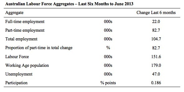
The following table provides an accounting summary of the labour market performance over the last six months. The monthly data is highly variable so this Table provides a longer view which allows for a better assessment of the trends. WAP is working age population (above 15 year olds).
The conclusion – overall 104.7 thousand jobs (net) have been created in Australia over the last six months (heavily influenced by the February and April 2013 results). Over the last six months, full-time employment has risen by only 22.0 thousand jobs (net) while part-time work has grown by 82.7 thousand jobs.
Over the last 6 months, a staggering 82.7 per cent of the net employment opportunities created have been part-time, which explains the sharp rise in underemployment (see below)
The Working Age Population has risen by 179 thousand in the same period while the labour force rose by 151.6 thousand. The weak employment growth has thus not been able to keep pace with the underlying population growth and unemployment has risen as a result (by 47 thousand).
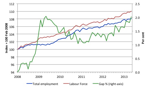
To put the recent data in perspective, the following graph shows the movement in the labour force and total employment since the low-point unemployment rate month in the last cycle (February 2008) to June 2013. The two series are indexed to 100 at that month. The green line (right-axis) is the gap (plotted against the right-axis) between the two aggregates and measures the change in the unemployment rate since the low-point of the last cycle (when it stood at 4 per cent).
You can see that the labour force index has largely levelled off and now falling and the divergence between it and employment growth has been relatively steady over the last several months with this month showing some improvement.
The Gap series gives you a good impression of the asymmetry in unemployment rate responses even when the economy experiences a mild downturn (such as the case in Australia). The unemployment rate jumps quickly but declines slowly.
It also highlights the fact that the recovery is still not strong enough to bring the unemployment rate back down to its pre-crisis low. You can see clearly that the unemployment rate fell in late 2009 and then has hovered at the same level for some months before rising again over the last several months.
The Gap shows that the labour market is still a long way from recovering from the financial crisis that hit in early 2008. There hasn’t been much progress since January 2010, when the fiscal stimulus started to run out.
In fact, in June 2013, the Gap reached the levels that appeared in May and June 2009 when the Australian economy was enduring the impact of the crisis. All the gains made since then have gone.
Teenage labour market – remains in a parlous state
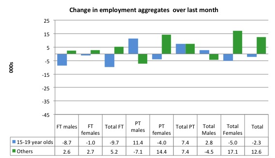
Full-time employment for teenagers declined by 9.7 thousand in June 2013 and part-time employment rose by 7.4 thousand. Overall, teenage employment fell by 2.3 thousand (net) jobs.
The following graph shows the distribution of net employment creation in the last month by full-time/part-time status and age/gender category (15-19 year olds and the rest)
If you take a longer view you see how poor the situation is.
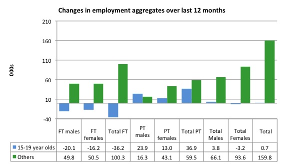
Over the last 12 months, teenagers have gained only 700 jobs while the rest of the labour force have gained 159.8 thousand net jobs. Remember that the overall result represents a very poor annual growth in employment.
Even more disturbing is the attrition of full-time jobs among teenagers – losing 36.2 thousand over the last year.
The teenage segment of the labour market is being particularly dragged down by the sluggish employment growth, which is hardly surprising given that the least experienced and/or most disadvantaged (those with disabilities etc) are rationed to the back of the queue by the employers.
The following graph shows the change in aggregates over the last 12 months.
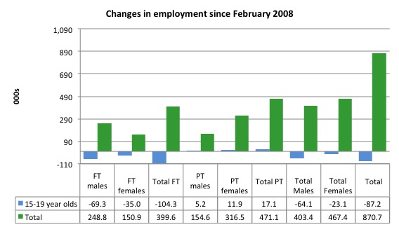
To further emphasise the plight of our teenagers I compiled the following graph that extends the time period from the February 2008, which was the month when the unemployment rate was at its low point in the last cycle, to the present month (June 2013). So it includes the period of downturn and then the “recovery” period. Note the change in vertical scale compared to the previous two graphs.
Since February 2008, there have been 870.7 thousand (net) jobs added to the Australian economy but teenagers have lost a staggering 87.2 thousand over the same period. It is even more stark when you consider that 104.3 thousand full-time teenager jobs have been lost in net terms.
Even in the traditionally, concentrated teenage segment – part-time employment – there have been only 17.1 thousand jobs (net) gained even though overall some 471.1 thousand part-time jobs have been added.
Overall, the total employment increase is modest. Further, around 54 per cent of the total (net) jobs added since February 2008 have been part-time, which raises questions about the quality of work that is being generated overall.
Overall, the performance of the teenage labour market remains poor. It doesn’t rate much priority in the policy debate, which is surprising given that this is our future workforce in an ageing population. Future productivity growth will determine whether the ageing population enjoys a higher standard of living than now or goes backwards.
The longer-run consequences of this teenage “lock out” will be very damaging.
The problem is that in the modest growth period that the Australian labour market enjoyed as a result of the fiscal stimulus and mining investment, teenagers failed to participate in the gains – they went backwards.
Now, with the economy entering a new period of slowdown, these losses will be added too given that teenagers are among the first in line to be shown the door by employers seeking to reduce staff levels in the face of declining aggregate sales.
The Government’s response is to push this cohort into endless training initiatives (supply-side approach) without significant benefits. The research shows overwhelmingly that job-specific skills development should be done within a paid-work environment.
I would recommend that the Australian government announce a major public sector job creation program aimed at employing, in the first instance, all the unemployed 15-19 year olds.
It is clear that the Australian labour market continues to fail our 15-19 year olds. At a time when we keep emphasising the future challenges facing the nation in terms of an ageing population and rising dependency ratios the economy still fails to provide enough work (and on-the-job experience) for our teenagers who are our future workforce.
Unemployment
The unemployment rate rose 0.2 points to 5.7 per cent in June 2013. Official unemployment increased by 23,700 to 709,300.
Overall, the labour market still has significant excess capacity available in most areas and what growth there is is not making any major inroads into the idle pools of labour.
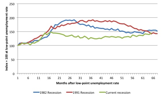
The following graph updates my 3-recessions graph which depicts how quickly the unemployment rose in Australia during each of the three major recessions in recent history: 1982, 1991 and 2009 (the latter to capture the 2008-2010 episode). The unemployment rate was indexed at 100 at its lowest rate before the recession in each case (January 1981; January 1989; April 2008, respectively) and then indexed to that base for each of the months as the recession unfolded.
I have plotted the 3 episodes for 68 months after the low-point unemployment rate was reached in each cycle. The current episode is now in its 65th month. For 1991, the peak unemployment which was achieved some 38 months after the downturn began and the resulting recovery was painfully slow. While the 1982 recession was severe the economy and the labour market was recovering by the 26th month. The pace of recovery for the 1982 once it began was faster than the recovery in the current period.
It is significant that the current situation while significantly less severe than the previous recessions is dragging on which is a reflection of the lack of private spending growth and declining public spending growth.
Moreover, the current episode is also different to the last two major recessions in the sense that the recovery is over and the economy is deteriorating again.
The graph provides a graphical depiction of the speed at which the recession unfolded (which tells you something about each episode) and the length of time that the labour market deteriorated (expressed in terms of the unemployment rate).
From the start of the downturn to the 65-month point (to June 2013), the official unemployment rate has risen from a base index value of 100 to a value 144.4 – peaking at 148 after 17 months. After falling steadily as the fiscal stimulus pushed growth along (it reached 122.8 after 35 months – in January 2010), it has been slowly trending up for some months now. Unlike the other episodes, the current trend, at this stage of the cycle, is upwards.
The gains that emerged in the recovery as a result of the fiscal stimulus in 2009-10 have now been lost.
At 65 months, 1982 index stood at 154.2 and was falling while the 1991 index was at 141.9 and was also falling. It is clear that at an equivalent point in the “recovery cycle” the current period is more sluggish than our recent two major downturns.
It now appears that the recoveries are converging, which tells us that the current policy has failed to take advantage of the fact that the latest economic downturn was much more mild than the previous recessions. In other words, the policy failure is locking the economy into a higher unemployment rate than is desirable and otherwise attainable.
Note that these are index numbers and only tell us about the speed of decay rather than levels of unemployment. Clearly the 5.4 per cent at this stage of the downturn is lower that the unemployment rate was in the previous recessions at a comparable point in the cycle although we have to consider the broader measures of labour underutilisation (which include underemployment) before we draw any clear conclusions.
The notable aspect of the current situation is that the recovery is very slow.
Broader labour underutilisation
The ABS published its quarterly broad labour underutilisation measures in the May data release. The next update will be in the August release.
In the May release, total underemployment rose to 7.3 per cent (from 7.1 per cent) in the May-quarter and the ABS broad labour underutilisation rate rose sharply by 0.3 points to 12.9 per cent (the sum of unemployment and underemployment). There are now 908.6 thousand workers underemployed in Australia.
The sum of underemployment and unemployment will now be above 13 per cent as a result of the further deterioration in June 2013.
If hidden unemployment is added to this figure the best-case (conservative) scenario would see a 14.5 per cent underutilisation rate. Please read my blog – Australian labour underutilisation rate is at least 13.4 per cent – for more discussion on this point.
Taken together, there are area least 1.8 million workers who desire work but cannot find it.
Aggregate participation rate rose by 0.1 points
The participation rate rose by 0.1 percentage points in June 2013 continuing the rise and fall pattern that we have seen for the last 6 months – over a downward trend.
It is now at 65.3 per cent. The rise in participation added to the rise in unemployment given the fact that employment growth lagged behind the additions to the labour force coming from underlying growth in the working age population.
Remember that the labour force is a subset of the working-age population (those above 15 years old). The proportion of the working-age population that constitutes the labour force is called the labour force participation rate. So changes in the labour force can impact on the official unemployment rate and so movements in the latter need to be interpreted carefully. A rising unemployment rate may not indicate a recessing economy.
The labour force can expand as a result of general population growth and/or increases in the labour force participation rates.
The participation rate is still substantially down on the most recent peak in November 2010 of 65.9 per cent when the labour market was still recovering courtesy of the fiscal stimulus.
What would the unemployment rate be if the participation was at its November 2010 peak?
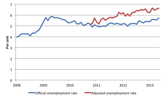
The following graph tells us what would have happened if the participation rate had been constant over the period November 2010 to June 2013. The blue line is the official unemployment since its most recent low-point of 4 per cent in February 2008. It is currently at 5.7 per cent.
The red line starts at November 2010 (the peak participation month). It is computed by adding the workers that left the labour force as employment growth faltered (and the participation rate fell) back into the labour force and assuming they would have been unemployed. At present, this cohort is likely to comprise a component of the hidden unemployed (or discouraged workers).
Total unemployment in June 2013 was estimated to be 709.3 thousand. However, if participation had not have fallen there would be 827.5 thousand workers unemployed given growth in population and employment since November 2010.
The difference between the two numbers reflects the change in hidden unemployment since November 2010. These workers would take a job immediately if offered one but have given up looking because there are not enough jobs and as a consequence the ABS classifies them as being Not in the Labour Force.
Note, the gap between the blue and red lines doesn’t sum to total hidden unemployment unless November 2010 was a full employment peak, which it clearly was not. The interpretation of the gap is that it shows the extra hidden unemployed since that time.
As the participation rate dropped over the period, the gap rose. The adjusted unemployment rate would now be 6.6 per cent instead of the official rate of 5.7 per cent.
Quite a different picture indeed.
Hours worked – modest rise in June 2013
Aggregate monthly hours worked increased by 8.8 million hours (0.54 per cent) in seasonally adjusted terms. The rise in hours worked this month continues the trends over several months of growth being interspersed with contraction with the trend switching back and forth between positive and negative.
The small swings up and down in monthly hours worked each month since the beginning of 2011 is being largely driven by similar fluctuations in full-time employment.
The following graph shows the trend and seasonally adjusted aggregate hours worked indexed to 100 at the peak in February 2008 (which was the low-point unemployment rate in the previous cycle). The rising trend which marked the early recovery courtesy of the fiscal stimulus is now clearly gone.
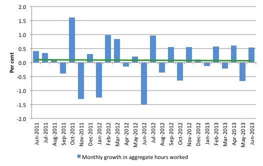
The next graph shows the monthly growth (in per cent) over the last 24 months. The green linear line is a simple regression trend – which is slightly downward trending. You can see the pattern in working hours that is also portrayed in the employment graph – zig-zagging across the zero growth line.
The data doesn’t support the notion of a fully employed labour market that is bursting against the inflation barrier.
Conclusion
Overall, today’s data shows that the Australian labour market is deteriorating slowly. In general, we always have to be careful interpreting month to month movements given the way the Labour Force Survey is constructed and implemented.
But the trend evidence supports a view that the labour market is very weak and employment growth is consistently so low relative to population growth that the unemployment rate is trending upwards – slowly.
The data does not suggest we have reached the point where unemployment will rise sharply. Rather it will eke its way up towards 6 per cent over the next 6 months.
The most striking aspect of a sad picture remains the appalling performance of the teenage labour market. Employment has collapsed for that cohort since 2008. I consider it a matter of policy urgency for the Government to introduce an employment guarantee to ensure we do not continue undermining our potential workforce.
The data certainly doesn’t support the Federal Government’s current macroeconomic settings, which are biased towards contraction. More fiscal stimulus is definitely needed but will not be forthcoming given the government’s neo-liberal biases.
That is enough for today!
(c) Copyright 2013 Bill Mitchell. All Rights Reserved.

Nearly fell over – huge chunk of Bill’s post quoted and linked over at MacroBusiness tonight!
Macrobusiness regularly provides links to Bill’s articles – this is the first time I’ve seen them quote such a large piece though.
And right on cue, flawse attacks Bill as being completely wrong (he has used stronger descriptors in the past) and MMT as being totally and utterly ficticious. I once challenged him to demonstrate to me that if MMT had it wrong, what then was the true nature and origin of the thing we choose to call money? In fact, I challenged him repeatedly – I’m still waiting for a response. He doesn’t know or won’t reveal what he thinks is the answer – yet he “knows” beyond a shadow of doubt that MMT is a fraudulent construct.
Strangely enough, I still think he comes across as an otherwise reasonable bloke.
The Macrobusiness bloggers themselves appear to agree with quite a few of the basic tenents of MMT and are calling upon the government to abandon the drive for surplus (for now at least) and to support demand through public investment.
A lot of MB analysis is driven by MMT, they’re closer to MMR though. That’s more of a political difference than an operational difference though. Agree re: character assessment of the person discussed.
I would like to see you both join http://groups.google.com/group/mmt-australia that I started & others, hopefully only for those with sympathies in MMT direction atm. Invite the critics after a critical mass. << Bill, please feel free to edit or remove this post if you deem this as advertising.
The problem with debating the MB and MMR clowns is that you simply give them the oxygen they require to breath.
Much better to ignore them and let nature take its course.
MMT points out the best way to run macroeconomics in a capitalist mixed economy. However, unless we do something to reform capitalism itself (the concentration of ownership and the exploitation of workers) then we are never going to get the thorough-going reform we require.
To my mind, Worker Collective Capitalism would represent a necessary transition which might or might not be the end point of reforms. In theory, there is no reason that capital ownership should be concentrated in a small class of non-workers (capitalists) and/or into corporate structures. Capital ownership could equally be spread to the workers in the enterprises themselves and to these collective bodies rather than corporate bodies. Just as there is no need for a separate owning class (apart from the workers themselves) there is no need for a separate managerial class (apart from the workers themselves).
Worker Collective Capitalism of this sort is not state ownership and would not do away with private ownership. It simply asserts that private ownership of enterprises cannot exist separately from “workership” (work participation) in the enterprise. This “workership” can be current or historical thus retired workers continue to hold a stake (shares) in enterprises they participated in during their working life. These stakes would be non-inheritable.
Just two classes of private ownership would still exist. These would be personal ownership of personal goods and effects (everything from a guitar to a house for example) and worker collective ownership of enterprises. State ownership would also exist and cover about 25% of national economic activity and employment. Natural monopolies, essential services and strategic enterprises would be state enterprises.
Banking reforms to meet this set-up would be far reaching but not necessarily complex. Suffice it to say that state (nationalised) banking would play a far larger role and commercial banking a much lesser role. For example, there is no reason that home loan lending should not be a state monopoly so that housing supply is controlled and equitable and the profits of private lending accrue to the state and thus benefit all citizens via reinvestment in services and infrastructure.
I believe that what the Japan’s monetary easing policy is doing to push the YEN downwards healthily is also an appropriate action for the Australian government to consider. In a layman term, just print more money to make the currency move downwards peacefully.
Since the YEN is much cheaper than before, the export and tourism businesses from Japan are active again. This is exactly what we want to see.
Also, if the A$ depreciate, it will show an improvement of our government’s overseas investments which are usually calculated in foreign currencies.
Before A$ starts to depreciate, it should be a good idea for investors in Australia to rapidly purchase some overseas assets e.g. a supermarket chain in Hong Kong or some businesses in China or other parts of Asia.