The Australian Bureau of Statistics (ABS) released the latest labour force data today (APRIL 16,…
Australian Labour Force data – the fiscal policy sabotage continues
Yesterday, the third-quarter National Accounts data revealed that real GDP growth is trailing behind the underlying population growth which means that per capita incomes have been falling. Today’s release by the Australian Bureau of Statistics (ABS) of the Labour Force data for November 2012 reveals that employment growth is also failing to keep pace with the underlying population growth and the only reason unemployment is not skyrocketing is that more workers are dropping out of the labour force as a result of the lack of job opportunities being created. The data is unambiguously bad. The unemployment rate fell to 5.2 per cent but only because the participation rate fell. The fact that workers are giving up looking for jobs is a portent of a very sluggish labour market. So unemployment fell but hidden unemployment rose. The trend performance of the labour market is flat and these monthly shifts are merely fluctuating around that flat trend. The data is not consistent with any notions that the Australian labour market is booming or close to full employment. The most continuing feature that should warrant immediate policy concern is the appalling state of the youth labour market. My assessment of today’s results – worrying with further weakness to come. The government has in the past few weeks insisted it will pursue its budget surplus obsession and announced further cuts in discretionary net spending. Not only will that act of fiscal vandalism fail but in doing so it will further undermine a very weak labour market.
The summary ABS Labour Force (seasonally adjusted) estimates for November 2012 are:
- Employment increased 13,900 (0.1 per cent) with full-time employment falling by 4,200 and part-time employment rising by 18,100.
- Unemployment decreased by 16,300 (2.5 per cent) to 637,400.
- The official unemployment rate fell to 5.2 per cent from 5.4 per cent (on unrounded estimates).
- The participation rate decreased by 0.1 points to 65.1 per cent.
- Aggregate monthly hours worked rose by 1.3 million hours (1.3 per cent).
- The quarterly ABS broad labour underutilisation estimates (the sum of unemployment and underemployment) were published today (for the fourth-quarter 2012) and show that the total labour underutilisation rate increased by 0.2 pts to 12.5 per cent.
The ABC National News Report – Unexpected fall in unemployment for November – said that:
Many economists thought falling job advertisements as well as public sector job shedding would push up the unemployment rate … Employment Minister Bill Shorten welcomed today’s better-than-expected result, but says Australia cannot become complacent.
When the ABC says “many economists” they mean the private bank economists who they talk to all the time and who have a systematic record of large forecast errors – in both sign and magnitude.
There is no surprise in these results. They are unambiguously bad and a fall in the unemployment rate is a sign of a very weak demand-side. That has been signalled in other data releases (for example, job vacancies earlier this week).
The comment by the Minister for Employment should be disregarded as self-serving rot. The result is not “better-than-expected” if you understand what is going on. It is totally consistent with a slowing economy that has been failing to generate sufficient employment growth since the Government began its obsessive pursuit of a budget surplus at a time when it should have been expanding the deficit.
The ABC quoted another private bank economist who also appears to be in denial:
… the figures show the job market is healthy …
Hmmm.
The Sydney Morning Herald commentator Michael Pascoe wrote in response to the data – Stubborn unemployment refuses to rocket – is much more astute as to what is going on.
He said:
Not that there’s anything optimistic about today’s figures … The welter of other statistics released over the past week points to the labour market weakening further as population growth picks up and Australia’s mini-fiscal cliff (OK, let’s call it “Australia’s steep creek bank”) takes its toll.
Employment growth – still cycling around zero
The November data shows that employment growth was very weak again with total employment rising by just 13,900 (0.1 per cent) – with full-time employment falling by 4,200 and part-time employment decreased by 8,000.
Employment growth is currently not sufficient to absorb the growth in the labour force arising from underlying growth in the working age population. Only falling participation rates are keeping a lid on unemployment. See analysis later.
Today’s data reasserts the message that the labour market data is switching back and forth each month with an sluggish (slightly negative) underlying trend being fairly stable for some months now.
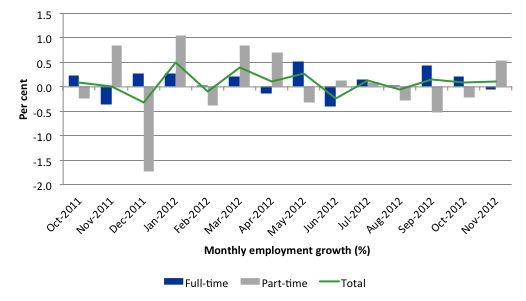
There have been considerable fluctuations in the full-time/part-time growth over the last year with regular crossings of the zero growth line
The following graph shows the month by month growth in full-time (blue columns), part-time (grey columns) and total employment (green line) for the 12 months to November 2012 using seasonally adjusted data.
Today’s results just repeat the topsy-turvy nature of the data over the period shown. The Australian labour market is struggling with the low GDP growth creating a near jobless growth environment.
While full-time and part-time employment growth are fluctuating around the zero line, total employment growth is still well below the growth that was boosted by the fiscal-stimulus in the middle of 2010.
The following table provides an accounting summary of the labour market performance over the last six months. The monthly data is highly variable so this Table provides a longer view (over the last 6 months) which allows for a better assessment of the trends. WAP is working age population (above 15 year olds). The first three columns show the number of jobs gained or lost (net) in the last six months.
The conclusion – overall only 52.1 thousand jobs (net) have been created in Australia over the last six months with 62.9 thousand full-time jobs being offset by the loss of 8.7 thousand part-time jobs (net). This is a very miserable employment growth performance.
The WAP has risen by 148 thousand in the same period while the labour force rose by 32.2 thousand. The relatively weak employment growth has not been able to keep pace with the underlying population growth and unemployment has risen as a result (by 11 thousand).
The rise in unemployment would have been greater had not the participation rate fallen (by 0.344 percentage points), which reduced the growth in the labour force.
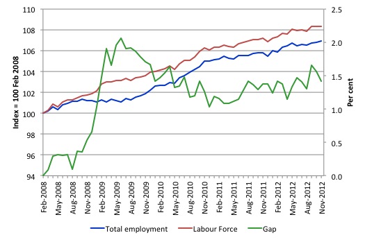
To put the recent data in perspective, the following graph shows the movement in the labour force and total employment since the low-point unemployment rate month in the last cycle (February 2008) to November 2012. The two series are indexed to 100 at that month. The green line (right-axis) is the gap (plotted against the right-axis) between the two aggregates and measures the change in the unemployment rate since the low-point of the last cycle (when it stood at 4 per cent).
You can see that the labour force index has largely levelled off and now falling and the divergence between it and employment growth has been relatively steady over the last several months with this month showing some improvement.
The Gap series gives you a good impression of the asymmetry in unemployment rate responses even when the economy experiences a mild downturn (such as the case in Australia). The unemployment rate jumps quickly but declines slowly.
It also highlights the fact that the recovery is still not strong enough to bring the unemployment rate back down to its pre-crisis low. You can see clearly that the unemployment rate fell in late 2009 and then has hovered at the same level for some months before rising again over the last two months.
The gap shows that the labour market is still a long way from recovering from the financial crisis that hit in early 2008. There hasn’t been much progress since November 2010, when the fiscal stimulus started to run out.
Teenage labour market – remains in a parlous state
The teenage labour market marked time this month, which means it remained in its parlous state. I am getting an increased number of calls from journalists over the last few months about the plight of teenagers in the labour market, which means the issue might start getting some traction in the policy debate. So far there has been virtually no response from the Government?
I note overnight that the EC Commissioner for Employment, Social Affairs and Inclusion issued a press release (December 5, 2012) – Youth employment: Commission proposes package of measures – which outlines their intention to introduce a Youth Guarantee scheme, which will include a Job Guarantee (as far as I can tell at this stage). I will comment more fully on that next week.
This was the Commissioner who invited me to talk about the Job Guarantee at the EC Employment Conference in Brussels in September. It is a good sign that the EC is moving in this direction. Slowly taking steps that might one day lead to a steady jog – that is, a Job Guarantee for anyone who is unemployed.
The EC’s press release said that in regard to the hideously high youth unemployment in Europe it was imperative that “(a)voiding these economic costs now and in the future outweighs by far the fiscal costs of the proposed Youth Guarantee”. So true yet the Australian government is so ideologically entwined in its budget surplus mantra that it cannot see this verity.
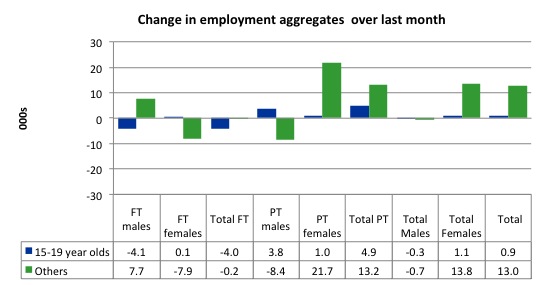
The following graph shows the distribution of net employment creation in the last month by full-time/part-time status and age/gender category (15-19 year olds and the rest)
Over the last month, teenagers gained 900 jobs while the rest of the workforce gained 13 thousand jobs. Teenagers also lost 4 thousand full-time job opportunities.
The conclusion is that the weak employment growth is providing no significant opportunities to teenagers to enter the employed workforce.
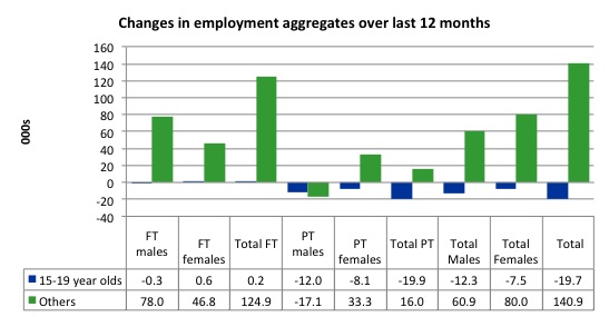
If you take a longer view you see how poor the situation is.
Over the last 12 months, teenagers have lost 19.7 thousand net jobs overall which the rest of the labour force have gained 140.9 thousand net jobs. Teenagers have gained 200 full-time opportunities but lost 19.9 thousand part-time opportunities in net terms.
So the Australian labour market has further undermined the opportunities for this cohort over the last year.
The teenage segment of the labour market is being particularly dragged down by the sluggish employment growth, which is hardly surprising given that the least experienced and/or most disadvantaged (those with disabilities etc) are rationed to the back of the queue by the employers.
The following graph shows the change in aggregates over the last 12 months. Australian teenagers are going backwards which is a trend common around the world at present.
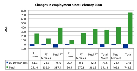
To further emphasise the plight of our teenagers I compiled the following graph that extends the time period from the February 2008, which was the month when the unemployment rate was at its low point in the last cycle, to the present month (November 2012). So it includes the period of downturn and then the “recovery” period. Note the change in vertical scale compared to the previous two graphs. That tells you something!
The results are stunning and represent a major policy failure.
Since February 2008, there have been 748.6 thousand (net) jobs added to the Australian economy but teenagers have lost a staggering 97.8 thousand over the same period. It is even more stark when you consider that 75.6 thousand full-time teenager jobs have been lost in net terms. Even in the traditionally, concentrated teenage segment – part-time employment – there have been 22.2 thousand jobs (net) lost.
Further, around 48 per cent of the total (net) jobs added since February 2008 have been part-time, which raises questions about the quality of work that is being generated overall.
Overall, the performance over the last 12 months is poor and should receive a much higher priority in the policy debate than it does.
The longer-run consequences of this teenage “lock out” will be very damaging.
The Australian government has no coherent strategy to resolve this appalling state. Ensuring teenagers are included in paid work, if they do not desire to remain in school, should be a number one policy priority.
The Government’s response is to push this cohort into endless training initiatives (supply-side approach) without significant benefits. The research shows overwhelmingly that job-specific skills development should be done within a paid-work environment.
I would recommend that the Australian government announce a major public sector job creation program aimed at employing, in the first instance, all the unemployed 15-19 year olds.
It is clear that the Australian labour market continues to fail our 15-19 year olds. At a time when we keep emphasising the future challenges facing the nation in terms of an ageing population and rising dependency ratios the economy still fails to provide enough work (and on-the-job experience) for our teenagers who are our future workforce.
Unemployment
The unemployment rate fell to 5.2 per cent in November 2012 (from 5.4 per cent) and official unemployment fell by 16,300. The fall in unemployment, however, masks the fact that the labour force participation rate also fell – we analyse that issue in the next section.
The reality is that employment growth remains below the underlying population growth and it is only the sluggish labour force growth (being held back by these regular contractions in the participation rate) that has prevented a substantial rise in unemployment.
Overall, the labour market still has significant excess capacity available in most areas and what growth there is is not making any major inroads into the idle pools of labour.
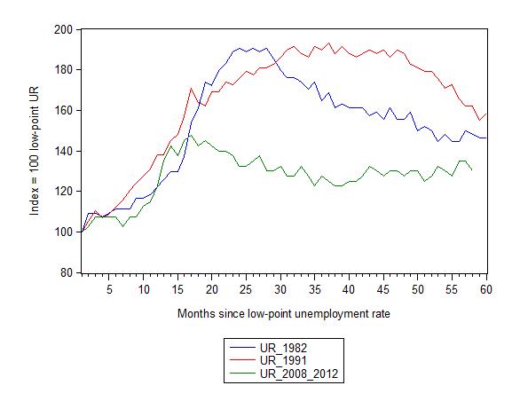
The following graph updates my 3-recessions graph which depicts how quickly the unemployment rose in Australia during each of the three major recessions in recent history: 1982, 1991 and 2009 (the latter to capture the 2008-2010 episode). The unemployment rate was indexed at 100 at its lowest rate before the recession in each case (November 1981; December 1989; April 2008, respectively) and then indexed to that base for each of the months as the recession unfolded.
I have plotted the 3 episodes for 58 months after the low-point unemployment rate was reached. For 1991, the end-point shown is the peak unemployment which was achieved some 38 months after the downturn began although the recovery was painfully slow. While the 1982 recession was severe the economy and the labour market was recovering by the 26th month. The pace of recovery for the 1982 once it began was faster than the recovery in the current period.
It is significant that the current situation while significantly less severe than the previous recessions is dragging on which is a reflection of the lack of private spending growth and declining public spending growth.
The graph provides a graphical depiction of the speed at which the recession unfolded (which tells you something about each episode) and the length of time that the labour market deteriorated (expressed in terms of the unemployment rate).
From the start of the downturn to the 58-month point (to November 2012), the official unemployment rate has risen from a base index value of 100 to a value 130 – peaking at 145 after 21 months. It has been hovering at the current level for some months now. Unlike the other episode, the current trend, at this stage of the cycle, is unclear.
At 58 months, 1982 index stood at 148 and was falling, while the 1991 index was at 162 and falling steadily. It is clear that at an equivalent point in the “recovery cycle” the current period is more sluggish than our recent two major downturns.
It now appears that the recoveries are converging, which tells us that the current policy has failed to take advantage of the fact that the latest economic downturn was much more mild than the previous recessions. In other words, the policy failure is locking the economy into a higher unemployment rate than is desirable and otherwise attainable.
Note that these are index numbers and only tell us about the speed of decay rather than levels of unemployment. Clearly the 5.2 per cent at this stage of the downturn is lower that the unemployment rate was in the previous recessions at a comparable point in the cycle although we have to consider the broader measures of labour underutilisation (which include underemployment) before we draw any clear conclusions.
The notable aspect of the current situation is that the recovery is very slow.
Broader labour underutilisation
The ABS published its quarterly broad labour underutilisation measures today for the November-quarter, which gives us updated estimates of its underemployment measures.
Underemployment overall rose from 7.1 per cent in the August-quarter to 7.2 per cent in the November-quarter. Taken together with the unemployment rate, the ABS broad labour underutilisation rate is now at 12.5 per cent up from 12.4 per cent in the August-quarter.
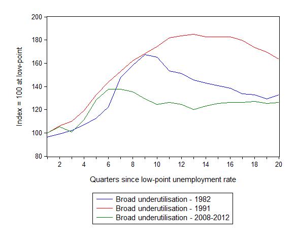
The following graph replicates the previous graph except it uses the ABS broad labour underutilisation rate (unemployment plus underemployment).
At the same period in the recovery (using quarterly data), the broad labour underutilisation rate (unemployment plus underemployment) had an index value of 132 in the 1982 recession (absolute value of 11.4 per cent); an index value of 163 in the 1991 recession (absolute value of 16 per cent); and an index value of 126 in the current period (absolute value of 12.5 per cent).
So while the level of unemployment is much lower now than in the 1982 recession (at a comparable stage), underemployment is now much higher and so the total labour underutilisation rates is higher. But the 1982 recovery in broad underutilisation terms was more robust than the current stagnating situation.
Commentators who think of the 1982 recession as severe, rarely see it in these terms. Joblessness is probably worse than underemployment but both mean that labour is wasted and income earning opportunities are being foregone. For a worker with extensive nominal commitments, the loss of income when hours are rationed may be no less severe than the loss of hours involved in unemployment, if the threshold of solvency is breached.
And it is important to keep in mind that the while the broad labour underutilisation rate has risen in the last three months, the labour market has also endured a fall in the participation rate, which means that hidden unemployment has also risen.
That is, things are getting worse.
Aggregate participation rate fell in November
The participation rate fell by 0.1 percentage points in November 2012 to 65.1 per cent. It remains 0.4 percentage points lower than it was 12 months ago.
It is still substantially down on the most recent peak of 66 per cent (November 2010) when the labour market was gathering pace courtesy of the fiscal stimulus.
This drop in participation in the last year or more has meant the labour force growth has been relatively subdued with the additional result being that the unemployment rate is considerably lower than would otherwise been the case.
In the current month, unemployment fell by 16.3 thousand and the unemployment rate rounded out fell from 5.4 per cent to 5.2 per cent of the labour force. How much of that fall in unemployment is due to the fall in participation given that we know the weak employment growth failed once again to keep pace with the underlying population growth?
The labour force is a subset of the working-age population (those above 15 years old). The proportion of the working-age population that constitutes the labour force is called the labour force participation rate. So changes in the labour force can impact on the official unemployment rate and so movements in the latter need to be interpreted carefully. A rising unemployment rate may not indicate a recessing economy.
The labour force can expand as a result of general population growth and/or increases in the labour force participation rates.
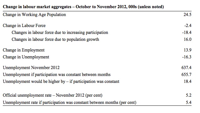
The following Table shows the breakdown in the changes to the main aggregates (Labour Force, Employment and Unemployment) and the impact of the rise in the participation rate.
In November 2012, employment rose by 13,900 while the labour force fell by 2,400 persons. That is the reason that unemployment fell by 16,300
The labour force fall November was the outcome of two separate factors:
- The underlying population growth added 16 thousand persons to the labour force. The population growth impact on the labour force aggregate is relatively steady from month to month; and
- The participation rate fall meant that 18.4 thousand workers left the labour force (relative to what would have occurred had the participation rate remained unchanged).
Clearly, employment growth was not sufficient to match the underlying population growth (a deficiency of 2.1 thousand).
But if the participation rate had not have fallen, at the current employment level, unemployment would have been 655.7 thousand instead of 637.4 thousand as recorded by the ABS.
Thus, without the drop in the participation rate, the unemployment rate would have been 5.4 per cent rather than 5.2 per cent as officially published.
The conclusion is that unemployment would have actually risen by 18.4 thousand instead of falling by 16.3 thousand had the labour force participation not have fallen.
The difference is that hidden unemployment rose while official unemployment fell. In functional terms this signals an overall deterioration in the labour market.
Hours worked rose modestly in November 2012
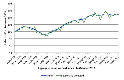
Aggregate monthly hours worked fell by 1.3 million hours (1.3) per cent) in seasonally adjusted terms and the trend is now firmly down and signalling a labour market that is deteriorating.
The small swings up and down in monthly hours worked each month since the beginning of 2011 is being driven by similar fluctuations in full-time employment.
The following graph shows the trend and seasonally adjusted aggregate hours worked indexed to 100 at the peak in February 2008 (which was the low-point unemployment rate in the previous cycle). The rising trend which marked the early recovery courtesy of the fiscal stimulus is now clearly gone.
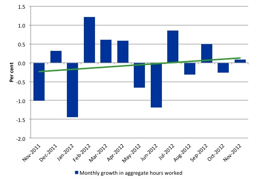
The next graph shows the monthly growth (in per cent) over the last 12 months. The green linear line is a simple regression trend – basically flat. You can see the pattern in working hours that is also portrayed in the employment graph – zig-zagging across the zero growth line. The economy cannot get any head of steam up as any growth in private spending is being offset by the fiscal contraction.
Once again the data doesn’t support the notion of a fully employed labour market that is bursting against the inflation barrier.
Conclusion
Overall, today’s data confirms that the labour market remains weak and fluctuating around a zero employment growth trend. Employment growth is clearly not strong enough to even keep pace with the growth of the underlying population let alone eat into the huge pool of unemployment and underemployment.
Within this pattern of weak employment growth, variations in the participation rate from month to month have been driving rises or falls in the unemployment around a slightly increasing trend.
That pattern has been evident for the last 18 months or so and leads to the conclusion that the labour market is weak and trending towards increased weakness.
We always have to be careful interpreting month to month movements given the way the Labour Force Survey is constructed and implemented. But the underlying trend is weak as a result of the withdrawal of the fiscal stimulus undermining employment growth.
The most striking aspect of a sad picture remains the appalling performance of the teenage labour market. Employment has collapsed for that cohort and I consider it a matter of policy urgency for the Government to introduce an employment guarantee to ensure we do not continue undermining our potential workforce.
The data certainly doesn’t support the Federal Government’s current macroeconomic settings, which are biased towards contraction. More fiscal stimulus is definitely needed.
That is enough for today.
(c) Copyright 2012 Bill Mitchell. All Rights Reserved.

Hi,
Just wanted to say thanks for a great breakdown of what is happening in the labour market. Much more insightful than what is in the papers
I watched the very same ABC report and it’s always the same old song with the Bank economists. As long as interest rates are falling and their wealth is increasing they simply couldn’t care less about the plight of others.
I’m suprised they haven’t said that the participation rate is a falling because peoples preference for leisure time rather than work is increasing.
And as any good bank economist will tell you : all unemployment is voluntary. The youth need to simply look harder for those jobs that don’t exist.
Bank economist + ABC = Bullshit. And to add insult to injury they sound like some Gen Y / Millenial twit just out of some university business course. This garbage is insulting to anybody with even minimal knowledge of economic matters or basic life experience for that matter.
As for the labour market,if you keep importing immigrants then that market will be corrupted beyond belief.