The Australian Bureau of Statistics (ABS) released the latest labour force data today (APRIL 16,…
Australian labour market – staggering along
The Australian Bureau of Statistics (ABS) published the Labour Force data for October 2011 today. The data shows that employment barely grew and thanks to an artificially low labour force growth rate was just sufficient to allow unemployment to fall slightly. However, most of the drop in unemployment was due to a slight decline in the participation rate. The data is not bad but it is certainly not good and points to a weak economy overall. How long that remains is anyone’s guess in these uncertain times where governments have largely abandoned any plans to provide fiscal support to help the economies grow. The recent acceleration of the crisis in Europe should not impact negatively on our labour market if the Government is flexible enough to abandon its obsessive pursuit of a budget surplus. The black spot in the data today is the continued deterioration of the youth labour market. That should be a policy priority but unfortunately the government is largely silent on that issue. Overall, the Australian labour market is just staggering along.
Overnight, Europe has continued to kick own goals. Governments are collapsing (France – next?) and none of the leaders seem to want to admit that if they want to keep the Eurozone together then the only way forward is for the ECB to offer unconditional support for government deficits while the member states expand their economies rather than deliberately drive them into the ground.
By allowing the bond markets to wreak havoc the leaders are failing badly. They could deal the bond markets out of the equation, restore confidence throughout the region, and get people working again if they chose to. They are so obsessed with austerity (driven by rabid German economists) that the situation will continue to decline.
Clearly it would be better for all of them to call it a day and work on an orderly break-up of the EMU. That won’t happen and so the best strategy for individual nations is to exit on their own terms. Given the apparent disdain for economic growth among the leadership, the member states should exit immediately and use their restored fiscal capacity to stimulate growth and a way forward.
I have been saying that for several years now and nothing that has happened over that time suggests that the strategy of the Euro leaders is any better.
Which brings me to today’s ABS Labour Force data.
The summary ABS Labour Force (seasonally adjusted) estimates for October 2011 are:
- Employment increased 10,100 (0.1 per cent) with full-time employment increasing by 20,000 and part-time employment decreasing by 9,900. Over the last year, employment has grown by less than 1 percent (0.9 per cent).
- Unemployment decreased by 5,700 (0.9 per cent) and is now at to 630,800.
- The official unemployment rate decreased to 5.2 per cent down from a revised 5.3 per cent last month (revised from 5.2 per cent).
- The participation rate declined by 0.1 points to 65.6 per cent.
- Aggregate monthly hours worked increased by 10.4 millions hours (0.7 per cent) which just offset last month’s decrease of 9.4 million hours.
- The quarterly labour underutilisation estimates were last published in August and showed that the ABS broad labour underutilisation rate hase risen over the last three months to 12.3 per cent (up from 12.2 per cent). They will be published again next month.
The ABC News response – Unemployment rate falls to 5.2pc – said that the falling rate had beatan “economists’ expectations”.
While they claimed the job participation rate remained steady at 65.6 per cent that is not exactly true if you examine the data carefully. I will show you later the impact of the slight decline in the participation rate that did occur.
Most of the fall in the unemployment rate is due to labour supply contraction rather than jobs growth.
The Prime Minister was quoted as saying:
We should be saying to each other, ‘we came through the global financial crisis strong’ … We worked together to achieve that as Australians, Government, employers, unions … Now we need to keep working together to manage our patchwork economy.
She might have noted that the teenagers (15-19) didn’t participate in this “bonanza” with a further deterioration in the teenage labour market. I would request that the journalists out there challenge the PM on this issue.
Ask her why her government is denying our future workers the chance to work and gain experience … and … what she was doing about it. There is a policy vacuum in this area.
The Sydney Morning Herald report was more ebullient with the headline – Jobs market shows some strength.
They said:
Employment rose for a second month in October as more workers got full-time jobs and the unemployment rate ticked lower, another sign of domestic resilience to the gloom spreading from Europe.
Which is all true but is in contradistinction to what they went onto say when reporting what the RBA might do with respect to interest rates in December.
They said:
The central bank expects the jobless rate to rise a little further from here, before declining gradually back to current levels … Employment growth slowed to 0.9 per cent in October compared to the same month last year, a long way from the heady peak of 3.6 per cent touched in 2010.
Which is a more accurate impression of what is going on at present.
Employment growing but barely
The October data shows that employment increased by 10,100 (net) (0.1 per cent) down from the 0.2 per cent growth last month. There have been considerable fluctuations in the full-time/part-time performance and regular crossings of the zero growth line over the last year. Since December 2010, employment has declined 5 out of the 10 months, didn’t grow at all for another month, and average growth has been a miserly 0.1 per cent.
Since October 2010, employment has grown a miserly 0.9 per cent compared to labour force growth of 0.7 per cent. The latter is usually more than twice this annual growth rate. So the sluggish supply growth is keeping unemployment much lower than it otherwise would be given how poor the employment growth has been.
The overall impression is that for the year to date we are effectively in a near jobless growth environment.
Full-time employment expanded by 20,000, the second month of growth which is a good sign. However, the expansion over the two months still fails to match the lost jobs over the previous two months. Full-time employment is still below its level in June 2011.
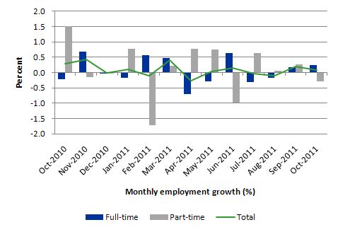
The following graph shows the month by month growth in full-time (blue columns), part-time (grey columns) and total employment (green line) for the 12 months to October 2011 using seasonally adjusted data. It is clear that the picture has been mixed over the last 12 months with employment growth averaging 0.1 per cent per month (full-time 0.1 per cent; part-time 0.1 per cent).
While full-time and part-time employment growth are fluctuating around the zero line, total employment growth is still well below the growth that was boosted by the fiscal-stimulus in the middle of 2010.
The following table provides an accounting summary of the labour market performance over the last six months. The monthly data is highly variable so this Table provides a longer view (over the last 6 months) which allows for a better assessment of the trends. WAP is working age population (above 15 year olds). The first three columns show the number of jobs gained or lost (net) in the last six months.
The conclusion – a very modest addition of employment in net terms dominated by full-time employment growth.
The WAP has risen by 106 thousand in the same period while the labour force has risen by 82.8 thousand. Employment has, however, only risen by 36.8 thousand which is the reason unemployment has risen by 46 thousand over this period.
The reality is that the labour market is fairly weak and employment growth is failing to keep pace with the underlying population growth.

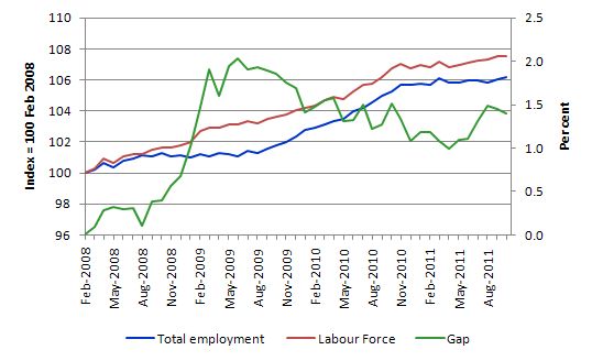
To put the recent data in perspective, the following graph shows the movement in the labour force and total employment since the low-point unemployment rate month in the last cycle (February 2008) to October 2011. The two series are indexed to 100 at that month. The green line (right-axis) is the gap (plotted against the right-axis) between the two aggregates and measures the change in the unemployment rate since the low-point of the last cycle (when it stood at 4 per cent).
You can see that even though the labour force is slowing (mainly due to a fall in working age population due to lower in-migration rates), the divergence between it and employment growth has been widening over the last several months, although in September and October there was a small correction. The overall result is that the Gap (unemployment) has risen significantly in recent months.
The Gap series gives you a good impression of the asymmetry in unemployment rate responses even when the economy experiences a mild downturn (such as the case in Australia). The unemployment rate jumps quickly but declines slowly.
It also highlights the fact that the recovery is still not strong enough to bring the unemployment rate back down to its pre-crisis low. You can see clearly that the unemployment rate fell in late 2009 and then has hovered at the same level for some months before rising again over the last two months.
The Australian labour market continues to be stuck in a period of sluggish growth.
Teenage labour market – appalling and getting worse
The teenage labour market has continued to deteriorate in October from an already parlous starting point. The appears to be no policy awareness with the government and the media continually trying to convince us that the economy is close to full employment.
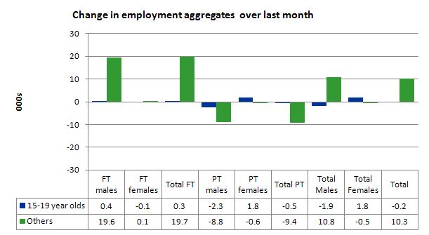
The following data shows that the teenage labour market is in an appalling state. In October 2011, teenagers endured further losses in total employment.
The following graph shows the distribution of net employment creation in the last month by full-time/part-time status and age/gender category (15-19 year olds and the rest).
If you take a longer view you see how poor the situation is.
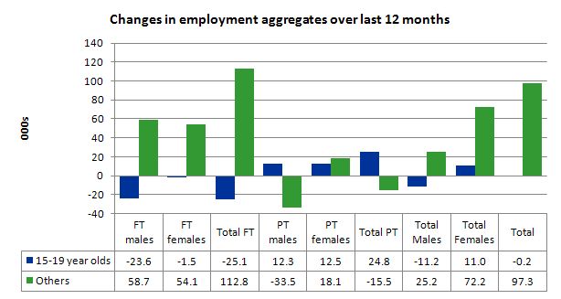
Over the last twelve months teenagers have lost 0.2 thousand (net) jobs while the rest of the labour force has gained 97.3 thousand jobs (net). owever, the overall figure hides the extent of the loss. 15-19 year olds lost 25.1 thousand full time jobs in the same period while gaining 24.8 thousand part-time jobs. In other words, the sparse job opportunities available to them are in the form of casualised, low-paid, insecure jobs that will not develop skills.
The following graph shows the change in aggregates over the last 12 months. Australian teenagers are going backwards which is a trend common around the world at present.
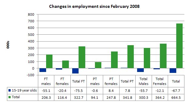
To further emphasise the plight of our teenagers I compiled the following graph that extends the time period from the February 2008, which was the month when the unemployment rate was at its low point in the last cycle, to the present month (October 2011). So it includes the period of downturn and then the “recovery” period. Note the change in vertical scale compared to the previous two graphs. That tells you something!
The results are stunning and represent a major policy failure. Since February 2008, there have been 664.5 thousand (net) jobs added to the Australian economy but teenagers have lost a staggering 67.7 thousand jobs (net) over the same period. It is even more stark when you consider that 75.5 thousand full-time teenager jobs have been lost in net terms while only 7.8 thousand (net) part-time jobs have been added.
Further, around 52 per cent of the total (net) jobs added since February 2008 have been part-time.
There is nothing good that you can say about any of that. It makes a mockery of those (like the bank economists and our politicians) who claim we are close to full employment. An economy that excludes its active teenagers from any employment growth at all is not one that is using its existing capacity to its potential.
The longer-run consequences of this teenage “lock out” will be very damaging.
In the May 2011 quarter broad labour underutilisation data released last month by the ABS, the underemployment rate for 15-24 year olds was 13.1 per cent (up from 12.9 per cent in the February quarter). Total labour underutilisation for 15-24 year olds was 24.2 per cent (only marginally below the 24.6 per cent in February).
In the August 2011 quarter (the most recent broad labour underutilisation data), the underemployment rate for 15-24 year olds was 13.5 per cent. Total labour underutilisation for 15-24 year olds was 24.9 per cent.
In the last few days, the Treasurer has said in response to the slowing growth – that he will cut public sector spending harder to continue to pursue a surplus. He should be announcing a major public sector job creation program aimed at employing, in the first instance, all the unemployed 15-19 year olds.
It is clear that the Australian labour market continues to fail our 15-19 year olds. At a time when we keep emphasising the future challenges facing the nation in terms of an ageing population and rising dependency ratios the economy still fails to provide enough work (and on-the-job experience) for our teenagers who are our future workforce.
Unemployment
The unemployment rate fell by 0.1 percentage points to 5.2 per cent in October (with the September figure revised up to 5.3 from 5.2 per cent). The weak employment growth was sufficient to outstrip the very weak labour force growth at present and so unemployment fell modestly.
With participation rates nearly constant all the labour force growth is being driven by underlying growth in the working age population (above 15 year olds) even though that growth is slowing (due to a decline in in-migration rates).
Overall, the labour market still has significant excess capacity available in most areas and what growth there is is not making any major inroads into the idle pools of labour.
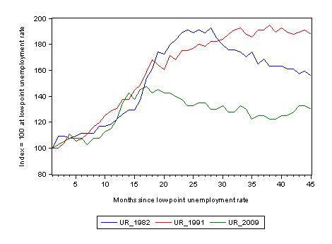
The following graph updates my 3-recessions graph which depicts how quickly the unemployment rose in Australia during each of the three major recessions in recent history: 1982, 1991 and 2009 (the latter to capture the 2008-2010 episode). The unemployment rate was indexed at 100 at its lowest rate before the recession in each case (August 1981; November 1989; February 2008, respectively) and then indexed to that base for each of the months as the recession unfolded.
I have plotted the 3 episodes for 45 months after the low-point unemployment rate was reached. For 1991, the end-point shown is the peak unemployment which was achieved some 38 months after the downturn began although the recovery was painfully slow. While the 1982 recession was severe the economy and the labour market was recovering by the 26th month. The pace of recovery for the 1982 once it began was faster than the recovery in the current period.
It is significant that the current situation while significantly less severe than the previous recessions is dragging on which is a reflection of the lack of private spending growth and declining public spending growth.
The graph provides a graphical depiction of the speed at which the recession unfolded (which tells you something about each episode) and the length of time that the labour market deteriorated (expressed in terms of the unemployment rate).
From the start of the downturn to the 45-month point (to October 2011), the official unemployment rate has risen from a base index value of 100 to a value 130 – peaking at 145 after 21 months. At the same stage in 1991 the rise was 187.5 (and falling) and in 1982 – 155 (and falling overall with monthly variations).
Note that these are index numbers and only tell us about the speed of decay rather than levels of unemployment. Clearly the 5.3 per cent at this stage of the downturn is lower that the unemployment rate was in the previous recessions at a comparable point in the cycle although we have to consider the broader measures of labour underutilisation (which include underemployment) before we draw any clear conclusions.
The notable aspect of the current situation is that the recovery has more or less stalled.
Aggregate participation rate declines marginally
The participation rate fell by 0.1 points in October (from 65.63 in September 2011 to 65.58 per cent in October). So a marginal decline. However, the decline did help keep unemployment from being worse.
The labour force is a subset of the working-age population (those above 15 years old). The proportion of the working-age population that constitutes the labour force is called the labour force participation rate. So changes in the labour force can impact on the official unemployment rate and so movements in the latter need to be interpreted carefully. A rising unemployment rate may not indicate a recessing economy.
The labour force can expand as a result of general population growth and/or increases in the labour force participation rates.
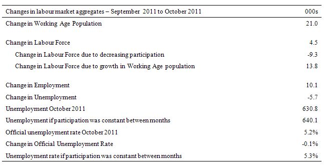
The following Table shows the breakdown in the changes to the main aggregates (Labour Force, Employment and Unemployment) and the impact of the fall in the participation rate.
What impact did the slight decline in the participation rate have? The analysis shows that unemployment would have been 640.1 thousand instead of the lower figure of 630.8 thousand if the participation rate had have stayed constant between the two months. If the workers who left the labour force in October were counted as unemployed then the unemployment rate would have been 5.3 per cent rather than 5.2 per cent.
So the slight decline in the unemployment rate is largely the result of negative participation effects.
Hours worked rise marginally in October
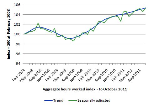
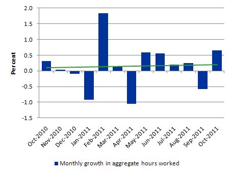
Total monthly hours worked rose by 10.4 million hours in October (0.6 per cent) after falling in September by 9.4 million hours (or 0.6 per cent). wiping out the gains made over the previous two months. After the initial fiscal-driven recovery from the recession, the trend is now flat.
The following graph shows the trend and seasonally adjusted aggregate hours worked indexed to 100 at the peak in February 2008 (which was the low-point unemployment rate in the previous cycle). The rising trend which marked the early recovery courtesy of the fiscal stimulus has now flattened.
The next graph shows the monthly growth (in per cent) over the last 12 months. The green linear line is a simple regression trend and it is suggesting monthly growth rates is very weak although positively trended..
Once again the data doesn’t support the notion of a fully employed labour market that is bursting against the inflation barrier.
Conclusion
It is clear that our economy is doing better than Europe. Which is not to say very much, given the appalling lack of leadership over there.
The October Labour Force data shows that the Australian economic recovery remains very subdued and is not producing any significant growth in employment.
We always have to be careful interpreting month to month movements given the way the Labour Force Survey is constructed and implemented but there has now been enough data over the last several months to tell us that my assessment in the previous paragraph is sound.
Employment growth over the last twelve months has been insufficient to keep pace with the population growth and so despite so-called economic recovery unemployment has been rising. The changes to monetary policy didn’t help but my view is that the withdrawal of the fiscal stimulus was poorly times (too early) and there is a case for a targetted job creation program – especially for youth.
There is still a lot of slack left to be mopped up and the teenage employment problem should be a policy priority. However, the Government is silent on that – almost as silent as it is loud about cutting public spending further to keep their “surplus” pursuits on track.
I guess I will be talking about Europe tomorrow – if it survives overnight!
That is enough for today!
I have noticed over the past couple of months that the official UR has begun to diverge quite significantly from other labour market indicators such as the Roy Morgan index which continues to rise, and the NAB job ad survey which continues to fall. I keep expecting seasonally adjusted unemployment to rise but it keeps confounding my expectations (which is good I hasten to add!). But if other such indicators are anything to go on, the official seasonally-adjusted UR will soon begin to turn upward.
I thought the same thing today Lefty (was expecting 5.3-5.5%) but I figure we’re all on top of things, so we’re not seeing lags but real-time data – the unemployment data will bear us out next month. Then there’ll probably be a slight fall or stability over the christmas period.
The couldn’t care less attitude of our oligarchy and their politician tools to our youth is just another indication of the entrenched short term thinking of this low life crew.
What matters to them is profits,executive remuneration and bonuses.With the majority of the politicians it is getting voted back in when the election time comes around which they celebrate by telling even bigger whoppers then usual.
Yes,we are better off,for the moment,than Europe.But Europe is a classic case of advanced self inflicted injury in the cause of ideologies.Has anything changed from the 19th and 20th centuries? And the masochism continues – who will be the first of the bleeders to break and lead the stampede out of the EMU?
I wouldn’t be surprised if it stablises or even falls slightly over Christmas Senexx – additional retail hiring etc. Of course, “the great moderation” (yeah, right) is over and we are now living in “the great volitility” so it probably isn’t wise to make too many specific forecasts.
Dear Bill,
Regarding the budget surplus, Swan, a subdued Aus. economy and general austerity (Europe and elsewhere) … I present (courtesy of a PragCap commentator) an indigenous analysis:
This site is worth viewing.
http://www.shadowstats.com/
The essential message is that US government economic data is fallacious, particularly the unemployment and CPI statistics. I have long held that the same is true in Australia.
The SGS (Shadow Government Statistics) for the US puts true unemployment at over 20% i.e. Great Depression levels. In Australia, our youth are in an economic Great Depression right now. The stranglehold of neoliberalism and surplus fetishism over our policy must be broken.