In the 1990s, a new industry was created in Australia. It produced nothing. But it…
Australian labour market – relatively steady and defies the RBA reckoning
This week is a big data week. Today the Australian Bureau of Statistics (ABS) released of the latest labour force data (April 13, 2023) – Labour Force, Australia – for March 2023. The March result is weaker than February’s strong outcome but still relatively robust. Employment rose with a bias towards full-time work and kept pace with population growth such that unemployment fell marginally. The employment to population rose modestly. Overall a good result. Some caution needs to be observed though – the underlying (‘What-if’) unemployment rate is closer to 4.9 per cent rather than the official rate of 3.5 per cent, which indicates the labour market still has slack. The downside is that the broad underutilisation rate rose 0.3 points to 9.7 per cent and that means there are still 1,402.7 thousand Australian workers without work in one way or another (officially unemployed or underemployed). That extent of idle labour means Australia is not really close to full employment despite the claims by the mainstream commentators. The falling inflation rate coupled with the steady labour market which is maintaining relatively low unemployment runs counter to the RBA model, that is being used to justify the interest rate hikes. Guess which one is wrong?
In its – Media Release – the ABS noted that:
The seasonally adjusted unemployment rate remained at 3.5 per cent in March … wwith employment increasing by around 53,000 people, and the number of unemployed decreasing by 1,600 people, the unemployment rate remained at a near 50-year low of 3.5 per cent …
… In line with the increase in employment, the employment-to-population ratio increased 0.1 percentage point to 64.4 per cent, with the participation rate remaining at 66.7 per cent. Both indicators were close to their historical highs in November 2022 …
Seasonally adjusted monthly hours worked fell by 0.2 per cent in March 2023, following the strong 3.8 per cent increase in February.
Conclusion: There is no clear sign of any major contraction – yet. It is very much a steady sitution.
While the ABS claims that there is “a tight labour market” and “employers are finding it hard to fill the high number of job vacancies”, the wages data does not reflect that.
The employers are not yet willing to bid for labour at higher wages because they have become conditioned by persistently high levels of slack and low wages growth to get labour on the cheap.
So when they complain they cannot fill vacancies, they are really saying they are not prepared to offer decent wages to attract labour.
Employment rose by 53,000 (0.4 per cent) in March 2023
1. Full-time employment increased by 72,200 and part-time employment fell by 19,200.
2. The employment-population ratio rose by 0.1 point to 64.4 per cent.
Both good outcomes.
However, there is something fishy going on because underemployment rose by 0.4 points (see below) yet all the employment growth was in full-time jobs.
That conjunction doesn’t add up.
The ABS provided a feature article this month – Insights into hours worked, March 2023 – which notes that hours worked fell by 3.2 million hours (see below) and “the proportion of employed people working fewer hours than usual for all reasons increased between February and March 2023”.
But that doesn’t explain the rise in underemployment while full-time employment was growing strongly.
We will have to wait for the ABS to explain that anomaly.
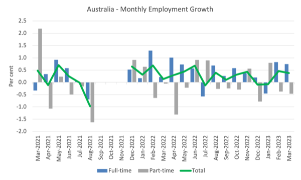
The following graph shows the month by month growth in full-time (blue columns), part-time (grey columns) and total employment (green line) for the 24 months to March 2023 using seasonally adjusted data.
I took out the observations from September to January 2021 – they were outliers due to the Covid wave at that time.
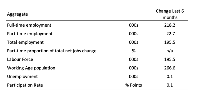
The following table provides an accounting summary of the labour market performance over the last six months to provide a longer perspective that cuts through the monthly variability and provides a better assessment of the trends.
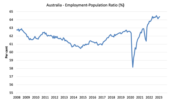
Given the variation in the labour force estimates, it is sometimes useful to examine the Employment-to-Population ratio (%) because the underlying population estimates (denominator) are less cyclical and subject to variation than the labour force estimates. This is an alternative measure of the robustness of activity to the unemployment rate, which is sensitive to those labour force swings.
The following graph shows the Employment-to-Population ratio, since January 2008 (that is, since the GFC).
The ratio ratio rose 0.1 point to 64.4 per cent in March 2023.
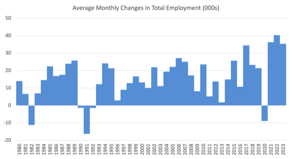
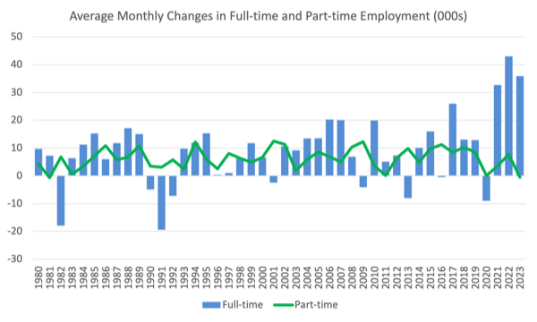
For perspective, the following graph shows the average monthly employment change for the calendar years from 1980 to 2022 (to date).
1. The average employment change over 2020 was -8.9 thousand which rose to 36.3 thousand in 2021 as the lockdowns eased.
2. For 2022, the average monthly change was 40.3 thousand.
3. So far, in 2023, the average change is 35.4 thousand (but that reflects the poor result for January).
The following graph shows the average monthly changes in Full-time and Part-time employment (lower panel) in thousands since 1980.
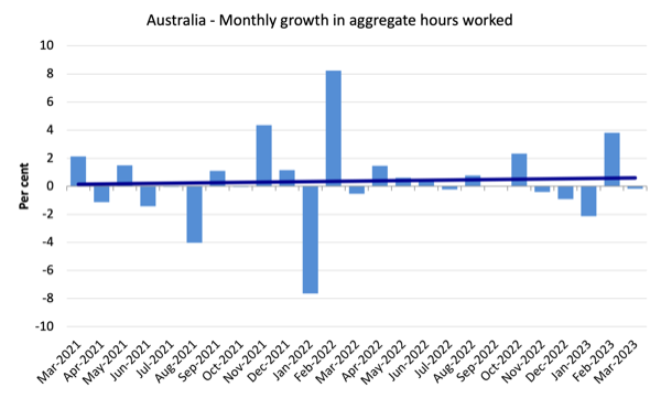
Hours worked fell 3.2 million hours (-0.17 per cent) in March 2023
The following graph shows the monthly growth (in per cent) over the last 24 months.
The dark linear line is a simple regression trend of the monthly change (skewed upwards by the couple of outlier results).
It is now clear that the February result was not characteristic of the state of affairs and the March result is consistent with the relative static picture over the last 12 months.
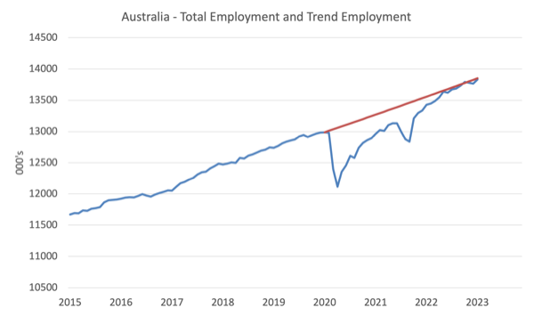
Actual and Trend Employment
The Australian labour market is now larger than it was in March 2020 and employment has just about returned to the pre-pandemic trend.
The following graph shows total employment (blue line) and what employment would have been if it had continued to grow according to the average growth rate between 2015 and April 2020.
In March 2023, the gap fell by 38.9 thousand to just 19.5 thousand jobs.
The Population Slowdown – the ‘What-if’ unemployment analysis
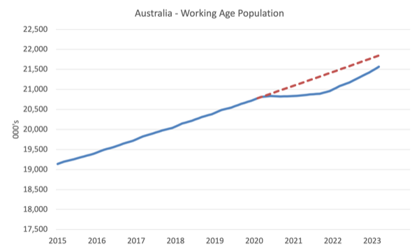
The following graph shows Australia’s working age population (Over 15 year olds) from January 2015 to March 2023. The dotted line is the projected growth had the pre-pandemic trend continued.
The difference between the lines is the decline in the working age population that followed the Covid restrictions on immigration.
The civilian population is 281.8 thousand less in March 2023 than it would have been had pre-Covid trends continued.
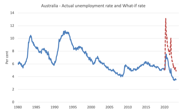
The following graph shows the evolution of the actual unemployment rate since January 1980 to March 2023 and the dotted line is the ‘What-if’ rate, which is calculated by assuming the most recent peak participation rate (recorded at November 2022 = 66.8 per cent), the extrapolated working age population (based on growth rate between 2015 and March 2020) and the actual employment since March 2020.
It shows what the unemployment rate would have been given the actual employment growth had the working age population trajectory followed the past trends.
In this blog post – External border closures in Australia reduced the unemployment rate by around 2.7 points (April 28, 2022), I provided detailed analysis of how I calculated the ‘What-if’ unemployment rate.
So instead of the current unemployment rate of 3.5 per cent, the rate would have been 4.9 per cent in March 2023, given the employment performance since the pandemic.
This finding puts a rather different slant to what has been happening since the onset of the pandemic.
Unemployment fell 1,600 to 507,000 persons in March 2023
So the net employment change essentially kept pace with the population growth.
But, also so bear in mind the ‘What-if’ analysis above and see the impact of the fall in participation below.
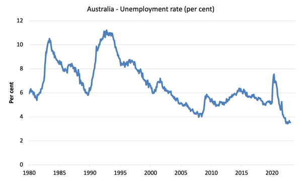
The following graph shows the national unemployment rate from January 1980 to March 2023. The longer time-series helps frame some perspective to what is happening at present.
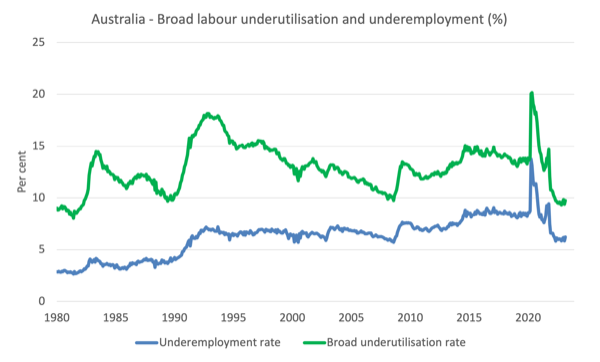
Broad labour underutilisation rises 0.4 points to 9.7 per cent in March 2023
1. Underemployment rose by 0.4 points to 6.2 per cent (a rise of 58.1 thousand).
2. Overall there are 895.6 thousand underemployed workers.
3. The total labour underutilisation rate (unemployment plus underemployment) rose by 0.4 points 9.7 per cent.
4. There were a total of 1,402.7 thousand workers either unemployed or underemployed.
Note: my query of these figures above. Overall, 9.7 per cent of available labour being wasted is not a fully employed state.
The following graph plots the seasonally-adjusted underemployment rate in Australia from April 1980 to the March 2023 (blue line) and the broad underutilisation rate over the same period (green line).
The difference between the two lines is the unemployment rate.
Teenage labour market sterady in March 2023
Teenagers gained 2.3 thousand net jobs in March all full-time. Part-time employment fell slightly.
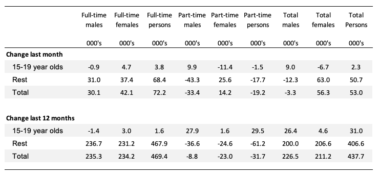
The following Table shows the distribution of net employment creation in the last month and the last 12 months by full-time/part-time status and age/gender category (15-19 year olds and the rest).
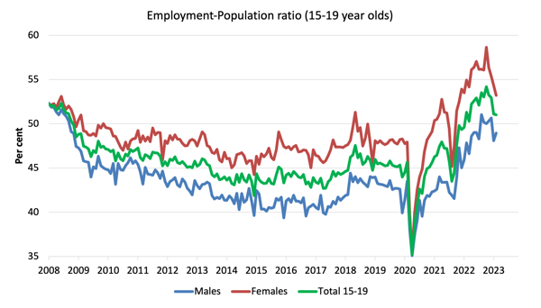
To put the teenage employment situation in a scale context (relative to their size in the population) the following graph shows the Employment-Population ratios for males, females and total 15-19 year olds since June 2008.
You can interpret this graph as depicting the change in employment relative to the underlying population of each cohort.
In terms of the recent dynamics:
1. The male ratio rose 0.9 points over the month.
2. The female ratio fell by 1.1 points.
3. The overall teenage employment-population ratio fell by 0.1 point over the month.
Conclusion
My standard monthly warning: we always have to be careful interpreting month to month movements given the way the Labour Force Survey is constructed and implemented.
My overall assessment is:
1. The March result is weaker than February’s strong outcome but still relatively robust.
2. Employment rose with a bias towards full-time work and kept pace with population growth such that unemployment fell marginally. The employment to population rose modestly. Overall a good result.
3. Some caution needs to be observed though – the underlying (‘What-if’) unemployment rate is closer to 4.9 per cent rather than the official rate of 3.5 per cent, which indicates the labour market still has slack.
4. The downside is that the broad underutilisation rate rose 0.3 points to 9.7 per cent and that means there are still 1,402.7 thousand Australian workers without work in one way or another (officially unemployed or underemployed).
5. That extent of idle labour means Australia is not really close to full employment despite the claims by the mainstream commentators.
That is enough for today!
(c) Copyright 2023 William Mitchell. All Rights Reserved.
Nathan Tankus wrote last year (7th February of 2022) that “Meanwhile, the pandemic became a major real world example of non-financial regulation contracting demand throughout the economy. In orher words, pandemic measures reduce demand which actually required expansionary fiscal policy to ‘offset’.” (New Report: Monetary Policy Without Interest Rates Hikes).
And so central bankers keep telling you that only interest rates hikes can tame demand.
Even the *short-run* Phillips curve, the monetarists’ last redoubt, is being taken from the room on a stretcher (with its buddy, Neoliberalism, jogging close behind).