The Australian Bureau of Statistics (ABS) released the latest labour force data today (APRIL 16,…
Its probably good news …
Today the latest Labour Force data came out from the ABS and it surprised everyone who watches these releases. Employment is up (full-time stronger than part-time); working hours are up; participation is up, unemployment is down and the demand-side outstripped the supply-side, so the unemployment rate falls by 0.1 percentage points. Everything about that is good. Several commentators are now saying that the RBAs decision on Wednesday to put the short-term interest rate up is now vindicated. I don’t think so. Things remain grim and that last thing we need now is any contractionary policy impulse.
The summary results from the September Labour Force estimates are:
- Employment rose by 40,600 but the surprise was that full-time employment increases dominated – 35,400 extra full-time jobs compared to 5,200 extra part-time jobs.
- Unemployment fell by 3,800 and participation increased by 0.1 percentage points.
- The rising demand for labour was greater than the rising supply – and so the official unemployment rate decreased 0.1 pt to 5.7 per cent.
- Finally, working hours rose by 13.4 million hours (or 0.8 per cent).
To guage what might be happening with underemployment I worked out how much of the extra hours was due to the extra full-time jobs and/or rising hours in part-time work. Between August and September total working hours rose by 13403.6 million. If we convert the rise in full-time employment (35,400 thousand) into hours and express that as a percentage of the change in working hours we find that 45.7 per cent of the 13.4 million can be explained by increased full-time jobs.
So the tentative conclusion at this stage is that part-time workers are being offered more hours because the 7.2 million extra hours unaccounted for by the full-time rise cannot be explained by the modest increase in part-time employment over the month. Of-course, you cannot be sure that the extra hours are being given to those who desire more hours but it is probable.
So with participation rates up, unemployment down and (probably) underemployment down – one tentatively concludes that total labour underutilisation fell in the month of September – if so, that is good news.
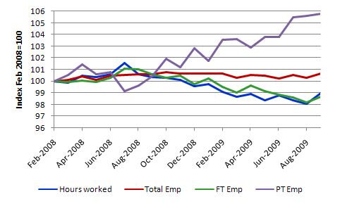
The following graph plots the evolution of the main employment aggregates since the downturn began in February 2008 indexed to 100 at that date. The aggregates are Aggregate monthly hours worked (blue line), total employment (red line), full-time employment (green line), and part-time employment (purple line).
It shows why this is still the underemployment recession with total monthly working hours and full-time employment having contracted significantly while total employment has been held up by relatively strong part-time employment growth (albeit with less hours on offer overall).
Accuracy
The data is based on the Labour Force Survey which is subject to sampling variability. This means that in making the move from the sample estimate to the population estimate errors are introduced. Statisticians use the concept of a standard error to capture the variability that sampling involves. They also deploy the estimated standard errors to construct 95 per cent confidence intervals around the estimate published. So we can be fairly confident that the true value lies within the 95% confidence interval, which is expressed as an upper and lower value of the survey estimate.
The following table is taken from the ABS Labour Force publication and shows the estimate for April 2009 (middle column) and the 95% confidence interval for each of the labour force aggregates (right column). You can see that we could be equally certain that total employment rose by 100,600 as we could be that employment fell by 19,400 in September 2009. The estimated change was 40,600.
You will note that the upper bound on the unemployment rate change was still 0.3 percentage points which means that the expectation of it rising to 6 per cent (from 5.8 per cent) is as valid as the actual figure posted.
The point is that the monthly figures bounce around a fair bit and we will have to wait for another month or so before we can be sure we have reached the peak of the unemployment rate in this cycle. Let’s hope so.
| Labour Force category | Change Aug-Sep | Confidence Interval |
| Total Employment | 40,600 | -19,400 to 100,600 |
| Total Unemployment | -3,800 | -39,200 to 31,600 |
| Unemployment rate | -0.1 pts | -0.5 pts to 0.3 pts |
| Participation rate | 0.1 pts | -0.3 pts to 0.5 pts |
Why?
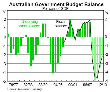
Examine the following graph which is taken from the package of charts that the RBA puts out after the Board meets to determine the interest rate each month. This particular chart is culled from the Output, Expenditure, Activity and Financial Conditions Indicators for the Australian Economy package.
It gives you an idea of why things are different this time around. Compare the fiscal expansion this downturn with that of the 1991 recession which at that time was the worst Australia had faced since the Great Depression. It is clear that the fiscal response was much quicker this time around and came before the labour market had deteriorated considerably.
In 1991, the then smart-a Treasurer kept telling us that it would be a “soft landing” and tried to hang onto his tight fiscal policy as the economy started plunging into a very deep recession. Remember also that interest rates were very high and the RBA refused to bring them down quickly – again acting out the neo-liberal agenda to the hilt.
This time, both arms of macroeconomic policy reacted early and it is almost beyond doubt that the response has saved the economy from a major recession akin to what is going on abroad. The task now is the make sure they do not retrench the stimulus too early. There is still a lot of labour underutilisation to mop up yet and that will take a very strong economy. With households needing to reduce their debt (see graph in the RBA charts packs) then the deficit will be required to finance the savings required to achieve that reduction and keep aggregate demand growing.
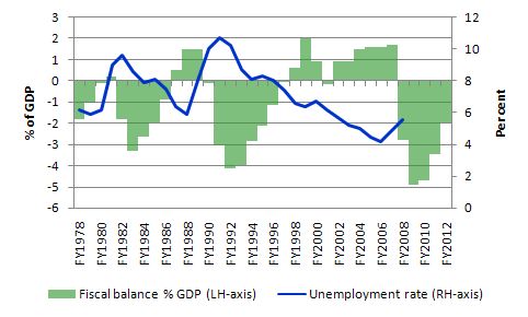
I also plotted the evolution of the unemployment rate onto the fiscal balance data. The clear negative relationship between the two (deficits follow rising unemployment) is driven largely by the automatic stabilisers over this period, given that the neo-liberal macroeconomic policy agenda had taken hold of both major parties by then. But the data reinforces the view that the early timing of the expansion this time has been very beneficial.
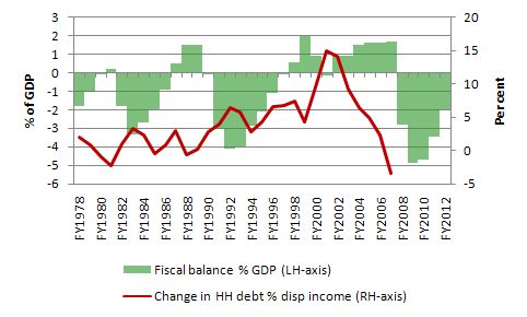
The next graph plots the yearly change in Household debt as a percentage of disposable income (red line) against the fiscal balance. You can see what was happening during the 10/11 years of surpluses under the previous government. As they pushed into surplus, consumption was sustained by a sharp rise in the household debt ratio and as this escalation started to slowdown around 2000, we posted a negative quarter of GDP growth in December 2000, and the fiscal balance went into deficit.
What allowed growth to resume was the unprecedented mining boom that followed and even though the rate of accumulation of the household debt ratio was slowing (but still rising), the government was able to post further surpluses without the economy contracting sharply. This atypical period in our history is now and any attempts to resume that growth strategy (built on household debt) will be short-lived.
The only way the government will be able to reduce its deficits and still allow the private saving ratio to rise (and household debt to systematically fall) would be if China and the other developing, resource-hungry nations drive a huge net exports bonanza.
Tale of two economies
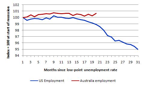
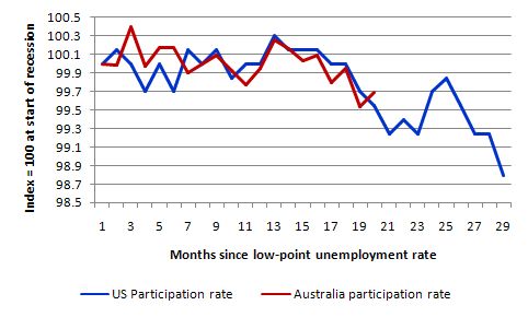
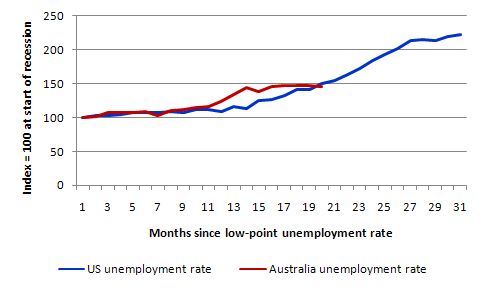
The following graphs compare the US and Australian labour markets up to September 2009 using monthly ABS Labour Force data and monthly BLS data. The graphs are indexed to 100 at the low-point unemployment rate (March 2007 for the US and February 2008 for Australia) and then trail out since then. They show you when in the relative economic downturn, the Australian economy started to deviate in terms of its rate of decline from the US.
The first graph charts the movement in total employment. US employment started to collapse at about the 11th month into the their slowdown whereas Australia has continued to generate net employment albeit the quality of that employment has been compromised (given decline in full-time work and the rising underemployment).
The next graph shows the movement in labour force participation which at the same point in the respective cycles was very similar. A modest decline in both countries. As the employment crisis worsened in the US in the months that followed participation plummetted which indicates that hidden unemployment in the US will have sky-rocketed. Hidden unemployment in Australia has risen a bit but probably not more than a 1 per cent increase which is modest compared to 1991.
Having seen the demand-side and supply-side dynamics, we then put them together to examine the evolution of the US and Australian unemployment rates. This might surprise you. Australia was actually deteriorating more quickly than the US in this regard in the previous few months (as the unemployment rate here jumped sharply in January this year). But you can see that in the last few months it has flattened out and is now signalling recovery whereas the US situation kept getting worse.
Conclusion
Monthly figures can jump around given the sampling variability and the trend series are still suggesting unemployment will rise some more. My guess is that if we see another month in October like this one – more or less stable or slight decline – then we can conclude that unless there is another demand shock (for example, the government starts withdrawing its fiscal stimulus) then the unemployment rate for this cycle may have peaked.
But there is still a lot of labour slack to wipe out and with the worst out of the way this is the perfect chance to target public sector job creation to really push unemployment and underemployment down.
The unexpected growth has reduced their estimates of the budget deficit anyway (via the automatic stabilisers) so some $15 billion would hardly be noticed by anyone other than the unemployed who gained jobs as a result.
Further, I note today that the investment bankers are claiming the RBA will push rates up by 0.50 per cent in November. I hope not. But then you can hardly say they have exercised good judgement in the past of the rate movements that they control.
Overall, its probably good news on the labour market front today.
hi bill,
would be interested to get your take on the lateline interview of prof lacy hunt last night.
especially his thoughts on the government expenditure multiplyer tending towards zero over time, and hence the long term ineffectiveness of government stimulus,
and crowding out due to government financing of deficits,
more neo classical nonsense??
re peter green, i’ll check him out,
much obliged
Of course, those arguing that the RBA was right to put up interest rates wouldn’t mention that today’s labour force data represents a compilation of what has been occurring BEFORE the rate rise a couple of days ago so that any negative effects will take a little while to show anyway.
We may have not (yet) seen the paragigm shift we were hoping for out of this but I think there has been a significant victory – the power of deficit spending at staving off the worst effects of downturns has been clearly demonstrated and polling shows that the public overwhelmingly agrees. That has to be a step in the right direction.
Dear Lefty
The role of fiscal policy has definitely been demonstrated. The challenge is to understand it in a broader framework – that is what modern monetary theory is all about. Once we understand that – then we will all think differently about deficits/surpluses – including the idea that deficits are about bad times and surpluses are the norm. In fact, surpluses lead to bad times (normally) and deficits (normally) are about living well for all.
best wishes
bill
Promising and unexpected news. And for me this is especially true, for personal reasons. But I will repeat the old proverb: it’s bad luck to count the chicks before they hatch.
And I will try to argue my reservations (although I agree in general lines with you, Bill). I have to two observations.
First observation:
Indeed, as you explained, this is a point estimate obtained from a sample. But the series is also seasonally adjusted, which may introduce some noise. This explains that the adjustment factors are routinely re calculated.
As a matter of fact, paragraph 26 [1] of the Explanatory Notes ends with this specific warning: “This means that month-to-month movements of the seasonally adjusted estimates may not be reliable indicators of trend behavior”.
But there is a further detail: as you mentioned, the 95% confidence intervals are
Employment status Change Confidence Interval
Total Employment 40,600 -19,400 to 100,600
Total Unemployment -3,800 -39,200 to 31,600
From these intervals one can safely infer that Total Employment did increase: the interval is 120,000 wide and only 1/6 (19.4/120) of it would correspond to a decrease in employment consistent with the sample.
But it’s much riskier to conclude that Total Unemployment fell: the interval is 70,800 wide, but 44.63% of it is positive. This means that an increase in Unemployment is still consistent with this sample.
Now, what kind of sense can one make of this? In my opinion, the key could be in the increase of the Participation Rate: people, who had not been actively searching for a job, got one.
Second observation:
Now, what follows is pure speculation and I warn everybody that I am neither an economist nor a statistician: although the series is seasonally adjusted, maybe an unusually strong recruitment drive before X-mas could have something to do with the sudden availability of jobs: in “economese” it would account for a unexpectedly higher demand of labor.
And if households were bracing themselves for an interest raise, this could explain that additional family members, previously not looking for a job, started job hunting. That’s the supply side.
In any case, it seems to me that we’ll have to wait at least until the next survey is conducted, and I would not be surprised that a more conclusive picture had to wait until the X-mas season is over.
Maybe some light could also be provided by statistics on bankruptcy. Are there any figures available, anyone? I would also suggest a closer look at current household debt.
This need to wait, of course, is consistent with the advise given by the Explanatory Notes themselves.
Regards,
Marco
[1] 6202.0 Labour Force, Australia Sep-2009. Explanatory Notes.
http://www.abs.gov.au/AUSSTATS/abs@.nsf/Lookup/6202.0Explanatory%20Notes1Sep%202009?OpenDocument
Actually, after some more thought and some web surfing, I found another possible explanation: maybe there is a mistake in the ABS figures. Not a typo, but in their methodology.
By Ockham’s razor, this explanation should be better than the one I proposed, as it’s simpler. But it’s not necessarily easier to disprove.
Regards,
Marco
After giving all this news some more thought there is something odd: we should be expecting the unemployment situation -in general- to improve. That was to be expected -according to MMT, as in the graph Bill included above- and, after all, it was the very justification given by the RuddBot to the stimulus package, following his own economists’ advice.
What may be surprising is that it came so early (in the shape of the increase in Total Employment), but leaving Total Unemployment basically untouched!
About the “early” recovery, well, as Bill says, the stimulus came early (although it was not applied all at once). But why did it not reduce Total Unemployment? Could it be just a fluke?
In consequence, my previous “explanation” has to be wrong. The Total Employment new jobs should be in principle recovery jobs, created by the stimulus itself. Probably this reinforces the finding that there appears to be an increase in the worked time by Part Timers.
But then, what about the housing situation?
And I wonder the reaction of the RBA: by starting to raise interest rates -even if it in itself had no major negative effects- it may put political pressure on the Commonwealth Government to prematurely wind down the still unspent portion of the stimulus package. The Federal Opposition is squealing for this. And even the more moderate economic commentators and journalists seem to take this for granted.