In the 1990s, a new industry was created in Australia. It produced nothing. But it…
US labour market remains fairly robust
Last week’s (January 4, 2019) release by the US Bureau of Labor Statistics (BLS) of their latest labour market data – Employment Situation Summary – December 2018 – showed that total non-farm payroll employment rose by 312,000 and the unemployment rate rose by 0.2 points to 3.9 per cent on the back of a 0.2 points rise in the participation rate. The coincidence of rising employment and rising participation is usually a good sign as workers are being attracted back into the labour force by the increased job opportunities. We will see in the next few months whether that is a one-off blip or a sustained trend. If it is a sustained trend then the rise in unemployment as a consequence of the labour force growth outstripping employment growth will be temporary and sustained reductions in unemployment will then occur. While the US labour market is looking fairly robust there is still a substantial jobs deficit remaining which tells us that it remains some distance from full employment. There is room for expansion.
Overview for December 2018
- Payroll employment rose by 312,000.
- Total labour force survey employment rose by 142 thousand in net terms.
- The seasonally adjusted labour force rose by 419 thousand which pushed the unemployment rate up.
- Official unemployment rose by 276,000 to 6.294 million.
- The official unemployment rate rose by 0.2 points to 3.9 per cent).
- The participation rate rose by 0.2 points to 63.1 per cent but remains well below the peak in December 2006 (66.4 per cent). Adjusting for age effects, the rise in those who have given up looking for work for one reason or another since December 2006 is around 3,585 thousand workers. The corresponding unemployment rate would be 5.8 per cent, far higher than the current official rate.
- The broad labour underutilisation measure (U6) remained steady at 7.6 per cent.
For those who are confused about the difference between the payroll (establishment) data and the household survey data you should read this blog – US labour market is in a deplorable state – where I explain the differences in detail.
Payroll employment trends
The BLS noted that:
Total nonfarm payroll employment increased by 312,000 in December. Job gains occurred in health care, food services and drinking places, construction, manufacturing, and retail trade. Payroll employment rose by 2.6 million in 2018, compared with a gain of 2.2 million in 2017.
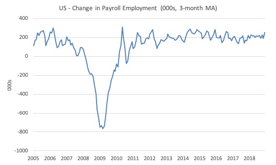
The first graph shows the monthly change in payroll employment (in thousands, expressed as a 3-month moving average to take out the monthly noise).
The monthly changes were stronger in 2014 and 2015, and then dipped in the first-half of 2016. By the end of 2016, job creation was stronger but then it tailed off again, somewhat.
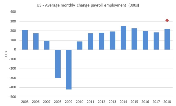
The next graph shows the same data in a different way – in this case the graph shows the average net monthly change in payroll employment (actual) for the calendar years from 2005 to 2018.
The red diamond is the current month’s increase.
The slowdown that began in 2015 continued through 2017 and 2018 so far appears to have reversed that trend, with the current average for 2018 (220 thousand) higher than the 2017 average.
The average change in 2017 was 182 thousand, down from the 195 thousand average throughout 2016.
The average net change in 2014 was 250 thousand, in 2015 it was 226 thousand.
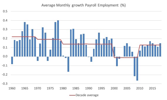
To put the current recovery into historical perspective the following graph shows the average annual growth in payroll employment since 1960 (blue columns) with the decade averages shown by the red line.
It reinforces the view that while payroll employment growth has been steady since the crisis ended, it is still well down on previous decades of growth.
Labour Force Survey – employment growth remains positive
In December 2018, employment as measured by the household survey rose by 142 thousand net (0.09 per cent) while the labour force rose by 419 thousand (0.26 per cent).
As a result, total unemployment rose by 276 thousand and the unemployment rate rose by 0.2 points to 3.86 per cent.
The combination of positive employment growth and rising participation is a good conjunction.
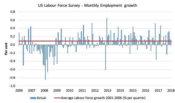
The next graph shows the monthly employment growth since the low-point unemployment rate month (December 2006). The red line is the average labour force growth over the period December 2001 to December 2006 (0.09 per cent per month).
Summary conclusions:
1. There is still no coherent positive and reinforcing trend in employment growth since the recovery began back in 2009. There are still many months where employment growth, while positive, remains relatively weak when compared to the average labour force growth prior to the crisis or is negative.
2. The December growth rate (0.09) was down on the November rate (0.14 per cent).
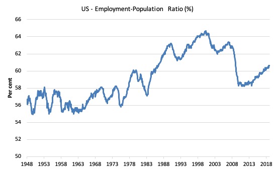
A good measure of the strength of the labour market is the Employment-Population ratio given that the movements are relatively unambiguous because the denominator population is not particularly sensitive to the cycle (unlike the labour force).
The following graph shows the US Employment-Population from January 1970 to December 2018. While the ratio fluctuates a little, the December 2018 ratio was steady at 60.6 per cent.
It has risen by 0.5 points since the beginning of 2018 but has been steady for the last three months.
Over the longer period though, we see that the ratio remains well down on pre-GFC levels (peak 63.4 per cent in December 2006), which is a further indication of how weak the recovery has been so far and the distance that the US labour market is from being at full capacity (assuming that the December 2006 level was closer to that state).
Unemployment and underutilisation trends
The first graph shows the official unemployment rate since January 1950.
It is clear that the US labour market is reaching unemployment rates not seen since the late 1960s.
The unemployment rate rose in December despite the employment growth because the participation rate rose on the back of the sustained improvement in labour market conditions. However, the supply response outstripped the rise in demand and hence official unemployment rose.
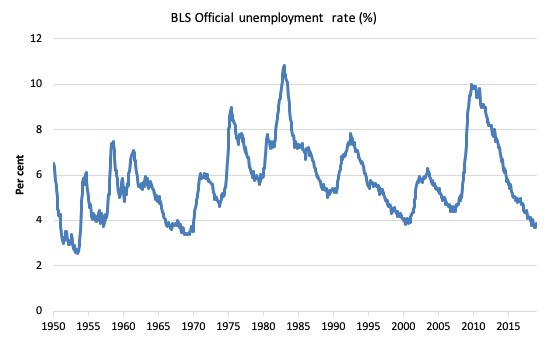
The official unemployment rate is a narrow measure of labour wastage, which means that a strict comparison with the 1960s, for example, in terms of how tight the labour market, has to take into account broader measures of labour underutilisation.
The next graph shows the BLS measure U6, which is defined as:
Total unemployed, plus all marginally attached workers plus total employed part time for economic reasons, as a percent of all civilian labor force plus all marginally attached workers.
It is thus the broadest measure of labour underutilisation that the BLS publish.
In December 2006, before the effects of the slowdown started to impact upon the labour market, the measure was estimated to be 7.9 per cent.
After a period of steady decline over the first part of 2018, it is now at 7.6 per cent and has been steady at that rate for the last two months.
The U-6 measure is marginally below the pre-GFC level but remains above the trough of the early 2000s.
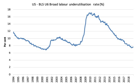
That provides a quite different perspective in the way we assess the US recovery and challenges the view that the US economy is close to full employment.
The US jobs deficit
The current participation rate of 63.1 per cent is a long way below the most recent peak in December 2006 of 66.4 per cent.
When times are bad, many workers opt to stop searching for work while there are not enough jobs to go around. As a result, national statistics offices classify these workers as not being in the labour force (they fail the activity test), which has the effect of attenuating the rise in official estimates of unemployment and unemployment rates.
These discouraged workers are considered to be in hidden unemployment and like the officially unemployed workers are available to work immediately and would take a job if one was offered.
In most advanced nations, the population is shifting towards older workers who have lower participation rates – so the US is not special in this regard.
Thus some of the decline in the total participation rate could simply being an averaging issue – more workers who have a lower participation rate as a proportion of the total workforce.
In this blog post (November 7, 2017) – Updating the impact of ageing labour force on US participation rates – I estimated that about 61 per cent of the decline in the participation rate since January 2008 has been due to non-cyclical shifts in the demographic weights (shifting age composition).
That still leaves a significant cyclical response.
Adjusting for the demographic effect would give an estimate of the participation rate in December 2018 of 64.4 per cent if there had been no cyclical effects (up from the current 63.1 per cent).
This would give an adjusted unemployment rate of 5.77 per cent rather than 3.86 per cent, if all the ‘hidden’ unemployed (since December 2006) were to be counted among the official unemployed.
To compute these job gaps we have to set a ‘full employment’ benchmark. I have set this at 3.7 per cent, which is where the US labour market reached in November 2018.
I explain in this blog post – US labour market – strengthened in February but still not at full employment (April 13, 2018) – is the best case scenario given that I actually think the cyclical losses are much worse than I provide here.
Using the estimated potential labour force (controlling for declining participation), we can compute a ‘necessary’ employment series which is defined as the level of employment that would ensure on 3.7 per cent of the simulated labour force remained unemployed.
This time series tells us by how much employment has to grow each month (in thousands) to match the underlying growth in the working age population with participation rates constant at their January 2008 peak – that is, to maintain the 3.7 per cent unemployment rate benchmark.
In the blog post cited above (US labour market – strengthened in February but still not at full employment), I provide more information and analysis on the method.
There are two separate effects:
- The actual loss of jobs between the employment peak in November 2007 and the trough (January 2010) was 8,582 thousand jobs. However, total employment is now above the January 2008 peak by 10,350 thousand jobs.
- The shortfall of jobs (the overall jobs gap) is the actual employment relative to the jobs that would have been generated had the demand-side of the labour market kept pace with the underlying population growth – that is, with the participation rate at its January 2008 value and the unemployment rate was constant at 3.7 per cent. This shortfall loss amounts to 5,142 thousand jobs.
The following graph shows the US Jobs Gap, which depicts the gap between current employment and the level of employment that would have generated a 3.7 per cent unemployment rate, given current population trends.
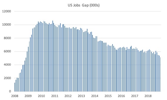
This reinforces the conclusion we reached above that the US labour market, while now enjoying a low official unemployment rate has not fully recovered from the GFC.
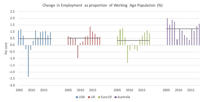
International Comparison
I was interested in seeing how the US labour market was generating jobs (as a proportion of its Working age population) relative to the UK, the Eurozone (19) and Australia.
The following graph tells the story.
I computed the annual change in employment as a proportion of the previous year’s working age population (to scale the changes) from 2005 to 2018.
The grey horizontal line is just the average ratio for each geographic entity (0.48 per cent for the US; 0.54 for the UK; 0.35 for the Eurozone, and 1.21 for Australia).
The results show that the US experienced the largest shock but recovered more quickly and have sustained a stable rate of relative employment change since then.
The UK had a milder (but severe) downturn and prolonged its negative effects as a result of the Obsorne austerity. More recently, the relative employment change has also been slowing (well before Brexit).
The Eurozone is the standout poor performer – an lower overall average performance, an extended (austerity-driven) recession and fairly modest comeback.
Australia bucks the trend but still demonstrates the damaging effects of fiscal austerity. The fiscal stimulus in 2009 saved the economy from the recession but when the then Treasurer, Wayne Swan bowed to pressure to pursue a fiscal surplus in 2011 the economy dived.
Conclusion
The December BLS labour market data release for the US tells me that the US labour market remains fairly robust.
Caution should always be exercised given the volatility of the monthly data.
Total non-farm payroll employment rose by 155,000 and the unemployment rate rose by 0.2 points to 3.9 per cent on the back of a 0.2 points rise in the participation rate.
The coincidence of rising employment and rising participation is usually a good sign as workers are being attracted back into the labour force by the increased job opportunities.
We will see in the next few months whether that is a one-off blip or a sustained trend.
If it is a sustained trend then the rise in unemployment as a consequence of the labour force growth outstripping employment growth will be temporary and sustained reductions in unemployment will then occur.
While the US labour market is looking fairly robust there is still a substantial jobs deficit remaining which tells us that it remains some distance from full employment.
There is room for expansion – preferably, not in the form of any wall-like constructions anywhere!
That is enough for today!
(c) Copyright 2019 William Mitchell. All Rights Reserved.
A concern I have voiced repeatedly on this most excellent blog is whether the numbers concerning jobs and employment used to make various calculations and estimates reflect, in any manner, what I consider to be perhaps the gravest problem with the post-GFC economy in the U.S. and elsewhere; namely, the substitution of precarious gig or temp-type jobs (with low pay and little if any benefits) for what used to be solid well-paying jobs (with both implied job security and ample benefits). While this substitution was well underway prior to the GFC, I have the impression (perhaps falsely) that the recent global recession only sped up and intensified this disturbing trend. Could someone please help out this economic ignoramus by letting me know which numbers I should be looking at, in an analysis like the one Bill provides above, to gauge the progress (or regress) of this trend of substitution of crappy jobs for decent ones? If I, as a worker, go from the the latter to the former, I may still be considered “employed,” but doesn’t this designation focus only on quantity at the expense of quality? I know that Bill has said a great deal about this unfortunate situation, but I just can’t seem to understand how it is shown, if at all, in the overall periodic employment analyses that Bill so generously provides to us.
Yes the quality of jobs not only the number of jobs is important. Are economists also allowed to consider the type of work being done. For example if people are being employed to dig their grand childrens graves does that count as a job? Or does it only count as a job when they are digging their childrens graves? Or is that a question that economists are not allowed to ask because it is a sociological or archeological question?
If the (sacred) people want to take more trips to Las Vegas to see the shows, and the hotel rooms are running at a high occupation rate, more hotels should be built in Las Vegas, right? After all if that is what the (sacred) people want, it is the job of the economy and the government to give to them, right?
If more jobs are created delivering fresh beef from the Brazilain rainforest on overnight Fed Ex flights
to the Candadian Trunda piloted by retired US Air Force pilots on planes manufactured in the EU should economists be concerned about the balance of trade about the balance of trade or is that a distraction from the domestic economies job producing capablities of the countries involved? After all if it is being done that means that the people in the Canadian Trunda can afford it. It is not the job of (mainsteam) economists to question whether or not those making enough money in the Canadian trunda should be allowed to eat juicy fresh redblooded beef grown in a swelthering environment. Nor is it anyones business to question how it is that these Canadians are making their money as long as it is legal.
Nor is it anyones business to question whether or not beef grown in Brazil should stay in Brazil to make the price of beef for their own population more affordable. After all the Lnadowners are free to marry whomever they choose. Selling their beef is a private enterprise akin to marriage. Therefore it should naturally be beyond question that these landowners be allowed to sell their produce to the more well endowed northerners. These landowners certianly did not take anything away from the Brazilans that belonged to the Brazilians, right? Nor is it anyones business to question who it is who actually owns the land in the Brazilians rainforest that the beef gets fat on. If it a Chinese or Japanese firm and we question how it is that a Chinese or Japanese MNC managed to buy up Brazilian rainforest we would call in to question at least two sacred cows. We better not do that.