The income and wealth inequality that continues to grow in most advanced nations has led…
US labour market – the recovery is now stalling
The US Bureau of Labor Statistics published the latest – Employment Situation – September 2015 – on October 2, 2015, and the data shows a weakening labour market overall. At least it will silence the squad that are calling for higher interest rates for a time. The data shows that after 7 years of recovery mode employment growth is now starting to slow and it is likely that the change in employment in 2015 will be less than the annual change last year. All the main indicators were weak – employment, participation fell, hours of work fell, earning growth was zero – which is consistent with an overall slowdown. In seasonally adjusted terms, total payroll employment increased by 142,000 in September while the Household Labour Force Survey data showed that employment fell by 236 thousand. In the first 9 months of 2015, the average monthly change in non-farm payroll employment has been 198,000 whereas the corresponding figure for 2014 was 260,000. The unemployment rate was unchanged at 5.1 per cent but would have been higher had not the participation rate fallen by 0.2 percentage points to 62.4 per cent. The participation rate is now at its lowest level since September 1977 The other sign that the labour market is weaker is that the Employment-Population ratio fell slightly to 59.2 per cent (from 59.4 per cent). There is also evidence that a significant proportion of the jobs that are being created are in low pay, precarious areas of the labour market.
For those who are confused about the difference between the payroll (establishment) data and the household survey data you should read this blog – US labour market is in a deplorable state – where I explain the differences in detail.
Focusing on the Household Labour Force Survey data, the seasonally adjusted labour force fell by 350 thousand in September 2014, while employment fell by 236 thousand, meaning that unemployment fell by 114 thousand.
But the unemployment rate was stable at 5.5 per cent but would have risen had not the participation rate fallen by 0.2 percentage points to 63.4 per cent.
We will see next month when the BLS revises the data how they reconciled the rise in payroll employment with the fall in Labour Force survey employment.
The most likely reason for the slowdown in employment growth relate to the slowdown in world trade as China attempts to engineer its rebalancing act to a stable inflation growth path driven by domestic demand.
As sales decline, so does employment. It is clear from survey data that manufacturing orders are falling in the US and that situation is unlikely to change in the near future.
There was no growth in average earnings which means that the low inflation environment will continue and the US Federal Reserve will be in no hurry to push up interest rates.
The participation rate of 62.4 is now at its lowest level since September 1977, although the slump then was mostly cyclical, whereas the declining participation rate over the last decade has also including ‘averaging’ effects of the ageing population (see below).
Employment is now likely to grow by less than it did in 2014, the first year that will have happened since the recovery from the GFC began.
The bright spot is that underemployment declined somewhat meaning that the broader measures of labour underutilisation eased a little.
However, while the underemployment level fell, it remains the case that there are historically large numbers of people who cannot get enough hours of work.
Employment growth faltering
In September 2015, employment fell by 0.16 per cent, while the labour force fell by 0.22 per cent. The latter decline meant that the underlying population growth of 0.10 per cent was not strong enough to offset the decline in the participation rate as workers exited the labour force, mainly as a result of the stagnant employment outlook.
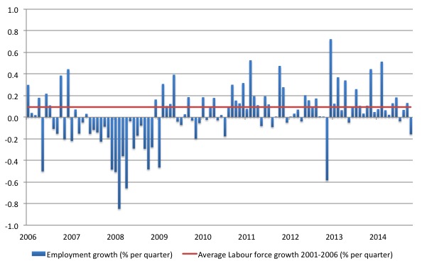
The following graph shows the monthly employment growth since the low-point unemployment rate month (December 2006). The red line is the average labour force growth over the period December 2001 to December 2006 (0.094 per cent per month). The unemployment rate rises if the employment growth is below the labour force growth rate.
What is apparent is that a strong positive and reinforcing trend in employment growth has not yet been established in the US labour market since the recovery began back in 2009. There are still many months where employment growth, while positive, remains relatively weak when compared to the average labour force growth prior to the crisis.
The situation will look decidedly weaker when (and if) the labour force participation rate reverts back to its past behaviour.
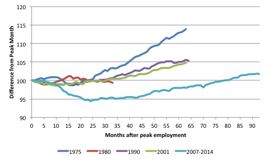
As a matter of history, the following graph shows employment indexes for the US (from US Bureau of Labor Statistics data) for the five NBER recessions since the mid-1970s.
They are indexed at the NBER peak (which doesn’t have to coincide with the employment peak). We trace them out to 64 months or so, except for the first-part of the 1980 downturn which lasted a short period.
It was followed by a second major downturn 12 months later in July 1982 which then endured. The current downturn has lasted 93 months and employment only returned to an index value of 100 in June 2014, which was last achieved in December 2007.
The previous recessions have returned to the 100 index value after around 30 to 34 months.
Since June 2014, total employment in the US has only grown by 1.7 per cent, a very slow growth rate.
Federal Reserve Bank – Labour Market Conditions Index (LMCI)
The Federal Reserve Bank of America has been publishing a new indicator – Labor Market Conditions Index (LMCI) – which is derived from a statistical analysis of 19 individual labour market measures since October 2014.
It is now being watched by those who want to be the first to predict a rise in US official interest rates. If the latest data from the LMCI is a guide to potential interest rate movements then they won’t be rising any time soon.
You can get the full dataset HERE.
I discussed the derivation and interpretation of the LMCI in this blog – US labour market weakening.
A rising value is a sign of an improving labour market, whereas a declining value indicates the opposite.
At present the LMCI value is at zero and declining.
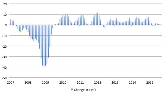
The next graph shows the monthly changes in the LCMI from January 2007 to July 2015.
To put the current period into perspective, the next graph shows the entire history of the LMCI (from August 1976 to September 2015).
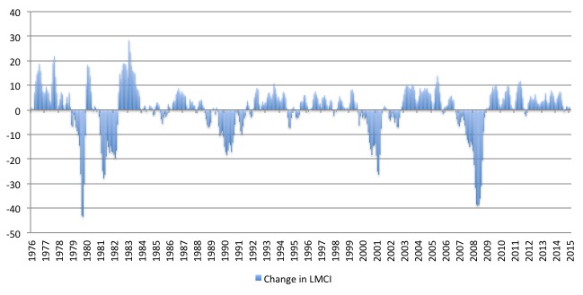
The conclusion is that the current labour market is relatively weak (compared to last year). To understand that we note that while unemployment is now lower than last year, the rate of hiring is also slower and the way these factors combine in the index leads to an overall assessment that the labour market is in decline.
The US jobs deficit
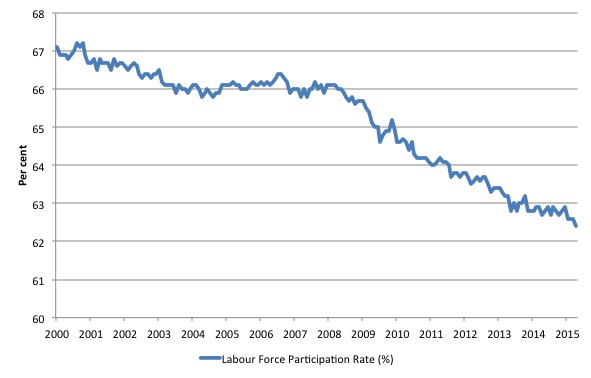
What really is striking about the last few years in the US is the falling participation rate. In September 2015, the participation rate fell by a further 0.2 percentage points.
The following graph shows the decline in labour force participation since January 2001 in the US.
The labour force participation rate is the proportion of the working age population that is either employed or unemployed.
The fall in participation since December 2006 has been stark – from 66.4 per cent to 62.4 per cent in September 2014, a decline of 4 percentage points.
In terms of the current working age population that amounts to some 10 million workers who have exited the labour force since December 2006. Remember that the official unemployment is only 7.9 million workers.
When times are bad, many workers opt to stop searching for work while there are not enough jobs to go around. As a result, national statistics offices classify these workers as not being in the labour force (they fail the activity test), which has the effect of attenuating the rise in official estimates of unemployment and unemployment rates.
These discouraged workers are considered to be in hidden unemployment and like the officially unemployed workers are available to work immediately and would take a job if one was offered.
But the participation rates are also influenced by compositional shifts (changing shares) of the different demographic age groups in the working age population. In most nations, the population is shifting towards older workers who have lower participation rates.
Thus some of the decline in the total participation rate could simply being an averaging issue – more workers are the average who have a lower participation rate.
I analysed this declining trend in this blog – Decomposing the decline in the US participation rate for ageing.
I updated that analysis to September 2015 and computed that the decline in the participation rate due to the shift in the age composition of the working age population towards older workers with lower participation rates accounted for about 58 per cent of the actual decline.
So if there had been no ageing effect the current participation rate would be 65.3 per cent rather than the actual rate in September 2015 of 62.4 per cent.
Thus, even if we take out the estimated demographic effect (the trend), we are still left with a massive cyclical response.
What does that mean for the underlying unemployment?
The labour force changes as the underlying working age population grows and with changes in the participation rate.
If we adjust for the ageing component of the declining participation rate and calculate what the labour force would have been given the underlying growth in the working age population if participation rates had not declined since December 2006 then we can estimate the change in hidden unemployment since that time due to the sluggish state of the US labour market.
The current unemployment rate is 5.5 per cent. Taking out the demographic effect of the falling participation rate, gives an adjusted unemployment rate of 7.4 per cent (if the participation rate had not declined due to cyclical factors since December 2006).
That puts an entirely different spin on the recovery to date.
To hold the unemployment rate constant with the participation rate at its peak, employment has to expand at a rate equal to the net new entrants into the labour force.
That is, has to keep pace with the underlying growth in the working age population adjusted for participation rate changes.
The following graph shows the actual labour force since January 2007 (green line), which reflects the declining labour force participation rate and contrasts it with what the labour force would have been if the participation rate had have remained at its January 2007 peak of 66.4 per cent (blue line).
The blue line is thus driven by the underlying changes in the working age population.
However, as discussed above, demographic changes have been a driving force in the declining participation rate. I modelled those changes using fixed-weight analysis and adjusted the potential labour force accordingly.
The red line shows what the labour force would have been if the participation rate had not been negatively affected by the cyclical downturn. So it nets out the ageing effect of the declining participation rate.
The difference between the green (actual) and red (potential net of ageing) lines gives an idea of the cyclical damage that has occurred on the labour supply side of the US labour market.
The gap between the lines is an estimate of the additional hidden unemployment that has occurred.
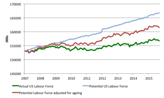
The peak participation rate occurred in January 2007 (66.4 per cent). It has steadily fallen since then and in September 2015 it was 62.4 per cent. Adjusting for the demographic effect would give an estimate of the participation rate in September 2015 of 64.3 if there had been no cyclical effects.
So the 2.1 percentage point decline in the participation rate (net of ageing effect) amounts to 5,274 thousand workers who have left the labour force as a result of the cyclical sensitivity of the labour force.
It is hard to claim that these withdrawals reflect structural changes (for example, a change in preference with respect to retirement age, a sudden increase in the desire to engage in full-time education).
In January 2007 (at the peak participation rate which had carried over from December 2006), the US unemployment rate was 4.6 per cent (which was slightly higher than the 4.4 per cent low point recorded a month earlier in December 2006. It didn’t start to increase quickly until early 2008 and then the jump was sudden.
We can have a separate debate about whether 4.4 per cent constitutes full employment in the US. My bet is that if the government offered an unconditional Job Guarantee at an acceptable minimum wage there would be a sudden reduction in the national unemployment rate which would take it to well below 4.4 per cent without any significant inflationary impacts (via aggregate demand effects).
So I doubt 4.4 per cent is the true irreducible minimum unemployment rate that can be sustained in the US.
But we will use it as a benchmark so as not to get sidetracked into definitions of full employment. In that sense, my estimates should be considered the best-case scenario given that I actually think the cyclical losses are much worse than I provide here.
For those mystified by this statement – it just means that I think the economy was not at full employment in December 2006 and thus was already enduring some cyclical unemployment at that time.
Using the estimated potential labour force (controlling for declining participation), we can compute a ‘necessary’ employment series which is defined as the level of employment that would ensure on 4.4 per cent of the simulated labour force remained unemployed.
This time series tells us by how much employment has to grow each month (in thousands) to match the underlying growth in the working age population with participation rates constant at their January 2007 peak.
I computed the ‘necessary’ employment series for the unadjusted potential labour force and the age-adjusted potential labour force, corresponding to the blue and red lines in the previous graph, respectively.
The following graph compares the two ‘necessary’ employment series with the actual US employment. The former series starts at January 2007. The actual employment data is graphed from January 2003 to show perspective.
The dark green uses the unadjusted potential labour force and the light green uses the age-adjusted potential labour force series.
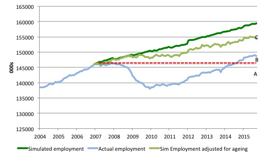
This allows us to calculate how far below the 4.4 per cent unemployment rate (constant participation rate) the US employment level is.
There are two effects:
- The actual loss of jobs since the employment peaked in January 2008 and the trough was in October 2009 – a fall of 8,365 thousand jobs. The AB gap in the graph shows the gap in employment relative to the January 2008 peak (the dotted red line is an extrapolation of the peak employment level). You can see that it wasn’t until July 2014 that the US labour market closed that gap. By September 2015, the AB gap is estimated to be minus 2,322 thousand jobs.
- The loss of the jobs that would have been generated had the demand-side of the labour market kept pace with the underlying population growth – that is, with the participation rate at its peak and the unemployment rate constant at 4.4 per cent. That loss amounts to 8,090 thousand jobs. This is the segment BC measured as at September 2015.
The total jobs that would need to be created to unwind the cyclical damage caused by the crisis is thus 5,668 thousand (approximately 5.6 million). This is the sum of the segments AB + BC or simply segment AC.
Conclusion
While the US fiscal deficit has remained large enough to support some growth and allow some confidence to be regained in the private sector the signs are that the private sector recovery is slowing on the back of a deteriorating international situation.
The result is that employment growth is now stalling and the underlying state of the labour market is entering a new phase of fragility.
At present, all the signs are gloomy but as always, monthly data swings around and we will have to wait to see whether this negative trend consolidated.
But it is pretty clear that on the current pace, the total growth in employment in 2015 will be less than it was in 2014.
Notice
I am flying to Europe this afternoon and I will mostly be out of range. So comments that require moderation will not be dealt with until I get a connection again. So please be patient.
That is enough for today!
(c) Copyright 2015 Bill Mitchell. All Rights Reserved.
The flaws in theory and the economic absurdities left unresolved by them are coalescing. The world is in a race between Wisdom and Destruction, evolution and paradigm change or failure to confront these necessities and at best a limping future, at worse chaos and war in an age of modern weaponry.
Paradigm changes appear to be absurdities to those with lingering orthodoxies and/or a lack of confidence to embrace Wisdom, but it is always orthodoxy that is actually the absurdity and Wisdom that invokes the needed insight. Let us have a Wisdomics whose policies are an integration of reductionism and philosophy aligned with freedom for the individual and free flowingness of the system, and that factor all relevant truths and possibilities.
Similar opinion on the slowing of the recovery seems to held by some economists in the US.
The nature of the employment people are finding is not encouraging either. While some may find full time work, when it’s broken down into categories, many of the occupations that are coming into greater demand pay too little for the worker to become a significant contributer to aggregate demand.
Some employment is still better than no employment. Perhaps someday a lot of 30 somethings might finally be able to leave their parents basement and start purchasing things.
It will be interesting to see how the new TPP deal will affect things. I think I heard that something like 50% of the content traded within the trade zone will still be allowed to come from nonparticipating countries? Manufacturing labor will still be offshore if this is true. The stock casinos sure went wild though.
J Christensen,
“slowing of the recovery”
In a mainstream economist’s glossary of terms this can be translated as ” what recovery?”
When you hear them talk about “soft landings” you know we really are in the sh** !
Your name sake Roger Mitchell’s monetary soveirgnty site produces
a graph showing the previous 18 recessions in the U.S. have been preceded
by falling government sector deficits.The graph is currently predicting a recession.