I started my undergraduate studies in economics in the late 1970s after starting out as…
Being beguiled by labour force data
I said the other day that I would avoid the US debate for a while. So to wean myself off it I have gone to the other extreme. Local! Today the Australian Bureau of Statistics released their Detailed Labour Force data for June 2011, which always follows a week after the preliminary national estimates are released. Among that data release are the regional estimates which provoke considerable interest because they relate to localised areas where the local lobby groups – like real estate developers, chamber of commerces, and the like are always keen to seize on the data to promote their own agendas. So typically they will seize on some easy to understand single indicator and pronounce forth when, in fact, a more detailed analysis shows that the situation is exactly the opposite to what they are claiming. This generally happens when the unemployment rate falls and they tell everyone things are good (which of-course advances their own interests). So I thought I would just document (again) this issue as a way of further educating the public in the prudent use of labour force data. Things are not always what they seem.
The local Newcastle media is not shy in talking up the local economy and often quote business lobby groups and a local private research institute (which I consider just reflects the voice of business who provide them with contracted research opportunities). I am a regular commentator in the local media and typically present a very different view to that offered by the business interests which includes property developers who are intent on getting their hands on as much public space as they can for private gain.
I am often attacked by these interest for suggesting that their claims that the local economy is booming are overstated – to put it politely. I have always seen my role to be an independent academic researcher and commentator and to portray events and developments as accurately as I can without hyperbole. The vested interests, however, rarely like this level of scrutiny or truth.
Today’s data release is no exception. And it provides us with a good vehicle for explaining how the labour force framework is structured. I did a radio segment a few weeks ago where I was asked to treat the audience as students and to explain the way labour market data is compiled. This is a regular feature the public broadcaster runs and is very popular (I am told). Apparently, my segment was of great interest.
It is clear that the general public struggle to put all the components of the labour market data together. The interviews I did today confirmed the point – given the local unemployment rate fell this month “wasn’t that great news for the region?” I was asked several times by journalists and/or radio show hosts.
The Hunter Region
Newcastle is the 7th largest city in Australia (population 288,732 in 2006) and is at the mouth of the Hunter River. It is an old industrial town (steel) and dominates the region. The Hunter region or Hunter Valley as it is known has a population of 645,395 persons in 2006.
It is often stated that the region is one of those favoured by the so-called “once-in-a-hundred-years” mining boom that Australia is meant to be enjoying. The reality is a little different but the region is faring better than in the past. It used to be home of the BHP steelworks which shut down in stages over the last two decades of the last century. Thousands of jobs were lost in that closure.
The other two major industries are coal mining and wine production.
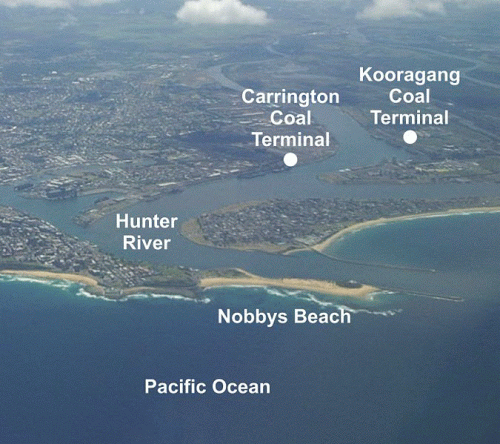
Here is the mouth to the Port and the large coal loading terminals that fill the ships up on a 24 hours a day basis. Japan is Newcastle’s largest customer for coal. On the ocean side is my favourite surf beach – Nobby’s. I live a few minutes from there.
And here is the daily queue of ships that waits out to see to get access to the port. Recently, the waiting times for ships held in Newcastle’s vessel queue has been around 10-11 days with around 28 boats being loaded per week. At times, we have counted many more ships than that in the queue extending for as far as the eye can see down the coast towards Sydney.
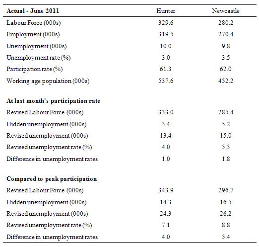
Anyway, today’s labour force data – for the region came out and I summarised the changes in the last month in the following Table. The relevant data is Table 16. Labour force status by Regions and Sex.
The press are seizing on the decline in the unemployment rate which they are claiming is evidence of the impact of the mining boom. In my interviews today I pointed out that rather than showing the regional labour market is in good shape the data actually is masking very disturbing trends.
So how do I conclude that?
Labour Force Framework
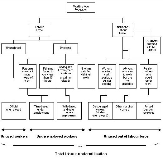
The following diagram summarises the labour force framework which is the foundation for cross-country comparisons of labour market data. The framework is made operational through the International Labour Organization (ILO) and its International Conference of Labour Statisticians (ICLS). These conferences and expert meetings develop the guidelines or norms for implementing the labour force framework and generating the national labour force data.
The rules contained within the labour force framework generally have the following features:
- an activity principle, which is used to classify the population into one of the three basic categories in the labour force framework.
- a set of priority rules, which ensure that each person is classified into only one of the three basic categories in the labour force framework.
- a short reference period to reflect the labour supply situation at a specified moment in time.
The system of priority rules are applied such that labour force activities take precedence over non-labour force activities and working or having a job (employment) takes precedence over looking for work (unemployment). Also, as with most statistical measurements of activity, employment in the informal sectors, or black-market economy, is outside the scope of activity measures.
Paid activities take precedence over unpaid activities such that for example ‘persons who were keeping house’ as used in Australia, on an unpaid basis are classified as not in the labour force while those who receive pay for this activity are in the labour force as employed. Similarly persons who undertake unpaid voluntary work are not in the labour force, even though their activities may be similar to those undertaken by the employed.
The category of ‘permanently unable to work’ as used in Australia also means a classification as not in the labour force even though there is evidence to suggest that increasing ‘disability’ rates in some countries merely reflect an attempt to disguise the unemployment problem.
In terms of those out of the labour force, but marginally attached to it, the ILO states that persons marginally attached to the labour force are those not economically active under the standard definitions of employment and unemployment, but who, following a change in one of the standard definitions of employment or unemployment, would be reclassified as economically active.
Thus for example, changes in criteria used to define availability for work (whether defined as this week, next week, in the next 4 weeks etc.) will change the numbers of people classified to each group. This also provides a great potential for volatility in series and thus there can be endless argument about the limits applied to define the core series.
According to ILO concepts, a person is unemployed if they are over a particular age, they do not have work, but they are currently available for work and actively seeking work. Unemployed people are generally defined to be those who have no work at all.
Unemployment is therefore defined as the difference between the economically active population (civilian labour force) and employment. The unemployment rate refers to the number of unemployed persons as a percentage of the civilian labour force. The inference is that the economy is wasting resources and sacrificing income by not providing enough opportunities for the unemployed to be involved in productive activity.
As shown in diagram above there are other avenues of labour resource wastage that are not captured by the unemployment rate as defined in this manner. The persons represented in these other avenues of resource wastage may be either in or out of the labour force.
In this blog – given the nature of the regional data (not very detailed – only gives employment, unemployment, participation rates) – I will focus on the transitions between the labour force and not in the labour force.
If you examine the Diagram above and trace down the Not in the Labour Force category you will see a group defined as “Workers wanting work, available but not seeking”.
These workers are called discouraged workers (also called the hidden unemployed) and are statistically classified as being not in the labour force. The international guidelines suggest, however, that for persons not in the labour force, the relative strength of attachment to the labour market be measured.
Thus persons marginally attached to the labour force are those not economically active under the standard definitions of employment and unemployment, but who, following a change in one of the standard definitions (of employment or unemployment), would be reclassified as economically active.
From the perspective of underutilised labour resources, the issue is whether those classified as being out of the labour force have characteristics similar to those who are classified as being in the labour force but unemployed.
In Australia, marginally attached are those who want to work and are actively looking for work but not available to start work in the reference week, or those who are not actively looking for work but who are available to start work within four weeks.
Discouraged workers are a sub-group of the marginally attached. They want to work and are available for work (under the same terms as the unemployed) but believe that search activity is futile given the poor state of the labour market.
The discouraged (not in the labour force) worker is thus more like the unemployed (in the labour force) worker than they are, for example, like a retired person or a child in full-time education.
I have written several articles about this topic. Here is an early one (1999) which you can read in Working Paper form for free – Estimating Hidden Unemployment in Australia and the United States – which outlines a methodology that can be used.
In this blog the approach is even simpler. The thought process is this.
Analysis of the data
The aggregates are:
WAP = Working Age Population (all over 15 year olds).
LF = Labour Force.
(t) = now
PR = Participation rate which is the percentage of the WAP that is in the LF.
HU = Hidden Unemployment
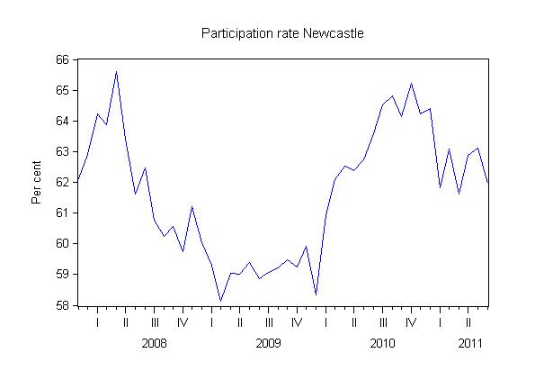
Consider this graph which shows the labour force participation rate for Newcastle from November 2007 to June 2011. The huge swings are almost certainly cyclical in nature – reflecting the discouraged worker effect.
Computations:
1. At the peak of the last boom participation rates should have been maximised. The drop in participation rates as the economy entered recession and has slowly started to recover is mostly due to the discouraged worker effect.
2. So we can approximate that cyclical effect by comparing what the labour force would have been now if the participation rate had have been at its previous peak. The difference is the hidden unemployment estimate.
The formula would be: WAP(t)*PR(peak) = revised LF(t)
So: HU = Revised LF(t) – LF(t)
3. We can then add the hidden unemployed to the current unemployed number to get a “revised unemployment level” (in 000s).
The formula is: Revised unemployment = UN(t) + HU.
4. We can then compute what the unemployment rate would be if the hidden unemployed were included in the labour force (that is, if the participation rate was still at its peak level and employment growth was at its current rate).
The formula is: Revised unemployment rate (%) = 100*(UN(t) + HU)/(LF(t) + HU).
The following Table shows this sort of computation for two participation rate assumptions: (a) if the Participation Rate was at last month’s level; (b) if the Participation Rate was at its previous peak (April 2008)
In terms of the change in the last month, while the actual fall in the Newcastle unemployment rate was 1.2 percentage points (seasonally adjusted), if the participation rate had have remained constant between the months (that is, at 63.1 per cent rather than dropping to 62 per cent), then the unemployment rate would have been 5.3 per cent rather than 3.5 per cent.
So the labour market is not only not producing enough jobs (slightly negative employment growth = 0.2 per cent) in the last month, but 5,200 workers gave up looking and left the labour force.
It is true, that they might have returned to full-time education or retired, but that source of labour force decline in the last month is unlikely.
The situation would be much worse if participation rates had have remained at their previous peak (April 2008). For the Hunter the peak was 64 per cent and for Newcastle 65.6 per cent. Their respective values in June 2011 is shown in the Table (61.3 and 62 per cent, respectively).
The final part of the Table shows what would have happened now if there had have been no adverse cyclical effects on the participation rate and the labour force had have grown in line with the underlying population growth.
The unemployment rate for Newcastle in June 2011 would have been 8.8 per cent if we added in the 16.5 thousand discouraged workers. The current level of unemployment in Newcastle was recorded as 3.5 thousand but there is an additional 16.5 thousand workers languishing outside the labour force because there is not enough work being created and they have given up looking.
So that makes the situation look very different.
To see these cyclical effects in a different way I produced two graphs.
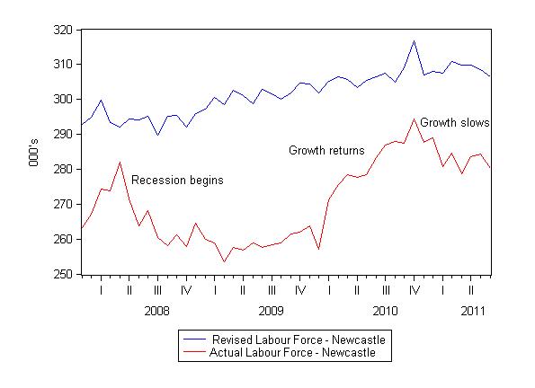
The first one shows the actual labour force for Newcastle from November 2007 to June 2011 (the span of the recently available data). That is the red line. You can see the huge cyclical swings in the labour force as participation rates have dropped, recovered and started dropping again.
The blue line is what the labour force would have been, given underlying population growth, if the participation rate had have remained at its April 2008 peak throughout the period. The difference between the two lines is the discouraged worker effect (almost certainly).
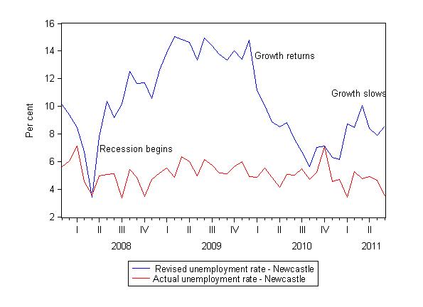
The next graph then shows you what the unemployment rate history over the same period would have been if we had have added the hidden unemployed into the labour force and recomputed the unemployment rate.
The lower red line is the evolution of the actual unemployment rate and local commentators made much of this – saying that the recession had not impacted much at all on the local economy.
The upper blue line is the evolution in the unemployment rate that would have occurred if the discouraged workers were added into the labour force. It present a much different story.
With the so-called mining boom now in full swing – the local Newcastle economy is actually going backwards while the official unemployment rate suggests it is improving.
The explanation lies in understanding the participation rate effects which are usually ignored by the local press and business commentators.
Conclusion
Anyway, that got me out of the American data for a day at least. I read some of the latest news from the US this morning and decided enough is enough.
But while I went local today the principles of the analysis apply everywhere at every level. Labour force data is often mis-used and it is a good thing if the public become more educated on how the data is compiled and what the different categories in the framework imply.
The reality is that sometimes a falling unemployment rate is a very bad sign.
Carbon Tax etc
I did an interview on the Radio National program – Bush Telegraph – on Tuesday (July 12, 2011) about the impact of the carbon tax on investment in clean energy to flow to regional areas. Bush Telegraph is a program that focuses on regional issues in Australia.
The context was the decision by the Federal Government to allocated $A10 billion dollars for renewable energy projects through the new Clean Energy Finance Corporation as a result of the revenue they will raise from the newly announced Carbon Tax.
The question I was asked was will “the switch to clean technology be able to replace job losses in coal mines and coal-fired power plants?”.
Here is the audio from that segment.
That is enough for today!


Bill – can you please give your blessing on the economic laws I am proposing. Essentially what I have done is forced all “economic speak” into binary language since money is essentially digital and then applied 1) the law of conservation and then 2) the theory of constraints to monetary operations.
Austin’s Law of Monetary Equilibrium: Monetary equilibrium at any level of public spending for a government under a nonconvertible, floating exchange rate, fiat-based currency system requires offsetting spending with tax revenues while balancing deficits at a rate corresponding to the currency users’ rate of savings.
Austin’s Law of Fiscal Optimization: – you can read this one on Issuer-User Paradigm
Thanks
DollarMonopoly.com
Bill, do you have anything to say about the latest report from the OBR in the UK: http://www.guardian.co.uk/business/2011/jul/13/age-austerity-continue-decades-obr
To me, the idea of making planning decisions to cope with future trends is sound enough, but the idea of netting up future liabilities into a “net present value” is completely meaningless. How do we know what meaning this figure has when we don’t know the economic future?
Dear gastro george (at 2011/07/14 at 21:47)
I read it today unfortunately. I was nearly going to write something but then the regional labour force data came out and saved me.
I will reflect on it next week. The OBR presents an argument that is logical once you accept a totally erroneous and illogical starting point. It is amazing how grown adults can write and think this stuff.
I guess they are feeling a little overshadowed by the idiotic discussion the other side of the Atlantic and want to up the ante – they must be want some attention.
best wishes
bill
The link to “Estimating Hidden Unemployment in Australia and the United States” (1999) isn’t working for me. If other readers have the same problem, this URL will link you to the paper’s abstract, which has a link on it the paper itself:
http://e1.newcastle.edu.au/coffee/publications/wp2.cfm?id=4
That puts it in 8th spot. If you want to get ahead of Canberra you have to include the rest of the Hunter region.
Dear Aidan (at 2011/07/14 at 1:44)
There are two ways that the Australian Bureau of Statistics defines an urban area:
1. The ABS defines a Statistical Division as an area under the unifying influence of one or more major towns or cities. The Statistical Division called Newcastle had a population 546,788 in June 2010 making it the 7th largest city in Australia (the Canberra-Queanbeyan was 8th at 410,419 with Canberra as a subset at 358,600).
2. The ABS defines an Urban Centres as being a population cluster of 1,000 or more people. The urban centre of Newcastle had a population of 288,732 in June 2010 making it the 8th largest city in Australia (Canberra was 7th at 356,120).
Reference: http://www.abs.gov.au/ausstats/abs@.nsf/Latestproducts/3218.0Main Features12009-10
So I was mixing my regional definitions when I noted we were the 7th largest city. We are and we are not is the answer! Thanks for the observation it made me check this up which was good.
best wishes
bill
Hi Bill,
It would be interesting to see the same or similar analysis of Newcastle and Hunter region Labour force statistics back to the 70s or 80s. In particular, the performance of the region coming out of the early 90s recession, into the closure of the steelworks in 1999 then into the mining boom beginning in around 2003-2004 when the thermal coal price more than doubled. I guess investment for that would have begun flowing through somewhat after that.
Of course the region has benefited tremendously from the long boom since the early 90s recession. I would also think that the labour market is at one of it’s most healthy positions for this region in the last 30 years (at least since the oil crisis and the loss of the post war labour consensus) but I have no way to confirm that (unless total labour underutilisation values were calculated for the region).
Nevertheless, excellent to see a post on the local economy Bill.
Cheers,
R.