Today (June 3, 2026), the Australian Bureau of Statistics (ABS) released the latest - Australian…
Australian economy now slightly above the March 2020 level as growth continues
The data release from the Australian Bureau of Statistics of the – Australian National Accounts: National Income, Expenditure and Product, March 2021 (released June 2, 2021) – shows that the Australian economy grew by a healthy 1.8 per cent in the March-quarter after growing by 3.2 per cent in the December-quarter 2020. Further, the economy is now 1.1 per cent larger than it was at the outset of the pandemic in March 2020. Household consumption growth is positive but subdued. Fiscal support is declining. But business investment is now recovering and is a really positive sign. Several sectors are still struggling and renewed outbreaks of the virus in recent weeks will further create these disparities. I consider there is still need for expanded fiscal support.
The main features of the National Accounts release for the March-quarter 2020 were (seasonally adjusted):
- Real GDP increased by 1.8 per cent for the quarter. The annual growth rate was 1.1 per cent
- Australia’s Terms of Trade (seasonally adjusted) rose by 7.4 per cent in the quarter and was up by a very strong 15.4 per cent over the 12 month period. This is due to higher export prices for our primary commodities (iron ore).
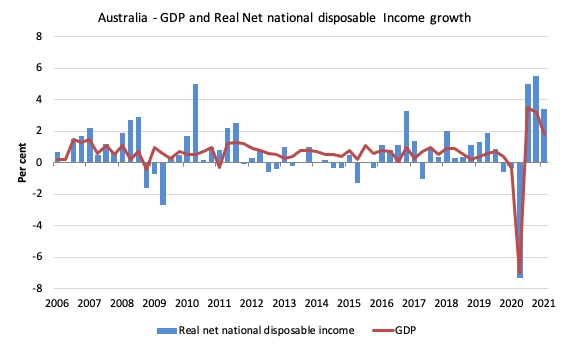
- Real net national disposable income, which is a broader measure of change in national economic well-being rose by 3.4 per cent for the quarter and was 6.1 per cent higher over the 12 months, which means that Australians are better off (on average) than they were at that point 12 months ago. A lot of that is due to the terms of trade effect.
- The Household saving ratio (from disposable income) decreased from 12 per cent to 11.6 per cent as the uncertainty over employment and health reduced and household spending resumed. It remains above recent trends.
Overall growth picture – the recovery continues
The ABS – Press Release – said that:
With 1.8% growth in the March quarter 2021, Australian economic activity has recovered to be above pre-pandemic levels and has grown 1.1% through the year …
Private investment rose 5.3 per cent and contributed 0.9 percentage points to growth. Machinery and equipment investment recorded its strongest quarterly rise since December 2009, driven by the continued improvement in business confidence and support from Government tax incentives …
Household spending increased 1.2 per cent and added 0.7 percentage points to growth.
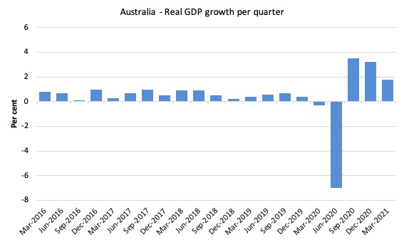
The first graph shows the quarterly growth over the last five years.
The massive 2020 outlier renders graphs like this rather binary and suppress the variations in the growth performance in prior quarters.
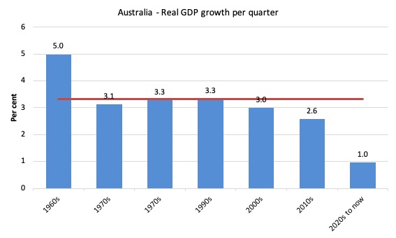
To put this into historical context, the next graph shows the decade average annual real GDP growth rate since the 1960s (the horizontal red line is the average for the entire period (3.2 per cent) from the March-quarter 1960 to the March-quarter 2020).
The 2020-to-now average is obviously is the average for the first 5 quarters of this decade and has been dominated by the pandemic.
I put the data labels in the graph because it is harder to differentiate the decades given the flattening effect of the current outlier.
It is obvious then how far below historical trends the growth performance of the last 2 decades have been as the fiscal surplus obsession has intensified on both sides of politics.
Even with a massive household credit binge and a once-in-a-hundred-years mining boom that was pushed by stratospheric movements in our terms of trade, our real GDP growth has declined substantially below the long-term performance.
Analysis of Expenditure Components
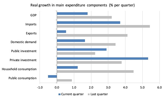
The following graph shows the quarterly percentage growth for the major expenditure components in real terms for the December-quarter 2020 (grey bars) and the March-quarter 2020 (blue bars).
Points to note:
1. The pre-Pandemic growth performance was already weak.
2. Household Consumption expenditure rose by 1.2 per cent in the March-quarter (lower than previous quarter). Over the last 12 months, it has remained static, which means it has recovered to the March 2020 level.
3. General government consumption expenditure rose by 0.5 per cent in the March-quarter and by 5 per cent over the 12 months. The fiscal stimulus is now tapering.
4. Private investment expenditure growth rose (surprisingly) by 5.3 per cent for the quarter and by 3.6 per cent over the year. This is a major shift after nearly a decade of supressed non-mining business investment.
5. Public investment rose by 2.9 per cent for the quarter and by 4.9 per cent for the year.
6. Export expenditure rose by 0.5 per cent in the March-quarter but fell by 6.2 per cent over the 12 months. Imports rose by 3.7 per cent for the quarter and were 1 per cent higher over the year.
Contributions to growth
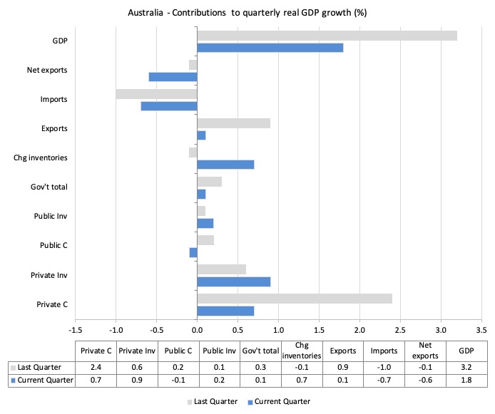
What components of expenditure added to and subtracted from the 7 per cent decline in real GDP growth in the March-quarter 2020?
The following bar graph shows the contributions to real GDP growth (in percentage points) for the main expenditure categories. It compares the March-quarter 2021 contributions (blue bars) with the December-quarter 2020 (gray bars).
In no order:
1. Household consumption expenditure contributed 0.7 points to the overall growth which is subdued relative to pre-pandemic levels.
2. Private investment expenditure contributed 0.9 points to growth. A major positive shift.
3. Growth in inventories were a contractionary force by 0.1 points. Stocks are depleting quickly as shortages emerge.
4. Public consumption contributed negative 0.1 points as major fiscal support was withdrawn. Public investment contributed positive 0.2 points. Overall, the government sector contributed 0.1 points.
5. Net exports reduced growth by 0.6 points – because the contribution of exports (0.1 points) was offset by the import effect (-0.7 points) (remember imports are a drain on expenditure).
Material living standards rose significantly in March-quarter 2020
The ABS tell us that:
A broader measure of change in national economic well-being is Real net national disposable income. This measure adjusts the volume measure of GDP for the Terms of trade effect, Real net incomes from overseas and Consumption of fixed capital.
While real GDP growth (that is, total output produced in volume terms) rose by 1.8 per cent in the March-quarter 2021, real net national disposable income growth rose by 3.4 per cent.
How do we explain that?
There was a rise in employee compensation (of 1.5 per cent), which helped boost household disposable income.
Further the terms of trade improved quite sharply. Australia once again floats on the back of the primary commodity wealth.
The following graph shows the evolution of the quarterly growth rates for the two series since the March-quarter 2006.
Household saving ratio falls from 12.2 to 11.6 per cent as household spending returns
As more opportunities to spend opened up with the pandemic restrictions being relaxed, household consumption expenditure has improved but remains overall subdued.
The following graph shows the household saving ratio (% of disposable income) from the March-quarter 2000 to the current period. It shows the period leading up to the GFC, where the credit binge was in full swing and the saving ratio was negative to the rise during the GFC and then the most recent rise.
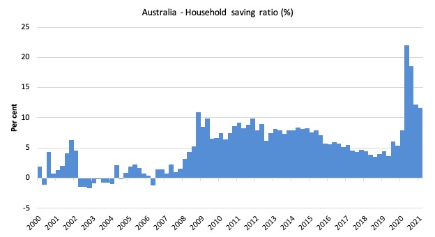
While the saving ratio might appear to be still very high, if we take a longer term view of it, the behaviour is less ‘historic’ than we might think. Back in the full employment days, when governments supported the economy and jobs with continuous fiscal deficits (mostly), households saved significant proportions of their income.
In the neoliberal period, as credit has been rammed down their throats, the saving rate dropped (to negative levels in the lead-up to the GFC).
Hopefully, households are paying off the record levels of debt they are now carrying and improving their financial viability.
To put the more recent period into an historical context, the next graph shows the household saving ratio (% of disposable income) from the March-quarter 1960 to the current period.
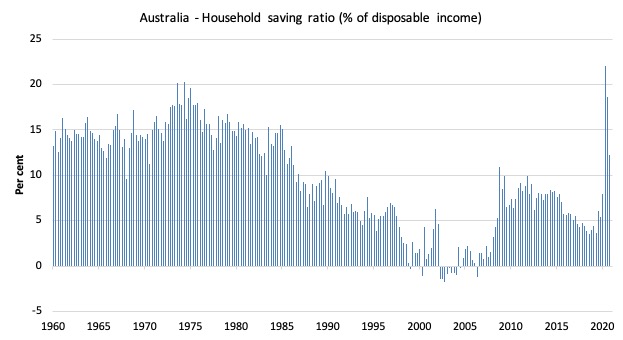
The following table shows the impact of the neoliberal era on household saving. These patterns are replicated around the world and expose our economies to the threat of financial crises much more than in pre-neoliberal decades.
The result for the current decade (2020-) is the average from March 2020 (5 quarters to date).
| Decade | Average Household Saving Ratio (% of disposable income) |
| 1960s | 14.3 |
| 1970s | 16.1 |
| 1980s | 12.0 |
| 1990s | 5.4 |
| 2000s | 2.2 |
| 2010s | 6.42 |
| 2020- | 14.5 |
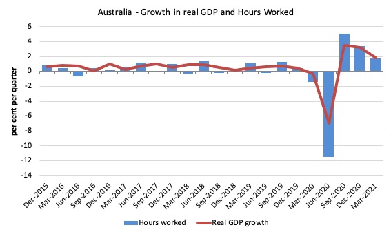
Real GDP growth and hours worked
The following graph presents quarterly growth rates in real GDP and hours worked using the National Accounts data for the last five years to the March-quarter 2021.
The March-quarter data shows that both output and hours worked is tapering downwards towards pre-pandemic levels.
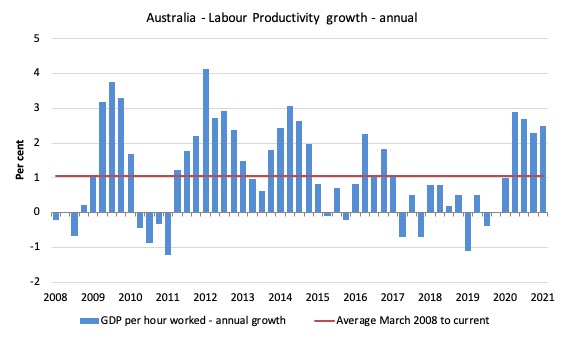
To see the above graph from a different perspective, the next graph shows the annual growth in GDP per hour worked (labour productivity) from the March-quarter 2008 quarter to the March-quarter 2021. The horizontal red line is the average annual growth since March-quarter 2008 (1.1 per cent), which itself is an understated measure of the long-term trend growth of around 1.5 per cent per annum.
The relatively strong growth in labour productivity in 2012 and the mostly above average growth in 2013 and 2014 helps explain why employment growth was lagging given the real GDP growth. Growth in labour productivity means that for each output level less labour is required.
Current growth suggests that workers who were on short-time and limited activity during the major lockdowns in 2020 are now being more fully utilised.
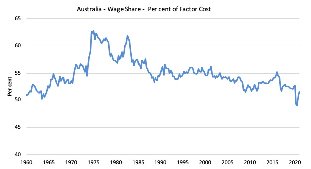
The distribution of national income – slight recovery in the wage share
The wage share in national income grew marginally by 0.7 points to 51.6 per cent – coming off a record low of 49 per cent in the September-quarter 2020.
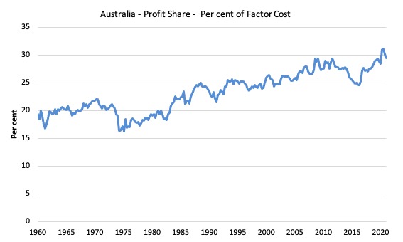
The first graph shows the wage share in national income while the second shows the profit share.
The declining share of wages historically is a product of neoliberalism and will ultimately have to be reversed if Australia is to enjoy sustainable rises in standards of living without record levels of household debt being relied on for consumption growth.
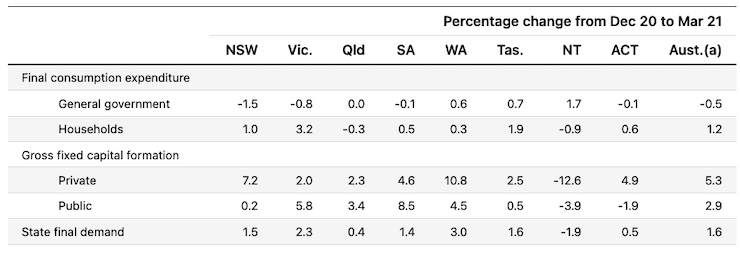
The change in final demand at the State/Territory level
The following table (taken from the ABS – thanks) shows the states/territories final demand trends for the March-quarter 2021.
While Victoria is recovering from its harsh lockdown last year and outstripping the other jurisdictions bar Western Australia (which is floating on the terms of trade boom being a mining state), it is anyone’s guess, at present, what the effect of the current (now to be at least) 2 week strict lockdown in Victoria will be.
Conclusion
Remember that the National Accounts data is three months old – a rear-vision view – of what has passed and to use it to predict future trends is not straightforward.
The recovery in real GDP growth in the March-quarter continues after the first few large spikes in the last two quarters if 2020.
The economy is now 1.1 per cent above where it was at the outset of the pandemic in March 2020.
Household consumption growth is positive but subdued.
Fiscal support is declining.
Business investment is now recovering and is a really positive sign.
That is enough for today!
(c) Copyright 2021 William Mitchell. All Rights Reserved.
This Post Has 0 Comments