The recent extreme weather in the northern hemisphere, the twin monster tropical storms in Japan,…
US labour market in dire straits – overheating potential – zero
Payroll employment highly subdued. 408 thousand workers exit the labour force due to lack of jobs. Overheating potential zero. In last month’s assessment – US labour market – things are getting worse again as the virus spreads (January 18, 2021) – I predicted things would get worse given the trajectory of the virus. I have formed a strong view that nations have to deal with the health issue before they can expect the economy to open up again. No nation can ignore a spiralling death rate and avoid some restrictions which damage the economy. The evidence demonstrates that the nations that have largely suppressed the virus are doing the best in economic terms. Last Friday (February 5, 2021), the US Bureau of Labor Statistics (BLS) released their latest labour market data – Employment Situation Summary – January 2021 – which is consistent with my prediction. Payroll employment growth has slowed rapidly (only increasing by 49 thousand). But the labour force survey data is a bit difficult to interpret this month due a population benchmarking changes (see below). In terms of the household survey, employment rose by 201 thousand and the labour force was reduced by 408 thousand, meaning that official unemployment fell by 606 thousand and the unemployment rate fell by 0.4 points. Taking out the population control effect, the labour force shrank by 200 thousand. While the signals are a little confused, the data is showing there is no strong recovery going on at the moment as the health crisis intensifies. There is an elevated degree of excess capacity. I consider that the US will have to stabilise the health situation before they will be able to sustain any economic recovery. And we can disregard New Keynesian macroeconomists who are suffering from attention deficit problems it seems, and claiming that the economy is close to overheating and cannot absorb the proposed stimulus from the new Administration. The stimulus is actually too little!
Overview for January 2021:
- Payroll employment increased by 49,000.
- Total labour force survey employment rose by 201 thousand net (0.13 per cent).
- The seasonally adjusted labour force fell by 408 thousand (0.25 per cent).
- Official unemployment fell by 606 thousand to 10,130 thousand
- The official unemployment rate fell by 0.4 points to 6.3 per cent.
- The participation rate fell by 0.1 points to 61.4 per cent.
- The broad labour underutilisation measure (U6) fell by 0.6 points to 11.1 per cent, as the part-time for economic reasons cohort (the US indicator of underemployment) fell by 2161 thousand (3.5 per cent).
For those who are confused about the difference between the payroll (establishment) data and the household survey data you should read this blog post – US labour market is in a deplorable state – where I explain the differences in detail.
Note also that in this release, the BLS have conducted their “annual benchmarking” of the establishment survey and updated their seasonal adjustment factors.
Further, the household survey data “reflect updated population estimates”, which have led to some significant changes.
A major change is that the estimates of payroll employment in March 2020 were reduced by 220 thousand and April by 142 thousand. For October 2020, the estimates were revised up by 117 thousand.
The revisions to the population benchmarks for the household survey (the Labour Force Survey) on December 2020 estimates saw the Civilian noninstitutional population reduced by 476 thousand, the labour force reduced by 200 thousand, total employment reduced by 180 thousand and unemployment reduced by 20 thousand.
So for the December-January period, the actual change reported in the Labour Force was -406 thousand, of which the population benchmark effect contributed -200 thousand. Actual employment published 201 thousand, population control effect 180 thousand. Actual unemployment -606 thousand, population effect -20 thousand.
This is standard practice in survey work and if you are unsure what it all means then the BLS have detailed explanations available. It arises because the statistician is making population estimates from survey responses, which require them to scale the survey responses up.
BLS explanation of COVID effects on data
The BLS say:
… the share of responses that may have been misclassified was highest in the early months of the pandemic and has been considerably lower in recent months.
For March through December, BLS published an estimate of what the unemployment rate might have been had misclassified workers been included among the unemployed. Repeating this same approach, the seasonally adjusted January unemployment rate would have been 0.6 percentage point higher than reported. However, this represents the upper bound of our estimate of misclassification and probably overstates the size of the misclassification error. According to usual practice, the data from the household survey are accepted as recorded. To maintain data integrity, no ad hoc actions are taken to reclassify survey responses.
So we are still operating in an environment of uncertainty but the data accuracy has increased.
Payroll employment trends
The BLS noted that:
Total nonfarm payroll employment changed little in January (+49,000) but is below its February 2020 level by 9.9 million, or 6.5 percent. In January, notable job gains in professional and business services and in both public and private education were offset by losses in leisure and hospitality, in retail trade, in health care, and in transportation and warehousing …
… employment in leisure and hospitality declined by 61,000, following a steep decline in December (-536,000) … Since February, employment in leisure and hospitality is down by 3.9 million, or 22.9 percent …
… Retail trade lost 38,000 jobs in January, after adding 135,000 jobs in December … Employment in retail trade is 383,000 lower than in February …
… Employment in health care declined by 30,000 in January … Since February, health care employment is down by 542,000 …
… Employment in transportation and warehousing declined by 28,000 in January and is 164,000 lower than in February …
… Employment in manufacturing changed little over the month (-10,000), following 8 months of growth … Employment in manufacturing is up by 803,000 since April but is 582,000 lower than in February …
… Construction employment changed little over the month (-3,000), after increasing for 8 consecutive months. However, employment in the industry is down by 256,000 since February.
So a pretty dire situation. The idea that the US could just disregard the spread of the virus is a failed strategy.
All the ‘contact’ sectors have shed jobs dramatically.
And, when I read statements by Olivier Blanchard last week that the US economy is in danger of overheating one just wonders where these characters have been all this time.
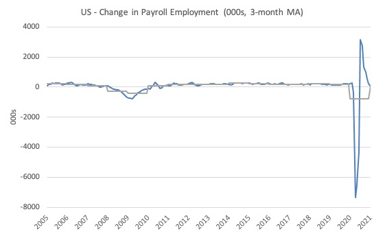
The first graph shows the monthly change in payroll employment (in thousands, expressed as a 3-month moving average to take out the monthly noise). The gray lines are the annual averages.
The data swings are still large and dwarf the past history.
Clearly, the 20.7 million job loss in April has not yet been reversed. Given the loss of payroll jobs in March and April, the US labour market is still 9.8 million jobs short from where it was at the end of February.
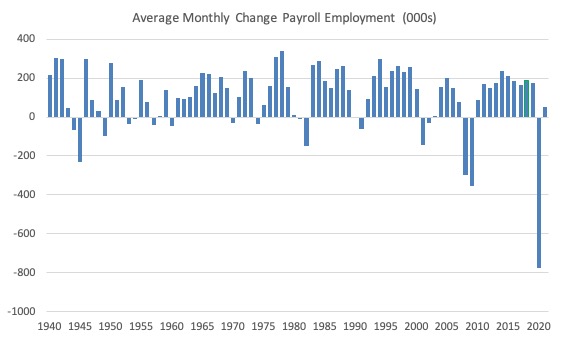
The next graph shows the same data in a different way – in this case the graph shows the average net monthly change in payroll employment (actual) for the calendar years from 1940 to 2020 (the 2020 average is for the months to date).
I usually only show this graph from 2005 but because history is being created at present I included the full sample available from 1940.
The final average for 2019 was 178 thousand.
The final average for 2020 was -778 thousand.
The average for 2021 (so far) is 49 thousand.
Labour Force Survey – employment growth positive
The data for December reveals:
1. Employment as measured by the household survey rose by 201 thousand net (0.13 per cent).
2. The labour force fell by 406 thousand (0.25 per cent).
3. The participation rate fell by 0.1 points.
4. As a result (in accounting terms), total measured unemployment fell by 606 thousand and the unemployment rate fell 0.4 points to 6.3 per cent.
The BLS note that both unemployment measures:
… are much lower than their April 2020 highs, they remain well above their pre-pandemic levels in February 2020 (3.5 percent and 5.7 million, respectively)
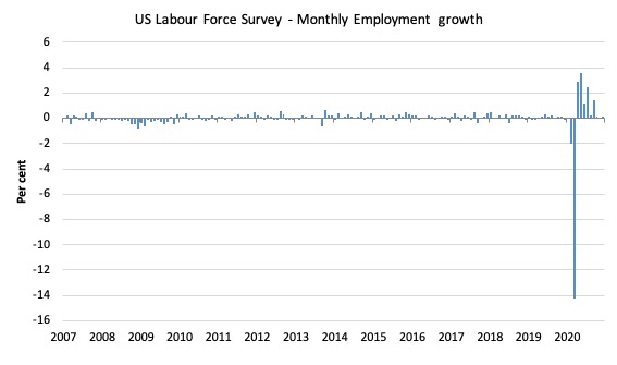
The following graph shows the monthly employment growth since January 2008, which shows the massive disruption this sickness has caused.
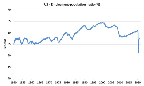
The Employment-Population ratio is a good measure of the strength of the labour market because the movements are relatively unambiguous because the denominator population is not particularly sensitive to the cycle (unlike the labour force).
The following graph shows the US Employment-Population from January 1950 to January 2021.
While the ratio fluctuates a little, the April 2020 ratio fell by 8.7 points to 51.3 per cent, which is the largest monthly fall since the sample began in January 1948.
In January 2021, the ratio rose by 0.1 points to 57.5 per cent (noting population benchmark changes though).
It is still well down on the level in January 2020 (61.1 per cent).
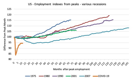
As a matter of history, the following graph shows employment indexes for the US (from US Bureau of Labor Statistics data) for the five NBER recessions since the mid-1970s and the current 2020-COVID crisis.
They are indexed at the employment peak in each case and we trace the data out for each episode until one month before the next peak.
So you get an idea of:
1. The amplitude (depth) of each cycle in employment terms.
2. The length of the cycle in months from peak-trough-peak.
The early 1980s recession was in two parts – a short downturn in 1981, which was followed by a second major downturn 12 months later in July 1982 which then endured.
Other facts:
1. Return to peak for the GFC was after 78 months.
2. The previous recessions have returned to the 100 index value after around 30 to 34 months.
3. Even at the end of the GFC cycle (146 months), total employment in the US had still only risen by 8.3 per cent (since December 2007), which is a very moderate growth path as is shown in the graph.
The current collapse is something else and progress has now now stalled.
Unemployment and underutilisation trends
The BLS report that:
In January, the unemployment rate fell by 0.4 percentage point to 6.3 percent, and the number of unemployed persons decreased to 10.1 million. Although both measures are much lower than their April 2020 highs, they remain well above their pre-pandemic levels in February 2020 (3.5 percent and 5.7 million, respectively).
The first graph shows the official unemployment rate since January 1994.
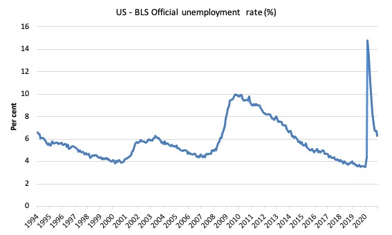
The official unemployment rate is a narrow measure of labour wastage, which means that a strict comparison with the 1960s, for example, in terms of how tight the labour market, has to take into account broader measures of labour underutilisation.
The next graph shows the BLS measure U6, which is defined as:
Total unemployed, plus all marginally attached workers plus total employed part time for economic reasons, as a percent of all civilian labor force plus all marginally attached workers.
It is thus the broadest quantitative measure of labour underutilisation that the BLS publish.
In December 2006, before the effects of the slowdown started to impact upon the labour market, the measure was estimated to be 7.9 per cent.
In January 2021 the U6 measure decreased by 0.6 points to 11.1 per cent.
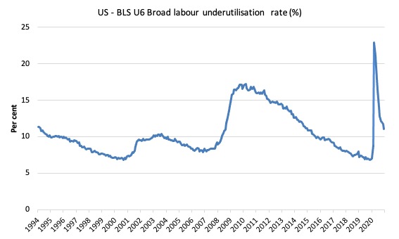
What drove this decline in U6?
The BLS say that:
The number of persons employed part time for economic reasons, at 6.0 million, changed little in January. This measure is 1.6 million higher than the February level. These individuals, who would have preferred full-time employment, were working part time because their hours had been reduced or they were unable to find full-time jobs …
The number of persons not in the labor force who currently want a job, at 7.0 million, edged down in January but is 1.9 million higher than in February. These individuals were not counted as unemployed because they were not actively looking for work during the last 4 weeks or were unavailable to take a job …
The number of persons marginally attached to the labor force, at 1.9 million, decreased in January. These individuals wanted and were available for work and had looked for a job sometime in the prior 12 months but had not looked for work in the 4 weeks preceding the survey. The number of discouraged workers, a subset of the marginally attached who believed that no jobs were available for them, was little changed over the month at 624,000.
Ethnicity and Education
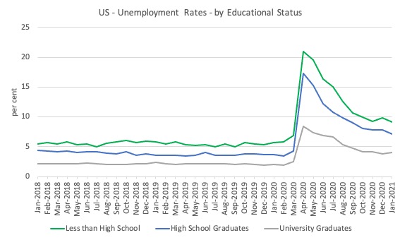
The next graph shows the evolution of unemployment rates for three cohorts based on educational attainment: (a) those with less than high school completion; (b) high school graduates; and (c) university graduates.
As usual, when there is a crisis, the least educated suffer disproportionately.
In the collapse in employment, the unemployment rates rose by:
- 14.4 points for those with less than high-school diploma.
- 12.9 points for high school, no college graduates.
- 5.9 points for those with university degrees.
The period since April 2020 has seen the unemployment rate fall by:
- 11.9 points for those with less than high-school diploma meaning the unemployment rate is now 3.8 points above the March level.
- 10.2 points for high school, no college graduates meaning the unemployment rate is now 4.6 points above the March level.
- 4.4 points for those with university degrees meaning the unemployment rate is now 2.3 points above the March level.
In the last month, the change in the unemployment rate has been:
- -0.7 points points for those with less than high-school diploma.
- -0.7 points points for high school, no college graduates meaning the unemployment rate.
- +0.2 points for those with university degrees meaning the unemployment rate.
In the US context, especially in the current time, the trends in trends in unemployment by ethnicity are interesting.
Two questions arise:
1. How have the Black and African American and White unemployment rate fared in the post-GFC period?
2. How has the relationship between the Black and African American unemployment rate and the White unemployment rate changed since the GFC?
Summary:
1. All the series move together as economic activity cycles. The data also moves around a lot on a monthly basis.
2. The Black and African American unemployment rate was 6.7 per cent in March 2020, rose to 16.8 per cent in May and is now down to 9.2 per cent in January 2021.
3. The Hispanic or Latino unemployment rate was 6 per cent in March 2020, rose to 18.9 per cent in April and fell to 8.6 per cent in January 2021.
4. The White unemployment rate was 4 per cent in March 2020, rose to 14.2 per cent in April and fell to 5.7 per cent in January 2021.
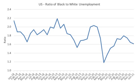
The next graph shows the Black and African American unemployment rate to White unemployment rate (ratio) from January 2018, when the White unemployment rate was at 3.5 per cent and the Black or African American rate was at 7.5 per cent.
This graph allows us to see whether the relative position of the two cohorts has changed since the crisis.
If it is rising, then the unemployment rate of the Black and African American cohort is either rising faster than the white unemployment rate or falling more slowly (or a combination of that relativity).
While there is month-to-month variability, the data shows that, in fact, through to mid-2019, the position of Black and African Americans had improved in relative terms (to Whites), although that just reflected the fact that the White unemployment was so low that employers were forced to take on other ‘less preferred’ workers if they wanted to maintain growth.
In April 2019, the ratio was 2.1 (meaning the Black and African American unemployment rate was more than 2 times the White rate).
By April 2020, the ratio had fallen to its lowest level of 1.2, reflecting the improved relative Black and African American position.
As the pandemic hit, the ratio rose and peaked at 1.8 in August 2020, but fell to 1.7 in September, reflecting an improvement in the relative position of the Black and African American workers.
In January 2021, the ratio was 1.61 down from 1.65 in December.
Conclusion
The January 2021 US BLS labour market data release reveals that the recovery seen since the catastrophic labour market collapse in March and April has gone at best stalled, depending on the weight one gives to the payroll data relative to the household survey.
Payroll employment only rose by 49 thousand.
I consider that the US will have to stabilise the health situation before they will be able to sustain any economic recovery.
The US appears to be going in the opposite direction to that.
That is enough for today!
(c) Copyright 2021 William Mitchell. All Rights Reserved.
Thanks you Bill for the thorough, insightful analysis, as well as a decisive conclusion.
Some observations I have looking at the graphs:
1. The first 3 graphs show a big shock to the system compared to a more or less linear relationship in the past.
2. Graph numbered 4, in my imagination, I see a quadratic curve (like a rainbow)
3. Graph 5, I see a linear relationship. It tells us that using “time” as an independent variable, it provides us with only a linear recovery path with very shallow recovery angle (long pain and suffering from now).
4. Graphs 6 and 7 show similar pictures to Graph 4, but in mirror images (in relevant demographic variables).
5. Graph 8 tells another shocking story like in the first 3 graphs, but as classified by education as well.
6. The last graph, or no. 9, shows a quadratic curve like again in a stretched out rainbow.
In sum, a shock to the US macroeconomy followed by various unemployment data.
Also, maybe, there is a need to help those who are more vulnerable as shown in graphs for longer term.
Lastly, considering that the global pandemic will be with us for a year or two due to the bell shape or normal distribution like recovery nature I observed, the macro economic policies should be generated under this “timeframe” rather than the piecemeal approach as in the past.
@vorapot
“Lastly, considering that the global pandemic will be with us for a year or two”
Bloomberg are predicting seven years at current vaccination rates!
The tragedy is that Summers, Blanchard and company who were instrumental in keeping the amount of Obama’s ARRA low are returning now from the back door and warn Biden of the danger of overheating the economy through his stimulus package. And it seems that he listens to them.
@Mr Shigemitsu Someone in the Guardian’s editorial office seems to have started to read Wray and Mitchell. Maybe responding to your desertion? Don’t renew your donation yet. Also thanks for the Jacobin article with background on the latest Italian technocratic govt. Really informative for me.