I read a new Report this morning - Waste Not - that was published by…
British labour market – low unemployment hiding a deeper malaise
The British Office of National Statistics (ONS) published its latest labour market data last week (August 14, 2018) – Labour market economic commentary: August 2018. The results are illuminating because they demonstrate how we must use broad concepts to appraise labour market health rather than just focusing on the official unemployment rate. A marked characteristic of the British labour market has been the near zero rate of growth in wages (and falling real wages) for some years, despite the claims that employment has reached record levels and the unemployment rate is now at levels unseen since the early 1970s. The research question is to dig deeper into the data to see what might be driving these relationships. The conclusion I reach is that the quality of employment has fallen somewhat over the last decade or so and the capacity of workers to successfully achieve wage settlements has fallen significantly as trade union membership has gone south. I am doing more formal research on this question to narrow down all the determinants and will report when I have more to say.
Employment – at record levels
The heading reflects the sort of statements that politicians make. In this case it is true. Total employment in the June-quarter was 32,386 thousand and it has never been higher.
But then the total working age population (above 16 years) was 53,044 thousand and that has never been higher.
So the statement “employment at record levels” is somewhat vacuous no matter how good it sounds.
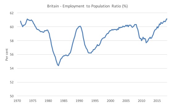
We are better off considering rates and the Employment to Population ratio shown in the next graph is at levels not witnessed since the June-quarter 1973, just before the OPEC oil crises hit.
Part-time, self-employed and temporary
The data also shows that the proportion of workers who are now in part-time positions has risen from 23.5 per cent in the June-quarter 1992 to 26.4 per cent in the June-quarter 2018 – not a significant shift.
There has also not been much change in the proportion of workers working second jobs over that period and there has been a decline in the proportion of temporary employees as a percent of all employees.
Further, contrary to popular perception, the proportion of total workers who are self-employed has barely shifted over this 26 year period – 13.6 per cent in the June-quarter 1992 to 14.7 per cent in the June-quarter 2018.
But of those, the proportion of self-employed who are working part-time has risen from 17.6 per cent in the June-quarter 1992 to 30.1 per cent in the June-quarter 2018 – a large shift and likely to be hiding a significant shortfall in labour demand as people eke out a working life as best they can.
Zero hour contracts
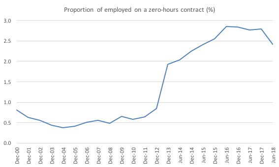
The ONS data – EMP17: People in employment on zero hours contracts (Last updated: August 14, 2018) shows that the proportion of workers in this state has risen from 0.8 per cent of all workers in the December-quarter 2000 to a peak of 2.8 per cent in the December-quarter 2017.
In the first six months of 2018, the proportion has dropped to 2.4 per cent.
The following graph shows the history.
Unemployment rate down to early 1970 levels
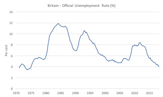
The next graph shows the official unemployment rate from the first-quarter 1971 to the June-quarter 2018. It was 4 per cent in the most recent quarter.
It was last at that level in the March-quarter 1975, just before the then Labour government declared Keynesian economics was dead!
So on this aggregate Britain is performing well and there are no hints that the Brexit referendum has altered the steady fall in official unemployment since the most recent peak in the December-quarter 2011.
Hours worked – steady
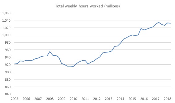
The next graph shows the total weekly hours worked in Britain (in millions of hours) from the March-quarter 2005 to the June-quarter 2018.
Since the pre-GFC peak, hours worked have only grown by a total of 8 per cent overall and only 1 per cent since the end of 2016.
In the June-quarter 2018, there was a 0.1 per cent decline in hours worked recorded.
Britain
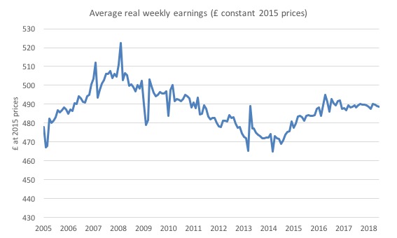
Real earnings flat
The earnings statistics tells us that the labour market is not as strong as the narrow aggregates (such as the official unemployment rate) might suggest.
The next graph shows real average weekly earnings (expressed in 2015 constant prices) from January 2005 to June 2018.
This is not what a fully employed labour market looks like.
Underemployment
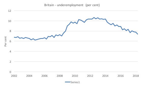
ONS also released their latest estimates of – EMP16: Underemployment and overemployment – last week (August 14, 2018).
Underemployment refers to part-time workers who desire more hours of work.
The following graph shows the evolution of the underemployment rate from the March-quarter 2002 to the June-quarter 2018.
While its trajectory is downwards, the current rate of 7.4 per cent remains above the pre-GFC level of 7 per cent (June-quarter 2008).
Trade Unions in decline
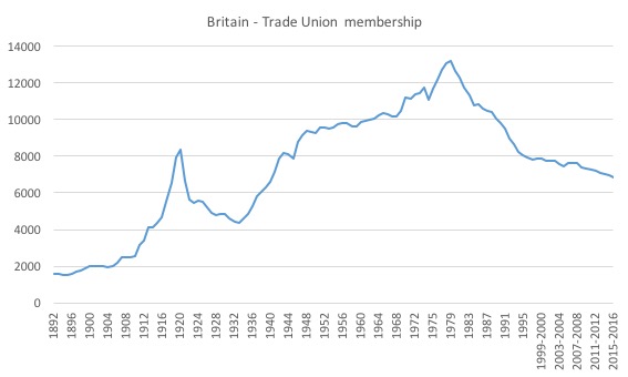
One of the key shifts in the British labour market has been the decline in trade union membership after Margaret Thatcher’s elevation to government.
The – data – shown in the following graph reveals the decline.
What does this look like in terms of coverage ratios – that is, membership as a proportion of all employees?
The data shows that the proportion has dropped from 38.6 per cent in 1989 to 22.9 per cent in 2017 (for Great Britain).
In 1995, the coverage ratio was 32.4 per cent overall (all employees), 21.4 per cent for the private sector, and 61.3 per cent for the public sector.
By 2017, the ratio had dropped to 23.3 for all employees (in the UK), 13.5 per cent in the private sector and 51.8 per cent in the public sector.
This has translated into a significant decline in the proportion of employees who have their wages and conditions covered by a collective agreement.
In 1996, this proportion was 36 per cent (overall), 23.2 per cent (private) and 74.4 per cent (public).
By 2017, it was 26 per cent (overall), 15.2 per cent (private) and 57.6 per cent (public).
So the significant shifts have been in the way the successive governments have sought to hollow out the protections for workers employed in the public sector.
Phillips Curve variations
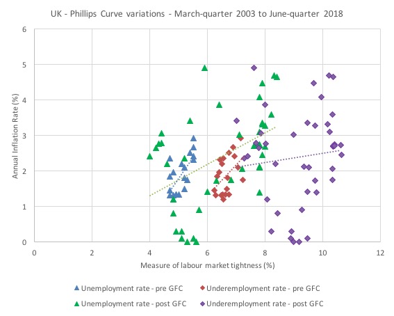
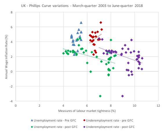
What is very surprising from my perspective is the way the indicators of labour underutilisation interact with the British inflation rate and the wage inflation rate.
The following two graphs tell the story and tell me that there has been a dislocation between the drivers on wage inflation (which has stalled around zero) and the rate of change in the Consumer Price Index (general price inflation).
The first graph shows the relationship between the two labour underutilisation indicators (unemployment and underemployment) pre-GFC and post-GFC and the annual inflation rate (CPI-based).
The straight dotted lines are simple linear regression trends.
While the relationships have shifted out somewhat post-GFC, the degree of labour underutilisation does not appear to be a disciplining factor on the inflation rate in Britain over this 15-year period (the period where data was comparable).
The next graph shows the relationship between the two labour underutilisation indicators (unemployment and underemployment) pre-GFC and post-GFC and the annual growth in private average weekly earnings (wage inflation).
Now we see that post-GFC, the degree of labour underutilisation both official unemployment and underemployment has shifted and is now exerting a downward pressure on wage inflation.
These summary results have raised a number of research questions which I will investigate when I get time.
Gross Flows and Transition Probabilities
Instead of just looking at the raw employment and unemployment data, I find it useful to examine the gross flows data – which shows the flows between labour force categories.
What you realise is that underpinning the quarterly movements in the aggregates are massive flows of workers between the various labour force categories.
The latest gross flows data from ONS was published last week (August 14, 2018) – Labour market flows: August 2018.
ONS summarise the data in this way:
– The gross flow to unemployment has decreased to its lowest since October to December 2001.
– The gross flow to employment has decreased to its lowest since July to September 2011.
– The gross flow from inactivity has decreased to its lowest since April to June 2009.
I updated my British gross flows dataset for the UK today (which takes us to the June-quarter 2018) and computed updated Transition Probabilities, which are derived from the Gross Flows labour market data.
To fully understand the way gross flows are assembled and the transition probabilities calculated you might like to read these blogs – What can the gross flows tell us? and More calls for job creation – but then. For earlier US analysis see this blog – Jobs are needed in the US but that would require leadership
Gross flows analysis allows us to trace flows of workers between different labour market states (employment; unemployment; and non-participation) between months. So we can see the size of the flows in and out of the labour force more easily and into the respective labour force states (employment and unemployment).
Each period there are a large number of workers that flow between the labour market states – employment (E), unemployment (U) and not in the labour force (N). The stock measure of each state indicates the level at some point in time, while the flows measure the transitions between the states over two periods (for example, between two months).
The net changes each month – between the stock measures – are small relative to the absolute flows into and out of the labour market states.
The various stocks and flows are denoted as follows (single letters denote stocks, dual letters are flows between the stocks):
- E = employment stock, with subscript t = now, t+1 the next period.
- U = unemployment stock.
- N = not in the labour force stock.
- EE = flow from employment to employment (that is, the number of people who were employed last period who remain employment this period)
- UU = flow of unemployment to unemployment (that is, the number of people who were unemployed last period who remain unemployed this period)
- NN = flow of those not in the labour force last period who remain in that state this period
- EU = flow from employment to unemployment
- EN = flow from employment to not in the labour force
- UE = flow from unemployment to employment
- UN = flow from unemployment to not in the labour force
- NE = flow from not in the labour force to employment
- NU = flow from not in the labour force to unemployment
The following Matrix Table provides a schematic description of the flows that can occur between the three labour force framework states.
The various inflows and outflows between the labour force categories are expressed in terms of numbers of persons which can then be converted into so-called transition probabilities – the percentage probabilities that transitions (changes of state) occur.
We can then answer questions like: What is the probability that a person who is unemployed now will enter employment next period?
So if a transition probability for the shift between employment to unemployment is 0.05, we say that a worker who is currently employed has a 5 per cent chance of becoming unemployed in the next month. If this probability fell to 0.01 then we would say that the labour market is improving (only a 1 per cent chance of making this transition).
From the table above – sometimes called a Gross Flows Matrix – the element EE tells you how many people who were in employment in the previous month remain in employment in the current month.
Similarly the element EU tells you how many people who were in employment in the previous month are now unemployed in the current month. And so on. This allows you to trace all inflows and outflows from a given state during the month in question.
The transition probabilities are computed by dividing the flow element in the matrix by the initial state. For example, if you want the probability of a worker remaining unemployed between the two months you would divide the flow (UU) by the initial stock of unemployment. If you wanted to compute the probability that a worker would make the transition from employment to unemployment you would divide the flow (EU) by the initial stock of employment. And so on.
So the 3 Labour Force states in the Matrix Table above allow us to compute 9 transition probabilities reflecting the inflows and outflows from each of the combinations.
Analysing movements in these probabilities over time provides a different insight into how the labour market is performing by way of flows of workers.
So how has Britain been doing?
In the graphs that follow, the codes (such as EU, UE, etc) are transition probabilities rather than flows in thousands.
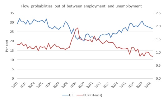
Transitions between Employment and Unemployment
The first graph shows the transition probabilities between employment and unemployment from December 2007 to April 2017.
The probabilities crossed (but note the different axis) early on in the GFC when employment was collapsing and unemployment was rising quickly (September 2008).
Then in the early period of the Cameron government the probabilities were more or less stationary.
Since then there has been a steady fall in the chance of an employed worker losing their job, while the chance of an unemployed worker gaining employment continued to rise until the June_quarter 2018.
From the June_quarter 2018, there has been a steady decline in the probability of an unemployed worker entering employment.
The former transition probability (EU) is now well below the pre-GFC level, whereas the UE probability is now below the pre-GFC level.
Transitions from Unemployment
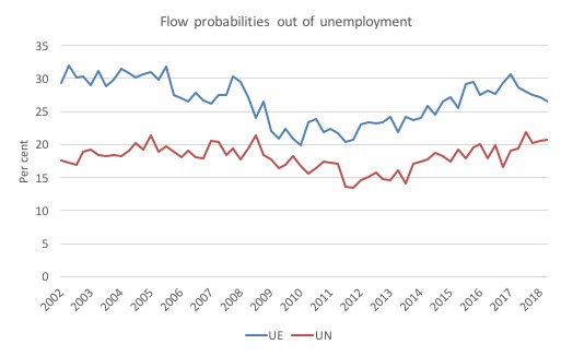
The next graph shows the outflow probabilities from unemployment – it compares the UE and the UN (probability that an unemployed worker will exit the labour force) – from the March-quarter 2002 to the June_quarter 2018.
When workers are confronted with a lack of employment opportunities they typically exit the labour force (give up looking for work) and enter what we call hidden unemployment.
So we would expect the UN probability to have risen during the crisis, which it did in, say, the US and Australia.
But for Britain, that didn’t occur – in fact, the opposite happened – and it is only in recovery that the UN probability has started to rise back to pre-GFC levels. There is a research project in seeking answers to that puzzle.
I have already commented on the UE transition probability. The only additional fact that is evident is that an unemployed workers in Britain is more likely to transit into employment than exit the labour force although that difference became compressed during the crisis.
The narrowing gap between UE and UN is a sign that the British labour market is not as strong as the ‘record’ employment figures suggest.
Transitions out of Employment
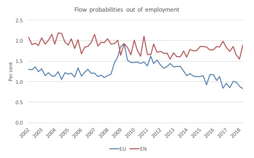
What about the transitions out of employment? Is an employed worker more likely to transit into unemployment (EU) or to exit the labour force (EN)?
The next graph compares these two transition probabilities.
We see that during the crisis the probability that an employed worker would become unemployed rose sharply and was in the worst period of the crisis above the EN probability.
The EN probability really describes retirement-type transitions and these have been quite stable over the cycle because it reflects underlying demographics, which move slowly.
The EU transition is much more cyclical as one would expect.
Transitions from Inactivity
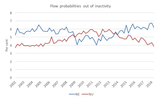
Finally, what about new entrants into the British labour force? Are they more likely to enter employment (NE) or, initially, transition into unemployment (NU)?
The next graph tells us the answer.
During the crisis, it is clear that the chances of a new entrant becoming employed fell sharply and was lower than the NU probability.
This particularly would have impacted on school-leavers.
It took some four and a half years (March-quarter 2009 to December-quarter 2013) for that situation to reverse. Since then, new entrants are much more likely to enter employment (NE) than unemployment (NU).
However, over the last few years the probability of a worker who is current not in the labour force becoming employed has stalled and in the June-quarter 2018 fell quite sharply.
Transitions related to self-employment
There has been a strong case made that the strong employment growth is hiding the fact that many of the jobs being created are precarious, self-employed jobs.
The UK Guardian editorial (August 18, 2018) – The Guardian view on record employment: Not the whole picture – noted:
The Conservative party’s achievement has been to strip away bargaining power from employees and have them work on the terms offered by employers. The result has been widespread use of zero-hours contracts, self-employment and other forms of underemployment.
The gross flows data provides some useful information.
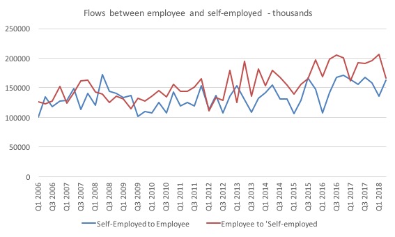
The next graph shows the flows (in thousands) for those who are already employed between employee and self-employed status.
The blue line is the flows between self-employment and employee status and the red line is the opposite flow.
It is clear that since 2009, the employee-self-employment flow has generally been greater than the opposite direction although in the net difference hasn’t been great and has narrowed.
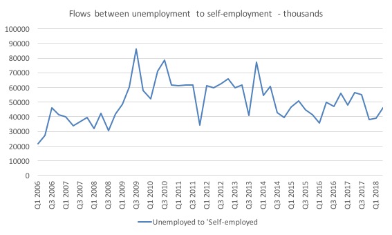
What about the unemployment to self-employment flow? The flow from those unemployed into employee status outstrip the flow from those unemployed to self-employment by a considerable margin.
Further, as the next graph shows, the latter flow (unemployed to self-employed) has been relatively stable (note this is unadjusted data so you have to see the trend underlying it to make generalised statements) since the initial rise during the crisis.
The flows are still well above the pre-GFC levels.
This means that early on during the GFC, the unemployment to self-employment flow rose sharply (as employment growth faltered), and, while lower now, has not returned to the pre-GFC level.
Many of the ‘jobs’ associated with that flow could be illusory (in the sense they provide on intermittent income and little security).
Transitions between skill classification
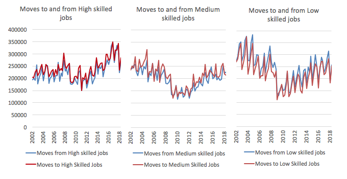
The gross flows data also allows us to see the magnitudes of flows (thousands) into and out of skill categories (low, medium and high).
The following graph shows these flows and some very interesting insights are available.
1. There is much more cyclical disruption in the low-skilled segment of the labour market than elsewhere. During the GFC the flows in and out of low-skilled jobs fell dramatically and they have still not reached the earlier peaks.
2. There was little cyclical disruption for the high-skilled workers as a result of the GFC and the recovery has advantaged them significantly in absolute and relative terms.
3. The medium-skilled segment tightened considerably during the GFC and has not recovered as much as the other skill segments.
Conclusion
The evidence is fairly consistent across a range of measures that, in aggregate terms, the British labour has improved markedly over the last 5 years.
Employment growth is strong and has accelerated since mid-2016.
But underlying that growth are some disturbing trends – like the rise in zero hours contracts and the increasing proportion of self-employed who are working part-time and likely to be underemployed.
Further, while the unemployed improved their chances of gaining a job up to this year, that transition probability is now falling.
Also the flat wages growth (zero real wages growth) is not a sign that the labour market is at full employment.
More research is needed.
That is enough for today!
(c) Copyright 2018 William Mitchell. All Rights Reserved.

Interesting that the sharp decline in Trade Union membership actually started around 1975 (if I am reading the chart correctly), which was within the 2nd Wilson Labour government (before Wilson resigned and Callaghan took over). I assume this was due to reduced employment due to cutbacks in order to try to reduce the inflation that the previous Tory “boom” had caused. And the start of the Labour “neoliberal” period which Bill has described in such detail on this blog and in “Reclaiming The State”.
A job guarantee programme during that period might have been helpful. (and helped to maintain union membership levels, just so long as the unions didn’t play silly beggars and object to JG workers being members of “their” union (which I could sadly imagine happening, especially in the UK in the mid 1970s).
Yes, employment as a gross measure has improved but the detail shows that a good deal of the ‘opportunities’ are not good ones. And that is what can be seen on the street, as it were. I have yet to see a pundit differentiate among the different types of inflation, though some, not many, do differentiate among some of the different kinds of employment opportunities, though often not well. The commentary is I think it is fair to say execrable.
The application of Hartz-type reforms in the UK around 2013 preceded by a program of verbal vilification of benefit claimants has, I imagine, contributed to the high employment figures. Many people were harried into jobs that they would otherwise have seen as unacceptable (in some cases, ill people were harried, arguably, to their deaths). The Job Centers became known as ‘sanction centers’ where threats and intimidation were the general rule of the day with ‘targets’ being set to reduce numbers. Many people in employment are also totally reliant on housing benefit and other benefits.
I daresay there was full-ish “employment” in C18th century England too, in the sense that if you didn’t work or steal (and get deported!) you would starve – yet most normal people (Tories excepted, of course) wouldn’t want to go back to those days.
Being forced, on pain of anything between one month and three years (!) of sanctions, to take a zero-hours, commission-only job for the sole purpose of getting you off the jobcentre’s books is not evidence of “full employment”.
How does migration fit into all of this? Apparently many employers in the UK “would not be able to operate” without migrant workers. Some sectors such as food processing predominantly employ people from the countries that recently joined the EU and say that freedom of movement of workers from there is critical. Does a reserve army of people a RyanAir flight away provide labour market slack that enables substitution of low cost, flexible, labour in place of investment in mechanisation and development of higher productivity working practices? Could that be realistically overcome with MMT type policies? Obviously the primary tragedy is that the labour market in Bulgaria etc is sufficiently slack that people feel forced to migrate. But from within the UK, should we be fighting to maintain freedom of movement or not?
Stone, where a country gets its workers from is a political matter, not an economic one and certainly not one about how the modern monetary system operates. So, MMT would, strictly speaking, have nothing to say about it. On the basis of MMT considerations, however, one could take a political position on the issue, depending on where you stood on the political spectrum.
Larry, I think it’s a mistake to imagine that politics and economics can be disentangled to that extent. Do you really imagine that entirely free or entirely restricted labour force movements between say the UK or USA or Japan and the rest of the world would have no economic repercussions?
I also think the politics of this is extremely fraught and conflicted. I want to ensure everyone (including recent migrants) feels secure in knowing that they have the solidarity of the rest of the population standing up for them. That need not be conflated with debates about the benefits or otherwise of restrictions on future migration. However many people (mistakenly IMO) say that we must present a united voice saying that free migration is best all round because that’s the surest way to demonstrate solidarity.
Another complication is that rich people especially benefit from an ample, flexible, supply of migrant workers whilst people struggling to find work (especially recent migrants themselves) can be exploited.
Perhaps the best approach is to have strictly enforced sector-wide collective bargaining and various stringent employment regulations that mean the only possible jobs are “good” jobs. Perhaps that would limit firms based around exploitation of migrant workers. How does all of that fit in with MMT policies for full employment? Would job guarantee jobs be open to people migrating to take them up? How does the need for a “high pressure economy” to drive innovation (as put forward by JW Mason) fit in with this?
Stone, it would certainly have economic repercussions. But as Larry said, MMT per se has nothing to say about it.
The sectoral balances are still the same. The requirement for government spending to generate full employment and meet the desires of the non-government savings is still the same. The banks still work the same way by obtaining reserves after lending. The limitations being real resources is still the same. The assumption that all spending is inflationary if the supply is not adequate is the same.
Mike Ellwood’s comments echo exactly what I was thinking and the steady decline here in Australia of union membership is a worrying trend. Either unions in the UK and Australia need a massive rethink about their purpose and function or they will have to restructure themselves appropriately to meet current 21st century working arrangements.
Thank you Wayne. Of course, it needs a union-friendly government to be in power as well as the unions being a lot smarter than they were in the 1970s (at least in the UK).
Wayne McMillan, I guess unions work best when the legal and institutional framework is set up so as to foster constructive labour relations. On of the best aspects of the UK Labour Party 2017 General Election manifesto IMO were the plans to do just that with sector-wide-collective-bargaining (as has been used so successfully in Nordic countries). Once unions have such arrangements in place for them, then people will see the point in joining and getting involved again.
Matt, you mention “The limitations being real resources is still the same” -I guess that is the rub of it. If the Job Guarantee program has to be such that it competes with private employment to such an extent that private employment needs to offer good, high productivity, well paid and desirable jobs; and that is paired with a pretty much limitless reserve army of potential migrants who could take up such Job Guarantee positions; then real resources would be overwhelmed since, by definition, Job Guarantee jobs are not providing crucial economic productivity but rather occupying a buffer stock of workers. For a more happy outcome, it would be necessary for migrants to themselves form a high wage, high productivity, economy to occupy each other as fast as they came over. Is that something that could realistically be hoped for? If that could be achieved, then it doubly demonstrates how inexcusable it is that such an economy isn’t in existence in the countries where they would be migrating from.
Where is the Phillips ‘Curve’ .There appears to be no mathematical relationship
between unemployment and inflation.
Is it not time to bin this concept as being empirically irrelevant?
Stone, you are partially correct – the Job Guarantee jobs not only provide the buffer stock, but the wages it pays stimulates demand and in doing so the rest of the economy, which then hires from the JG pool. Also, there is nothing preventing JG jobs from being productive if the private sector is failing to provide in whatever segment of the economy.
So it’s more likely that the better qualified and able of the migrants would find themselves in the productive private sector quite quickly.
And in our hypothetical situation, as the migrants are not using real resources in their home country, there’s no reason they can’t be imported to the host country. Which would then ideally stimulate the demand of the home country, leading to lower rates of migration as living standards improve.
Now, is it realistic? Not really, at this point in time, because of political restrictions on movement and trade. But I think when the first advanced economy implements a proper JG it will force the rest of the world to sit up and take notice, and hopefully the dominoes will start to topple.