Today (June 3, 2026), the Australian Bureau of Statistics (ABS) released the latest - Australian…
US growth surprise will not last
Last Friday July 27, 2018), the US Bureau of Economic Analysis published their latest national accounts data – Gross Domestic Product: Second Quarter 2018 (Advance Estimate), which tells us that the annualised real GDP growth rate for the US was a very strong 4.1 per cent in the was 3 per cent in the June-quarter 2018. Note this is not the annual growth over the last four-quarters, which is a more modest 2.8 per cent (up from 2.6 per cent in the previous quarter). As this is only the “Advance estimate” (based on incomplete data) there is every likelihood that the figure will be revised when the “second estimate” is published on August 29, 2018. Indeed, the BEA informed users that it has conducted a comprehensive revision of the National Accounts which includes more accurate data sources and better estimation methodologies. So I had to revise my entire dataset today to reflect the revisions. The US result was driven, in part, by “accelerations in PCE and in exports, a smaller decrease in residential fixed investment, and accelerations in federal government spending and in state and local spending.” Real disposable personal income grew at 2.6 per cent (down from 4.4 per cent in the first-quarter). The personal saving ratio fell from 7.2 per cent to 6.8 per cent. Notwithstanding the strong growth, the problems for the US growth prospects are two-fold: (a) How long can consumption expenditure keep growing with flat wages growth and elevated personal debt levels? (b) What will be the impacts of the current trade policy? rise is a relevant question. At some point, the whole show will come to a stop as it did in 2008 and that will impact negatively on private investment expenditure as well, which has just started to show signs of recovery. Government spending at all levels has also continued to make a positive growth contribution. But with rising private debt levels and flat wages growth the growth risk factors are on the negative side. When that correction comes, the US government will need to increase its discretionary fiscal deficit to stimulate confidence among business firms and get growth back on track.
US economy – what is going on at the aggregate level?
The US Bureau of Economic Analysis said that:
Real gross domestic product increased at an annual rate of 4.1 percent in the second quarter of 2018 … In the first quarter, real GDP increased 2.2 percent (revised).
The uptick in growth sees the US growing at its fastest rate since the September-quarter 2014 (when the annualised growth rate was 4.84 per cent).
The June-quarter growth was rounded down to 1 per cent (up from 0.55 in the March-quarter).
The following sequence of graphs captures the story.
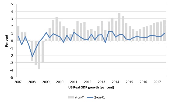
The first graph shows the annual real GDP growth rate (year-to-year) from the peak of the last cycle (December-quarter 2007) to the June-quarter 2018 (gray bars) and the quarterly growth rate (blue line). The data is available – HERE.
The year-to-year growth calculation smooths out the considerable volatility in the quarterly data to help us see the trend.
There is now growing momentum in US growth.
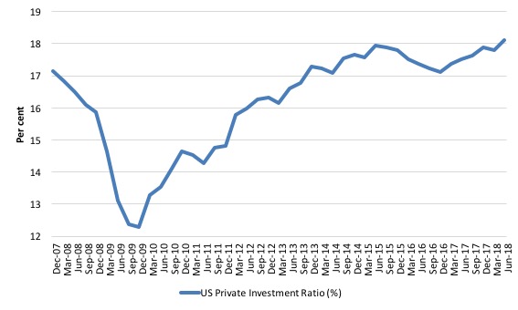
The next graph shows the evolution of the Private Investment to GDP ratio from the December-quarter 2007 (real GDP peak prior to GFC downturn) to the June-quarter 2018.
The decline in the investment ratio as a result of the crisis was substantial and endured for 2 years. As a result the potential productive capacity of the US contracted somewhat. There are various estimates available but the overall message is that potential GDP fell considerably as a result of the lack of productive investment in the period following the crisis.
The retreat in the Investment ratio after the June-quarter 2015, appears to have been arrested and the ratio continues to rise – now at 18.1 per cent (up from 17.8 per cent in the March-quarter).
It is now close to the record levels achieved in the March and June-quarters 2006 just before the GFC emerged.
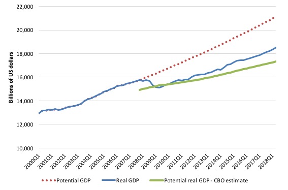
In this blog post – Common elements linking US and UK economic slowdowns – I discuss estimates of potential GDP in the US and the shortcomings of traditional methods used by institutions such as the Congressional Budget Office.
So if you are interested please go back and review that discussion.
The latest CBO estimates, made available through – St Louis Federal Reserve Bank, show why we should be skeptical.
To get some idea of what has happened to potential real GDP growth in the US, the next graph shows the actual real GDP for the US (in $US billions) and two estimates of the potential GDP. There are many ways of estimating potential GDP given it is unobservable.
While I could have adopted a much more sophisticated technique to produce the red dotted series (potential GDP) in the graph, I decided to do some simple extrapolation instead to provide a base case.
The question is when to start the projection and at what rate. I chose to extrapolate from the most recent real GDP peak (December-quarter 2007). This is a fairly standard sort of exercise.
The projected rate of growth was the average quarterly growth rate between 2001Q4 and 2007Q4, which was a period (as you can see in the graph) where real GDP grew steadily (at 0.68 per cent per quarter) with no major shocks.
If the global financial crisis had not have occurred it would be reasonable to assume that the economy would have grown along the red dotted line (or thereabouts) for some period.
The gap between actual and potential GDP in the June-quarter 2018 is around $US2,613 billion or around 12.4 per cent. That gap had been rising steadily since late 2014 but then stabilised. In the June-quarter 2018, it fell by 0.2 points as a result of the stronger growth and rising Investment ratio.
The green line is the estimate of potential output provided by the US Congressional Budget Office and made available through – St Louis Federal Reserve Bank.
In relation to the CBO estimate, the US economy is estimated to be operating at 6.7 per cent over its potential in the June-quarter 2018.
I don’t believe the estimate!
As a hint, the BEA report that the “price index for gross domestic purchases increased 2.3 percent in the second quarter, compared with an increase of 2.5 percent in the first quarter”. That is, price pressures declined, hardly symptomatic of an economy that is operating at 6.7 per cent over its capacity.
Further, wages growth remains flat and broader measures of labour underutilisation indicate there is still considerable slack.
Which suggests that the CBO estimates are inaccurate – probably by several percentage points.
We know (and I explain this in more detail in the blog post mentioned above), the CBO base their estimate of Potential GDP on their estimate of the NAIRU – the (unobservable) Non-accelerating Inflation Rate of Unemployment.
This is a conceptual unemployment rate that is consistent with a stable rate of inflation.
The literature demonstrates that the history of NAIRU estimation is far from precise. Studies have provided estimates of this so-called ‘full employment’ unemployment rate as high as 8 per cent or as low as 3 per cent all at the same time, given how imprecise the methodology is.
The former estimate would hardly be considered “high rate of resource use”. Similarly, underemployment is not factored into these estimates.
The continued slack in the labour market (bias towards low-pay and high underemployment) would lead to the conclusion that the output gap is likely to be closer to the extrapolated estimate than the CBO estimate.
Contributions to growth
The accompanying BEA Press Release said that:
The acceleration in real GDP growth in the second quarter reflected accelerations in PCE and in exports, a smaller decrease in residential fixed investment, and accelerations in federal government spending and in state and local spending. These movements were partly offset by a downturn in private inventory investment and a deceleration in nonresidential fixed investment. Imports decelerated.
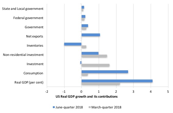
The next graph compares the June-quarter 2018 (blue bars) contributions to real GDP growth at the level of the broad spending aggregates with the March-quarter 2018 (gray bars), where the overall annualised real GDP growth was 3 per cent compared to 3.1 per cent.
While household consumption expenditure continues to be a positive contributor, that contribution has dropped substantially in the June-quarter 2018 – from 2.24 percentage points in the last quarter to 1.62 points this quarter.
American household debt remains high (see below) and real wages growth is flat. Uncertainty is increasing. So how that impacts will remain to be seen.
The Government sector undermined growth in the June-quarter 2018 by -0.02 points overall – a continued, small negative contribution.
The Federal government, however, continued to support growth (although at a lower rate) – 0.08 points compared to 0.13 points in the June-quarter.
The other contributor to growth was Net exports (0.41 points up from 0.21 points in the June-quarter 2017).
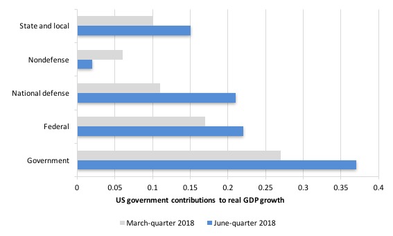
The next graph decomposes the government sector and shows that all levels of government contributed significantly to growth in the June-quarter and increased the contribution relative to the March-quarter.
The federal contribution was, however, dominated by the strong military expenditure while reducing the contribution of non-defense spending.
That has been a trend under the current Presidency – a worrying sign.
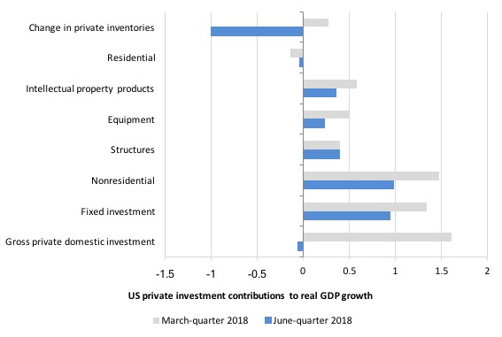
The next graph shows the contributions to real GDP growth of the various components of investment.
The inventory cycle dominated other positive investment contributions.
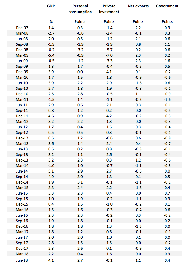
The following table shows the contributions the different expenditure components have made to real GDP growth since the peak in the December-quarter 2007.
The thing to concentrate on is what was going on in 2016 where only household consumption was holding growth up. With incomes flat and prices rising, that growth was being fuelled by increased indebtedness.
The last two quarters have seen more balanced contributions to growth from investment and the external sector.
The Federal Reserve Bank of New York publication – Household Debt and Credit Report – was last updated for the first-quarter 2018 – (PDF Download).
It shows:
that total household debt reached a new peak in the first quarter of 2018, rising $63 billion to reach $13.21 trillion. Balances climbed 0.6 percent on mortgages, 0.7 percent on auto loans, and 2.1 percent on student loans this past quarter, while they declined by 2.3 percent on credit cards …
Aggregate household debt balances increased in the first quarter of 2018, for the fifteenth consecutive quarter, and are now $526 billion higher than the previous (2008:Q3) peak of $12.68 trillion. As of March 31, 2018, total household indebtedness was $13.21 trillion, a $63 billion (0.5 percent) increase from the fourth quarter of 2017. Overall household debt is now 18.5 percent above the 2013:Q2 trough.
The question that remains unanswered is whether US households will be able to maintain consumption spending growth given the rising household debt levels.
Is the significant slowdown in consumption spending growth a sign that a peak debt level is approaching?
The following graph is taken from the FRBNY publication. Clearly the gap between mortgage and non-mortgage debt is rising as total household indebtedness rises.
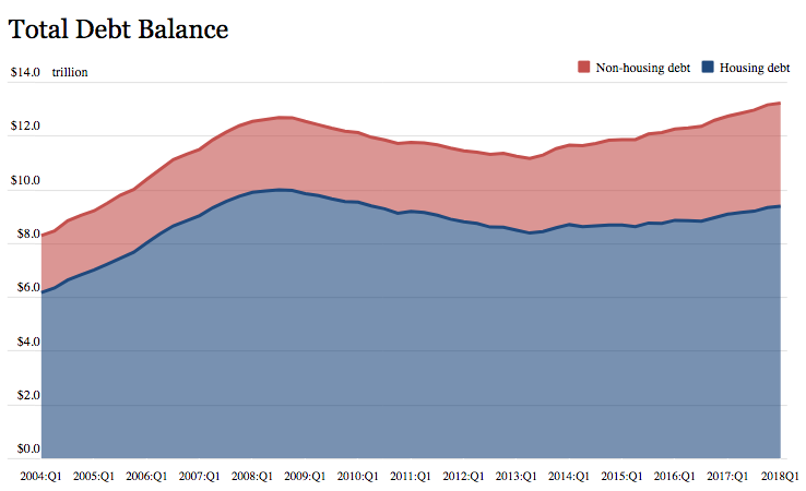
This looks to be an unsustainable situation and will require either significant non-government spending boosts in investment or net exports or government spending increases to offset the likely slowdown in household consumption spending.
The export situation and the trade war
I will write more about the tariff tit-for-tat in a future blog post.
What appears to be happening is the decisions taken by Trump are putting US trading partners into situations that will see them concede in one way or another.
In the case of China, the US is much less dependent on exporting to China than China is to having access to the US market for its exports. It is not even close.
Which means that the balance of power in the dispute is firmly in the US hands.
The estimates I have seen indicate that the impact on growth if the trade war continues would be of the order of 0.1 to 0.3 per cent downgrade for the US and 1.0 to 1.5 per cent for China.
China will likely accept the inevitable slowdown and continue as before.
In the case of Europe, the story is likely to be different.
When Trump met with Jean-Claude Juncker (President of the European Commission) on June 25, 2018 at the White House, it was clear that the Europeans were not keen to leave matters uncertain.
What emerged was a tentative deal to have zero tariffs on non-auto industrial goods, increased European purchases for US soybeans and LNG, reform of the WTO and a shared pact to wipe out the piracy of intellectual property.
That looked to me like a win for the US.
The thorny issue of car tariffs was held over but is really driving the other concessions that Europe made to Trump, notwithstanding the negative impacts on US motorcycles and bourbon.
The German car makers are hardly going to stand idle in this matter and will be pushing the EU to agree to zero tariffs with the US.
So, it is still uncertain whether the ‘trade war’ will do that much to reduce US growth.
The major risk is the rising household indebtedness and flat wages growth.
The falling wage share and business investment
There was an interesting article in the UK Guardian (July 29, 2018) – Almost 80% of US workers live from paycheck to paycheck. Here’s why – by Robert Reich, which bears on this data and some research I have been doing.
Robert Reich’s main aim in the article is to explain by the low unemployment rates in the US (forecast to be 3.5 per cent by the end of the year) has not translated into wages growth.
He writes:
But the official rate hides more troubling realities: legions of college grads overqualified for their jobs, a growing number of contract workers with no job security, and an army of part-time workers desperate for full-time jobs. Almost 80% of Americans say they live from paycheck to paycheck, many not knowing how big their next one will be.
Blanketing all of this are stagnant wages and vanishing job benefits. The typical American worker now earns around $44,500 a year, not much more than what the typical worker earned in 40 years ago, adjusted for inflation. Although the US economy continues to grow, most of the gains have been going to a relatively few top executives of large companies, financiers, and inventors and owners of digital devices.
America doesn’t have a jobs crisis. It has a good jobs crisis.
In my regular labour market analyses for the US I demonstrate the many aspects of this stagnancy that Reich lists above.
He argues that the shift in bargaining power to capital is the reason and there are two main driving factors in this shift:
1. “the increasing difficulty for workers of joining together in trade unions.”
2. “the growing ease by which corporations can join together in oligopolies or to form monopolies.”
Both of these factors are characteristic of the neoliberal era, despite the stated antagonism towards concentration in industry.
Reich gives a good account of how these factors came to be so influential and I will leave the details to your curiosity.
He shows that as union membership rates have decreased (from around 27 per cent in the late 1960s to around 11 per cent now) the “share of total US income going to the middle” has declined in lock-step – it “correlates directly with that decline in unionization”.
And, the other aspect that follows is that:
… the share of total income going to the richest 10 percent of Americans over the last century is almost exactly inversely related to the share of the nation’s workers who are unionized.
So for the workers, “The pie is growing but they’re getting only the crumbs.”
Reich teases out the implications of these trends:
This great shift in bargaining power, from workers to corporations, has pushed a larger portion of national income into profits and a lower portion into wages than at any time since the second world war. In recent years, most of those profits have gone into higher executive pay and higher share prices rather than into new investment or worker pay. Add to this the fact that the richest 10% of Americans own about 80% of all shares of stock (the top 1% owns about 40%), and you get a broader picture of how and why inequality has widened so dramatically.
This is the point I wanted to focus on because it dovetails into my own research.
It follows, of course, that if the capitalists are not reinvesting the extra share of national income they have money to spend on “political campaigns and lobbying” – even though the hapless Left have been floundering around believing that globalisation has rendered the nation state dead!
The right know full well the nation state is where it has to do business and spends copious amounts of cash lobbying politicians to get what they want.
Anyway, what I wanted to show you was the relationship between the investment ratio and movements in the capital share in national income.
There is an excellent conceptual analysis of what the wage share is and how it is calculated in the BLS publication (February 2017) – Estimating the U.S. labor share.
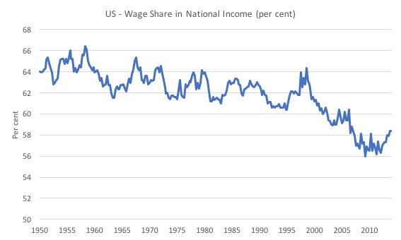
The first graph shows the wage share in GDP from the March-quarter 1950 to the September-quarter 2016.
There was a steady decline over the period to 1998 and then a sharp decline, which saw the wage share fall from 62.1 per cent in the September-quarter 1998 to 58.4 per cent in the September-quarter 2016.
That 3.7 per cent swing amounts to some $US69.6 billion that workers were missing out on by the end of the period relative to what they would have been paid had the wage share remained at its 1998 level.
Most of that income went to capital.
The second graph (taken from the BLS research paper) shows us, in very stark terms, the “Capital share and investment developments in G20 countries” (it is the top panel of Figure 7 in the BLS paper on page 13) from 2000 to 2012 and the Investment ratio (per cent of GDP) over that time. Both series are indexed to 100 in 2000.
It is obvious what has been going on.
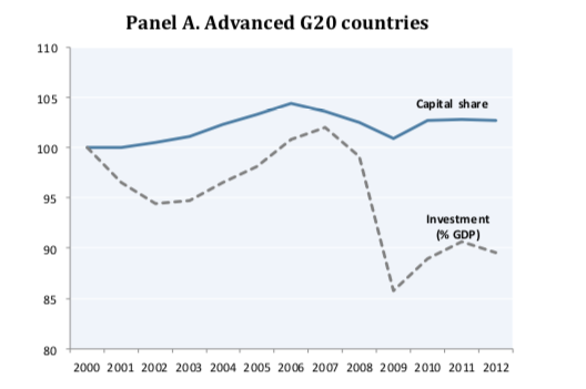
The BLS describe what is going on in this way:
It might be argued that lower wages are necessary to boost profits in order to increase investment and, in turn, job creation. However, in developed economies, the shift in income away from labour towards capital has not produced the expected results on investment. Between 2000 and 2007, the capital share in advanced G20 countries grew by close to 2 percentage points. In contrast, investment as percentage of GDP did not keep pace and remained stable (from 22.4 per cent in 2000 to 22.8 per cent in 2007). Since the onset of the global crisis, investment as a percentage of GDP in advanced G20 countries has declined steeply. In 2012, the most recent year with available information, investment as percentage of GDP was, on average, 20 per cent, almost 3 percentage points below the peak reached just before the crisis. It is important to note that investment decreased much more than what had been expected on the basis of the stability in capital as percentage of GDP.
So, the standard neoliberal claims that the labour share has to be reduced to stimulate more private business investment and jobs is not supported by the evidence.
The BLS note that:
1. “in advanced economies, profits of non-financial corporations have increasingly been used to pay dividends and to invest in financial assets rather than to make productive investments” – so instead of building new capacity, capital recipients have been taking the cash to the financial market casino and speculating.
2. “productive investment in advanced economies has been hampered by weak household, government and trade demand” – in other words, if the current productive capacity is sufficient to meet the aggregate expenditure then firms will be reluctant to invest in new capacity.
Another casuality of an austerity-biased policy environment.
3. “when the negative impacts of falling labour share on private consumption are not offset by investment, countries tend to rely more on credit (household debts) and/or net exports in order to maintain aggregate demand. This may contribute to increasing economic instability and global imbalances” – which is exactly the issue I examined in yesterday’s blog post about British trends.
Unsustainable growth processes are those that rely on households accumulating ever increasing debt levels.
Once the precariousness of those debt levels reach a threshold, then aggregate spending slows and recession ensues.
Conclusion
The June-quarter 2018 real GDP growth estimate of an annualised 4.1 per cent was probably driven by one-off factors which followed policy announcements etc.
The press indicates that US “farmers rushed shipments of soybeans to China to beat retaliatory trade tariffs before they took effect in early July” (Source).
Households also increased their consumption spending on the back of “lower taxes”.
Both growth boosts will thus exhaust by next quarter.
While household consumption growth has continued, it is being funded by the record levels of household indebtedness and that process is finite.
That is enough for today!
(c) Copyright 2018 William Mitchell. All Rights Reserved.
Nice article professor Mitchell. When you don your ‘green shade’ hat, you reveal the real economic factors at work. Nicely done. Thanks.
I notice that australias labour share of income has been declining since late 70s to early 80s, right around the time we introduced super.
I also notice our total super in assets only just eclipses our total household debt, leaving only our houses as assets (lets hope we dont have a wave of retirements)
I also crunched some numbers..if all australians with bad consumer debt decreased their debt by half, this would free up on average 3 hours worth of income per week (21 million hours in total)…if those hours were then shared between all those unemployed, every single unemployed person would then have a 30 hour work week
(of course, what then are all those who work at those job network places and centerlink etc going to do for jobs?)
I’m confused …. your narrative about the graph US GDP Growth and its Contributors doesn’t seem to match the numbers in the graph itself, nor in the table that follows later. You also say March 2016 when I assume you mean March 2018.
But in any case your text doesn’t match what I see in the graph. For example, you say: However, private investment spending has increased its contribution from 0.6 percentage points to 0.98 points in the June-quarter 2018, which is a positive outcome.” But the table says this was plus 1.6 in March and minus .01 in June, which also matches the graph.
What am I missing?
Dear Ken (at 2018/08/03 at 3:!5 pm)
You are missing nothing. I left a previous paragraph in from am earlier commentary.
Thanks very much for pointing the discrepancy out.
best wishes
bill