The recent extreme weather in the northern hemisphere, the twin monster tropical storms in Japan,…
US labour market steady but some distance from full employment
On January 5, 2018, the US Bureau of Labor Statistics (BLS) released their latest labour market data – Employment Situation Summary – December 2017 – which showed that total non-farm employment from the payroll survey rose by 148,000 in December, well down on the 228,000 rise in November. While the payroll data showed a fairly strong employment outcome, the Labour Force Survey data estimated a that 104 thousand (net) jobs were created in November, up from the weaker rise in employment (57 thousand) in November. The labour force was estimated to have risen by 64 thousand with participation constant. The BLS thus estimated that unemployment fell by 40 thousand and the official unemployment rate fell slightly from 4.12 to 4.09 per cent. There is still a large jobs deficit remaining and other indicators suggest the labour market is still below where it was prior to the crisis.
Overview – Total employment rose by 104 thousand in December 2017
For those who are confused about the difference between the payroll (establishment) data and the household survey data you should read this blog – US labour market is in a deplorable state – where I explain the differences in detail.
See also the – Employment Situation FAQ – provided by the BLS, itself.
The BLS say that:
The establishment survey employment series has a smaller margin of error on the measurement of month-to-month change than the household survey because of its much larger sample size. … However, the household survey has a more expansive scope than the establishment survey because it includes self-employed workers whose businesses are unincorporated, unpaid family workers, agricultural workers, and private household workers …
Focusing on the Household Labour Force Survey data, the seasonally adjusted labour force rise by 64 thousand in December 2017 with the participation rate steady at 62.7 per cent.
Participation has been steady since October 2017, which may signal the cycle has peaked.
Total employment rose by a 104 thousand in net terms, which means that official unemployment fell by 40 thousand.
The official unemployment rate fell marginally to 4.09 per cent (from 4.12 per cent).
However, in assessing the overall state of the labour market, we have to bear in mind that the December 2017 participation rate of 62.7 per cent is still far below the peak in December 2006 (66.4 per cent).
Adjusting for the ageing effect (see below), the rise in those who have given up looking for work for one reason or another since December 2006 is around 3.69 million workers.
If we added them back into the labour force and considered them to be unemployed (which is not an unreasonable assumption given that the difference between being classified as officially unemployed against not in the labour force is solely due to whether the person had actively searched for work in the previous month) – we would find that the current US unemployment rate would be around 6.2 per cent rather than the official estimate of 4.1 per cent.
That provides a quite different perspective in the way we assess the US recovery. It challenges the view that the US economy is close to full employment.
Sure enough the unemployment is back down to pre-crisis levels but there are nearly 4 million workers missing from the labour force and their absence is not due to ageing effects (demographic changes).
Conclusion: on that basis, the US labour market is still a long way from where it was at the end of 2007, even though the U-6 Broad indicator has now returned to its pre-GFC level (see below).
Payroll employment trends
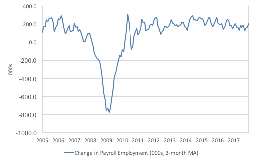
The first graph shows the monthly change in payroll employment (in thousands, expressed as a 3-month moving average to take out the monthly noise).
The monthly changes were stronger in 2014 and 2015, and then dipped in the first-half of 2016. By the end of 2016, job creation was stronger but then it tailed off again, somewhat.
Payroll employment change has steadily fallen per month (with fluctuations) since around 2015.
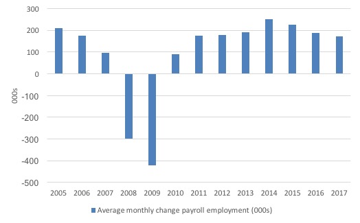
The next graph shows the same data in a different way – in this case the graph shows the average net monthly change in payroll employment (actual) for the calendar years from 2005 to 2017.
The slowdown that began in 2015 is continuing.
The average change in 2017 was 171 thousand, which is down from the 187 thousand average throughout 2016.
The average net change in 2014 was 250 thousand, in 2015 it was 226 thousand.
Labour Force Survey – employment growth positive this month
In December 2017, employment as measured by the household survey rose by 0.07 per cent (104 thousand) while the labour force grew by 0.04 per cent (64 thousand) and the participation rate was steady.
The monthly data has fluctuated considerably lately so it is a little hard to be definitive.
I expect there to be further revisions in the employment outcome when the data comes out next month. Please read – Employment Situation Technical Note – for more on why the data accuracy may vary from month to month.
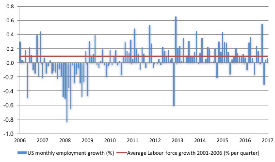
The next graph shows the monthly employment growth since the low-point unemployment rate month (December 2006). The red line is the average labour force growth over the period December 2001 to December 2006 (0.09 per cent per month).
December’s growth rate was below the pre-crisis average labour force growth and well below the average pre-crisis monthly employment growth of 0.11 per cent.
What is apparent is that no coherent positive and reinforcing trend in employment growth has been established in the US labour market since the recovery began back in 2009. There are still many months where employment growth, while positive, remains relatively weak when compared to the average labour force growth prior to the crisis or is negative.
The sharp positive spike in September is clearly an outlier as is (to a certain extent) the negative spike in October.
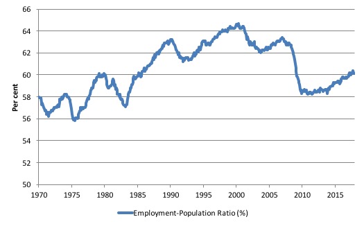
A good measure of the strength of the labour market is the Employment-Population ratio given that the movements are relatively unambiguous because the denominator population is not particularly sensitive to the cycle (unlike the labour force).
The following graph shows the US Employment-Population from January 1970 to December 2017. While the ratio fluctuates a little, the December 2017 outcome was stable at 60.1 per cent.
Over the longer period though, we see that the ratio remains well down on pre-GFC levels (peak 63.4 per cent in December 2006), which is a further indication of how weak the recovery has been so far and the distance that the US labour market is from being at full capacity (assuming that the December 2006 level was closer to that state).
Unemployment trends
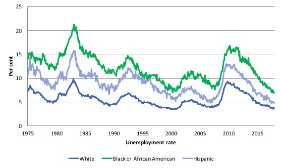
The trends in unemployment by ethnicity are interesting in the US.
Two questions arise:
1. Is the Black and African American unemployment rate higher than it was before the GFC, given that the White unemployment rate is now around its lower levels?
2. Has the relationship between the Black and African American unemployment rate and the White unemployment rate deteriorated since the GFC?
The answer to both questions (in order) is No.
The first graph shows the history of BLS unemployment rates for Black and African Americans, Hispanics and Whites.
You can see that they all cycle together as economic activity cycles. You can also see that the Black and African American unemployment rate is currently at 6.8 per cent, which is now lower than the pre-GFC minimum achieved of 7.6 per cent (August 2007).
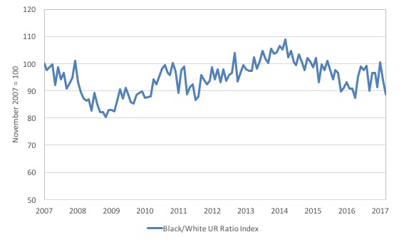
The second graph shows the Black and African American unemployment rate to White unemployment rate (ratio) from November 2007 (index = 100), when the White unemployment rate was at its previous lowest level.
This graph allows us to see whether the relative position of the two cohorts has changed since the crisis.
The data shows that, in fact, Black and African Americans are slightly better off in relative terms now (December 2017) than they were a decade ago.
The ratio index stands at 88.6, meaning that that the Black and African American to White unemployment rate ratio has fallen quite significantly.
The improvement in the Black and African American unemployment situation has been taken as a sign that the US labour market is getting tighter – moving closer to full employment.
It clearly shows that the US labour market recovery is broadening into the more disadvantaged groups.
But that may be (given other indicators) that the White participation rate has fallen so much and firms are prepared to moderate their prejudices against Blacks in order to attract labour.
The US jobs deficit
As noted in the Overview, the current participation rate of 62.7 per cent is a long way below the most recent peak in December 2006 of 66.4 per cent.
When times are bad, many workers opt to stop searching for work while there are not enough jobs to go around. As a result, national statistics offices classify these workers as not being in the labour force (they fail the activity test), which has the effect of attenuating the rise in official estimates of unemployment and unemployment rates.
These discouraged workers are considered to be in hidden unemployment and like the officially unemployed workers are available to work immediately and would take a job if one was offered.
In most advanced nations, the population is shifting towards older workers who have lower participation rates – so the US is not special in this regard.
Thus some of the decline in the total participation rate could simply being an averaging issue – more workers who have a lower participation rate as a proportion of the total workforce.
In this recent blog (November 7, 2017) – Updating the impact of ageing labour force on US participation rates – I estimated that about 61 per cent of the decline in the participation rate since January 2008 has been due to non-cyclical shifts in the demographic weights.
That is, the shift in the age composition of the working age population towards older workers with lower participation rates accounted for about 61 per cent of the actual decline since January 2008.
So, even if we take out the estimated demographic effect (the trend), we are still left with a significant cyclical response.
What does that mean for the underlying unemployment?
The labour force changes as the underlying working age population grows and with changes in the participation rate.
If we adjust for the ageing component of the declining participation rate and calculate what the labour force would have been given the underlying growth in the working age population if participation rates had not declined since January 2008 then we can estimate the change in hidden unemployment since that time due to the sluggish state of the US labour market.
Adjusting for the demographic effect would give an estimate of the participation rate in December 2017 of 64.1 if there had been no cyclical effects (1.4 percentage points up from the current 62.7 per cent).
It is hard to claim that these withdrawals reflect structural changes (for example, a change in preference with respect to retirement age, a sudden increase in the desire to engage in full-time education).
To compute these job gaps we have to set a ‘full employment’ benchmark. In the past, I have set it at 4.1 per cent, which is where the US labour market is currently sitting.
I doubted that 4.1 per cent was the true irreducible minimum unemployment rate that could be sustained in the US. For example, if the government offered an unconditional Job Guarantee at an acceptable minimum wage there would be a sudden reduction in the national unemployment rate which would take it to well below 4.1 per cent without any significant inflationary impacts (via aggregate demand effects).
In that sense, my estimates should be considered the best-case scenario given that I actually think the cyclical losses are much worse than I provide here.
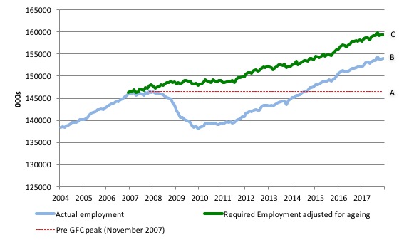
Using the estimated potential labour force (controlling for declining participation), we can compute a ‘necessary’ employment series which is defined as the level of employment that would ensure on 4.1 per cent of the simulated labour force remained unemployed.
This time series tells us by how much employment has to grow each month (in thousands) to match the underlying growth in the working age population with participation rates constant at their January 2007 peak – that is, to maintain the 4.1 per cent unemployment rate benchmark.
I computed the ‘necessary’ employment series based on the age-adjusted potential labour force (dark green line in the following graph).
The light blue line is the actual employment as measured by the BLS and the dotted red line is the level of employment that prevailed in November 2007 (the peak before the crisis).
This allows us to calculate how far below the age-adjusted 4.1 per cent unemployment rate (constant participation rate) the US employment level currently is.
There are two effects:
- The actual loss of jobs between the employment peak in November 2007 and the trough (January 2010) was 8,582 thousand jobs. However, total employment is now above the January 2008 peak by 7,426 thousand jobs. This gain in jobs is measured by the AB gap in the graph which shows the gap in employment relative to the November 2007 peak (the dotted red line is an extrapolation of the peak employment level). You can see that it wasn’t until August 2014 that the US labour market reached the November 2007 peak employment level again.
- The shortfall of jobs (the overall jobs gap) is the actual employment relative to the jobs that would have been generated had the demand-side of the labour market kept pace with the underlying population growth (Required Employment Adjusted for Ageing) – that is, with the participation rate at its January 2008 value and the unemployment rate was constant at 4.1 per cent. This shortfall loss amounts to 5,302 thousand jobs. This is the segment BC measured as at December 2017.
The US Jobs Gap is thus the departure of current employment from the level of employment that would have generated a 4.1 per cent unemployment rate, given current population trends.
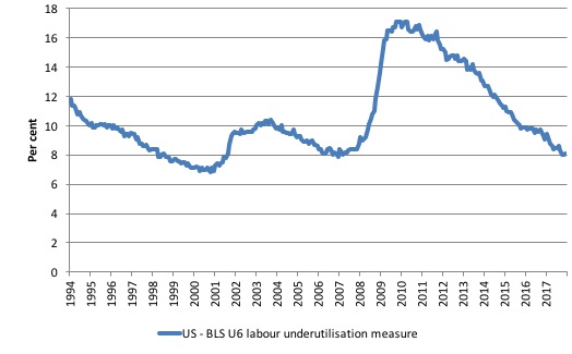
To put that into further perspective, the following graph shows the BLS measure U6, which is defined as:
Total unemployed, plus all marginally attached workers plus total employed part time for economic reasons, as a percent of all civilian labor force plus all marginally attached workers.
It is thus the broadest measure of labour underutilisation that the BLS publish.
In December 2006, before the affects of the slowdown started to impact upon the labour market, the measure was estimated to be 7.9 per cent.
It is now at 8.1 per cent (having risen from 7.9 per cent in October).
The U-6 measure remains above the trough of the early 2000s, and remains marginally above its pre-GFC level.
Wage movements
In trying to claim that the US economy was essentially back to full employment, Paul Krugman wrote in his latest column (January 9, 2017) – Deficits Matter Again – that:
How do we know that we’re close to full employment? The low official unemployment rate is just one indicator. What I find more compelling are two facts: Wages are finally rising reasonably fast, showing that workers have bargaining power again, and the rate at which workers are quitting their jobs, an indication of how confident they are of finding new jobs, is back to pre-crisis levels.
Well, my reading of the real wage data doesn’t accord with that claim.
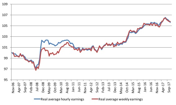
The following graph shows movements in real average hourly earnings and real average weekly earnings (indexed at 100 at their pre-GFC peak – December 2006 and November 2006, respectively) up to November 2017.
The faster growth as the recovery gained speed ended in early 2016. A more recent growth spurt is observed over the first half of 2017.
But that has now given way to declining growth in real wages.
The real hourly index has dropped from 106.5 points in July 2017 to 105.6 in November 2017. A similar fall in the real weekly earnings index.
Real wages are thus falling in the US – which is not a sign that “wages are finally rising reasonably fast”.
Hiring and Quit Rates
In the New York Times article cited above, Paul Krugman also claimed that “the rate at which workers are quitting their jobs, an indication of how confident they are of finding new jobs, is back to pre-crisis levels.”
Well, the latest JOLTS data does not really support Krugman’s assertions.
In this blog (September 8, 2016) – US labour market in an uncertain limbo – I explain in detail how mainstream labour market theory asserts that the quit rate is countercyclical – that is, rise when the economy is in decline and vice-versa – despite all evidence to the contrary.
This is because they consider supply-side shifts to dominate demand-side shifts. Refer to that blog for the detailed account.
Quits “are voluntary separations, and measure workers’ willingness or ability to leave the job” (Source)
And at the empirical level orthodox labour market theory predicts that quits will fall as employment falls.
The simplest fact then, which would give support to this notion of supply-side shifts, is whether the quit rate is, indeed, counter-cyclical – as the theory predicts. That is, does the quit rate rise when the unemployment rate rises or not. Simple enough.
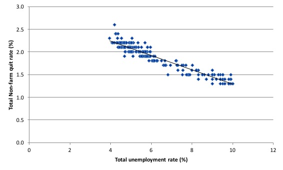
The US Bureau of Labour Market JOLTS database includes estimates of the quit rate. The following graph shows in a compelling way that the quit rate (non-farm quits as a percent of total non-farm employment) behaves in a cyclical fashion as we would expect – that is, it rises when times are good and falls when times are bad.
The graph relates the quit rate (vertical axis) to the unemployment rate (horizontal axis) from December 2000 to November 2017 (latest comparable data). The straight black line is a simple linear regression trend drawn through the graph.
There are no shifts evident in this relationship just movements along a fairly defined inverse relationship.
That is, when the unemployment rate rises, the quit rate falls. Exactly the opposite to that predicted by the supply-side story which means that their claim that causality runs from unemployment benefits to higher quits to higher unemployment is unsustainable.
Many studies, which are not caught up in the orthodox Groupthink, have demonstrated the phenomenon depicted in this graph – for several countries where decent data is available.
Workers become very cautious when unemployment starts to rise and postpone any desired or planned job changes and opt for the security of their present job.
When there are more jobs being created and the hiring rate rises, workers then take more risks and the quit rate tends to rise.
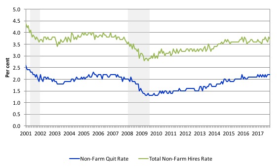
The following graph shows the Non-farm hiring and quit rate for the US from December 2000 (the beginning of the JOLTS dataset) to November 2017 (the most recent data).
Both the hires rate and the quit rate are still below the pre-GFC levels and certainly well below the levels at the turn of the century.
Just those indicators alone, tell us that the US labour market has some slack left to absorb.
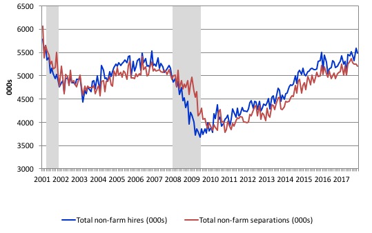
Another way of seeing how the job flows tell us about the direction of change is to compare movements in hires and separations. The following graph shows this relationship for the US economy as published by the BLS for the period from December 2000 to November 2017.
While labour markets are clearly dynamic in the sense that even in a downturn new jobs are being continually created and destroyed the rates of each dynamic change in a cyclical way. So while there were new jobs being created at the height of the downturn there was a severe shortfall of new jobs emerging as is shown in the graph.
Separations also fall for reasons noted above. The difference between hires and separations is the net change in employment in each month. If hires outstrip separations, employment grows and vice versa.
The most recent data shows that hiring and separations have not surpassed the pre-GFC levels.
If anything, separations are waning which indicates a weakening of labour demand.
Conclusion
The November labour market data release for the US show a labour market that is delivering steady outcomes from month to month but significant slack still remains.
Caution should always be exercised given the volatility of the monthly data.
The broader measure of labour underutilisation (U-6) rose slightly while the unemployment rate remains at low levels (although it could go lower with the introduction of a Job Guarantee).
This suggests a weakening of hours demand for labour.
I still do not think the US labour market is near to full employment. This assessment is reinforced by the fact that the participation rate is still well below where it was even after we adjust for the ageing effects (retirements), are bias towards low wage jobs continues, and the JOLTS dynamics suggest some slack.
That is enough for today!
(c) Copyright 2017 William Mitchell. All Rights Reserved.
Unemployment rate in Japan: 2,7%