The Australian Bureau of Statistics (ABS) released the latest labour force data today (June 25,…
US labour market – uncertainty remains paramount with data volatility
On November 3, 2017, the US Bureau of Labor Statistics (BLS) released their latest labour market data – Employment Situation Summary – October 2017 – which showed that total non-farm employment from the payroll survey rose by 261,000 in October, which the BLS said “mostly offset … a decline in
September that largely reflected the impact of Hurricanes Irma and Harvey”. For more on that issue see my analysis from last month – US labour market – hit by two hurricanes but improvement suggested. While the payroll data showed a strong rebound in employment, the Labour Force Survey data estimated a sharp drop in employment (484 thousand) in October while the labour force was also estimated to have contracted sharply by 765 thousand. The latter was due to a rather implausible decline in the participation rate (0.4 points), which will probably be revised next month. But, taking the data on face value, the BLS estimated that unemployment fell by 281 thousand and the official unemployment rate fell by 0.2 points to 4.1 per cent. There is still a large jobs deficit remaining and other indicators suggest the labour market is still below where it was prior to the crisis. What was striking about the October data though was the dramatic fall in the labour force participation rate – by 0.4 percentage points allied with the decline in the Employment-Population ratio (0.2 points). I analyse those movements in this month’s focus section of this blog. On the face of the aggregate data, the US labour market is getting back to its pre-GFC position but there is evidence that the quality of work has declined and negative cyclical effects remain in the system.
Overview – Total employment fell in October
For those who are confused about the difference between the payroll (establishment) data and the household survey data you should read this blog – US labour market is in a deplorable state – where I explain the differences in detail.
See also the – Employment Situation FAQ – provided by the BLS, itself.
The BLS say that:
The establishment survey employment series has a smaller margin of error on the measurement of month-to-month change than the household survey because of its much larger sample size. … However, the household survey has a more expansive scope than the establishment survey because it includes self-employed workers whose businesses are unincorporated, unpaid family workers, agricultural workers, and private household workers …
Focusing on the Household Labour Force Survey data, the seasonally adjusted labour force fell by 765 thousand in October 2017 as the participation rate fell by 0.4 points to 62.7 per cent.
Total employment fell by a 484 thousand in net terms somewhat reversing the equally unbelievable estimated rise last month of 900 odd thousand jobs (standby for revisions next month!).
Taken together, these shifts meant that official unemployment fell by 281 thousand.
The official unemployment rate fell by 0.2 points to 4.1 per cent.
Notwithstanding these improvements, the October 2017 participation rate of 62.7 per cent is still far below the peak in December 2006 (66.4 per cent).
Adjusting for the ageing effect (see below), the rise in those who have given up looking for work for one reason or another since December 2006 is around 3.71 million workers.
If we added them back into the labour force and considered them to be unemployed (which is not an unreasonable assumption given that the difference between being classified as officially unemployed against not in the labour force is solely due to whether the person had actively searched for work in the previous month) – we would find that the current US unemployment rate would be around 6.6 per cent rather than the official estimate of 4.1 per cent.
The 0.4 points fall in the participation rate in October means that there were 753 thousand less workers in the labour force in that month relative to what would have been had the participation rate not declined.
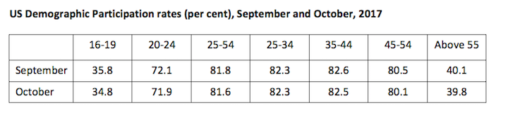
The following table shows the participation rates for September and October 2017 for the different age groups within the Working Age Population in the US.
The major shift has been at the two ends of the age distribution: the teenage participation rate fell by 1 percentage point, while those above 45 years also saw significant declines.
In tomorrow’s blog I provide detailed analysis of these demographic shifts (I was going to include it here but then the blog would be too long).
So the decline in the overall participation rate is not a straightforward case of the ageing population or young people returning to school.
But had that 0.4 points drop not occurred, then the unemployment rate would have been 4.5 per cent rather than the official rate of 4.1 per cent.
That provides a quite different perspective in the way we assess the US recovery.
Note also previous discussions – All net jobs in US since 2005 have been non-standard and the fact that there has been a bias towards low-wage job creation in the recovery.
Conclusion: on that basis, the US labour market is still a long way from where it was at the end of 2007, even though the U-6 Broad indicator has now returned to its pre-GFC level (see below).
Payroll employment trends
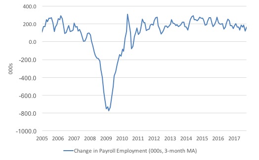
The first graph shows the monthly change in payroll employment (in thousands, expressed as a 3-month moving average to take out the monthly noise).
The monthly changes were stronger in 2014 and 2015, and then dipped in the first-half of 2016. By the end of 2016, job creation was stronger but then it tailed off again, somewhat.
In the first two months of 2017 (January and February), there was a strengthening of the net payroll employment change, followed by a lull in March and May, and then a strengthening.
September was definitely weaker due to the impact of the dual hurricanes, but October was the strongest month since September 2016.
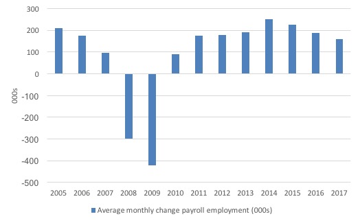
The next graph shows the same data in a different way – in this case the graph shows the average net monthly change in payroll employment (actual) for the calendar years from 2005 to 2017. Clearly, the average for 2017 is for January to October only.
The slowdown that began in 2015 is continuing.
The average change so far in 2017 (158 thousand) is down from the 187 thousand average throughout 2016.
The average net change in 2014 was 250 thousand, in 2015 it was 226 thousand.
Labour Force Survey – employment growth negative this month
In October 2017, employment as measured by the household survey fell by 0.31 per cent (484 thousand) while the labour force contracted by 0.47 per cent (765 thousand) and the participation rate fell sharply by 0.4 points.
This swing in employment downwards is substantial and follows an equally implausible rise last month.
But taken at face value, the fall in the labour force was larger than the decline in total employment, which mean that unemployment fell by 281 thousand and the unemployment rate fell from 4.22 per cent to 4.07 per cent.
We should note that the monthly data has been all over the place lately so it is a little hard to be definitive.
I expect there to be further revisions in the employment outcome when the data comes out next month. Please read – Employment Situation Technical Note – for more on why the data accuracy may vary from month to month.
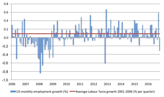
The next graph shows the monthly employment growth since the low-point unemployment rate month (December 2006). The red line is the average labour force growth over the period December 2001 to December 2006 (0.09 per cent per month).
What is apparent is that no coherent positive and reinforcing trend in employment growth has been established in the US labour market since the recovery began back in 2009. There are still many months where employment growth, while positive, remains relatively weak when compared to the average labour force growth prior to the crisis or is negative.
The sharp positive spike in September is clearly an outlier as is (to a certain extent) the negative spike in October.
A good measure of the strength of the labour market is the Employment-Population ratio given that the movements are relatively unambiguous because the denominator population is not particularly sensitive to the cycle (unlike the labour force).
The following graph shows the US Employment-Population from January 1970 to October 2017. While the ratio fluctuates a little, the October 2017 outcome (60.2 per cent) was 0.2 points down from the previous month.
This largely reversed the 0.3 points spike last month. Again, corrections in the data are going on.
Over the longer period though, we see that the ratio remains well down on pre-GFC levels (peak 63.4 per cent in December 2006), which is a further indication of how weak the recovery has been so far.

The US jobs deficit
As noted in the Overview, the current participation rate of 62.7 per cent is a long way below the most recent peak in December 2006 of 66.4 per cent.
When times are bad, many workers opt to stop searching for work while there are not enough jobs to go around. As a result, national statistics offices classify these workers as not being in the labour force (they fail the activity test), which has the effect of attenuating the rise in official estimates of unemployment and unemployment rates.
These discouraged workers are considered to be in hidden unemployment and like the officially unemployed workers are available to work immediately and would take a job if one was offered.
Tomorrow’s blog will provide detailed analysis which decomposes the long-term decline in the participation rates into trend and cyclical components, compositional shifts (changing shares) of the different demographic age groups in the working age population also impact significantly on the participation rate.
In most advanced nations, the population is shifting towards older workers who have lower participation rates – so the US is not special in this regard.
Thus some of the decline in the total participation rate could simply being an averaging issue – more workers who have a lower participation rate as a proportion of the total workforce.
The analysis in tomorrow’s blog will show that about 61 per cent of the decline in the participation rate since January 2008 has been due to non-cyclical shifts in the demographic weights.
That is, the shift in the age composition of the working age population towards older workers with lower participation rates accounted for about 61 per cent of the actual decline since January 2008.
But, even if we take out the estimated demographic effect (the trend), we are still left with a significant cyclical response.
What does that mean for the underlying unemployment?
The labour force changes as the underlying working age population grows and with changes in the participation rate.
If we adjust for the ageing component of the declining participation rate and calculate what the labour force would have been given the underlying growth in the working age population if participation rates had not declined since January 2008 then we can estimate the change in hidden unemployment since that time due to the sluggish state of the US labour market.
Adjusting for the demographic effect would give an estimate of the participation rate in October 2017 of 64.9 if there had been no cyclical effects (2.2 percentage points up from the current 62.7 per cent).
It is hard to claim that these withdrawals reflect structural changes (for example, a change in preference with respect to retirement age, a sudden increase in the desire to engage in full-time education).
To compute these job gaps we have to set a ‘full employment’ benchmark. In the past, I have set it at 4.1 per cent, which is where the US labour market is currently sitting.
I doubted that 4.1 per cent was the true irreducible minimum unemployment rate that could be sustained in the US. For example, if the government offered an unconditional Job Guarantee at an acceptable minimum wage there would be a sudden reduction in the national unemployment rate which would take it to well below 4.1 per cent without any significant inflationary impacts (via aggregate demand effects).
In that sense, my estimates should be considered the best-case scenario given that I actually think the cyclical losses are much worse than I provide here.
Using the estimated potential labour force (controlling for declining participation), we can compute a ‘necessary’ employment series which is defined as the level of employment that would ensure on 4.1 per cent of the simulated labour force remained unemployed.
This time series tells us by how much employment has to grow each month (in thousands) to match the underlying growth in the working age population with participation rates constant at their January 2007 peak – that is, to maintain the 4.1 per cent unemployment rate benchmark.
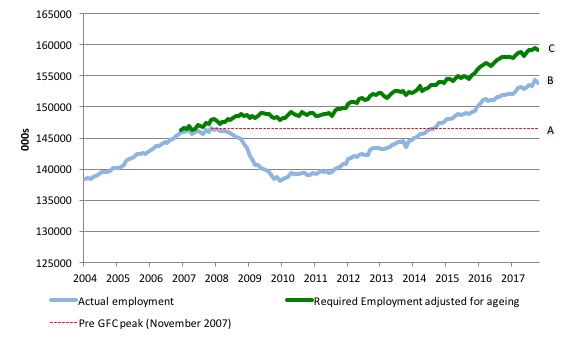
I computed the ‘necessary’ employment series based on the age-adjusted potential labour force (dark green line in the following graph).
The light blue line is the actual employment as measured by the BLS and the dotted red line is the level of employment that prevailed in November 2007 (the peak before the crisis).
This allows us to calculate how far below the age-adjusted 4.2 per cent unemployment rate (constant participation rate) the US employment level currently is.
There are two effects:
- The actual loss of jobs between the employment peak in November 2007 and the trough (January 2010) was 8,582 thousand jobs. However, total employment is now above the January 2008 peak by 7,266 thousand jobs. This gain in jobs is measured by the AB gap in the graph which shows the gap in employment relative to the November 2007 peak (the dotted red line is an extrapolation of the peak employment level). You can see that it wasn’t until August 2014 that the US labour market reached the November 2007 peak employment level again.
- The shortfall of jobs (the overall jobs gap) is the actual employment relative to the jobs that would have been generated had the demand-side of the labour market kept pace with the underlying population growth (Required Employment Adjusted for Ageing) – that is, with the participation rate at its January 2008 value and the unemployment rate was constant at 4.1 per cent. This shortfall (BC) loss amounts to 5,248 thousand jobs. This is the segment BC measured as at October 2017.
The US Jobs Gap is thus the departure of current employment from the level of employment that would have generated a 4.1 per cent unemployment rate, given current population trends.
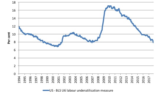
To put that into further perspective, the following graph shows the BLS measure U6, which is defined as:
Total unemployed, plus all marginally attached workers plus total employed part time for economic reasons, as a percent of all civilian labor force plus all marginally attached workers.
It is thus the broadest measure of labour underutilisation that the BLS publish.
In December 2006, before the affects of the slowdown started to impact upon the labour market, the measure was estimated to be 7.9 per cent. It now has returned to that value.
The U-6 measure remains above the trough of the early 2000s, but has now returned to its pre-GFC level.
It remains to be seen what this sharp participation rate drop means and we should wait until next month’s data before any conclusions are drawn.
Conclusion
The October labour market data release for the US is once again difficult to interpret because of the large negative spike in employment from the household survey. Perhaps, the payroll data is a better guide to what is going on and that came in as a strong indicator.
But caution always has to be exercised given the volatility of the monthly data.
The broader measure of labour underutilisation (U-6) has now returned to its pre-GFC level and unemployment fell sharply on the back of a relatively implausible participation rate decline.
I still do not think the US labour market is near to full employment. This assessment is reinforced by the fact that the participation rate is still well below where it was even after we adjust for the ageing effects (retirements).
That is enough for today!
(c) Copyright 2016 William Mitchell. All Rights Reserved.
Interesting article!
http://www.independent.co.uk/news/long_reads/actually-the-magic-money-tree-does-exist-according-to-modern-monetary-theory-a8021501.html