I started my undergraduate studies in economics in the late 1970s after starting out as…
The PBO – humiliation all round
In July 2013, the Australian Labor Party (the then Federal Government) humiliated itself when it created the – Parliamentary Budget Office. It was a case of “me too” “catch-up” neo-liberalism because the morons who dreamt up this plan felt left out because the US had its Congressional Budget Office and the Brits had a Office for Budget Responsibility and other advanced nations similar. The now conservative Federal government humiliated itself in September 2013 when it declined the sensible path which would have scrapped this ridiculous waste of public funds. The PBO humiliated itself yesterday when it released its first report – Australian Government spending Part 1: Historical trends from 2002-03 to 2012-13 – which contains spurious analysis, to say the least. And last not least, several leading economics journalists in Australia humiliated themselves this morning when they wrote up the PBOs press release as if it was something that mattered and refused to elicit a single critical word of the PBO report. Their creativity was to get some quotes from various “bank” economists who considered the report was tantamount to the sky falling in. What a sorry mess this all is. And it will be the poor, the unemployed and underemployed who will bear the brunt of the policy response.
In the Sydney Morning Herald article (December 11, 2013) – Government spending outpaces economic growth – which was representative of the media coverage of the PBO Report’s release we read:
Australian government spending has been outpacing economic growth for more than a decade. Figures released from the Parliamentary Budget Office on Tuesday show Australian Government spending has grown 27 per cent faster than the annual rate of growth of real GDP since 2002-03.
Spending growth averaged 3.8 per cent annually, while GDP growth averaged just 3 per cent.
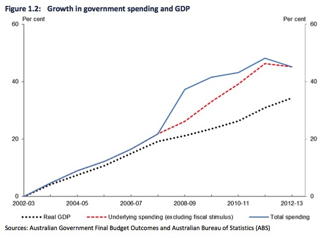
The PBO Report contained this opening graph, which set off all the idiot alarms (Figure 1.2, which I reproduce).
It went on to outline the “drivers of growth in government spending” as if the Figure 1.2 passes muster without further comment or qualification.
It is clear they just wanted the reader to worry about this last statement about the graph:
While real growth in GDP slowed to 2.4 per cent annually over the period 2007-08 to 2012-13, underlying spending grew in real terms by 3.6 per cent annually or 47 per cent faster than the annual rate of growth of real GDP.
There are only two questions that this graph poses which are interesting?
First, we know that all nominal outlays (private or public) carry an inflation risk. A nominal outlay is just an amount of dollars that is being injected into the economy in pursuit of real goods and services.
It is a flow of dollars. However, it is not necessarily a very interest aggregate to track over time because:
(a) it has to be scaled against something – like the size of the nominal economy, that is, nominal GDP (duh!). So we usually consider the ratio of outlays to nominal GDP as a guide to its evolution.
(b) its evolution is influenced by the rate of inflation. So you might have inflation running at 3 per cent per annum and nominal outlays growing at 3 per cent per annum, which means the real equivalent of the outlays (what they can buy in terms of real goods and services) is unchanged.
So before you can make any sense of whether the growth in real government outlays is a problem or not, you have to consider what has been happening to inflation.
We know that if nominal aggregate demand (that is, outlays) exceeds the real capacity of the economy to produce goods and services then there will be inflation. We would deem that rate of aggregate demand growth and the accompanying real rate of growth in outlays to be excessive as a consequence.
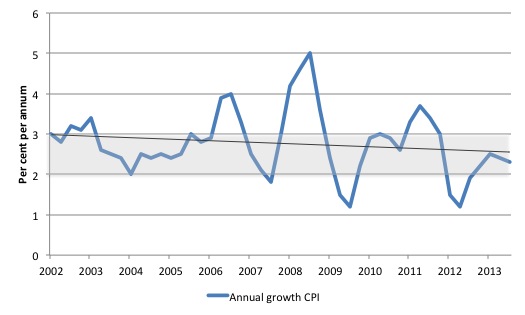
Thus, the first question we should ask (and the PBO Report doesn’t mention this issue at all in relation to Figure 1.2) is whether inflation has been accelerating or not. After all that is the risk of excessive real outlays growth (being expressed in the form of excessive nominal outlays growth).
At that point, I would have produced this graph and told the readers to stay calm there is nothing to worry about.
It shows the annual rate of growth in inflation (CPI-based measure) from the March-quarter 2002 to the September-quarter 2013. The black line is a simple linear trend regression (pointing downwards!) and the shaded area is the RBA inflation-targetting range.
The second question (and answer) then follows from the first. Is real Australian government spending excessive?
Once I saw the inflation graph I would then have written a few paragraphs informing the readers that with the real GDP growth slowing as the fiscal stimulus has been withdrawn and the national inflation rate slowing and at times well below the RBA range, it is obvious that the growth in real Australian government outlays is too low.
I would have backed that statement up by noting the deterioration in the labour market where for the last 24 months or so employment growth has been about zero and unemployment has risen – and the rise in unemployment would have been worse had not the labour force participation rate not falling significantly.
Then I would have concluded the Report with the demand for higher deficits.
But before that I would have also informed the readers that you cannot judge a government fiscal position without knowledge of what the other sectors (external and private domestic) are doing and the real activity level (real growth, employment) that the combination of the sectoral inputs to the spending stream are generating.
Purely speculating on the appropriateness of the government nominal (or real) outlays without a broader inquiry is irresponsible and incompetent. The PBO Report fails badly in that regard.
In relation to the way in which we might actually present this data here are three additional graphs.
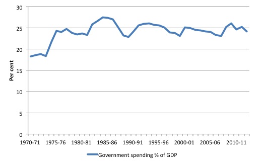
The first shows the evolution of the nominal Australian government outlays as a share of nominal GDP from fiscal year 1970-71 to 2012-13. That is, it shows the share of nominal government spending in total national income.
See any wildly exploding time series?
The behaviour of the time series seems to depict a very stable proportion with cyclical bumps (around 1981-82 and 1991 and 2009-10) which is explainable by nominal GDP (the denominator of the ratio) being recessed and government outlays (the numerator) rising to combat the recession (if only through the automatic stabilisers).
Nothing exceptional at all.
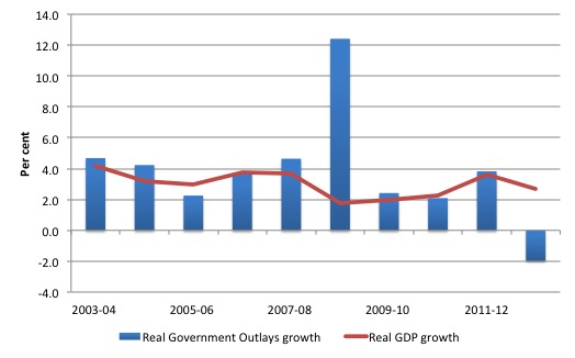
The second graph shows the annual growth in real GDP since 2003-04 to 2012-13 (red line) against the annual growth in real Australian government outlays.
The fiscal intervention (which saved the Australian economy from a major recession in 2008-09 is an outlier and after that real government outlays growth have fallen.
Indeed, apropos of the earlier point about the appropriateness of the current government outlays growth, this graph reinforces the notion that the cuts in real outlays in the recent period are undermining real GDP growth.
Why didn’t the PBO make these points? Answer: because this line of reasoning would undermine it simplistic ideological agenda – to make it look as though government outlays were out of control and unsustainable.
Before we see my final graph (remember I mentioned that there were three that I would present), consider the reaction from private sector economists to the PBO release.
One commentator (a former treasury official, now private consultant with a vested interest in sensationalising the government balances) claimed that:
Spending has grown quickly for a decade … It grew quickly when times were good under Howard, and it grew quickly when times were bad under Rudd and Gillard.
And it is now negative (in real terms) and real GDP is slowing and unemployment is rising.
Another commentator wheeled out by the SMH journalists who is listed as representing the “accounting body CPA Australia” was quoted as saying “the document raises two questions”:
Where is the government’s money going to come from? Or what do we need to stop spending on?
When I read that I had a sudden convulsive attack of hysterics. Where is the government’s money coming from, indeed. From the government of-course, except the commentator didn’t seem to get the joke! It was on him.
While he should have stopped there, he was further quoted as saying:
Reading between the lines, you can expect next week when the government does MYEFO and releases part two that they could say, ‘We’re in a hideous position and we need to make some tough calls’
To which if the journalists involved had the slightest understanding of what the topic was would have pointed out that words such as “hideous” are incommensurate with the analysis of a government balance.
First, the government issues the currency and so can always meet its nominal financial liabilities expressed in Australian dollars.
Second, “hideous” in relation to what? The only sensible way of assessing the appropriateness or otherwise of the evolution of a government fiscal position is to consider it in terms of its purpose. That sort of statement is completely missing from the PBO Report and the journalistic promotion of it that followed.
There is no interest per se in the growth of nominal or real government outlays or its relation to real GDP growth. There is no hard and fast rule that they should be equal or proportional.
It all depends on what the other sectors – external (net exports) and private domestic (consumption and investment) – are doing and the current state of aggregate demand growth relative to growth in available productive capacity.
There are times when the growth of nominal or real government outlays could be excessive (as noted above) and the result would be inflation. But at present that situation is not even remotely proximate.
The final graph shows the sectoral balances for Australia. Remember that the sectoral balances relationship is derived from the national accounts and brings together the expenditure sources of national income (consumption, investment, government and exports) with the uses of national income (saving, taxes, and imports).
The sectoral balances equation is:
(S – I) = (G – T) + (X – M)
The equality is a matter of accounting – that is, it always has to hold and national income movements ensure it does.
The following blogs provide more detailed analysis of the derivation and meaning of this statement:
- Barnaby, better to walk before we run
- Stock-flow consistent macro models
- Norway and sectoral balances
- The OECD is at it again!
- Saturday Quiz – June 19, 2010 – answers and discussion
The three sectoral balances are:
- Private domestic balance (S – I) – will be in surplus if the private domestic sector spends less than its income (S > I).
- Government Deficit (G – T) – will be in surplus if the government raises more tax revenue than it spends (G < T).
- Current Account balance (X – M) – will be in surplus if exports are higher than imports and net income flows (X > M)
The sectoral balances equation tells us that the private domestic balance (S – I) equals the sum of the government budget balance (G – T) plus external balance (X – M), where private savings is S, private investment is I; public outlays is G, taxes, T and exports (X) minus imports (M) is the net savings of non-residents.
We can tell stories about what is going on in the economy by making assumptions about the relative magnitudes of these balances, noting always that the strict equality is always ensured by movements in national income.
The balances are linked to national income because G and T are cyclical (in part) as a result of the automatic stabilisers (T falls in a recession and welfare outlays rise); because S and M are positive functions of national income, so in a recession both fall.
So the balances move about when national income changes but also discretionary shifts in the balances also promote national income changes. It is thus a complex system of cause and effect and feedback that the accounting statements summarise at any point in time.
For example, if the private domestic sector sought to increase its saving overall – to increase (S – I) – and there was not change in the external balance (X – M), then the loss of aggregate demand flowing into the economy would lead to a decline in real GDP growth and national income and rising unemployment.
To prevent that from happening the government would have to increase its deficit (G – T) flow to offset the demand impact of the private domestic saving.
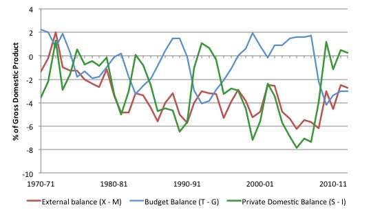
The following graph shows the movement in the government deficit as a per cent of GDP (blue line), the Current Account deficit as a percent of GDP (red line) and the private domestic balance (green line) for Australia for the financial years 1970-71 to 2012-13. As a piece of related information, the exchange rate was floated in 1983.
Note the budget balance is expressed as (T – G) so a deficit is a negative number.
Australia is a very open economy and exports and imports fluctuate around 20 per cent of GDP in real terms and in nominal terms the net exports deficit has been around 4 to 6 per cent of GDP.
That means that the external sector is consistently draining aggregate demand from the economy equivalent to around 4 to 6 per cent of GDP because the income (spending) that is associated with exports is less than the outlays (spending) that we make on imports. So there is a net outflow of spending from the economy to the rest of the world.
While the external deficit has increased since the late 1970s, it has been relatively stable since then (in the 4 to 6 per cent of GDP range).
Given that (relative) stability, the movements in the government balance then will mirror the movements in the private domestic balance.
It is clear that the private domestic balance is neither consistently zero or stable over time. It is also the case that the rate times the government balance moved into surplus, the private domestic deficit increased.
Indeed, the only reason the government was able to run a sequence of surpluses in the period 1996 to 2007 was because the private domestic sector was increasingly taking on debt (spending more overall than it was earning). These deficits were being funded by the external sector and the spending associated with them drove aggregate demand at sufficient speed to allow growth to push tax revenue up.
Note that the government surpluses of the late 1980s, were wiped out in the 1991 recession and that also corresponded with a temporary halt in the private domestic sector’s credit binge.
Similarly, the shift back into surplus for the private domestic sector in recent years is associated with a declining investment rate and a return to household saving ratios of around 11 per cent, when prior to the crisis the ratios were negative.
The result though is that the government has to return to deficit or else scorch the economy severely.
Conclusion
The point is that it is a complex analytical exercise that has to be deployed to work out whether real government outlays are excessive.
The PBO doesn’t provide that complexity.
The journalists fail to do their job, which is to probe, question and balance out the public information.
Humiliation all round.
Related aside
In the Sydney Morning Herald article today (December 11, 2013) – What if Qantas sold its frequent flyer program? – we read:
How can a frequent flyer program possibly be worth so much?
If you consider points as currency – and Qantas Points are Australia’s de facto second currency, after the Aussie dollar – then a frequent flyer scheme is effectively a license to print money.
The airline creates the points, conjuring them up from thin air at the press of a spreadsheet key to sell to retail partners – credit card companies, supermarkets, hotel chains, insurance and utility suppliers, restaurants and so on.
How about that? Conjuring up from thin air, pressing spreadsheet keys, etc, just like a government outlaying its own currency or a football/cricket ground scoreboard keeping track of a game.
No limits other than the those that a number system might provide … and in the case of the government outlays – the availability of the real goods and services that are for sale in the currency it issues.
Imagine, some officials announcing at half-time of a football game (irrespective of the code) that the stadium scoreboard had “run out of points” so the game would have to stop.
That is enough for today!
(c) Copyright 2013 Bill Mitchell. All Rights Reserved.
Hi
I have a question to everyone. I can never get my head around National Accounts and sectoral balances to me it sounds like something is fundamentally wrong about the calculation but I cant put my finger on it.
so the question is: where happens to profits in National Accounts calculations?
Hey YILMAZ, being a confused reader myself, I found the second link listed under the following blogs extremely helpful and specifically germane to your question. Many thanks, Prof. Mitchell.
Canada’s previous Parliamentary Budget Officer (Kevin Page) created quite a stir for the conservative government before the end of his term by actually taking his job seriously and performing very competently on behalf of the Canadian people. Many embarrassing questions were raised.
The new one, so far just wonders why quite a bit of approved budgeted spending hasn’t occurred yet and makes remarks about how we are way ahead of target toward a budget surplus around election time (no we are not expected to have achieved full employment in two years 🙁 ).
Where do those Qantas Points come from anyway? Koala bears?