I grew up in a society where collective will was at the forefront and it…
US labour market on a knife-edge – stimulus is needed
Last week (May 4, 2012), the US Bureau of Labor Statistics released its latest – Employment Situation Summary – for April 2012. The data revealed that employment growth in the US is now slowing but remains positive (payroll data) although the household survey data (which uses a broader concept of employment) revealed a fall in total employment. More indicative of the state of the US labour market was the decline in the participation rate as workers once again gave up looking for jobs that were not there! While the official unemployment rate fell by 0.1 percentage points to 8.1 per cent in April, the reality is that the labour supply contraction disguises the true picture. If we added the workers who dropped out of the labour force back into the unemployment numbers then the unemployment rate would have risen to 8.4 per cent. The US economy is thus at another turning point. Private spending growth does not appear capable at present of filling the gap left by a declining public spending contribution. Unless the government provides a renewed stimulus it is likely the US economy will head backwards and unemployment will rise.
Vale Shona
It is a very sad day today. We learned last night that our friend Shona Wray (my colleague Randy’s wife) passed away suddenly on May 6, 2012 in Italy.
For details – In Memoriam.
All love and commiserations to Randy and the kids!
US employment trends
Tonight the Australian Treasurer will deliver the 2012-13 Budget and one of the points he has been making is how well the Australian economy is travelling relative to the rest of the advanced world. There is truth in what he says, which doesn’t then allow the conclusion that a budget surplus is required in Australia at this present time.
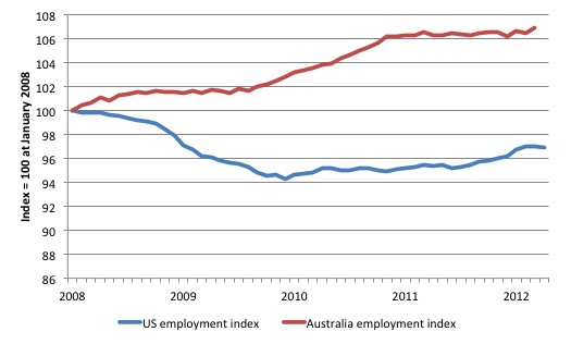
The following graph compares the evolution of total (labour force based) employment in the US and Australia since January 2008. The US cycle peaked in December 2007 and the Australian cycle peaked in February 2008.
First, the plunge in the US labour market was dramatic and substantial. Its recovery is also drawn out and weak – more analysis is presented on this below.
Second, the Australian labour market reacted very positively to the introduction of the fiscal stimulus in late 2008 and early 2009. There was a boost to construction and related employment through 2010 but as the fiscal stimulus was tapering and the Government sprouting its surplus logic the labour market basically stopped growing.
The Australian labour market added no net jobs in 2011, the first time this has happened since 1992 when we were in the throes of a very deep recession (much worse than now).
By comparison, the US labour market has shown some signs of life in recent months but that momentum looks to be slowing as the contribution of government wanes and private spending growth remains modest.
The BLS report from their establishment survey (firms) that:
Nonfarm payroll employment rose by 115,000 in April, and the unemployment rate was little changed at 8.1 percent
The increase in payroll employment was the smallest in six months.
However their household survey reported that total employment fell by 169 thousand.
The establishment survey (payrolls) data is subject to substantial revisions. The BLS report that the “change in total nonfarm payroll employment for February was revised from +240,000 to +259,000, and the change for March was revised from +120,000 to +154,000”.
So what are we to make of the latest employment data from the US?
To understand the difference between payroll- and household-based employment surveys you might like to read this excellent BLS publication (May 4, 2012) – Employment from the BLS household and payroll surveys: summary of recent trends.
The BLS say that:
The Bureau of Labor Statistics (BLS) has two monthly surveys that measure employment levels and trends: the Current Population Survey (CPS), also known as the household survey, and the Current Employment Statistics (CES) survey, also known as the payroll or establishment survey.
Employment estimates from both the household and payroll surveys are published in the Employment Situation news release each month. These estimates differ because the surveys have distinct definitions of employment and distinct survey and estimation methods.
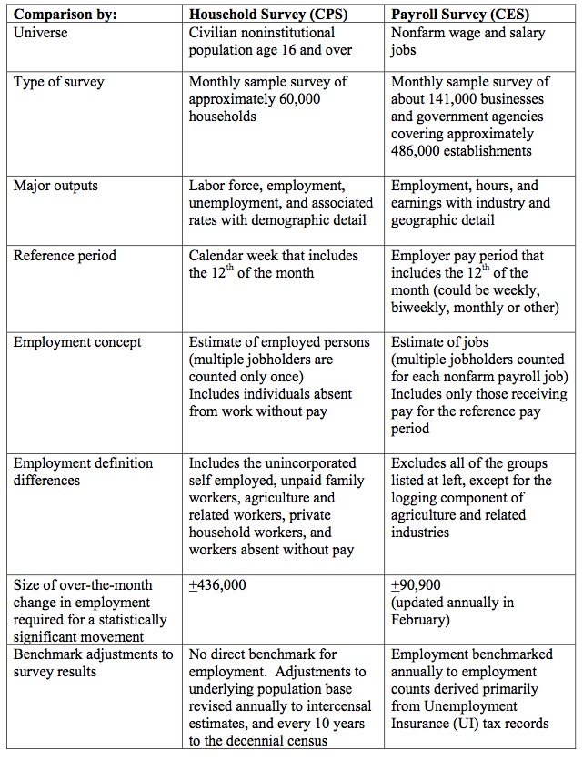
The document contains the following Table which catalogues the differences in the two employment surveys.
The BLS say that:
Both the payroll and household surveys are needed for a complete picture of the labor market. The payroll survey provides a highly reliable gauge of monthly change in nonfarm payroll employment. The household survey provides a broader picture of employment including agriculture and the self employed.
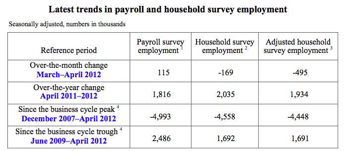
The following Table is taken from the BLS’s latest publication. The adjusted series is referred to as a “research series” by the BLS and attempts to bring the two concepts of employment closer together.
They adjust the household survey by “subtracting agriculture and related employment, nonagricultural self employed, unpaid family workers, private household workers, and workers absent without pay from their jobs, and then adding nonagricultural wage and salary multiple jobholders”.
The “household survey has a broader employment definition than the payroll survey” and so the former is always higher than the latter. They move in a similar cyclical pattern though with very similar turning points (troughs and peaks).
To summarise what the latest data is saying I offer the following points.
First, jobs are still be created but the pace of net job creation is slowing quickly (from payroll employment data).
Secondly, the BLS report that the unemployment rate was 8.1 per cent – down from 8.2 per cent in March. However, closer examination shows that this is largely because the labour force participation rate declined to 63.6 per cent in April down from 63.8 per cent. The 0.2 percentage points decline amounts to around 485 thousand workers who exited the labour force in the month.
A quick calculation shows that if we considered these workers as hidden unemployed and added them back into the official pool of unemployed (12,500 thousand workers) then the unemployment rate would be around 8.4 per cent.
In other words, employment growth is failing to keep pace with the underlying population growth and the participation rate decline hides the impact of that failure by holding the unemployment rate down.
The other point to note is that the – Productivity and Costs data – for the first quarter 2012, showed that:
Nonfarm business sector labor productivity decreased at a 0.5 percent annual rate during the first quarter of 2012 …
You can think of the declining productivity in two ways.
On the one hand, reduced productivity signals a decline in growth in the material standard of living because it provides the “room” for nominal wages growth to occur without putting pressure on the price level (from a unit cost perspective). But then you think that real wages growth has been suppressed for many years in the US and (most nearly) everywhere else as national income has been redistributed to profits.
In this context, the decline in productivity growth will probably squeeze the “gap” between real wages growth and productivity growth and increase the pressure of the top-end-of-town to introduce even more draconian ways of suppressing real wages growth.
It also makes an export-driven growth strategy difficult to maintain without very serious domestic deflation (cutting workers’ wages).
On the other hand, US workers might be thankful that productivity is weak (declining) as real output growth declines because otherwise the employment would have probably fallen significantly. Productivity growth means that the same level of output can be produced with less workers and so for a given growth in real GDP, the commensurate employment growth rate is lower. This means that when employment growth is declining, the unemployment queues will not swell by as much if productivity growth also slows.
The payroll data also shows that wages are only growing at 2 per cent in the US – a sure sign of a stagnant labour market.
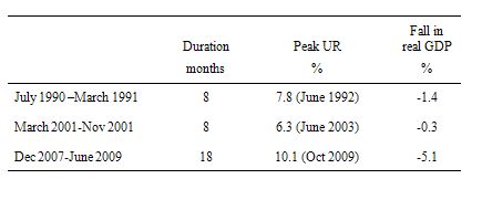
How is the US economy travelling relative to previous recessions? The following table shows the timing of US recessions since 1990 as derived from the NBER.
I restricted the analysis to the three recessions since 1990 because the BLS gross flows data (which I wanted to examine) is only available from that period (February 1990).
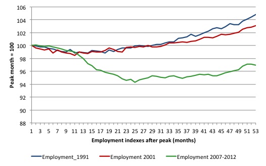
The following graph shows total US employment in each of the three recessions charted out to 53 months, which is the length of time since the most recent recession began to now. You can refer to the Table below to see the peak and trough months in each of the cycles.
The series are indexed to 100 at the respective start of each recession. So they tell you about the direction and pace of employment growth in the initial decline and then as the real economy recovered.
The current period is indeed striking. Even after real GDP growth resumed in the US (after 18 months of decline and a staggering drop of 5.1 per cent), total employment continued to fall. The 1991 and 2001 recessions had a broadly similar impact on total employment which lagged the turning point in real GDP growth by a few months but then steadily moved upwards.
The sheer loss of employment in the US this time is staggering and the US labour market sas been stagnant for months as the politicians fought about how much austerity should be imposed. The delay in any political action towards austerity has allowed for some recovery to occur but the evidence is suggesting that things are slowing again.
On the face of it, the current recession is much worse for workers than the last two US recessions. How much worse? How much easier it is for an unemployed worker to gain employment now compared to a similar stage in the last 2 recessions? Are new entrants into the labour market more likely to gain employment this recession? What is the chance of a worker losing their job relative to previous recessions?
These sorts of questions can be answered by examining the Gross labour flows that are available from the US Bureau of Labor Statistics. I updated my databases this morning and now have data up to April 2012.
To fully understand the way gross flows are assembled and the transition probabilities calculated you might like to read these blogs – What can the gross flows tell us? and More calls for job creation – but then. For earlier US analysis see this blog – Jobs are needed in the US but that would require leadership
By way of summary, gross flows analysis allows us to trace flows of workers between different labour market states (employment; unemployment; and non-participation) between months. So we can see the size of the flows in and out of the labour force more easily and into the respective labour force states (employment and unemployment).
The various inflows and outflows between the labour force categories are expressed in terms of numbers of persons. But a useful alternative presentation is to compute transition probabilities, which are the probabilities that transitions (changes of state) occur. For example, what is the probability that a person who is unemployed now will enter employment next period.
So if a transition probability for the shift between employment to unemployment is 0.05, we say that a worker who is currently employed has a 5 per cent chance of becoming unemployed in the next month. If this probability fell to 0.01 then we would say that the labour market is improving (only a 1 per cent chance of making this transition).
The following table shows the schematic way in which gross flows data is arranged each month – sometimes called a Gross Flows Matrix. For example, the element EE tells you how many people who were in employment in the previous month remain in employment in the current month. Similarly the element EU tells you how many people who were in employment in the previous month are now unemployed in the current month. And so on. This allows you to trace all inflows and outflows from a given state during the month in question.
The transition probabilities are computed by dividing the flow element in the matrix by the initial state. For example, if you want the probability of a worker remaining unemployed between the two months you would divide the flow (U to U) by the initial stock of unemployment. If you wanted to compute the probability that a worker would make the transition from employment to unemployment you would divide the flow (EU) by the initial stock of employment. And so on.
So for the 3 Labour Force states we can compute 9 transition probabilities reflecting the inflows and outflows from each of the combinations.
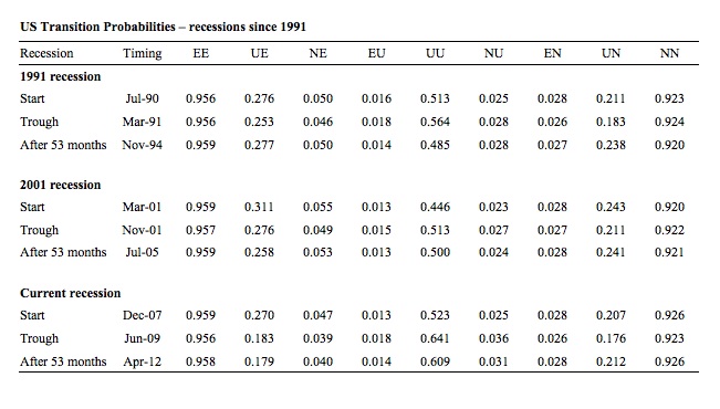
The following Table compares the three recessions in terms of the gross flow transition probabilities as at the start, the trough (when the NBER declared the recession over) and 53 months after the crisis began (April 2012 is 53 months into the current crisis).
The 9 transition probabilities tell an interesting story.
First, for those in employment, the situation is broadly similar in the last two recessions – an initial decline in the likelihood of an employed worker keeping their job (EE) of the same order of magnitude and a similar probability after 53 months. The current recessoin appears slightly worse in this regard than the 2001 recession.
Second, the probability of an unemployed worker entering employment (UE) is very different this time around. The drop in this probability in 1991 and 2001 was nowhere near the order of magnitude that has been experienced this time around. The common feature is that even after the recovery officially began, UE continued to decline in the 2001 and 2007 recessions indicating that other adjustments were going on (other than unemployed taking jobs). But the improvement in UE in the previous recessions was more marked than the current recession (in the last 20 months or so).
Third, an unemployed worker has a much higher likelihood of remaining in that state (UU) after 53 months this time compared to previous recessions.
Fourth, new entrants to the labour market are more likely to enter unemployment (NU) than employment (NE) at present which reduces the capacity of individuals to gain essential job experience (especially out of school).
Fifth, unemployed workers are more likely to exit the labour force (UN) than gain employment (UE) now.
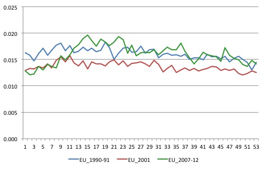
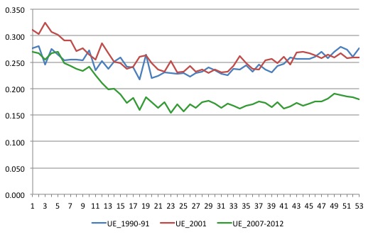
To gain a dynamic view of how each recession unfolded I plotted selected transition probabilities from the start of each of the recessions to the 53 month-point (so in effect – filling in the gaps in the previous Table).
The first graph shows the EU transition – the probability that an employed person will become unemployed. The major observation is how quickly the current recession deteriorated as it became clear that fiscal stimulus was not going to be sufficient.
The next graph shows the UE transition probabilities – – the probability that an unemployed person will become employed. This is when you really see what happened in the current recession. The previous recessions behaved fairly similarly. For around 18 months the likelihood that an unemployed worker would gain employment in the next month fell and then as growth intensified the UE probability slowly rose again.
The experience this time around is very different. The decline has been more severe and it is only in the last few months that the probability moved above the trough level where it had been stuck for more than 2.5 years.
Conclusion
After the crisis began the US economy was saved from a major depression by the initial fiscal stimulus. There is no doubt about that. However, because the stimulus was not of a sufficient magnitude, the economy only slowly ground its way towards growth and the labour market was stuck in a very persistent recessed state with only slight improvements occurring.
Unlike Europe and the UK, however, the austerity ambitions of the Congress have yet to be inflicted on the US economy and the continuing fiscal support allowed growth to resume.
The fiscal support is now waning and while consumers are showing some signs of confidence, overall employment growth is following the output growth slowdown.
It remains to be seen whether the confidence in the private sector stalls or can arrest the decline.
Interesting document trove
The legal firm handling the clean up of the Lehman Brothers mess – Jenner & Block LLP have released a large quantity of Documents – which trace its dealings prior to the collapse. They are staggering not because they tell us much that we didn’t already suspect but that it is staring us in the face – words on the page – E-mails, briefings, assessments etc.
I have only just started reading them. Today’s offering is this document from Standard & Poors Ratings Direct – Lehman Brothers Holdings – April 3, 2008, which delivered the update on the firms rating A+ and the rationale and outlook for that rating.
S&P said:
Standard & Poor’s Rating Services’ ratings on … Lehman … continue to reflect the firm’s sound franchise, which increasingly exhibits greater diversification in both product offering and geographic reach. The ratings also reflect Lehman’s strong risk-management culture and prudent liquidity and funding profile … We view Lehman’s ability to scale its cost base to adapt to market conditions favorably, given the decline in revenues that current market conditions have engendered … Lehman maintains an excellent risk culture, which results in the firm’s comparatively lower risk appetite than that of peers, and its strong liquidity and funding profile. Management has, and continues to implement a number of measures to ensure Lehman’s ability to meet its funding obligations, even in a stressed environment.
On June 5, 2008, S&P published their Q2 2008 Update – on Lehmans where we read:
Despite a sizeable forecast loss of almost $2.8 billion, the actions taken by Lehman in Q2’08 will result in the strongest capital and liquidity positions the Firm has ever had … The loss … while large, is less concerning when deconstructed into its constituent pieces as it illustrates that idiosyncratic “one-time” factors explain most of the poor performance and that Lehman’s underlying franchise remains strong and competitive … We believe that Lehman’s core underlying franchise remains as strong as ever … As markets improve, we are confident Lehman will perform well … When all factors are taken into account, we do not believe Q2’08 results justify any negative rating action for Lehman Brothers …
By the end of September 2008 the “Firm” had folded.
If a medical doctor, for example, gave these assessments to a patient and they died within the year I would think the doctor would be the subject of a malfeasance action.
Why are these ratings agencies immune?
Some things are moving in the right direction
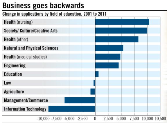
Yesterday (May 7, 2012), the Australian Financial Review carried this story – Business losing best and brightest – which reported on the shifting enrolments in Australian universities. The article noted that:
Business degrees are on the nose. Application rates have slowed and data suggests many of the brightest students are choosing careers in fields such as health.
Figures compiled by the Group of Eight show that over the decade to 2011, applications for management and commerce degrees at Australian universities declined by 15.4 per cent. At the same time, demand for health, society and engineering grew.
The actual reality is that the brightest students do not tend to go into business degrees in Australia. In general, these programs have lower entrance scores and as the article notes, “only a quarter of the students who received offers to study business scored an Australian Tertiary Admissions Rank (ATAR) of 90.05 or more, whereas 40 per cent of offers in science and health went to students in the top bracket”.
The following graphic shows the “change in applications by field of study, 2001 to 2011” (per cent). This is a healthy trend. The rise of business ad finance degrees have seen the demise of economics, economic history and quantitative subjects. They have also not equipped students with a broad understanding (education) of the place the business sector plays in the society (it is only one sector after all).
That is enough for today!

I am so very sorry to hear about the passing of Shona Kelly Wray. So tragic and devastating. And unimaginable grief. My thoughts are with Randy, his children, his family and friends. And all the lives Shona has touched through her work at UMKC.
Condolences to R. Wray, very sad news.
Sure we need stimulus, especially considering how we follow extreme austerity with a yearly deficit of roughly 10% of gdp. Maybe 20% of yearly deficits will do the trick.
Yes, Bill, nothing is properly being done to encourage employers to hire in the US. I can’t see this changing given current policy settings. And let’s face it nothing will be done until well into 2013, given the election.
My son (19) earns $20 as part time barman. Contrast that to the minimum wage and food stamps existence of a large portion of US citizens. We are indeed fortunate to live in Australia.
Condolences on your loss Professor, her family, colleagues and friends.
@Linus Huber
Budget deficits should be whatever the private sector requires for prosperity, not based on some arbitrary number we do or do not like the sound of.