I started my undergraduate studies in economics in the late 1970s after starting out as…
Inequality continues to rise in Australia
The ABS released the latest Household Income and Income Distribution, Australia data today which allows us to get a better understanding of how the national income is being distributed among individuals. The data released today provides information about what is known as the size or personal distribution of income (ignoring how the income was gained). The data confirms the trend that Australia is becoming more unequal with the bottom 20 per cent losing out to the top 20 per cent. The changes however are relatively modest.
In a earlier blogs I have shown the chart which depicts real wages growth falling way behind labour productivity growth and this has signified a huge shift in the distribution of national towards profits. Taking that view of income distribution involves us in a study of factor shares (the broad input classes). The gap between real wages growth and labour productivity growth is unsustainable.
From both perspectives (ways of viewing the distribution of income) we learn that there is a widening gap between rich and poor and between wages and profits. The two perspectives are of-course interrelated. If capital is gaining a great share of the proceeds of national income generation via an increasing profit share then it is likely that the top 20 per cent of the personal income distribution is gaining a higher share at the expense of the lower income ends of the distribution given the biased nature of ownership of the means of production in Australia (and elsewhere).
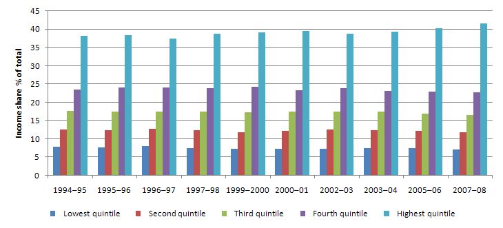
The following graph uses ABS data from 1994-95 to 2007-08 to show the evolution of the shares in total income by each quintile (20 per cent segment of the population). The data for the last three years has some comparability problems but you can read up about this by visiting the ABS link above. What you see is that the top 20 per cent has increased its share of national income over time largely at the expense of the bottom 20 per cent. There has been a slight diminution in the share of the 3rd and 4th quintiles as well.
The data in the following table summarises the trends. It tells us that in 1995-96, the bottom 20 per cent of the population received 8 per cent of the total income produced whereas the top 20 per cent received 38 per cent. The bottom 40 per cent receieved 20.6 per cent. By 2007-08 the bottom 20 per cent received 7.2 per cent, the bottom 40 received 19.1 per cent and the top 20 per cent captured 41.6 per cent. So a movement towards increased inequality.
To put this in perspective, in 1967-68, the lowest quintile took 6.59 per cent of total income while the top quintile took 38.75 per cent.
Economists use summary measures to make it easier to understand the state of the personal income distribution and movements in inequality. These measures also aid cross-country comparisons.
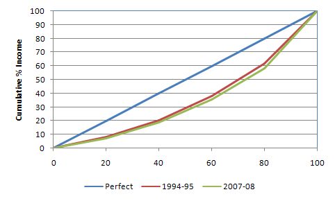
One such measure is the graphical device known as the Lorenz Curve. It is shown in the next graph. The horizontal axis is the cumulative percentage of the population from 0 to 100 per cent. On the vertical axis is the cumulative percentage of income received. Putting the two together the 45 degree line (blue line) from the lower left hand corner to the upper right hand corner would depict a perfectly equal distribution of the national income between persons. Any distributional line below that 45 degree line therefore demonstrates a state of some inequality and the more convex (bowed away from the blue line) the curve is the more unequal the distribution of income is. This line is called the Lorenz curve.
I have plotted the 1996-97 (green) and 2007-08 (red) data provided in today’s release (so 2007-08 is the latest). You can see that the changes are fairly small. The table above provides the underlying data that generates these charts. The specific changes are that the the top quintile (each quintile is 20 per cent of the total) now has a higher share of national income.
Another summary measure is the Gini coefficient, which directly relates to the graphical depiction of inequality provided by the Lorenz Curve. The Gini coefficient is a ratio formed by dividing the area between the line of equality and the Lorenz curve by the total triangle under the line of perfect equality. It ranges therefore in value from 0 (perfect equality) where the Lorenz curve is the 45 degree line to 1 (perfect inequality) where Lorenz curve is a reverse right-angle indicating the last person gets all the income. So the higher the Gini value the more unequal the income distribution is.
The latest data shows that the Gini coefficient in Australia was 0.307 in 1995-96 whereas in 2007-08 it has risen to 0.345. So again this signifies an increase in the inequality in the distribution of income.
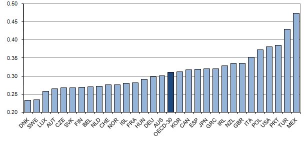
This graph comes from OECD data and was computed in the mid-2000s (so a few years old). It shows that Australia is in the mid-range of the nations in terms of Gini coefficient rankings. The Gini for Australia then was 0.311. So we have worsened our position since then.
You can get a good set of data from this OECD statistics source.
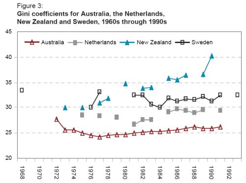
This graphic is taken from a UN Working Paper and shows the evolution of Gini coefficients for Australia, New Zealand and Sweden in the early 1970s through to 1992. In terms of the trends shown above, inequality in Australia has risen significantly since the 1970s but the rate of increase did not accelerate over the last 10 years.
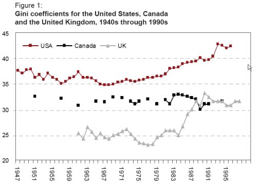
The next graph shows the Gini coefficients (drawn from the same UN paper) for the other major English speaking countries – the USA, Canada and the UK. You can see that inequality in these countries has risen more sharply than in Australia.
This OECD publication Growing Unequal? Income Distribution and Poverty in OECD Countries is useful to read if you are interested in this sort of data. The major conclusions of note are:
- “The gap between rich and poor and the number of people below the poverty line have both grown over the past two decades. The increase is widespread, affecting three-quarters of OECD countries. The scale of the change is moderate but significant.”
- “The rise in inequality is generally due to the rich improving their incomes relative both to low- and middle-income people.”
You might also be interested in exploring the OECD’s Gapminder Graphs, which are interesting although could be considered a play thing after a fairly short time.
Conclusion
This sort of data is part of a larger project I am working on and this blog just gives a snapshot of the trends. What we learn from it is interesting though. The notion that the last decade saw an acceleration in inequality in Australia in terms of the personal income distribution cannot be really maintained. We are becoming more unequal but the changes are slow moving and modest compared to trends elsewhere in the world.
The literature points to the role of social expenditure and the middle-class welfare that the previous regime made an art-form of.
The real changes that have occurred in the last decade or more (starting back in the mid-1970s and accelerating more recently) have to do with the quality and security of work. That is, gaining access to income and retaining that access is now significantly more difficult than it was in the 1960s when we had true full employment.
With increasingly precarious employment on offer it is now more of a struggle for many workers, especially those in the bottom three quintiles, to stay in the race. As this downturn continues to impact on the labour market (remember the employment impacts are the ones that drag out long after output growth has resumed) I expect the inequality to worsen.
The jump in Australia from a Gini coefficient of around 0.25 to over 0.30 occurred in the aftermath to the 1991 recession as long-term unemployment became entrenched and underemployment rose sharply for the first time in our recorded history.
I expect the same dynamics to play out this time even though the depth of the downturn is probably less severe than the 1991 episode.
Digression: Australian politics
I want a double dissolution just to get rid of the Family First senator who voted against the reintroduction of the student services payment legislation this week. Even though this bill was a weak attempt to restore the capacity of universities to levy a payment from students to support services – in the sense that it explicitly barred any of the proposed collections to be used for “political purposes” (whatever they are) – it was an essential piece of legislation to restore some of the capacity that higher educational institutions now lack which would help to make study a broadening rather than instrumental experience. Another casualty of the neo-liberal hatred of diversity.

In this context the
“The Spirit Level”
on ABC/RN at
http://www.abc.net.au/rn/saturdayextra/stories/2009/2589596.htm
The Spirit Level makes the case that in developed nations, like Japan and Australia, the more equal the distribution of income, the better it is for all, not only for the poor, but also for the wealthy.
It would seem that great inequality within a nation is apparently bad for us all, and the book questions the view that Australia is an equal society.
Dear Bill,
It’s not officially a crises until the rich are actually required to work for their money. Then the government might do something about it all.
Cheers, Alan
There’s something wrong with your Lorenz chart – they always start at 0,0 and always end at 100,100. They way you’ve got it, 100% of the population have 40% of the income. Where’s the other 60%?
Dear John
Thanks for that. I have fixed the Lorenze curves graph. The sentence wasn’t even finished that preceded the graph. It comes from rushing. I appreciate your detective work.
best wishes
bill
Hi Bill,
The Gini number does not capture the whole picture. If you look at the work of Saez in measuring income cohorts, he shows that the share of the top 1% grew in Australia from 4.6% in 1981 to 9.0% in 2000. So you can have a doubling of income concentration at the top end without a large Gini swing, particularly if there are benefits and transfers that soften the blow for the bottom end while not meaningfully depressing income for the top 1%.
I think for asset price dynamics the relevant figure is the concentration of income in the top 1%, or perhaps the top 5%, rather than income inequality as a whole, although the latter is an important input into social welfare considerations.
Just came upon this which Googling Gini. Interesting to see that there has been bugger-all change over time (despite the ghastly wailing from the lobbyists who would have you believe that we have been in the New Dickensian age). It was also refreshing to see the 2008-09 downturn described as less severe than 1991 (or any other recession before it) – we often lose perspective on these things.
I do wonder though about the conclusion that a downturn will necessarily entrench greater inequality. Data ended in 2007-08, and I can’t help but think the upper deciles were disproportionately benefiting from the bull market and high interest rates. This seems a downturn that disproportionately hit the rich.
thanks so much for this info, it is hepling around 30 kids with their economic assignment.
thanks again 🙂
I recently read an interesting article regarding this type of information. The data you have provided shows an indisputible point that yes, in Australia, the rich are gradually earning a higher percentage of national earnings than the lower percentiles.
The answer to this problem seems obvious to most- ‘why not just even things out by forcing the highest percentiles to pay more tax’, however the article i read exposed the problem with doing so; when a government bases its’ income tax revenue solely on a small sub-group of high income earners, any fluctuations in the market which affect these high income earners (for example, changing commodity prices which dramatically affect the incomes of those involved in the mining and energy sectors), therefore dramatically influences that governments’ revenue.
Is there anyone who can provide more insight into this concept or perhaps suggest further reading on the topic?