I started my undergraduate studies in economics in the late 1970s after starting out as…
Real wage movements moderate but positive
Today the ABS published its Average Weekly Earnings, Australia data which gives us some information about how workers are faring in the recession from the perspective of their wage returns. It also allows us to compare the trajectory of wage movements over this downturn (so far) against the 1991 downturn. Some interesting results emerge from that comparison.
In terms of nominal movements, the ABS highlight the following (trend) movements:
* Full-time adult ordinary time earnings rose by 6.5% for males and 5.2% for females in the twelve months to February 2009.
* In the twelve months to February 2009, full-time adult total earnings rose by 5.7% for males and 5.1% for females.
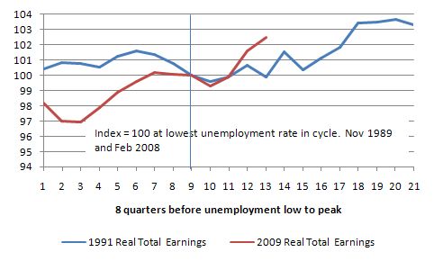
But I thought I would find out what has been going on with real wage movements in this downturn. The following graph shows real average weekly total earnings from persons in index number form plotted 8 quarters before the lowest unemployment rate quarter (which = 100) then to the highest unemployment rate in the 1991 cycle and for the February quarter in the current cycle. The vertical line is the base quarter – where the cycle (in unemployment rate terms) turned.
In interpreting the graphs, you should remember that the Output growth cycle leads the unemployment cycle so that when the graphs are still depicting quarters of rising unemployment, GDP growth had already resumed. I haven’t the time to demarcate the quarters when this occurred but the unemployment rate kept rising for several quarters in 1991 after the economy resumed growth.
In 1991, the end of the growth cycle saw real average weekly total earnings falling. As the unemployment rate started to rise in the February 1990 quarter, real wages fell for 3 of the next four quarters and then steady growth followed. The initial decline in real wages growth as the labour market started to deteriorate in the first few quarters of 2008 has now reversed. At present, real wages are growing.
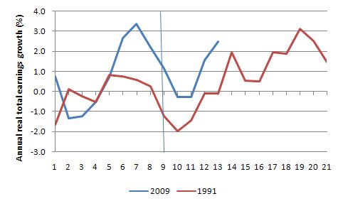
The next graph presents the same information in terms of annual percentage growth rates in real total earnings for the 1991 downturn (specified in terms of timing as above). You can see clearly that workers are travelling a bit better this time relative to the 1991. Also, females fared worse (slightly) than males in the 1991 downturn – suffering deeper real wage cuts in the descent and slower growth as the economy picked up a bit.
Gender real wages growth?
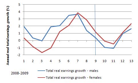
How are males and females faring? The following graphs show annualised real total earnings growth for males and females (using the same timing specification as above) for the current downturn. So 8 quarters prior to the start of the rise in unemployment (February 2008) and the subsequent quarters to February 2009. The vertical line is the quarter when the cycle (in unemployment rate terms) turned.
In the initial downturn, the negative impact on males was more severe and they have continued to lag behind females as real total earnings growth has resumed in the latter part of 2008 and into 2009. The return to growth has certainly coincided with the fiscal stimulus packages (and is consistent with other information we are getting about employment growth and retails sales). It certainly doesn’t tell a story of gloom just yet.
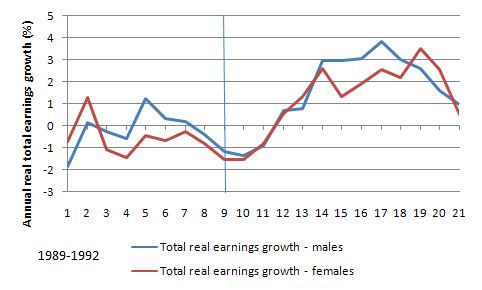
What happened in 1991? Here is the gender dynamics for real total earnings in the 1991 recession (timing specified as before). The vertical line is the switch between falling unemployment rates and rising unemployment rates. It is clear that the impact of the recession on both male and female real total weekly earnings in 1991 was more severe than we have so far witnessed during the current downturn.
So the research question is to explain the shift in the gender real wage sensitivity to the business cycle between 1991 and 2009 in favour of females. That will in some way be implicated in the increasing incidence of male underemployment which was relatively unknown in 1991. Typically underemployment has been a female issue given their over-representation in part-time work. However, in the the most recent boom, male full-time work fell away and increasingly, males were forced into part-time jobs which offered less than desired hours. I will report back on this if I discover anything.
Where’s the NAIRU?
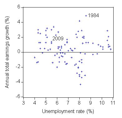
The AWE data also allows us to explore the relationship between the movement in real wages and the official unemployment rate – the so-called Phillips Curve. Recall that the original Phillips study was in terms of wage inflation not price inflation. This relationship is also at the heart of the so called NAIRU concept.
So, the next graph could be called “Where’s the NAIRU?”. You know that interesting game where people like me are always looking in every nook and cranny trying to find the NAIRU which is the unemployment rate where wage inflation (in this case) should be constant. This graph show the official unemployment rate on the horizontal axis and the annual change in real total earnings on the vertical axis. There is very little relationship at all between the two time series.
The problem, of-course, is that the Treasury Budget estimates are all really built around their economic model which says that the system attracts back to the 5 per cent NAIRU. If the NAIRU is a myth then the dynamics of the Treasury models are unlikely to represent anything that is remotely reasonable and consistent with an economy that is moving toward full employment.
In fact, the model will generate budget parameters and outcomes that will tell us that we are at full employment when in fact we will be 3 per cent of official unemployment away from it plus all the underemployment and hidden unemployment that would be associated with this level of economic activity – taken together representing more than 10 per cent wastage of the available labour resources.
Digression: US madness
Just when you thought things couldn’t get any worse, the US Congress passed new laws today protecting credit card recipients. The news report said:
Every American with a credit card will see sweeping changes in the market, with limits on sudden hikes in interest rates that drive consumers deeper into debt … The bill will revolutionize the market by restricting when and how a card company can raise an individual’s interest rate, who can receive a card and how much time people are given to pay their bill … In general, the new rules … will protect debt-ridden consumers from many of the surprise charges common in the industry, such as over-the-limit fees and costs for paying a bill by phone.
So that sounds okay to me. The banks all opposed the legislation and claimed credit will just tighten further. That is actually the aim of the Democrat-motivated legislation.
But here is the madness. The US has a history of including unrelated measures – that are tacked onto pieces of legislation and are required to get various lobbies on side. In the case of this credit card protection bill, some Republican senator from Oklahoma proposed that the bill allow people to have concealed and loaded weapons in national parks and wildlife refuges.
The news reports that:
The House approved that provision separately on Wednesday by a 279-147 vote.
So stay out of all national parks in the US from now on or pack a rod!
Hey Bill,
Does anyone go to those public lectures on the Economy?
A reasonable crowd has attended both.
The podcasts become available next month don’t they Bill?
I don’t think my little local uni even has an economics department.
Dear Lefty
We have a couple of videos nearly ready for release. By early next week. They will be available via the CofFEE site and I will make an announcement here.
By they way, my own university no longer has an economics department. It was scrapped – I won’t comment on that here though. I had already left and relocated CofFEE and my chair into the research division of the University outside of the business faculty. Just when we need strong economics education, universities are downsizing economics into business. You can imagine what I think of that.
best wishes
bill